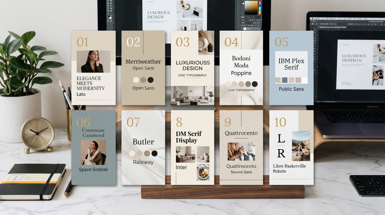
Typography can make or break your design. Two fonts that look great individually can clash horribly when placed together, while the right combination creates instant visual harmony. The good news? You don’t need years of design school to pair fonts like a pro.
Successful font pairings balance contrast with harmony. Pair a decorative display font with a simple body font, match fonts with similar x-heights for visual consistency, and limit yourself to two or three typefaces per design. Understanding basic font categories and following proven pairing principles helps you create professional-looking graphics without guesswork or expensive software.
Understanding the Basic Font Categories
Before you can pair fonts effectively, you need to understand what you’re working with.
Fonts fall into five main categories. Serif fonts have small decorative strokes at the ends of letters. Think Times New Roman or Georgia. Sans-serif fonts lack those decorative elements, creating a cleaner, more modern look. Arial and Helvetica are classic examples.
Script fonts mimic handwriting or calligraphy. They range from elegant wedding invitation styles to casual brush lettering. Display fonts are designed to grab attention at large sizes. They’re bold, decorative, and often quirky. Finally, monospace fonts give every character the same width, creating that typewriter or code editor look.
Each category serves a different purpose. Serifs feel traditional and authoritative. Sans-serifs feel modern and approachable. Scripts add elegance or personality. Display fonts create impact. Monospace fonts suggest technology or precision.
Understanding these categories helps you make intentional choices instead of random guesses.
The Three Golden Rules for Pairing Fonts
Some principles work across almost every design project.
Rule one: Create contrast. Your fonts should look different enough to establish clear hierarchy. Pairing two similar sans-serif fonts rarely works because they compete for attention without offering visual variety. Instead, try pairing a bold sans-serif headline with a lighter serif body text.
Rule two: Find common ground. While your fonts should contrast, they also need something in common. This might be similar proportions, matching x-heights (the height of lowercase letters), or complementary moods. A playful rounded sans-serif pairs beautifully with a casual script, but clashes with a formal Old English blackletter.
Rule three: Limit your selection. Two fonts work for most projects. Three fonts can work if you have a clear hierarchy (headline, subheading, body). Four or more fonts usually create visual chaos. If you’re starting out, stick with two.
These rules give you a framework for making decisions. They’re not absolute laws, but breaking them requires intention and experience.
How to Test Font Pairings Before Committing
Testing saves you from costly mistakes.
Start by setting up a simple test document with realistic content. Include a large headline, a medium-sized subheading, and several lines of body text. Use actual words from your project, not just “lorem ipsum.”
Place your font combinations side by side. Look at them from across the room. Do they create clear hierarchy? Can you instantly tell which text is most important?
Check readability at different sizes. Your body font should remain legible at 14-16 points. Your headline font should maintain its personality even when scaled down for mobile screens.
Test on different backgrounds. A font pairing that works on white might fail on a colored background or over photos. Try both light and dark modes if your design needs to work in multiple contexts.
Print a sample if your design will appear in physical form. Fonts that look crisp on screen sometimes lose definition in print, especially at small sizes.
Common Font Pairing Mistakes to Avoid
Knowing what not to do matters as much as knowing what works.
| Mistake | Why It Fails | Better Approach |
|---|---|---|
| Pairing two decorative fonts | Creates visual competition and reduces readability | Use one decorative font with a simple, neutral partner |
| Choosing fonts that are too similar | Looks like an accident rather than an intentional choice | Create clear contrast in weight, style, or category |
| Ignoring x-height differences | Makes text feel unbalanced and harder to scan | Choose fonts with similar x-heights for body text |
| Using trendy fonts for everything | Dates your design and reduces timeless appeal | Reserve trendy fonts for accents, use classics for body text |
| Forgetting about weight variations | Limits your ability to create hierarchy | Pick font families with multiple weights |
The most common mistake? Choosing fonts based on personal preference alone. Your favorite script font might be beautiful, but if it makes your Instagram captions unreadable, it’s the wrong choice.
Another frequent error involves pairing fonts from the same historical period without enough contrast. Two Art Deco fonts together often feel redundant. Pair that Art Deco display font with a clean, modern sans-serif instead.
Building Your Font Pairing System
A systematic approach beats random experimentation.
-
Start with your body text font. This is where readers spend the most time, so prioritize readability. Choose a neutral, highly legible font that works at smaller sizes.
-
Select a contrasting headline font. If your body font is serif, try a bold sans-serif for headlines. If your body is sans-serif, consider a serif or display font for impact.
-
Test the pairing with real content. Set up actual headlines and paragraphs from your project. See how they work together across different layouts.
-
Add a third font only if necessary. This might be for captions, pull quotes, or special callouts. Make sure it complements both existing fonts without creating confusion.
-
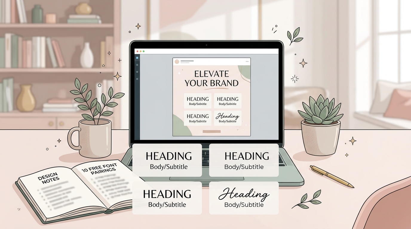
Document your choices. Save your font pairings somewhere accessible. Note the specific weights and sizes you’re using. This consistency matters more than you think, especially when building a brand style guide that actually gets used.
This process takes 20 minutes the first time. After that, you’ll make decisions faster because you understand the principles.
Font Pairing Strategies That Always Work
Some combinations have stood the test of time for good reasons.
Pair serif headlines with sans-serif body text. This classic combination creates clear hierarchy while maintaining excellent readability. Think Playfair Display for headlines with Open Sans for body text.
Combine geometric sans-serifs with humanist sans-serifs. Geometric fonts like Montserrat have perfect circles and straight lines. Humanist fonts like Lato have subtle organic variations. Together, they create visual interest while staying modern and clean.
Match a script accent with a simple sans-serif. Use the script sparingly for special words or short phrases. Let the sans-serif handle everything else. This works beautifully for wedding invitations, restaurant menus, and lifestyle brands.
Pair fonts from the same designer. Many type designers create complementary font families designed to work together. This takes the guesswork out of pairing.
Use different weights from the same font family. Sometimes the best pairing isn’t two different fonts at all. A single well-designed font family with multiple weights can create all the hierarchy you need.
These strategies work because they balance contrast with harmony. They give your eye something interesting to look at without creating chaos.
How Font Pairings Change Across Different Platforms
Your perfect pairing might need adjustment depending on where it appears.
Social media graphics need fonts that remain readable at thumbnail sizes. What looks elegant at full size might become illegible when shrunk to a 400-pixel square. Test your pairings at actual display sizes, not just in your design software.
Website typography needs to consider loading times and browser compatibility. Web fonts add page weight. Using two font families with multiple weights can slow down your site. Consider why your font choices are killing conversions before committing to resource-heavy typefaces.
Print materials require different considerations. Fonts that look crisp on screen sometimes appear too thin or too heavy in print. Always test print samples before running a large batch.
Presentations need high contrast and extreme readability. Your audience might be viewing from 20 feet away. Font pairings that work for a brochure might fail on a projector screen.
Email newsletters face the most restrictions. Many email clients have limited font support and will substitute your carefully chosen fonts with system defaults. Stick with web-safe fonts or design with the assumption that your fonts might not display as intended.
Creating Visual Hierarchy With Font Pairings
Good font pairings establish clear information hierarchy.
Your headline font should command attention immediately. Use size, weight, and spacing to make it the dominant element. A bold sans-serif at 48 points creates instant impact.
Subheadings need to feel connected to headlines while remaining distinct from body text. Try using the same font family as your headline but at a smaller size and lighter weight. Or use your body font at a larger size with increased letter spacing.
Body text should disappear into the background in the best way possible. Readers shouldn’t notice the font itself. They should simply absorb the information effortlessly. This is where understanding font hierarchy and why it matters for readability becomes crucial.
Captions and metadata can use a third font or a variation of your existing fonts. Keep them small and visually subordinate to main content.
Pull quotes and callouts benefit from your headline font or a special accent font. They should stand out from the main text flow while feeling cohesive with your overall design.
The best font pairings feel inevitable. When you see them together, you can’t imagine using anything else. That’s the goal: combinations so natural they seem like the only logical choice.
Adapting Font Pairings for Brand Consistency
Your font pairings should reinforce your brand identity, not fight against it.
Start by considering your brand personality. Are you professional and authoritative? Try pairing a traditional serif like Merriweather with a clean sans-serif like Roboto. Are you creative and approachable? Consider a geometric sans-serif like Poppins with a friendly rounded font like Nunito.
Match your fonts to your industry expectations while finding room for personality. Financial services can use modern fonts without looking frivolous. Creative agencies can use traditional fonts without seeming boring. The key is intentional contrast.
Consider how your fonts work with your color palette. Some fonts have delicate details that disappear against busy backgrounds. Others are bold enough to hold up against complex imagery. Test your pairings with your actual brand colors and typical background images.
Think about longevity. Trendy fonts date quickly. If you’re building a brand that needs to last years, choose fonts with staying power. You can always add trendy accent fonts for seasonal campaigns while keeping your core pairing timeless.
Document everything in your brand guidelines. Specify exact font names, weights, sizes, and use cases. Include examples of correct and incorrect usage. This consistency helps maintain professional appearance across all materials, similar to building a brand system instead of just a logo.
Free Resources for Finding Font Pairings
You don’t need expensive font libraries to create professional pairings.
Google Fonts offers hundreds of free, high-quality typefaces. Their interface lets you test combinations in real time. You can filter by category, language support, and popularity. The licensing is simple and commercial-friendly.
Font Pair is a website dedicated to showcasing Google Font combinations. You can browse curated pairings and see them applied to real design examples. It’s perfect for finding inspiration when you’re stuck.
Typewolf shows font usage on real websites. You can see which fonts successful brands pair together and how they implement them. It’s like having a library of real-world case studies.
Adobe Fonts (included with Creative Cloud subscriptions) offers thousands of professional typefaces. The selection includes many classic fonts that pair beautifully with free alternatives.
FontJoy uses machine learning to generate font pairings. You can lock one font and let it suggest partners, or let it generate completely random combinations. It’s a fun way to discover unexpected pairings.
Many type foundries offer free sample weights from their font families. You might get the regular weight for free while premium weights require purchase. This lets you test pairings before investing.
Troubleshooting When Font Pairings Don’t Work
Sometimes combinations that should work in theory fail in practice.
If your pairing feels off, check the x-heights first. Fonts with drastically different x-heights create visual imbalance. Either choose fonts with similar proportions or adjust your sizing to compensate.
Look at the spacing. Some fonts are naturally tight while others are airy. Mismatched spacing makes text feel uneven. Adjust letter spacing and line height to create visual harmony.
Consider the mood mismatch. A serious, corporate sans-serif paired with a playful script creates cognitive dissonance. Make sure your fonts tell the same story, even if they look different.
Check your weights. If everything feels too light or too heavy, you might need to adjust. Try using a bolder weight for headlines or a lighter weight for body text.
Test in context. Fonts that clash on a white background might work beautifully over photos. Conversely, pairings that look great in isolation might fail when applied to real content.
Sometimes the solution is to start over. Not every font needs a partner. Using a single font family with multiple weights often creates cleaner, more cohesive designs than forcing two incompatible fonts to work together.
Advanced Techniques for Experienced Designers
Once you master the basics, you can experiment with more sophisticated approaches.
Try pairing fonts from the same historical period but different categories. An Art Nouveau display font with an Art Nouveau-inspired serif creates cohesive period styling while maintaining functional hierarchy.
Experiment with super families. These are font collections designed with both serif and sans-serif versions that share the same basic structure. Examples include Lucida, Thesis, and Rotis. They’re designed to work together perfectly.
Use contrast in unexpected ways. Instead of pairing opposite categories, try pairing two sans-serifs with dramatically different personalities. A geometric sans-serif with a hand-drawn sans-serif can create interesting tension.
Consider variable fonts. These modern font files contain multiple weights and styles in a single file. They give you infinite variations to work with while maintaining perfect harmony because everything comes from the same design.
Play with scale relationships. Instead of making your headline twice as large as body text, try making it five times larger. Extreme scale differences create dramatic hierarchy that can make even simple font pairings feel special.
Layer fonts for decorative effects. Use one font as the main text and another as a shadow or outline. This technique works especially well for designing logos that work at any size.
Making Font Pairings Work on Social Media
Social platforms have unique requirements that affect font choices.
Instagram favors bold, high-contrast pairings. Your text needs to grab attention in a fraction of a second as users scroll. Pair thick, attention-grabbing display fonts with clean, minimal sans-serifs.
LinkedIn and Facebook allow more nuanced typography. Users spend more time reading on these platforms. You can use more sophisticated serif pairings without losing readability.
Pinterest users often save images for later reference. Your font pairings need to remain readable at various sizes and on different devices. Test how your pairings look in both the feed and full-size views.
Twitter (now X) shows images at multiple aspect ratios. Your text needs to remain legible whether it’s cropped to a square or displayed as a wide rectangle. Keep important text away from edges.
TikTok and Reels favor bold, simple fonts with high contrast. Viewers watch on small screens, often in bright sunlight. Subtle font pairings get lost. Go bold or go home.
Stories on Instagram and Facebook disappear after 24 hours. This temporary nature gives you permission to experiment with trendier pairings you might not use in permanent content. Just make sure they still align with your overall brand.
Font Pairing Inspiration From Different Industries
Different sectors have different typography conventions worth studying.
Tech companies often pair geometric sans-serifs with monospace fonts. This creates a modern, technical feel while maintaining readability. Think Helvetica for UI elements with Courier for code snippets.
Fashion brands love pairing elegant serifs with delicate scripts. This combination suggests luxury and attention to detail. Didot paired with a refined script creates instant sophistication.
Food and beverage brands frequently use friendly, rounded sans-serifs with hand-drawn scripts. This pairing feels approachable and artisanal. It works equally well for coffee shops and craft breweries.
Financial services typically pair traditional serifs with modern sans-serifs. This combination suggests stability and trustworthiness while feeling contemporary. It’s the visual equivalent of “established but innovative.”
Education and nonprofit sectors often use humanist sans-serifs with geometric sans-serifs. This creates an approachable, professional feel without seeming corporate or cold.
Real estate and architecture firms pair architectural-inspired fonts with elegant serifs. Clean, minimal sans-serifs suggest modern design while classic serifs add gravitas.
Study brands you admire in your industry. Notice which fonts they pair and how they use them. You’re not copying; you’re learning the visual language of your sector.
Your Font Pairing Toolkit
Start building your collection of reliable combinations today.
Keep a swipe file of font pairings you love. Screenshot examples from websites, save social media graphics, bookmark design inspiration. When you need a pairing for a new project, you’ll have proven combinations to reference.
Create templates with your favorite pairings already in place. Set up Instagram post templates, presentation decks, and document layouts with your go-to combinations. This speeds up your workflow and ensures consistency.
Test new pairings in low-stakes projects first. Try that experimental combination on an internal document before using it for client work. Build confidence through practice.
Join design communities where people share font pairings and give feedback. Reddit’s design subreddits, Facebook groups, and Discord servers offer opportunities to learn from others and get input on your choices.
Remember that rules exist to guide you, not limit you. Once you understand why certain pairings work, you can break the rules intentionally to create something unique. The best designers know the principles deeply enough to know when to ignore them.
Font pairings transform good designs into great ones. They create hierarchy, establish mood, and guide your audience through information effortlessly. Start with the basics, practice consistently, and soon you’ll develop an instinct for combinations that work. Your designs will look more polished, more professional, and more intentional. And that’s worth the effort.