You already know that a well-placed font can make or break a layout. But when you strip everything else away, typography becomes the star of the show. Minimalist typography isn’t about being boring. I…
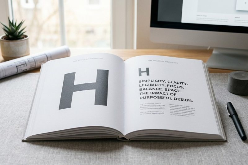
You already know that a well-placed font can make or break a layout. But when you strip everything else away, typography becomes the star of the show. Minimalist typography isn’t about being boring. I…
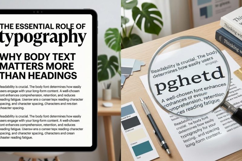
You have spent hours picking the perfect display font for your headings. It looks stunning on the mockup. But when you actually read the page, something feels off. Your eyes get tired. You lose your p…
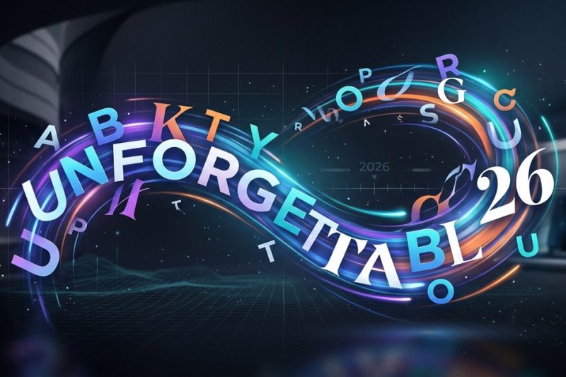
Attention spans are shorter than ever in 2026. Static text blends into the background noise of social feeds, websites, and advertisements. But words that move? They stop the scroll. They grab attentio…
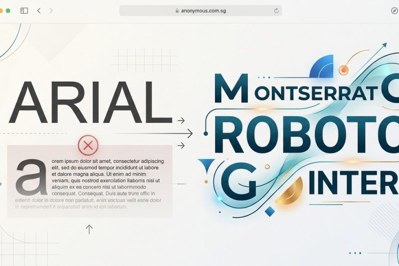
The default is rarely the best. Arial ships with every operating system, every browser, and every word processor on the planet. It is the path of least resistance. But for designers and developers who…
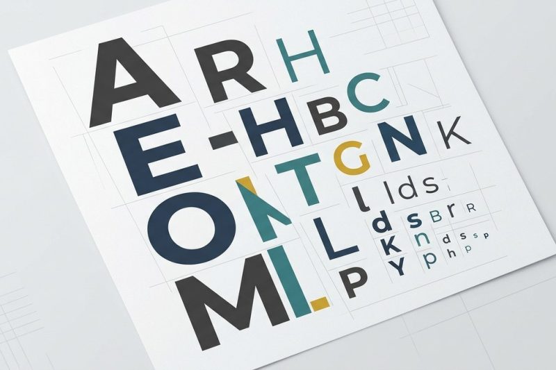
Creating a clear and compelling visual hierarchy through typography is a cornerstone of effective design. When done right, it guides viewers effortlessly through your content, emphasizing the most imp…

Building a consistent visual identity is essential for any brand aiming to stand out and be remembered. Among all design elements, typography plays a pivotal role in shaping how your audience perceive…

Transforming your design work to communicate clearly and effectively is vital in 2026. With the rapid evolution of digital interfaces and print media, mastering the right typography techniques can mak…
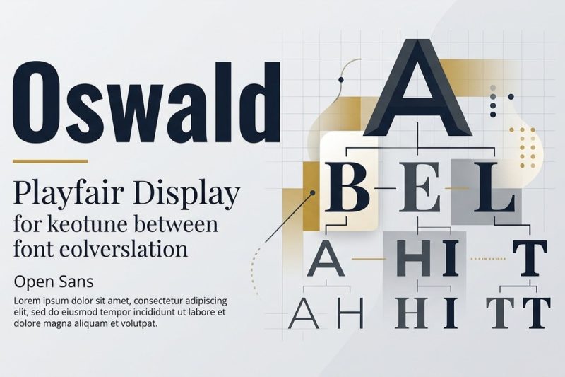
Thinking about how to make your designs stand out? Choosing the right fonts and pairing them effectively can transform a simple layout into a visual masterpiece. Good font pairing isn’t just about mix…

Designing text that invites readers to keep going is both an art and a science. Good typography makes your content easier to read, more engaging, and ultimately more persuasive. When line length is ju…
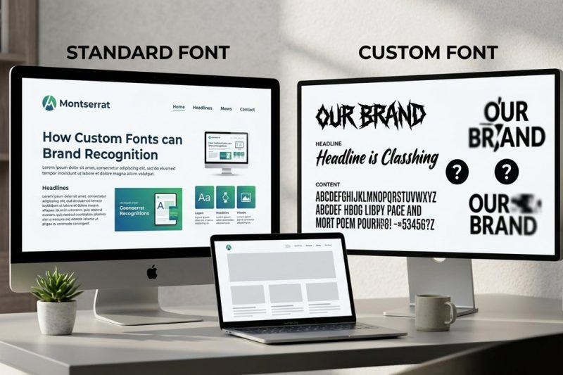
Brands often think that choosing a unique font makes their identity stand out. But is that always true? Do custom fonts hurt brand recognition? The answer depends on how you select and implement fonts…