A single color done well can speak louder than a rainbow. That is the quiet power of a monochromatic color palette. Unlike complementary or analogous schemes that rely on contrast between different hu…
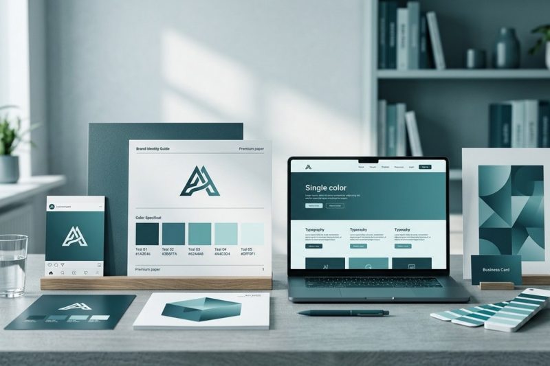
A single color done well can speak louder than a rainbow. That is the quiet power of a monochromatic color palette. Unlike complementary or analogous schemes that rely on contrast between different hu…
The year 2026 is bringing a fresh wave of color confidence. After years of muted neutrals and safe beiges, the design world is leaning into bolder, more personal choices. Think sunset oranges, icy blu…
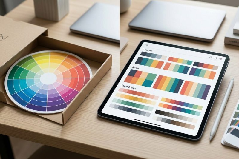
The color wheel has been the default tool for picking colors for as long as most of us can remember. Art schools teach it. Design books preach it. Every blog post about color theory starts with it. Bu…

Understanding how viewers perceive visual information is central to designing effective projects. When you master visual hierarchy in design, you guide the viewer’s eye naturally to what matters most….

Building a compelling brand identity goes beyond logos and taglines. It’s about the feelings, perceptions, and connections your brand creates with your audience. And at the core of that emotional conn…

Getting your color palette just right can feel like walking a tightrope. You want your colors to look beautiful, work well together, and be accessible for everyone. But how do you know if your choices…
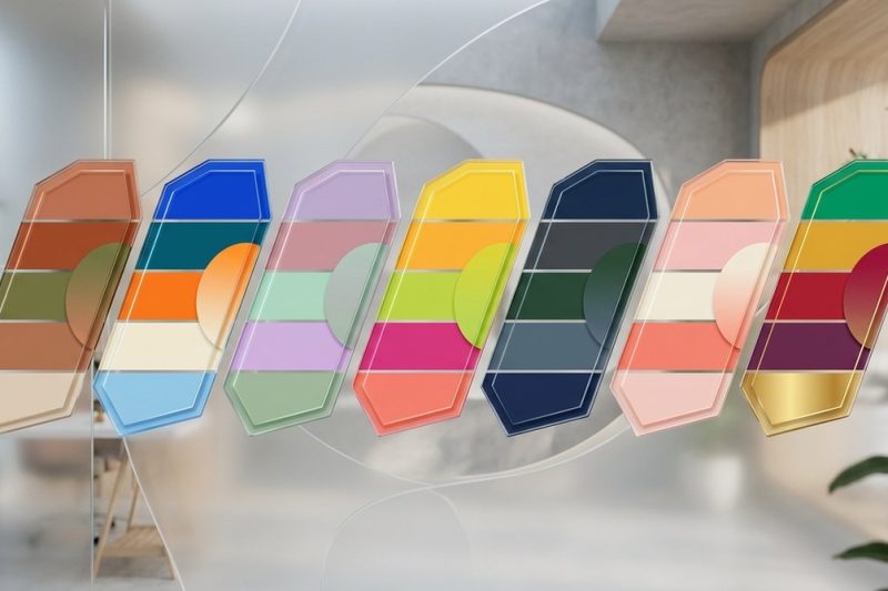
Designing with color is an exciting part of creating eye-catching visuals. However, piling on too many colors can backfire, making your work look chaotic rather than captivating. When you understand t…
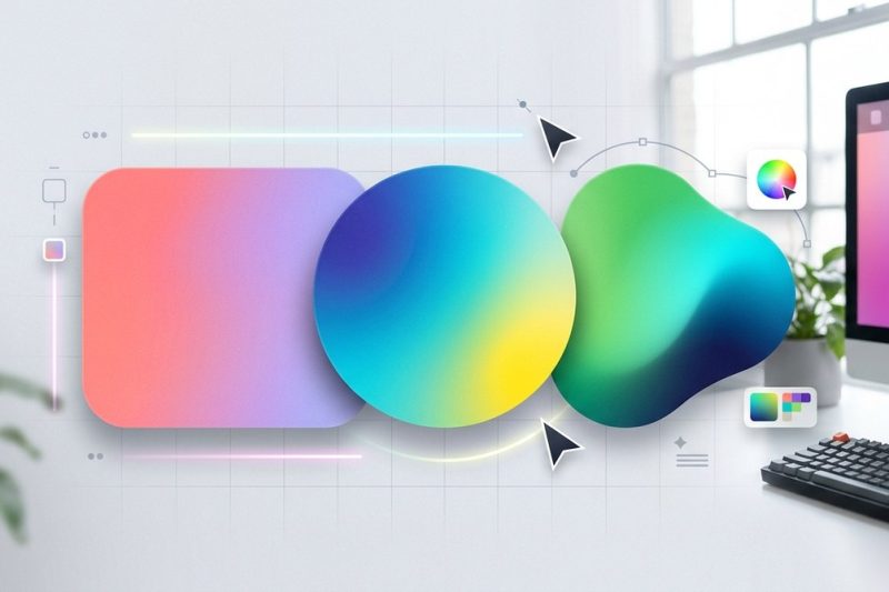
Designing with gradients can bring a vibrant, dynamic feel to your user interfaces. When used thoughtfully, gradients help guide user attention, add depth, and create memorable visuals. But many worry…

Creating a compelling color palette from an image can transform your design projects. Whether you’re working on branding, digital artwork, or personal projects, having a well-chosen set of colors make…
Black gets a bad reputation in design circles. You’ve probably heard the advice: never use pure black, always use dark grays, black makes everything look flat and lifeless. But here’s the truth. Black…