A subtle animation when a user hovers over a button. A loading bar that pulses instead of sitting still. These tiny moments might not seem important, but they separate a generic interface from one tha…
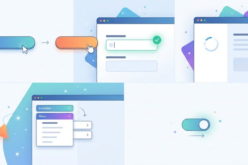
A subtle animation when a user hovers over a button. A loading bar that pulses instead of sitting still. These tiny moments might not seem important, but they separate a generic interface from one tha…
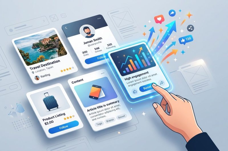
Creating effective UI cards can transform how users interact with your digital product. They are more than just visual containers; they are powerful tools to organize information, guide user actions, …
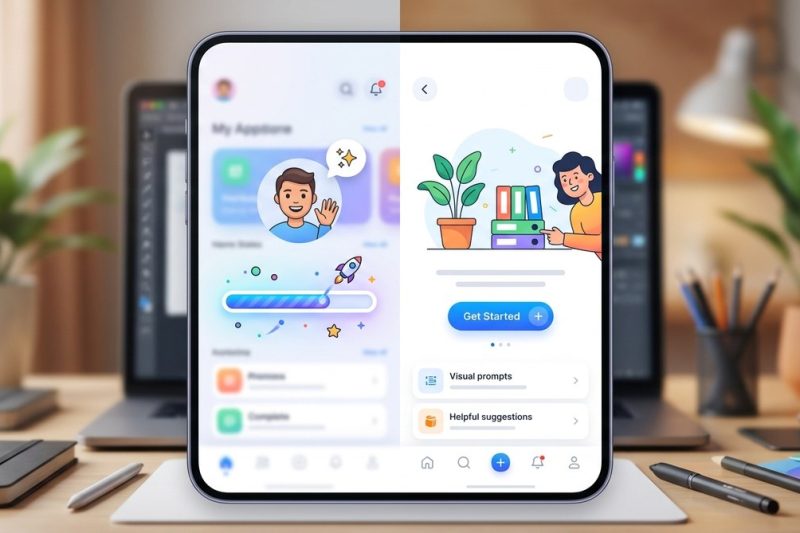
Struggling with dull, frustrating blank screens or slow-loading moments? You’re not alone. Many products overlook the power of well-crafted empty states and loading screens. When done right, these mom…

Choosing the perfect size for UI elements can feel like a moving target. Too small and users struggle to tap or click. Too large and your design feels cluttered or awkward. Getting it right is key to …
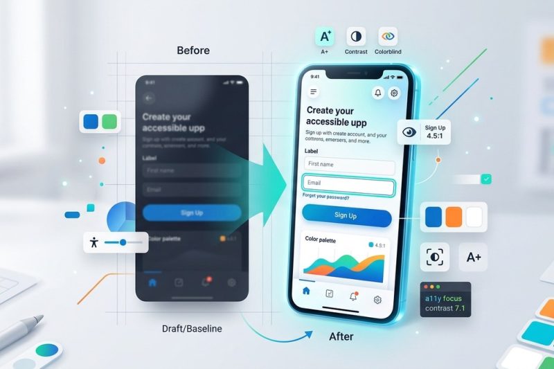
Creating user interfaces that are both accessible and attractive is a challenge many UI and front-end designers face today. The good news is that accessibility doesn’t mean sacrificing style. When don…
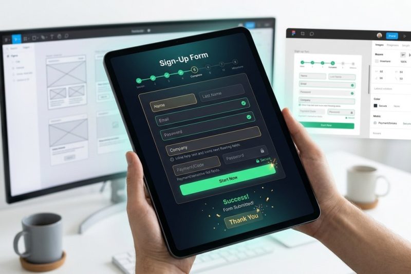
Creating a form that users want to complete is both an art and a science. With so many options online, users have become increasingly selective about where they spend their time. If your forms are too…
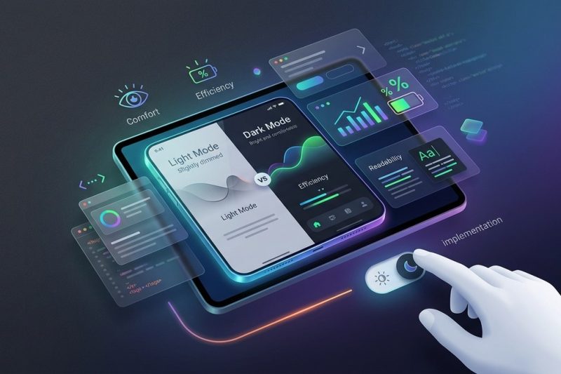
Dark mode has moved beyond a nice-to-have feature. Users expect it. Operating systems default to it. Battery life depends on it. And if your interface doesn’t offer it, you’re already behind. But here…

You spent weeks designing that interface. The layout looks solid. The colors feel right. But before you hand it off to developers or hit publish, there’s one more step most designers skip. A final rev…
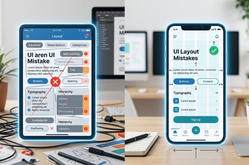
You just finished a design project and sent it for review. The feedback comes back harsh: the interface feels cluttered, buttons are hard to find, and text is barely readable. Sound familiar? Most int…
More than 60% of web traffic now comes from mobile devices. That number keeps climbing. If your interface doesn’t work perfectly on a smartphone, you’re losing users before they even see your content….