You’re staring at a blank screen at 9 PM, knowing you need to post three stories before tomorrow morning. Your brand colors are somewhere in your notes app. Your fonts are… well, you’ll figure that out later. And the layout? You’ll just wing it like last time.
Sound familiar?
Most content creators waste 2-3 hours every week designing Instagram stories from scratch. That’s 12 hours a month you could spend actually running your business.
Instagram story templates are pre-designed layouts that maintain consistent branding while cutting design time by up to 75%. The best templates include editable text layers, brand color swatches, and multiple layout variations. Choose templates that match your content types (quotes, product showcases, behind-the-scenes) and customize them once to create a reusable system. Templates work best when paired with a simple brand style guide that defines your fonts, colors, and visual patterns.
Why templates actually work better than designing from scratch
Templates aren’t about taking shortcuts. They’re about building a visual system that your audience recognizes instantly.
When someone scrolls through stories at lightning speed, consistent design patterns help them stop on yours. They see your color palette, your font choices, your layout style, and their brain registers “oh, this is that brand I follow.”
Creating that consistency without templates means remembering dozens of tiny decisions every single time. What size was that headline? Which shade of blue did I use last time? How much padding did I leave around the text box?
Templates answer all those questions automatically.
What makes a template actually useful
Not all templates are created equal. The ones gathering digital dust in your downloads folder probably share these problems:
They’re too specific. A template designed for “Summer Sale Announcement – Beach Theme – Pink Gradient” only works once. You need flexibility.
They’re too generic. Stock templates that work for every brand work for no brand. Your coffee shop shouldn’t look like a law firm.
They’re too complicated. If you need a design degree to customize the template, it’s not saving you time.
Good templates hit the sweet spot. They provide structure without being restrictive. They maintain your brand without being repetitive. They’re simple enough to edit on your phone if needed.
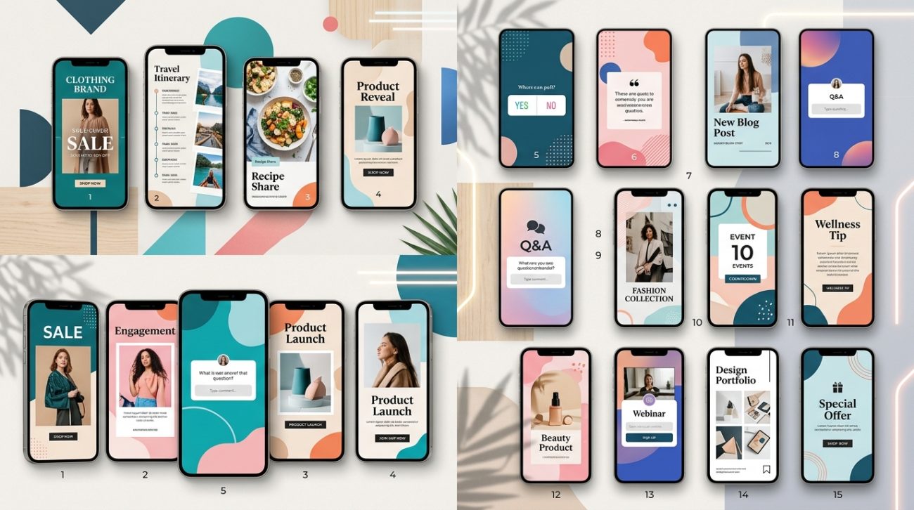
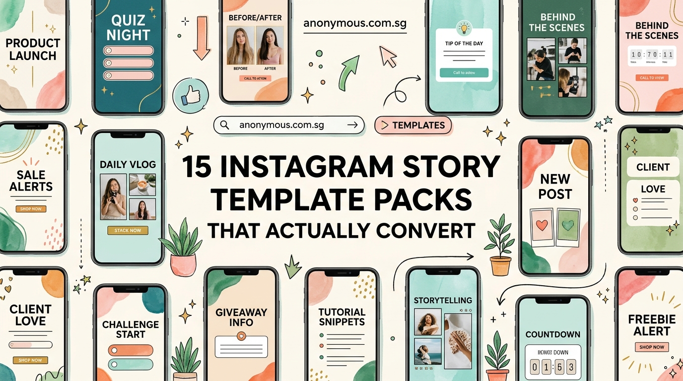
The five template types every content creator needs
Your content falls into predictable categories. Once you recognize the pattern, you can build a template for each type.
Announcement templates
Product launches, schedule changes, special offers. These need hierarchy: big headline, supporting details, clear call to action.
Your announcement template should have three text zones with defined sizes. The headline grabs attention. The body explains. The footer directs action.
Quote templates
Customer testimonials, motivational content, expert advice. Text is the star here, so your template needs excellent typography and breathing room.
Build in at least 20% margin around all edges. Use a maximum of two font weights. Include a subtle attribution area that doesn’t compete with the main quote.
Behind-the-scenes templates
Process shots, team introductions, workspace peeks. These templates frame photos consistently while adding context.
Your BTS template should have a designated photo area (usually 60-70% of the frame) and a caption zone that overlays or sits below the image. Add your logo small in a corner for brand consistency.
Educational templates
Tips, how-tos, step-by-step guides. These need clear information hierarchy and room for multiple pieces of content.
Educational templates work best with numbered steps, bullet points, or a grid layout. Keep backgrounds simple so text remains readable. Consider creating a series format where each slide follows the same pattern.
Engagement templates
Polls, questions, this-or-that choices. These leverage Instagram’s interactive stickers while maintaining your brand.
Design these templates with clear zones for the interactive elements. Leave space for Instagram’s native sticker placement. Use contrasting backgrounds so the stickers pop.
How to customize templates without making them look generic
Here’s the process that takes a stock template and makes it unmistakably yours:
-
Replace the color palette completely. Don’t just change the background. Swap every single color with your brand colors. This includes accent colors, text colors, and decorative elements.
-
Install your brand fonts. Most template tools let you upload custom fonts. Do this once and your templates will automatically feel more on-brand than 90% of content out there.
-
Adjust the spacing. Templates often use generic padding. Tighten or loosen the space between elements to match your brand’s personality. Luxury brands need more breathing room. Energetic brands can pack things tighter.
-
Simplify the decorative elements. Those swirls, shapes, and doodles? Delete half of them. Then delete half of what’s left. Clean templates age better than busy ones.
-
Add your brand patterns. Do you always use rounded corners? Specific icon styles? Consistent photo filters? Build these patterns into every template you customize.
Common template mistakes that make your stories flop
| Mistake | Why it fails | Better approach |
|---|---|---|
| Using 6+ colors per story | Creates visual chaos and dilutes brand recognition | Stick to 2-3 colors from your palette per template |
| Tiny text that’s unreadable on mobile | 80% of viewers watch on phones with small screens | Use minimum 24pt for body text, 36pt+ for headlines |
| Placing text over busy photos | Reduces readability and looks unprofessional | Add semi-transparent overlay boxes behind text |
| Ignoring safe zones | Important content gets cut off by profile icons and UI | Keep text and key visuals in the center 80% of the frame |
| Using different fonts in every story | Breaks brand consistency and looks amateur | Choose 2 fonts maximum and use them consistently |
Where to find templates that don’t look like everyone else’s
The popular template sites have a problem. When 10,000 people download the same pack, your stories start looking identical to your competitors’.
Better sources exist if you know where to look:
Independent designers on Creative Market and Etsy sell smaller-batch templates. You’ll see less overlap with other brands in your space.
Niche template creators focus on specific industries. A template pack made specifically for yoga studios will serve you better than generic “wellness” templates.
Custom template services let you commission templates built around your exact brand guidelines. Higher upfront cost, but you get templates nobody else has.
If you’re working with free options, at least customize them properly so they don’t scream “free template.”
Building your own template system from scratch
Sometimes the best template is the one you make yourself. You don’t need professional design software to do this.
Start with your most-posted content type. Open your design tool (Canva, Adobe Express, or even PowerPoint). Set your canvas to 1080×1920 pixels.
Create a layout that includes:
- Your logo in a consistent position
- A headline area with your primary font
- A body text area with your secondary font
- Accent shapes or lines in your brand colors
- Designated photo placement zones
Save this as your master template. Then create variations:
- Version A: Large image, small text overlay
- Version B: Text-focused with decorative background
- Version C: Split layout (image left, text right)
- Version D: Grid layout for multiple images
Each variation maintains the same core elements (fonts, colors, logo placement) but serves different content needs.
“The best template system is the one you’ll actually use consistently. Start with three templates max. Master those before adding more. Most creators need fewer templates than they think.” – Content strategist who’s analyzed 10,000+ story campaigns
Setting up templates for different platforms and tools
Your template needs to work with your actual workflow. That means considering where and how you’ll edit them.
Canva users: Create templates as designs in your brand kit. Use the “Make a copy” feature each time you need a new story. Set up your brand colors and fonts once in settings so they populate automatically.
Adobe Creative Cloud users: Save templates as .PSD or .AI files with organized layers. Name your text layers clearly (“HEADLINE HERE”, “Body text here”). Lock background layers so you don’t accidentally move them.
Mobile-only creators: Use apps like Unfold, Mojo, or Over. Create your templates on desktop first, then recreate the layouts in your mobile app. Save them as favorites for instant access.
Scheduling tool users: If you batch-create content in Later, Planoly, or Buffer, make sure your templates export at the right dimensions and file size. Instagram prefers files under 30MB.
How to organize your template library so you can find things
You’ll build up dozens of templates quickly. Without organization, you’ll waste time hunting for the right one.
Create a folder structure that matches how you think about content:
Instagram Templates/
  - Announcements/
  - Quotes/
  - Products/
  - Behind-the-scenes/
  - Educational/
  - Seasonal/
Name your files descriptively: “Quote-template-light-bg.psd” beats “Template-final-v3.psd” every time.
Keep a simple reference document (even just a Google Doc) with thumbnails of each template and notes about when to use it. This becomes your personal template guide.
Measuring whether your templates actually improve engagement
Templates should make your life easier AND perform better. Track these metrics to know if they’re working:
-
Completion rate: What percentage of viewers watch your entire story sequence? Higher completion rates mean your design is working.
-
Reply rate: Are more people responding to your stories? Good templates make content clearer, which encourages interaction.
-
Time spent creating: Track how long story creation takes before and after implementing templates. You should see at least a 50% time reduction.
-
Brand recognition: Run informal polls asking followers if they recognize your content before seeing your username. Consistent templates boost this recognition.
If your metrics aren’t improving after using templates for a month, the templates aren’t the right fit. Try a different style or audit your visual identity to find the disconnect.
Updating your templates without losing consistency
Your brand evolves. Your templates should too, but not so drastically that you lose recognition.
Update templates gradually:
- Change one element at a time (swap a font, adjust a color, modify a layout)
- Test the new version alongside your old templates for a week
- Get feedback from your audience before committing fully
- Keep archived versions so you can reference what worked
Most brands benefit from a template refresh every 12-18 months. More frequent changes confuse your audience. Less frequent updates make you look stale.
Batch creating content with your template system
Templates really shine when you batch-create content. Here’s the workflow that works:
-
Plan your content calendar for the week or month. List out every story you need to post.
-
Group by template type. All quotes together, all product shots together, all announcements together.
-
Open your template and create all stories of that type in one session. Your brain stays in the same design mode, making decisions faster.
-
Export everything at once. Name files with dates so you know what posts when.
-
Schedule or save to your content library for posting throughout the period.
This approach can help you create a month of content in one afternoon instead of scrambling daily.
Making templates work with Instagram’s native features
Instagram adds new features constantly. Your templates need to play nice with stickers, polls, questions, and other interactive elements.
Design templates with “safe zones” where you’ll never place critical text or images. Instagram’s UI elements (profile picture, username, timestamp, swipe-up bar) cover specific areas. Keep those zones clear.
When using interactive stickers:
- Leave a 200×200 pixel clear zone in the middle-bottom third for polls and sliders
- Place your text in the top two-thirds so it doesn’t compete with stickers
- Use solid or semi-transparent backgrounds behind stickers so they remain visible
- Test every template with actual stickers before considering it finished
Adapting templates for different aspect ratios and formats
Instagram stories are 9:16, but you might want to repurpose that content for feed posts (1:1 or 4:5), reels (9:16 but different safe zones), or other platforms.
Smart template design accounts for this from the start:
- Keep all critical elements in the center 80% of the frame
- Design with “crop-friendly” layouts where edges can be trimmed without losing meaning
- Create master templates in the largest size you’ll need, then crop down
- Use proper image dimensions for each platform
Some creators maintain multiple versions of the same template optimized for different formats. Extra work upfront, but massive time savings when repurposing content.
When to break your own template rules
Templates create consistency, but rigid consistency becomes boring. Break your template rules strategically:
-
Major announcements deserve special treatment. A product launch or rebrand can use a one-off design that stands out.
-
Seasonal content might justify temporary template variations. Holiday-themed elements can appear for a few weeks without confusing your audience.
-
Collaborations with other brands might require hybrid templates that incorporate both visual identities.
-
Trending formats sometimes demand breaking your usual pattern to participate in a viral moment.
The key is intention. Break rules on purpose, not because you forgot what your template system looks like.
Building templates that reflect your actual brand personality
Generic templates feel generic because they don’t reflect who you are. Your templates should communicate your brand personality before anyone reads a word.
A law firm’s templates should feel different from a bakery’s templates. A fitness coach’s stories should look different from a meditation teacher’s stories, even if both are in “wellness.”
Ask yourself:
- What three words describe your brand personality?
- What emotions should viewers feel when they see your content?
- What visual elements support those feelings?
Then build those answers into your templates. A playful brand might use rounded corners, bright colors, and casual fonts. A premium brand might use generous white space, muted tones, and serif fonts. A bold brand might use high contrast, geometric shapes, and all-caps headlines.
If you’re unsure about your visual identity, consider building a proper brand style guide before investing heavily in templates.
Templates that grow with your business
Your needs today won’t match your needs in six months. Design templates with scalability in mind.
Start simple. Three solid templates beat ten mediocre ones.
As your content strategy expands, add templates for new content types. Launching a podcast? Add an episode announcement template. Starting a newsletter? Create a signup prompt template.
Keep your core elements consistent across all templates:
- Same fonts (or font family)
- Same color palette
- Same logo placement
- Same overall vibe
This consistency lets you add infinite template variations without losing brand recognition.
Making templates work when you’re not a designer
You don’t need design skills to use templates effectively. You need decision-making skills.
Templates remove most design decisions. You just need to:
- Choose which template fits your content type
- Swap in your specific text and images
- Make minor adjustments if needed
- Export and post
The hard design work (layout, color theory, typography, visual hierarchy) is already done. You’re just filling in the blanks.
If you’re struggling with even basic customization, look for templates specifically marketed as “beginner-friendly” or “fully editable text layers only.” These typically have simpler structures and clearer editing instructions.
Your stories shouldn’t look like work
Good templates fade into the background. Your audience shouldn’t think “nice template.” They should think “great content.”
When templates become invisible infrastructure, you’ve nailed it. Your brand looks consistent and professional, but viewers focus on your message, not your design choices.
That’s the goal. Templates that save you hours of work while making your content look effortless.
Start with one template this week. Just one. Use it five times and see how it feels. Adjust what doesn’t work. Keep what does.
Then add a second template next week. Build slowly. Before you know it, you’ll have a complete system that makes content creation feel simple instead of stressful.