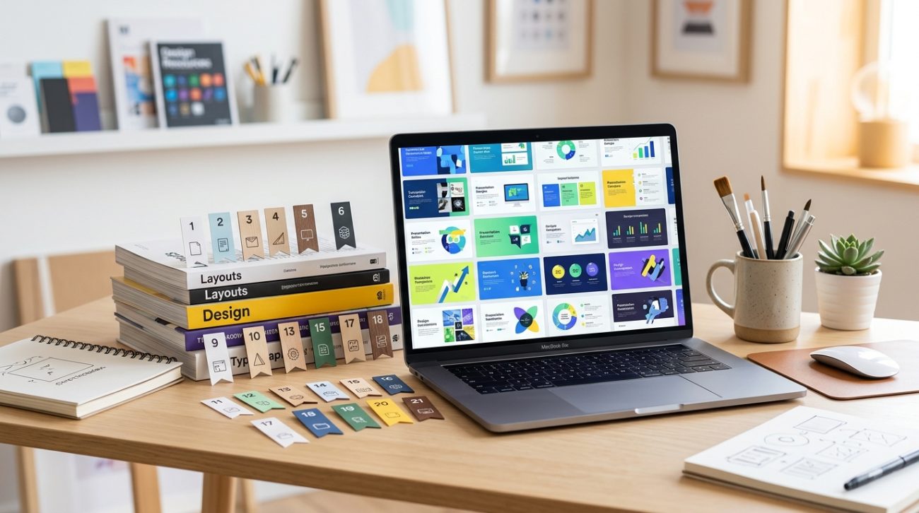
You’re staring at a blank slide deck with a deadline looming. Building a presentation from scratch takes hours you don’t have. The good news? You don’t need to start with an empty canvas or pay for expensive design software. Hundreds of free presentation templates exist online, but most libraries are cluttered with outdated designs that scream 2010. The challenge isn’t finding templates. It’s finding ones that look professional, customize easily, and don’t require a design degree to use.
Free presentation templates save hours of design work when you know where to look. The best sources offer modern layouts, easy customization, and file formats that work with PowerPoint, Google Slides, and Keynote. This guide shows you how to evaluate template quality, avoid common pitfalls, and customize slides to match your brand without starting from zero.
What makes a presentation template worth downloading
Not all templates deserve space on your hard drive. Before you download anything, check these quality markers.
File format compatibility matters more than you think. A template that only opens in one specific software version creates problems down the line. Look for templates that work across PowerPoint, Google Slides, and Keynote. Most quality sources provide multiple format options in a single download.
Editable elements separate useful templates from frustrating ones. Every text box, shape, and image placeholder should respond when you click it. Locked elements or flattened graphics force you to rebuild slides from scratch, which defeats the purpose.
Slide variety gives you flexibility. A strong template pack includes title slides, content layouts, data visualization options, team bios, and closing slides. You shouldn’t need to cobble together slides from three different sources to complete one deck.
Color scheme consistency shows professional design thinking. All slides should use the same palette, even if individual slides look different. This makes customization easier because you can change the entire deck’s colors in one go.
“A good template should feel invisible. You customize it to match your content and brand, then your audience never thinks about the design. They just absorb your message clearly.” – Sarah Chen, Presentation Designer
How to evaluate template quality in 30 seconds
You can spot a well-designed template fast once you know what to check.
- Open the master slide view to see how the template is built. Professional templates use master slides that control fonts, colors, and layouts across the entire deck.
- Click on three random text boxes to confirm they’re editable and use real fonts, not images of text.
- Check the image placeholders by replacing one with your own photo. It should resize and crop predictably.
- Look at the color palette in the design tab or theme colors. A proper template defines 6-10 theme colors you can swap globally.
- Test one animation or transition if the template includes them. They should enhance content, not distract from it.
This process takes less than a minute and saves you from downloading templates that look good in previews but frustrate you during editing.
Common template mistakes that waste your time
Even experienced designers fall into these traps when choosing templates.
| Mistake | Why it happens | How to avoid it |
|---|---|---|
| Downloading trendy designs that date quickly | Gradient overlays and specific color trends look fresh now but age badly | Choose clean layouts with classic typography |
| Picking templates with too many slides | More seems better, but you’ll never use 80% of them | Focus on packs with 15-25 versatile slides |
| Ignoring font licensing | Free templates sometimes use premium fonts you don’t own | Check if fonts are system defaults or Google Fonts |
| Skipping the preview PDF | You assume all slides match the thumbnail quality | Always review the full slide deck before downloading |
| Choosing image-heavy templates | They look impressive but require perfect photography | Select text-focused layouts you can populate easily |
The font licensing issue trips up more people than you’d expect. A template might look perfect on your screen because the designer’s premium fonts are embedded. When you edit text, your system substitutes a default font and the layout breaks. Always check the font list before committing to a template.
Where designers actually find quality templates
Forget generic stock photo sites. These sources consistently deliver professional options.
Slides Carnival offers hundreds of modern templates with excellent typography. Their minimalist aesthetic works for corporate presentations and creative pitches alike. Every template comes in PowerPoint and Google Slides formats.
Canva’s presentation section provides thousands of free templates with their drag-and-drop editor. While some features require a Pro account, the free tier includes plenty of professional options. The built-in photo library and graphics make customization faster.
Google Slides template gallery gets overlooked because it’s built into the software. The selection is smaller than dedicated sites, but every template is guaranteed to work perfectly in Google Slides. They’re also easy to convert to PowerPoint.
Behance hosts presentation templates from designers worldwide. Quality varies more than curated sites, but you’ll find unique styles you won’t see elsewhere. Filter by “free” and check licensing before downloading.
Slidebean focuses on startup pitch decks and business presentations. Their free templates include layouts specifically designed for investor presentations, product launches, and quarterly reviews.
If you’re building presentations that need to match existing brand guidelines, learning how to build a brand style guide that actually gets used helps you customize any template consistently.
How to customize templates without breaking the design
Templates give you a head start, but customization makes them yours.
Start with colors. Replace the template’s color scheme with your brand colors first. This single change makes the biggest visual impact. Most presentation software lets you edit theme colors, which updates every slide automatically.
Swap fonts strategically. Templates typically use two fonts: one for headings and one for body text. Replace both with your brand fonts, but keep the size hierarchy the designer established. If the template uses 44pt for main titles and 28pt for subtitles, maintain those proportions.
Replace images thoughtfully. Template photos are placeholders. Use your own images, but match the original photo’s composition and crop. If the template shows a horizontal landscape photo, don’t force a vertical portrait into that space.
Delete unused slides immediately. Don’t let extra slides clutter your file. Remove any layout you know you won’t need. This makes navigation easier and keeps your file size manageable.
Adjust spacing last. After you’ve added your content, fine-tune the spacing between elements. This polish separates amateur customizations from professional results.
Typography choices affect how professional your presentation looks. Understanding how to choose the perfect font for your brand identity helps you make better font decisions when customizing templates.
File format differences you need to understand
Not all presentation formats behave the same way.
PowerPoint (.pptx) remains the industry standard. It offers the most features, best animation controls, and widest compatibility. If you’re presenting on someone else’s computer, PowerPoint is the safest choice.
Google Slides wins for collaboration. Multiple people can edit simultaneously, and you don’t need to email versions back and forth. The feature set is simpler than PowerPoint, which can be good or limiting depending on your needs.
Keynote produces the smoothest animations and transitions. If you’re in the Apple ecosystem, Keynote creates stunning presentations. The downside is compatibility. Exporting to PowerPoint sometimes breaks layouts or loses effects.
PDF exports work for presentations you’ll email or post online. They preserve your design perfectly but remove all animations and transitions. Use PDFs for decks people will read on their own, not present live.
When you download a template, grab every format the creator offers. This gives you flexibility if you need to switch software mid-project.
Design principles that make slides more effective
Templates handle layout, but you still control these crucial elements.
- One idea per slide keeps your audience focused. If you’re explaining three points, use three slides.
- Contrast makes text readable. Dark text on light backgrounds or light text on dark backgrounds. Avoid low-contrast combinations like gray text on white.
- Alignment creates visual order. Everything on your slide should align to something else. Random placement looks amateurish.
- White space isn’t wasted space. Empty areas give your content room to breathe and make slides less overwhelming.
- Consistent placement builds rhythm. If your title appears in the top left on slide two, keep it there on slide three.
Color psychology affects how audiences perceive your message. The principles in how to choose brand colors that actually convert customers apply to presentation design too.
When to skip templates and build from scratch
Templates solve most presentation needs, but sometimes custom design makes more sense.
High-stakes pitches to investors or major clients might warrant custom design. Your presentation represents your company, and a unique design signals you took the project seriously.
Presentations with unusual content don’t always fit template structures. If you’re presenting complex data visualizations or interactive elements, building custom slides gives you more control.
Brand-critical presentations for companies with strict design standards might clash with template aesthetics. Large corporations often have internal presentation templates that match their brand guidelines exactly.
Repeated presentations you’ll give dozens of times justify the investment in custom design. If you’re using the same deck for a year of sales calls, spend time perfecting it.
For everything else, templates get you 90% of the way there in 10% of the time.
Mistakes that make template-based presentations obvious
You want people to focus on your content, not notice you used a template.
Leaving placeholder text is the most common giveaway. “Insert your company name here” or “Add your logo” tells everyone you rushed the job. Replace every piece of sample content.
Using template photos instead of your own images makes presentations feel generic. Stock photos of diverse teams having meetings look the same across thousands of decks. Use real photos from your company or project.
Keeping all the slides creates unnecessarily long presentations. Templates include 30+ slides to show variety. Your presentation should only include the slides you actually need.
Ignoring the template’s style when you add new elements breaks visual consistency. If the template uses rounded corners on all shapes, don’t add rectangles with sharp corners.
Mismatching fonts happens when you add text boxes without using the template’s text styles. Every new text element should use the predefined heading or body styles.
Typography consistency matters throughout your entire brand presence. The same mistakes that hurt presentations also affect other materials, as explained in 7 typography mistakes that make your designs look unprofessional.
Alternative tools worth considering
Presentation software has evolved beyond PowerPoint and Google Slides.
Pitch combines beautiful templates with collaboration features. The interface feels more modern than traditional presentation tools, and the template library focuses on startup and business use cases.
Beautiful.ai uses artificial intelligence to adjust layouts as you add content. Slides automatically reformat when you add or remove elements, which saves manual adjustment time.
Ludus targets designers who want more creative control. It offers advanced layout tools and integrates with design software like Figma and Sketch.
Prezi creates non-linear presentations that zoom and pan across a canvas. The effect can be striking, but it also risks making audiences dizzy if overused.
These tools offer free tiers, though premium features require subscriptions. They’re worth testing if traditional presentation software feels limiting.
Making templates work for different presentation types
Different presentation contexts need different approaches.
Sales presentations benefit from templates with strong data visualization slides. Charts, graphs, and comparison tables help you make your case with numbers. Look for templates that include pricing tables and testimonial layouts.
Educational presentations need clear information hierarchy and plenty of text space. Templates designed for lectures or training sessions typically include more content per slide than business templates.
Creative pitches work best with visually striking templates that have large image areas. You’re selling a vision, so the template should support bold photography and minimal text.
Internal updates can use simpler templates since your audience already understands the context. Focus on templates with good data visualization and timeline layouts.
Conference talks need high contrast and large text because they’re often viewed from far away. Avoid templates with small fonts or intricate details that won’t read from the back row.
Your next presentation starts here
Free presentation templates remove the biggest barrier to creating professional slides: design expertise. You don’t need to know color theory or typography rules when someone else has already made those decisions. You just need to know where to find quality templates and how to customize them effectively.
Start with one of the sources mentioned above. Download two or three templates that match your presentation type. Spend five minutes testing each one with your actual content. The right template will feel intuitive and make your information look better immediately. Save that template and customize it for your specific needs. Your next presentation will take half the time and look twice as good.