You’ve designed the perfect brochure. The layout sings. The colors pop. You export the PDF, send it off, and wait for the printed samples. Then your printer calls. Missing fonts. Wrong color mode. Images too low-res. Now you’re facing delays, extra costs, and a frustrated client. Most print disasters happen in the final 10% of the process, right before you hit send.
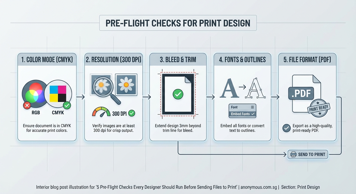
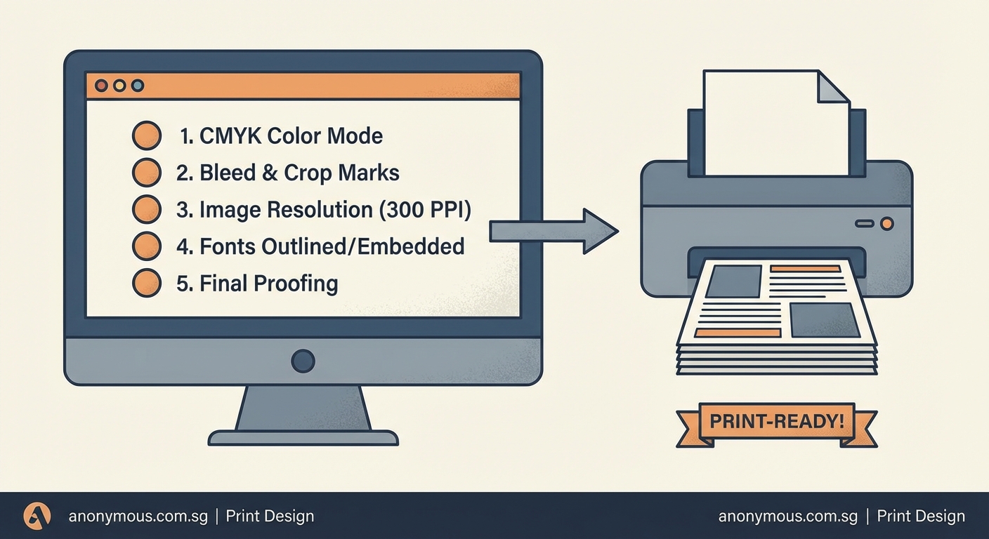
A proper pre-flight checklist for printing catches file errors before they become expensive problems. Check document setup, color modes, fonts, images, bleeds, and export settings every time. These steps take 10 minutes but save hours of rework and avoid rejection fees. Print-ready files protect your reputation and keep projects on schedule without surprises from the printer.
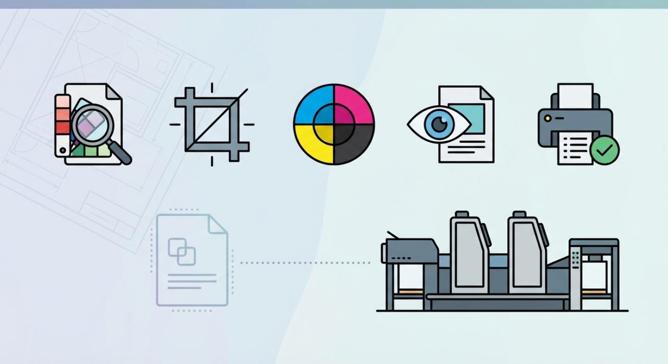
Why pre-flight checks matter more than you think
Print production doesn’t forgive mistakes the way digital design does. You can’t patch a brochure after 5,000 copies roll off the press.
A single missed detail can cost hundreds or thousands of dollars. Wrong color profiles turn vibrant blues into muddy grays. Missing bleeds create white edges. Low-resolution images look pixelated. Unembedded fonts get substituted with Arial.
Professional printers will catch some issues during their own pre-flight process. But they’ll charge you for the time. Worse, they might not catch everything, and you’ll discover the problem when boxes of unusable printed materials arrive.
Running your own pre-flight checklist for printing gives you control. You spot problems when fixing them is free. You build trust with printers. You deliver on time.
Document setup and specifications
Start with the foundation. Your document dimensions must match the final printed size plus bleed.
Bleed is the extra area beyond your trim edge. It prevents white slivers when the cutting blade shifts slightly. Standard bleed is 3mm (about 0.125 inches) on all sides.
Check these specifications before anything else:
- Final trim size matches the print order
- Bleed extends 3mm beyond trim on all sides
- Safe area keeps important text and logos at least 5mm inside the trim
- Page orientation is correct (portrait vs. landscape)
- Number of pages is correct and in proper sequence
Create a new document with wrong dimensions and you’re rebuilding the entire file. Catch it now.
Color mode and profile verification
RGB looks beautiful on screens. CMYK is what most printers actually use. Send RGB files to a CMYK printer and your colors will shift, often dramatically.
Convert all design elements to CMYK before export. Check every placed image. A single RGB photo in a CMYK document can cause problems.
For special projects, you might use spot colors like Pantone. These need careful handling. Each spot color adds a printing plate, which increases cost.
| Color issue | What happens | How to fix |
|---|---|---|
| RGB images in CMYK document | Color shifts, printer warnings | Convert images to CMYK in Photoshop |
| Undefined spot colors | Extra plates, higher costs | Convert to CMYK or define as proper Pantone |
| Rich black as pure K100 | Looks washed out when printed | Use C60 M40 Y40 K100 for deep black |
| Multiple black definitions | Inconsistent appearance | Standardize all black usage |
Your brand colors need special attention during this check. Document the exact CMYK values you’re using so they stay consistent across print runs.
Font embedding and outlining
Fonts cause more print rejections than almost anything else. The printer needs access to the exact font files you used, or the text will reflow incorrectly.
You have two options: embed the fonts in your PDF, or convert all text to outlines.
Embedding keeps text editable and searchable. It’s the better choice for most projects. Your PDF export settings should include “Embed All Fonts” turned on.
Converting to outlines turns text into vector shapes. The printer can’t edit it, but they also can’t mess it up. Use this for logos and headlines where you want absolute control.
Before you export:
- Open your Fonts panel and check for missing or substituted fonts
- Replace any fonts flagged with warnings
- Verify font licenses allow commercial printing and embedding
- Test that special characters and ligatures display correctly
- Confirm font weights match your design (regular vs. bold)
Typography mistakes multiply when fonts go wrong in print. A missing bold weight can destroy your entire hierarchy.
Image resolution and quality standards
Screen resolution is 72 ppi. Print needs 300 ppi at final size. This isn’t negotiable.
Check every image in your document. An image that looks sharp on your monitor might be only 150 ppi when placed at full size in your layout.
The math is simple. A 1500-pixel-wide image looks fine on screen. But printed at 5 inches wide, it’s exactly 300 ppi. Stretch it to 10 inches and you’re down to 150 ppi, which will look fuzzy.
Your software can show you actual effective resolution. In InDesign, the Links panel displays this information. Look for warnings on any image below 300 ppi.
Also check:
- Image color mode matches document (CMYK, not RGB)
- No images are missing or modified since placement
- Compression settings preserve quality
- Transparency and effects flatten correctly
- Images don’t have embedded color profiles that conflict with your document
Low-resolution images can’t be fixed by changing settings. You need the original high-resolution file.
Bleed, trim marks, and printer’s marks
Your artwork should extend past the trim line into the bleed area. Background colors, images, and design elements that touch the edge must bleed.
Text and logos should never bleed unless that’s your intentional design. Keep them in the safe area.
When you export your final PDF, include printer’s marks:
- Crop marks show where to trim
- Bleed marks show the bleed boundary
- Registration marks help align color plates
- Color bars let the press operator check ink density
Different printers have different preferences for marks. Some want them. Some add their own. Ask your printer before you export.
“The best pre-flight check is the one you run twice. I catch something new the second time through at least 30% of the time. Your brain skips over familiar details on the first pass.” — Production designer with 15 years in print
Overprint and transparency settings
Overprint controls how colors interact when they overlap. Set incorrectly, it can make text disappear or create unexpected color mixing.
Black text should usually overprint. This prevents tiny gaps if registration shifts slightly during printing. Colored text should knock out (not overprint) to maintain color accuracy.
Check your overprint settings in the Attributes panel. Look especially at:
- Small black text (should overprint)
- Black strokes and rules (usually overprint)
- Colored elements (should knock out)
- White elements (must knock out, never overprint)
Transparency effects like drop shadows and opacity need to flatten correctly for print. Your export settings should handle this automatically, but preview the flattened result before sending files.
Some printers prefer transparency flattened before you export. Others handle it themselves. Ask.
Spot colors and special ink handling
Spot colors are pre-mixed inks like Pantone colors. They print as separate plates from your CMYK colors.
Every spot color in your file adds cost. Make sure they’re intentional.
Check your Swatches panel for accidental spot colors. Sometimes they sneak in from imported graphics or copied elements. If you meant to use CMYK, convert them.
Real spot colors need proper definition. “Pantone 485 C” is correct. “Red” is not. Use the official Pantone library.
For metallic or fluorescent inks, coordinate with your printer early. These require special handling and affect the production schedule.
File format and export settings
PDF is the standard format for print. But not all PDFs are created equal.
Use PDF/X-1a or PDF/X-4 standards. These are designed specifically for print production and enforce the rules that prevent common errors.
Your export settings matter:
- Choose High Quality Print or Press Quality preset
- Set compatibility to Acrobat 5 (PDF 1.4) or newer
- Enable “Embed All Fonts”
- Set color conversion to “Convert to Destination (Preserve Numbers)”
- Include bleed settings (3mm on all sides)
- Add printer’s marks if required
- Compress images to 300 ppi maximum
After export, open the PDF and check it. Zoom to 200% and scan the entire document. Look for font substitutions, missing images, color shifts, or layout problems.
Print a test page on your office printer. Some issues only show up on paper.
Preflight tools and automated checking
Modern design software includes built-in preflight tools. Use them.
InDesign’s Preflight panel runs continuously while you work. It flags errors in real time. Before export, review every warning.
Adobe Acrobat Pro has its own preflight checker for PDFs. Run it on your exported file as a final verification.
Common preflight warnings to address:
- Missing or modified links
- Font issues (missing, not embedded, or substituted)
- Color space problems (RGB in CMYK document)
- Low-resolution images (below 300 ppi)
- Small text in spot colors (hard to register accurately)
- Hairline strokes (too thin to print reliably)
Don’t ignore warnings. Each one represents a potential print failure.
Communication with your printer
Your printer is your partner, not your enemy. Talk to them before you start designing.
Get their specifications document. It will tell you:
- Preferred file format
- Required bleed and safe areas
- Color profile to use
- How to handle spot colors
- Whether they want printer’s marks
- File delivery method
Different print processes have different requirements. Offset printing, digital printing, and large-format printing all work differently.
Send a test file for complex projects. A small proof run catches problems before the full production.
Include a PDF proof with annotations showing your intent for tricky areas. Mark spot colors, special finishes, and any unusual requirements.
Building your personal checklist
Every designer should maintain a customized pre-flight checklist for printing. Start with this framework and add items based on your common mistakes.
Print it out. Keep it next to your monitor. Check each item physically before sending files.
Your checklist might include:
- Document size and bleed verified
- All images 300 ppi or higher
- Color mode is CMYK (or specified spot colors)
- All fonts embedded or outlined
- Transparency flattened correctly
- Overprint settings reviewed
- Spell check completed
- Client approval received
- PDF exported with correct settings
- Final PDF opened and visually checked
Setting up print files correctly from the start prevents most pre-flight problems. But the checklist catches what you missed.
When to run your pre-flight check
Run pre-flight checks at multiple stages, not just at the end.
Check basics when you set up the document. Verify image resolution as you place photos. Review color modes before you start designing.
Run a complete check before sending files to the client for approval. This prevents showing them something you can’t actually print.
Run the final check right before export. Then check the exported PDF one more time.
For recurring projects like magazines or packaging, create a brand style guide that includes print specifications. This ensures consistency across issues and reduces checking time.
Common mistakes even experienced designers make
You’d think veteran designers would stop making pre-flight errors. We don’t.
Here are the mistakes that catch people repeatedly:
Assuming the screen shows accurate colors. It doesn’t. Your calibrated monitor might be close, but CMYK on press will look different. Request printed proofs for color-critical work.
Forgetting to update linked images. You edit a photo in Photoshop, save it, but forget to update the link in InDesign. The old version exports.
Using effects that don’t translate to print. Screen blend modes and transparency effects can flatten unpredictably. Test them.
Ignoring the printer’s specifications. Their spec sheet exists for a reason. Follow it exactly.
Rushing the final export. You’re under deadline pressure and skip checks. This is when errors happen. Build pre-flight time into your schedule.
Print-ready files build professional reputation
Printers remember designers who send clean files. You become the easy client. They’ll prioritize your jobs and go the extra mile when you need help.
Clients notice too. Projects that ship on time without production drama make you look competent and reliable.
The pre-flight checklist for printing isn’t glamorous work. It’s not the creative part of design. But it’s the professional part. It’s what separates hobbyists from people who get hired repeatedly.
Spend 10 minutes checking your files before every print job. Make it automatic. Your future self will thank you when the printed pieces arrive perfect, on time, and ready to impress.