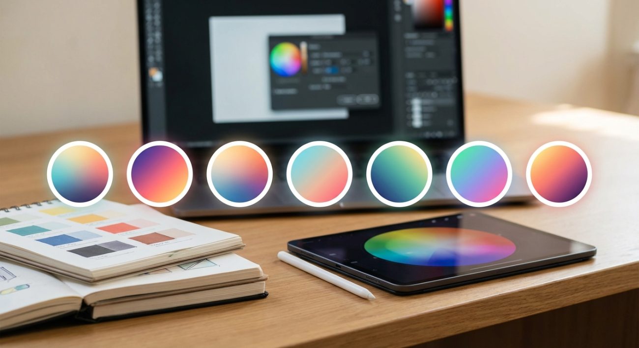
Finding the right colors for a design project can make or break the final result. A harmonious color scheme creates visual appeal, guides user attention, and strengthens brand identity. The wrong palette? It confuses viewers and undermines your message. Thankfully, modern color palette generators take the guesswork out of color theory and help you build stunning schemes in minutes.
Color palette generators are free digital tools that help designers create harmonious color schemes using proven color theory principles. They offer features like AI-powered suggestions, image extraction, accessibility testing, and export options. Whether you need complementary colors, analogous schemes, or brand palettes, these tools streamline the color selection process and ensure professional results every time.
What makes a color palette generator worth using
Not all color tools are created equal. The best ones combine intuitive interfaces with powerful features that actually save you time.
A solid color palette generator should let you adjust hue, saturation, and brightness with precision. You need real-time previews that show how colors interact. Export options matter too. JSON, CSS, SVG, and Adobe formats let you move seamlessly from concept to production.
Accessibility features separate good tools from great ones. WCAG contrast checkers ensure your text remains readable against backgrounds. Color blindness simulators show how your palette appears to users with different types of vision.
Some generators use artificial intelligence to suggest combinations based on mood, industry, or uploaded images. Others focus on specific methodologies like material design or flat UI trends.
How color palette generators actually work
These tools apply color theory principles automatically. You start with a base color, and the generator calculates relationships using mathematical formulas.
Complementary schemes pick colors opposite each other on the color wheel. Analogous palettes select neighbors that blend smoothly. Triadic combinations form triangles, creating vibrant contrast while maintaining balance.
Many generators use the HSL (hue, saturation, lightness) color model instead of RGB. This approach makes it easier to create variations that feel cohesive. Adjusting lightness while keeping hue constant produces tints and shades that belong to the same family.
Advanced tools analyze uploaded images to extract dominant colors. Algorithms identify the most prominent hues and build palettes around them. This feature works brilliantly when you need to match existing brand photography or artwork.
Top features to look for
Different projects demand different capabilities. Here are the features that matter most:
- Real-time color adjustments with live preview
- Multiple color harmony rules (complementary, triadic, tetradic, analogous)
- Accessibility and contrast ratio testing
- Image-based color extraction
- Gradient generation
- Export in multiple formats (HEX, RGB, HSL, CMYK)
- Save and organize favorite palettes
- Color blindness simulation modes
- Integration with design software
The best generators combine several of these features without overwhelming you. Clean interfaces let you focus on creativity rather than navigating complex menus.
Common mistakes when choosing colors
Even with powerful tools, designers make predictable errors. Recognizing these patterns helps you avoid them.
| Mistake | Why it happens | How to fix it |
|---|---|---|
| Too many colors | Excitement about options | Limit palettes to 3-5 main colors |
| Ignoring contrast | Colors look good in isolation | Always test text on backgrounds |
| Skipping accessibility | Assuming everyone sees colors the same way | Use WCAG AA standards minimum |
| Forgetting context | Choosing colors without considering use case | Test on actual designs, not just swatches |
| Copying trends blindly | Following popular palettes without strategy | Adapt trends to fit your brand identity |
Color choices should support your content, not distract from it. A palette that works beautifully for a children’s toy brand might feel completely wrong for a law firm.
Building your first palette step by step
Let me walk you through a practical process that works for most projects.
-
Start with your base color. This might come from a logo, brand guideline, or primary element in your design. Enter the HEX code or use a color picker.
-
Choose a color harmony rule that matches your project goals. Complementary schemes create energy and contrast. Analogous palettes feel calm and unified. Triadic combinations offer vibrancy without the tension of direct complements.
-
Generate your initial palette and examine the results. Most generators show you 3-5 colors based on your chosen rule. Pay attention to how they feel together.
-
Adjust individual colors to fine-tune the scheme. Shift saturation to make colors more muted or vibrant. Modify lightness to create hierarchy. Designers often make accent colors slightly more saturated than primary colors.
-
Test accessibility using built-in contrast checkers. Your text colors should meet WCAG AA standards at minimum (4.5:1 for normal text, 3:1 for large text). AAA standards (7:1 and 4.5:1) provide even better readability.
-
Export your palette in the format your project requires. Save it to your library for future reference and consistency across related projects.
This process typically takes 10-15 minutes. You can refine further as you apply colors to actual design elements.
When to use image-based color extraction
Pulling colors from photographs creates instant harmony because nature and professional photography already contain balanced palettes.
Upload a landscape photo and you might get earth tones perfect for an organic brand. A sunset image yields warm gradients ideal for energy and optimism. Product photography ensures your web design matches physical items exactly.
This approach works especially well for:
- E-commerce sites matching product colors
- Travel brands capturing destination moods
- Food and beverage companies reflecting ingredient tones
- Fashion retailers coordinating with seasonal collections
- Portfolio sites harmonizing with featured work
The extracted palette gives you a starting point. You still need to adjust for accessibility and practical application. A beautiful sky blue from a photo might not have enough contrast for body text.
Understanding color psychology for your audience
Colors trigger emotional responses rooted in culture and biology. Your palette should align with the feelings you want to create.
“Color is a power which directly influences the soul. Color is the keyboard, the eyes are the hammers, the soul is the piano with many strings.” This principle applies whether you’re designing a meditation app or an extreme sports brand. Your palette sets the emotional tone before users read a single word.
Blue conveys trust and stability. Banks and tech companies use it constantly. Red creates urgency and excitement, perfect for sales and calls to action. Green suggests growth, health, and environmental consciousness.
Yellow radiates optimism but can strain eyes in large doses. Purple combines the stability of blue with the energy of red, often associated with luxury or creativity. Orange balances red’s intensity with yellow’s friendliness.
Cultural context matters enormously. White represents purity in Western cultures but mourning in some Eastern traditions. Red means luck and prosperity in China but danger in Western contexts.
Organizing palettes for large projects
Design systems require more than a single palette. You need a structured approach to color that scales.
Start with primary brand colors (usually 1-3 hues). Add secondary colors for variety and hierarchy (2-4 additional hues). Create neutral scales for backgrounds, borders, and text (typically 8-10 shades of gray).
Generate semantic colors for UI states. Success (usually green), warning (yellow or orange), error (red), and info (blue) need to be distinct yet harmonious with your brand palette.
Many generators let you save multiple palettes and organize them into collections. Name them clearly: “Primary Brand,” “UI States,” “Marketing Accent,” “Seasonal Winter 2024.”
Document contrast ratios for each color combination you plan to use. This reference prevents accessibility issues as your team applies colors across different contexts.
Testing your palette in real conditions
Colors behave differently depending on screen settings, lighting, and surrounding elements. Always test before committing.
View your palette on multiple devices. That perfect blue on your calibrated monitor might look purple on a cheap laptop screen. Check both light and dark modes if your design supports them.
Print a color swatch if your project includes physical materials. RGB colors don’t translate directly to CMYK. What looks vibrant on screen can appear dull on paper.
Apply your palette to actual design mockups rather than just viewing swatches. Colors interact with each other. A gray that looks neutral in isolation might read warm or cool depending on nearby hues.
Get feedback from people outside your design bubble. Fresh eyes catch issues you’ve become blind to after staring at color combinations for hours.
Advanced techniques for color refinement
Once you master basic palette generation, these techniques add sophistication.
Create tonal scales for each primary color. Instead of using pure hues everywhere, generate 5-7 shades from light to dark. This gives you flexibility for hover states, backgrounds, and emphasis without introducing new colors.
Use the 60-30-10 rule as a starting framework. Your dominant color covers 60% of the design. Secondary color takes 30%. Accent color pops at 10%. This proportion creates visual hierarchy naturally.
Experiment with temperature shifts. Warm colors (reds, oranges, yellows) advance visually and grab attention. Cool colors (blues, greens, purples) recede and create calm. Mixing temperatures strategically guides the viewer’s eye.
Consider color gradients for depth and dimension. Many modern generators create smooth transitions between palette colors. Subtle gradients add polish to backgrounds, buttons, and illustrations.
Adapting palettes across different media
Your color scheme needs to work everywhere your brand appears. Each medium has unique requirements.
Web design demands RGB colors optimized for screens. Focus on accessibility and how colors render across browsers. Consider dark mode alternatives that maintain brand recognition.
Print materials require CMYK conversion. Work with your generator’s CMYK export or use a professional tool to convert. Always request printed proofs before large runs.
Social media graphics need colors that stand out in crowded feeds. Slightly higher saturation often performs better. Test how thumbnails appear at small sizes.
Presentation slides require high contrast for visibility in bright rooms. Colors that look subtle on your laptop might disappear when projected.
Video and motion graphics benefit from palettes with clear hierarchy. Animated elements need distinct colors to track easily as they move.
Keeping your color choices future-proof
Design trends change, but good color systems adapt without complete overhauls.
Build flexibility into your palette from the start. Instead of locking into ultra-specific shades, create ranges that allow variation. This approach lets you refresh the look without abandoning brand recognition.
Document the reasoning behind your color choices. Future designers (or future you) need to understand why certain combinations work. Note accessibility requirements, cultural considerations, and intended emotional impacts.
Review your palette annually. Color trends shift. What felt modern two years ago might look dated now. Small adjustments keep designs fresh without requiring total redesigns.
Archive old palettes when you update. You might need to recreate historical materials or reference previous campaigns. Version control for color systems prevents confusion.
Making color decisions with confidence
Choosing colors doesn’t have to feel overwhelming. The right color palette generator gives you a foundation based on proven principles. You bring the creative vision and understanding of your audience.
Start with these tools to build palettes faster and smarter. Test thoroughly. Gather feedback. Refine based on real-world application. Your color choices shape how people experience and remember your work. Make them count.