Your logo is the face of your business. It appears on your website, business cards, social media profiles, and everywhere customers see your brand. A poorly designed logo can make even the best business look amateur, while a strong one builds instant credibility.
Most small business owners make the same preventable errors when creating their first logo. These mistakes cost money, confuse customers, and damage professional reputation. The good news? You can avoid them with a few simple guidelines.
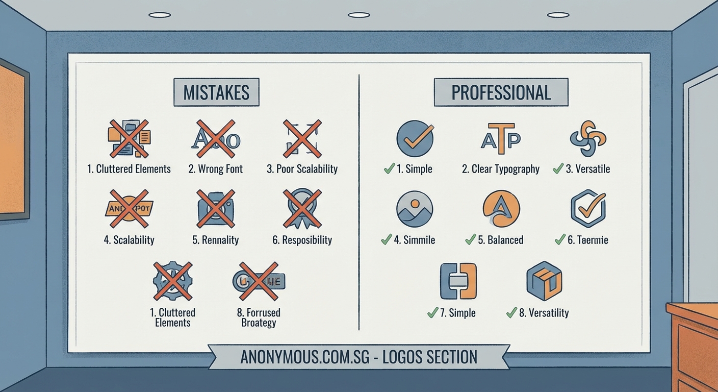
Amateur logo design mistakes can seriously damage your brand’s credibility. The seven most common errors include using too many fonts, choosing trendy effects over timeless design, ignoring scalability, relying on clip art, picking poor color combinations, overcrowding with details, and skipping competitor research. Avoiding these pitfalls creates a professional identity that builds customer trust and stands the test of time.
Using Too Many Fonts at Once
One of the fastest ways to make your logo look unprofessional is cramming multiple typefaces into a single design.
Your brain processes fonts as visual information. When you see three or four different typefaces competing for attention, it creates confusion. The message becomes unclear. Customers can’t tell what to focus on.
Professional designers stick to one or two fonts maximum. Usually one does the job perfectly.
Think about iconic brands like Nike, Apple, or Coca-Cola. Each uses a single, distinctive typeface. That simplicity makes them instantly recognizable.
Here’s what happens when you use too many fonts:
- Your logo looks cluttered and busy
- The brand message gets lost
- It becomes harder to read at small sizes
- You appear indecisive about your identity
- Printing costs increase with font licensing
Choose one strong typeface that matches your brand personality. If you need contrast, use different weights of the same font family (regular, bold, light). This creates visual hierarchy without chaos.
A tech startup might choose a clean sans-serif font. A bakery could use a warm, handwritten style. A law firm needs something traditional and trustworthy.
The font you pick should work at every size, from a tiny favicon to a billboard.
Chasing Trends Instead of Timeless Design
Design trends come and go faster than fashion seasons.
Remember when every logo had a glossy, 3D gradient effect? Or when everything needed to look “Web 2.0” with reflections and shine? Those logos now look dated and cheap.
Trendy effects might feel modern today, but they age poorly. Your logo needs to last five, ten, or twenty years without looking embarrassing.
| Design Element | Trendy Approach | Timeless Approach |
|---|---|---|
| Colors | Neon gradients, ultra-bright hues | Classic palette, 2-3 balanced colors |
| Effects | Drop shadows, bevels, glows | Flat or subtle depth only |
| Shapes | Whatever’s popular this year | Geometric basics, clean lines |
| Typography | Display fonts from current trends | Classic typefaces with proven staying power |
Think about brands that have lasted decades. Their logos either remain unchanged or evolve slowly. They didn’t chase what was hot in 2010 or 2015.
Your business deserves better than a logo that screams “designed in 2024.”
Focus on clean lines, balanced proportions, and classic design principles. These never go out of style.
If you want your brand to feel current, update your marketing materials and website design instead. Keep the logo solid and unchanging.
A great logo is like a good pair of jeans. It should fit perfectly, work in any situation, and never make you cringe when you look back at old photos.
Ignoring How Your Logo Scales
Your logo will appear at dozens of different sizes. It needs to work at all of them.
Many business owners design their logo at one size on their computer screen. They never test how it looks as a tiny social media profile picture or a massive banner.
This creates serious problems.
A logo packed with fine details might look impressive at 2000 pixels wide. Shrink it down to 200 pixels, and those details turn into an unreadable blob.
Test your logo at these sizes:
- Favicon size (16×16 pixels or 32×32 pixels)
- Social media profile (around 200×200 pixels)
- Business card (roughly 2 inches wide)
- Website header (variable, but often 300-500 pixels wide)
- Large format print (several feet wide)
If your logo becomes unrecognizable at small sizes, it fails the scalability test.
Simple shapes and clear forms scale better than complex illustrations. Bold lines work better than thin, delicate strokes. Solid colors perform better than intricate gradients.
Many successful brands create simplified versions of their logo for small applications. But ideally, your main logo should work everywhere without modification.
Consider how your logo looks in black and white too. You won’t always have color printing available. A logo that depends entirely on color for recognition has a fundamental weakness.
Relying on Generic Clip Art
Nothing screams “amateur hour” louder than stock clip art in a logo.
You’ve seen these logos everywhere. The generic lightbulb for “innovation.” The handshake for “partnership.” The globe for “international.” The swoosh for “movement.”
These symbols come pre-installed in design software or cost a few dollars on stock image sites. They’re convenient, cheap, and completely forgettable.
Here’s why clip art ruins your logo:
- Thousands of other businesses use the same images
- It shows you didn’t invest in original design
- Customers recognize it as generic instantly
- You might face legal issues with licensing
- It provides zero differentiation from competitors
Your logo should be unique to your business. It should tell your specific story, not a generic placeholder story.
If you can’t afford a professional designer yet, use typography-based logos instead. A well-chosen font with your business name creates more authenticity than borrowed clip art.
Look at successful brands in any industry. None of them use stock graphics. They invested in custom marks that belong only to them.
Custom doesn’t always mean complex. Some of the best logos are simple geometric shapes arranged in unique ways. But they’re original arrangements, not downloaded templates.
Choosing Color Combinations That Clash
Color psychology matters in branding, but basic color theory matters more.
Some color combinations hurt to look at. They vibrate on screen, make text unreadable, or create visual confusion. These choices tank your professional credibility immediately.
Common color mistakes include:
- Using colors that are too similar (low contrast, hard to distinguish)
- Picking colors that fight each other (certain reds and greens, some blues and oranges)
- Selecting too many colors (more than three gets messy)
- Ignoring how colors look on different backgrounds
- Forgetting about colorblind accessibility
Your logo needs to work on white backgrounds, dark backgrounds, and sometimes colored backgrounds. Test it everywhere.
A safe approach uses two or three colors maximum. One dominant color, one accent color, and possibly one neutral (black, white, or gray).
Make sure your colors have enough contrast for readability. Light yellow text on a white background might look “soft” but it’s completely useless.
Consider your industry too. Certain color associations run deep. Healthcare brands often use blue (trust, calm). Environmental companies lean toward green. Food brands favor warm colors that stimulate appetite.
You don’t have to follow these conventions religiously, but fighting against strong cultural associations makes your marketing harder.
Test your logo in grayscale. If it still looks good without color, you’ve built a strong foundation.
Overcrowding Your Logo with Details
More is not better in logo design.
New business owners often want their logo to communicate everything about their business at once. They add symbols, taglines, decorative elements, borders, multiple images, and complex illustrations.
The result looks like a ransom note made from magazine cutouts.
Professional logos embrace negative space. They give elements room to breathe. They trust that less communicates more.
Think about what you actually need:
- Your business name (or initials)
- Possibly one simple symbol or mark
- That’s usually it
Everything else is optional and often counterproductive.
A cluttered logo has practical problems too. It’s harder to reproduce accurately. It costs more to embroider on shirts. It looks terrible at small sizes. It distracts from your actual message.
Some of the world’s most valuable brands have incredibly simple logos. Apple’s apple. Nike’s swoosh. McDonald’s golden arches. Target’s target.
None of these try to tell the complete brand story in the logo itself. They’re memorable precisely because they’re simple.
Your marketing materials, website, and customer experience tell your full story. Your logo just needs to mark your territory clearly and look professional doing it.
If you’re adding an element, ask yourself: does this make the logo more recognizable or just more busy? If it’s the latter, delete it.
Skipping Research on Competitor Logos
You’re not designing in a vacuum.
Your logo exists in a specific market alongside competitor brands. If you ignore what others in your industry are doing, you risk two problems.
First, you might accidentally create something too similar to an existing brand. This confuses customers and could lead to legal trouble.
Second, you might fail to differentiate yourself. If every competitor uses blue and you also choose blue, you blend into the background instead of standing out.
Before finalizing your logo design, study your competition:
- Screenshot or collect logos from your top 10 competitors
- Note patterns (common colors, shapes, styles)
- Identify gaps (what’s nobody doing?)
- Choose a direction that sets you apart while staying appropriate for your industry
This doesn’t mean being different for the sake of being different. A funeral home probably shouldn’t use bright pink just because competitors use subdued colors. Context matters.
But within appropriate boundaries, differentiation helps customers remember you.
If everyone in your space uses serif fonts, maybe a clean sans-serif gives you an edge. If everyone uses abstract symbols, perhaps a typographic logo stands out.
Research also prevents embarrassing discoveries. You don’t want to launch your new logo only to learn it looks nearly identical to a major competitor’s brand. That mistake costs time, money, and credibility.
Take an hour to study your competitive landscape. That small investment prevents major headaches later.
Making Your Logo Work for Your Business
The difference between an amateur logo and a professional one often comes down to these seven mistakes.
You don’t need a massive budget or a famous designer to get this right. You just need to avoid common pitfalls that sink so many small business logos.
Stick to one or two fonts. Choose timeless design over trendy effects. Test your logo at multiple sizes. Skip the clip art and create something original. Pick colors that work together and serve your message. Embrace simplicity instead of cramming in details. Research your competitors before you commit.
Follow these guidelines and your logo will build credibility instead of undermining it. Your brand will look professional from day one, giving customers confidence that you deliver quality in your actual work too.
Start by evaluating your current logo against this list. If you spot problems, fixing them now saves you from years of looking unprofessional. Your brand deserves better than easily avoidable mistakes.