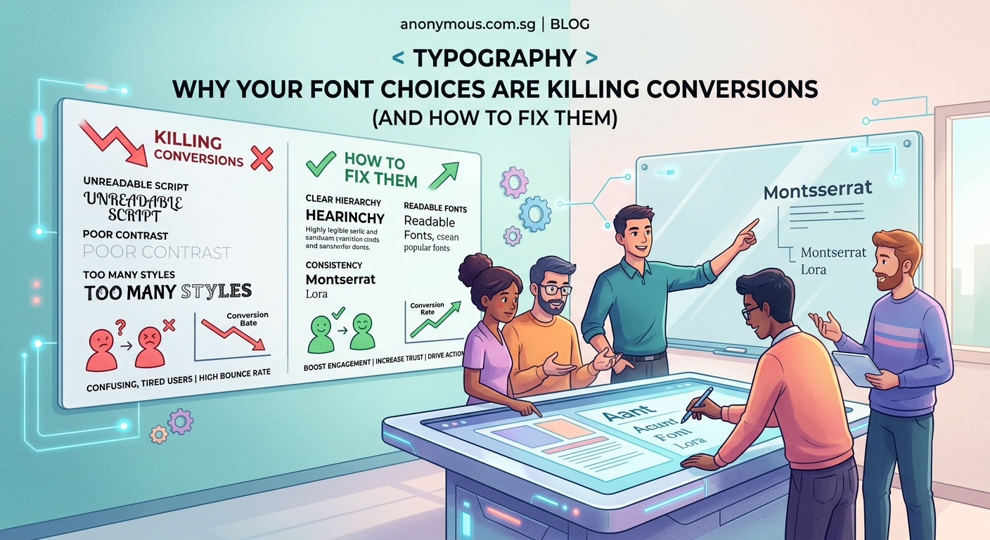
You’ve spent hours perfecting your website. The colors match your brand. The images look professional. But visitors still aren’t converting into customers. The problem isn’t your product or your traffic. It’s hiding in plain sight within your design choices.
Most websites fail to convert because of fixable design mistakes that create friction, confusion, or distrust. From illegible typography and cluttered layouts to weak calls to action and poor mobile experiences, these issues silently push customers away. This guide identifies the most common conversion killers and provides actionable fixes you can implement today to turn more visitors into paying customers.
Why good looking websites still fail to convert
A beautiful website doesn’t guarantee sales. Design exists to guide visitors toward a specific action, whether that’s making a purchase, booking a call, or signing up for your list. When design elements compete for attention or create obstacles, conversions drop.
Most business owners focus on aesthetics while ignoring usability. They choose fonts because they look stylish, not because they’re readable. They add elements because they fill empty space, not because they serve a purpose.
The result? Visitors leave confused, frustrated, or unconvinced.
The most common design mistakes that kill conversions
Let’s break down the specific problems that cost you customers and how to fix each one.
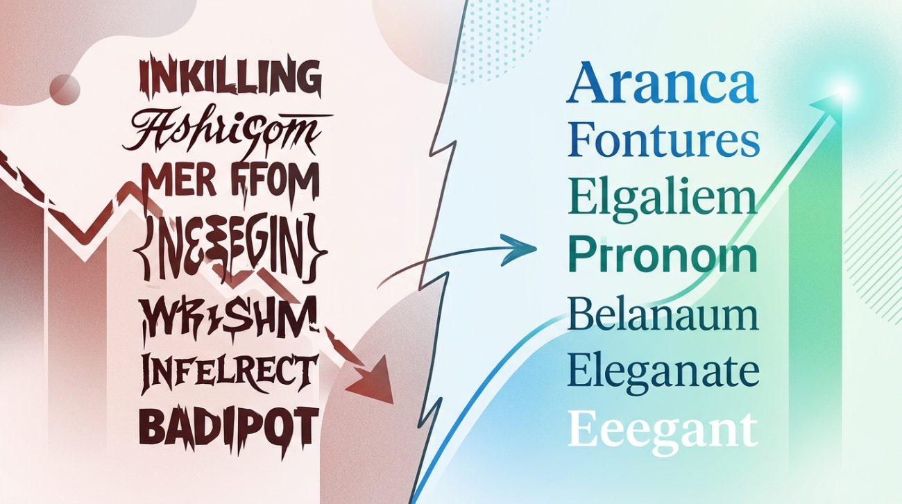
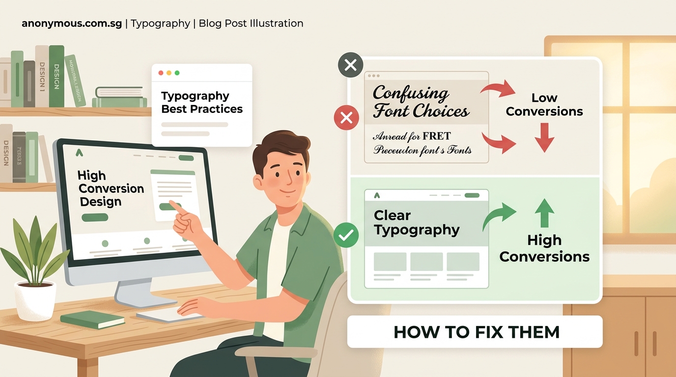
Typography that nobody can read
Your font choices directly impact whether people can consume your content. Fancy script fonts might look elegant in your header, but if visitors struggle to read your product descriptions, they won’t buy.
Here’s what goes wrong:
- Font sizes below 16px on body text force people to squint
- Low contrast between text and background strains eyes
- Decorative fonts used for paragraphs slow reading speed
- Too many different typefaces create visual chaos
The fix is straightforward. Use a minimum of 16px for body text and 18px for mobile. Stick to two font families maximum: one for headings and one for body copy. Test your contrast ratio using free tools to ensure text is legible for people with vision impairments.
If you need guidance on selecting appropriate typefaces, learning how to choose the perfect font for your brand identity will save you from costly mistakes.
Navigation that confuses instead of guides
Complex navigation systems make visitors work too hard to find what they need. Every extra click is an opportunity for them to leave.
Common navigation problems include:
- Mega menus with dozens of options
- Vague labels like “Solutions” or “Services” without context
- Hidden hamburger menus on desktop that bury important pages
- Inconsistent menu structures across different pages
Simplify your navigation to five to seven main items. Use clear, descriptive labels that tell people exactly what they’ll find. “Web Design Services” beats “What We Do” every time.
Place your most important pages in the main navigation. Everything else can live in the footer or be accessed through internal links.
Calls to action that blend into the background
Your call to action button is the gateway to conversions. If it doesn’t stand out, people won’t click it.
Weak calls to action share these traits:
- Generic text like “Submit” or “Click Here”
- Colors that match the surrounding design instead of contrasting
- Small button sizes that are hard to tap on mobile
- Multiple competing calls to action on the same page
Make your primary call to action impossible to miss. Use a contrasting color that appears nowhere else on the page. Write specific, action oriented text that tells people exactly what happens next: “Get Your Free Quote” or “Start Your 14 Day Trial.”
Limit yourself to one primary call to action per page. Secondary actions can exist, but they should be visually subordinate.
Mobile experiences that frustrate users
More than half of web traffic comes from mobile devices. If your site doesn’t work perfectly on phones, you’re losing conversions.
Mobile design mistakes include:
- Buttons too small to tap accurately
- Forms that require excessive typing
- Images that don’t scale properly
- Pop ups that can’t be closed on small screens
Test your site on actual mobile devices, not just by resizing your browser. Ensure buttons are at least 44×44 pixels for easy tapping. Minimize form fields and use mobile friendly input types like phone number keyboards.
Remove or delay pop ups on mobile. They’re annoying on desktop but infuriating on phones where they often cover the entire screen.
Color schemes that undermine trust
Colors trigger psychological responses. The wrong palette can make your business look unprofessional or untrustworthy.
Color problems that hurt conversions:
- Too many colors creating visual noise
- Color combinations that clash or vibrate
- Insufficient contrast making content hard to see
- Colors that don’t match your industry expectations
Stick to a focused palette of three to five colors: one dominant color, one or two accent colors, and neutral backgrounds. Healthcare sites need different colors than entertainment brands.
Understanding how to choose brand colors that actually convert customers helps you make strategic choices instead of guessing.
Slow loading speeds that cost you visitors
People abandon sites that take more than three seconds to load. Every additional second of delay reduces conversions.
Speed killers include:
- Unoptimized images at full resolution
- Too many custom fonts loading simultaneously
- Excessive animations and video backgrounds
- Poorly coded plugins and scripts
Compress all images before uploading them. Use modern formats like WebP that load faster than JPEGs. Limit yourself to two font families and only load the weights you actually use.
Remove any design element that doesn’t directly contribute to conversions. That animated background might look cool, but if it slows your site, it’s costing you money.
Forms that ask for too much information
Long forms create friction. Every field you add reduces completion rates.
Form mistakes that kill conversions:
- Asking for information you don’t immediately need
- Required fields that aren’t actually necessary
- Confusing labels or missing placeholder text
- Error messages that don’t explain how to fix problems
Only ask for information you need right now. You can collect more details later. Use inline validation to show errors immediately instead of after submission. Make optional fields clearly marked.
For contact forms, name, email, and message should be enough. You don’t need their phone number, company size, and budget range just to start a conversation.
Stock photos that scream fake
Generic stock photography makes your business forgettable. Visitors can sense inauthenticity.
Stock photo problems:
- Overly polished images with fake looking models
- Photos that don’t match your actual business
- The same images appearing on competitor sites
- Disconnected visuals that don’t support your message
Use real photos of your team, products, and customers whenever possible. If you must use stock photos, choose realistic ones that could believably be from your business.
Show your product in action. Demonstrate results. Feature real customer testimonials with actual photos instead of stock headshots.
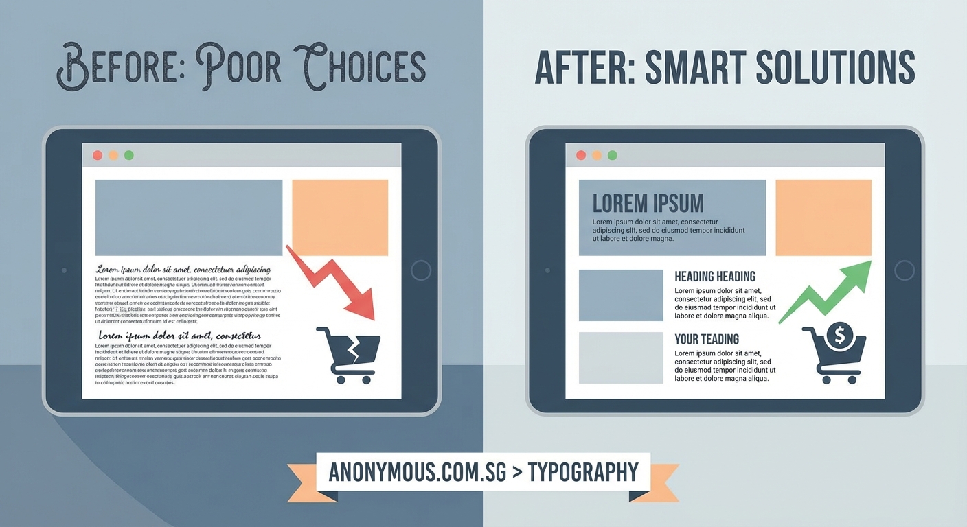
Cluttered layouts that overwhelm visitors
Trying to show everything at once results in showing nothing effectively. Cluttered designs make people feel overwhelmed and uncertain about what to do next.
Layout problems include:
- Too much text without visual breaks
- Competing elements fighting for attention
- Lack of white space making pages feel cramped
- No clear visual hierarchy guiding the eye
Embrace white space. It’s not wasted space; it’s breathing room that helps important elements stand out. Break long paragraphs into shorter chunks. Use headings, bullet points, and images to create visual variety.
Follow the principle of progressive disclosure. Show the most important information first, then let people access details if they want them.
Missing social proof that builds trust
People look for signals that others have successfully used your product or service. Without social proof, you’re asking them to take a risk.
Social proof gaps:
- No customer testimonials or reviews
- Missing trust badges or security certifications
- Lack of case studies or success stories
- No visible customer count or social media following
Add testimonials throughout your site, not just on a dedicated testimonials page. Include specific results and real names with photos. Display relevant trust badges near forms and checkout buttons.
Show how many customers you’ve served or products you’ve sold. Numbers create credibility.
How to audit your site for conversion killing mistakes
Follow this process to identify problems on your own site:
- Load your homepage on your phone and try to complete your main conversion goal without any prior knowledge of your site
- Ask three people outside your business to use your site while you watch and take notes on where they hesitate or get confused
- Use heatmap tools to see where people actually click versus where you want them to click
- Check your analytics for pages with high bounce rates or low time on page
- Review form abandonment rates to identify friction points in your conversion process
Document every issue you find. Prioritize fixes based on potential impact and implementation difficulty.
A comparison of design elements that help versus hurt conversions
| Element | Conversion Killer | Conversion Booster |
|---|---|---|
| Typography | Decorative fonts, small sizes, low contrast | Readable fonts, 16px minimum, high contrast |
| Navigation | Complex menus, vague labels, hidden options | Simple structure, clear labels, visible access |
| CTA Buttons | Generic text, blending colors, small size | Specific text, contrasting colors, prominent size |
| Forms | Many fields, unclear labels, confusing errors | Minimal fields, clear labels, helpful validation |
| Images | Generic stock photos, slow loading, irrelevant | Real photos, optimized files, contextual |
| Layout | Cluttered, no hierarchy, competing elements | Spacious, clear hierarchy, focused attention |
| Mobile | Tiny buttons, excessive typing, broken layouts | Touch friendly, minimal input, responsive design |
| Speed | Unoptimized images, many fonts, heavy scripts | Compressed files, limited fonts, clean code |
Typography mistakes deserve special attention
Since font choices impact every piece of text on your site, typography problems multiply across pages. Avoiding 7 typography mistakes that make your designs look unprofessional ensures your message gets read instead of ignored.
Common typography issues that specifically hurt conversions:
- Line lengths over 75 characters making text hard to follow
- Insufficient line height causing lines to feel cramped
- All caps text that slows reading speed
- Center aligned paragraphs that break reading flow
Set line height to 1.5 times your font size for comfortable reading. Keep line lengths between 50 and 75 characters. Use all caps sparingly for short headings only. Left align body text always.
Creating a design system that prevents mistakes
Instead of fixing problems reactively, build a system that prevents them. A documented design system ensures consistency and maintains conversion optimized choices across your site.
Your design system doesn’t need to be complex. Start with documented rules for typography, colors, spacing, and button styles. This foundation prevents most common mistakes and makes updates faster.
Building a brand style guide that actually gets used creates a reference that keeps your design decisions consistent as your site grows.
Include these elements in your system:
- Font families, sizes, and weights for different contexts
- Color palette with specific hex codes and usage rules
- Spacing scale for consistent margins and padding
- Button styles for primary, secondary, and tertiary actions
- Image guidelines for dimensions and file formats
Reference your design system before adding new pages or features. This prevents introducing inconsistencies that confuse visitors.
Testing changes to measure impact
Don’t guess which fixes will improve conversions. Test them systematically to know what actually works.
Set up simple A/B tests for major changes:
- Test new button colors or text against current versions
- Compare simplified navigation against existing structure
- Try different form lengths to find the optimal balance
- Experiment with testimonial placement and format
Run tests long enough to gather meaningful data. A few dozen conversions isn’t enough to draw conclusions. Wait for statistical significance before declaring a winner.
Track these metrics for each test:
- Conversion rate for your primary goal
- Bounce rate to measure engagement
- Time on page to assess content consumption
- Click through rates on calls to action
Small improvements compound. A 10% increase in conversion rate might not sound dramatic, but it means 10% more customers from the same traffic.
Design choices that build trust and credibility
Beyond avoiding mistakes, certain design choices actively increase conversions by building trust.
Trust building design elements:
- Professional photography that shows real people and products
- Clean, uncluttered layouts that feel organized
- Consistent branding across all pages and materials
- Transparent pricing without hidden costs
- Clear contact information and physical address
- Security badges and trust seals near sensitive actions
People buy from businesses they trust. Your design either reinforces or undermines that trust with every element.
Applying 7 psychology backed design principles helps you make choices that resonate with how people actually make decisions.
Fixing mistakes without starting over
You don’t need to rebuild your entire site to improve conversions. Focus on high impact changes first.
Priority fixes that deliver results:
- Increase body text size to 16px or larger
- Simplify your main navigation to seven items or fewer
- Make your primary call to action button larger and more contrastive
- Remove unnecessary form fields
- Optimize your five slowest loading pages
- Add three customer testimonials to your homepage
Implement one change at a time so you can measure its impact. Changing everything simultaneously makes it impossible to know what actually helped.
Track your conversion rate before and after each fix. This data guides future decisions and justifies design investments to stakeholders.
When design mistakes reflect deeper brand problems
Sometimes what looks like a design mistake actually reveals unclear brand positioning or messaging. If you can’t create a focused design, you might not have a focused brand.
Design problems that signal brand issues:
- Inability to choose a primary call to action because everything feels equally important
- Difficulty selecting colors because you’re trying to appeal to everyone
- Cluttered layouts because you can’t prioritize messages
- Generic stock photos because you haven’t defined your actual audience
Fix the brand foundation first. Clear positioning makes design decisions obvious. Understanding what makes a brand memorable helps you build a stronger foundation.
Your design should work for you, not against you
Every design choice either moves visitors toward conversion or pushes them away. There’s no neutral ground. That decorative font, that extra form field, that subtle call to action button is actively costing you customers.
The good news? Most conversion killing mistakes are fixable without a complete redesign. Start with the issues that create the most friction for your visitors. Test your changes. Measure results. Then move on to the next improvement.
Your website works for you 24 hours a day. Make sure it’s actually working, not just looking pretty. Fix these design mistakes and watch your conversion rate climb.