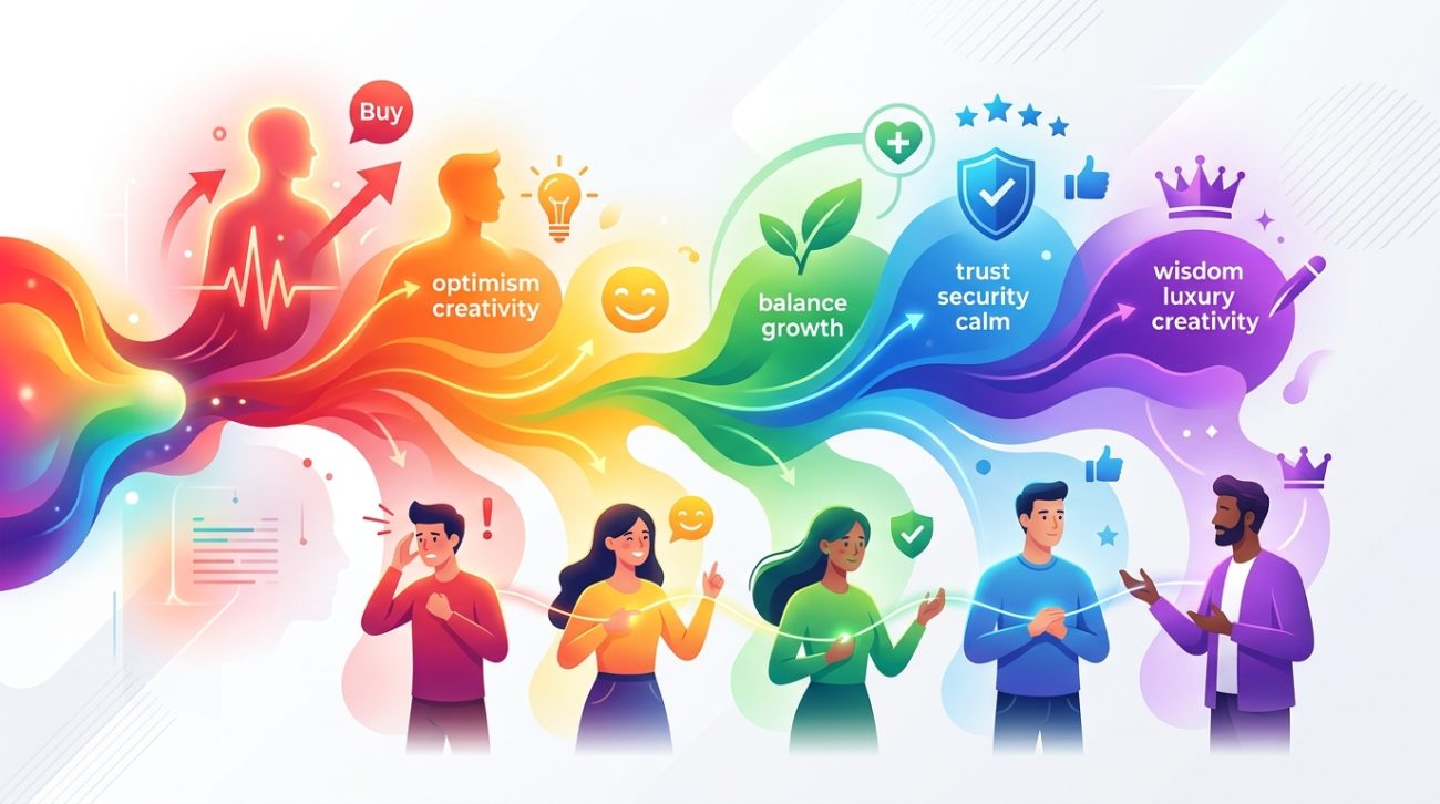
Color shapes how people feel, think, and act. It influences whether someone clicks a button, trusts a brand, or walks past a store window. Understanding color psychology gives you a powerful tool to connect with your audience on an emotional level.
Color psychology studies how different hues affect human emotions, decisions, and behaviors. By understanding these associations, designers and marketers can strategically select colors that resonate with their target audience, improve brand recognition, strengthen emotional connections, and drive desired actions like purchases or sign-ups. Cultural context and industry norms also play critical roles in color effectiveness.
Why color matters more than you think
Most people make snap judgments about products within 90 seconds of initial viewing. Between 62% and 90% of that assessment is based on color alone.
Your brain processes color before it registers shapes or words. That’s why a red stop sign works universally. The color hits your visual cortex first, triggering an immediate response before you even read the text.
For brands, this means color becomes a silent salesperson. It communicates values, builds recognition, and creates emotional bonds without saying a word. Think about how you instantly recognize a certain coffee chain by its green logo or a soft drink by its red can.
When you apply color psychology intentionally, you’re not manipulating people. You’re speaking their emotional language. You’re making it easier for them to understand what you offer and how it makes them feel.
How color psychology actually works
Color perception starts in the eye but finishes in the brain. Light waves hit your retina, triggering signals that travel to your visual cortex. But the interpretation happens in areas linked to memory, emotion, and decision making.
This is why colors carry meaning. Your brain associates blue with the sky and ocean, creating feelings of calm and trust. Red connects to blood, fire, and ripe fruit, evoking energy, danger, or appetite.
These associations aren’t random. Some are biological. Others are cultural. A few are personal, based on individual experiences.
The biological component is universal. Warm colors like red and orange increase heart rate and create arousal. Cool colors like blue and green have a calming effect and can lower blood pressure.
Cultural meanings vary widely. White represents purity in Western cultures but mourning in some Eastern traditions. Red signals luck and prosperity in China but danger in many Western contexts.
Personal experiences add another layer. If someone had a traumatic experience in a yellow room, that color might trigger anxiety regardless of its general associations.
Breaking down the emotional impact of each color
Let’s look at what each major color communicates and how you can use it strategically.
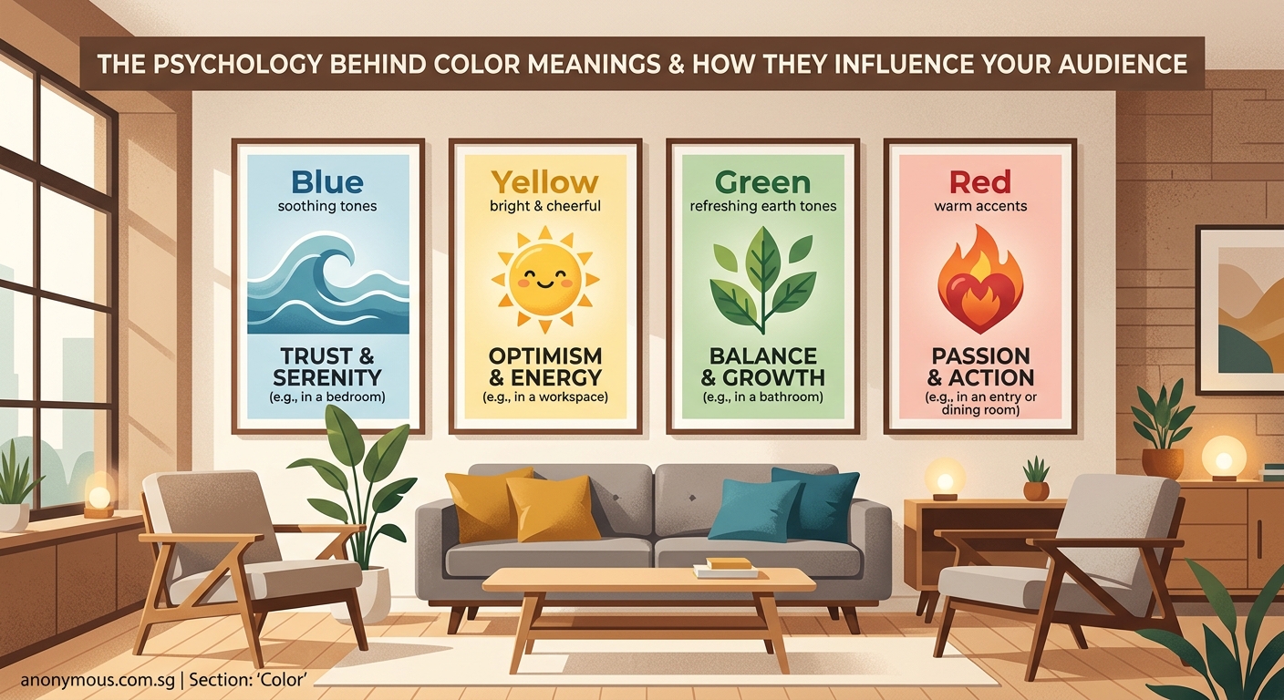
Red for urgency and excitement
Red grabs attention faster than any other color. It signals importance, passion, and action.
Use red when you want to:
– Create a sense of urgency (sale signs, countdown timers)
– Stimulate appetite (restaurants, food packaging)
– Convey boldness or confidence (sports brands, energy drinks)
– Encourage immediate action (call-to-action buttons)
Red increases heart rate and creates physiological arousal. That’s why clearance signs use it. It makes people feel like they need to act now.
But too much red can overwhelm or even trigger aggression. Balance it with neutral tones or use it sparingly as an accent.
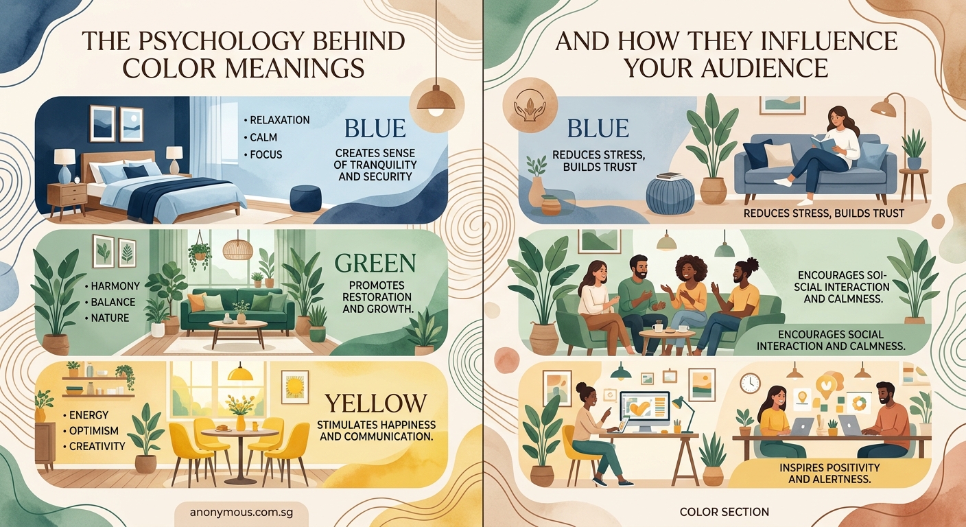
Blue for trust and professionalism
Blue is the world’s favorite color, preferred by roughly 40% of people globally. It communicates reliability, calm, and competence.
Banks, tech companies, and healthcare organizations love blue because it builds trust. When someone needs to feel secure about their money or health, blue reassures them.
Different shades create different effects:
– Navy conveys authority and tradition
– Sky blue feels friendly and approachable
– Teal adds creativity to trustworthiness
Blue can also suppress appetite, which is why you rarely see it in food branding. Use it when credibility matters more than excitement.
Green for growth and wellness
Green connects to nature, health, and renewal. It’s the color of fresh starts and environmental consciousness.
Perfect for:
– Wellness and organic brands
– Financial services (growth, prosperity)
– Environmental initiatives
– Stress reduction and relaxation
Green sits in the middle of the visible spectrum, making it easy on the eyes. It doesn’t demand attention like red but doesn’t recede like blue. This balance makes it versatile across industries.
Darker greens suggest wealth and prestige. Bright greens feel youthful and energetic. Olive or sage tones add sophistication.
Yellow for optimism and attention
Yellow is the most visible color in daylight. It radiates warmth, happiness, and energy.
Use yellow to:
– Attract attention without aggression
– Create feelings of joy and positivity
– Stimulate mental activity and creativity
– Add warmth to a color scheme
But yellow is tricky. Too much can cause eye strain or anxiety. Babies cry more in yellow rooms. Adults report feeling more irritable.
Use yellow as an accent or highlight. Pair it with darker colors to prevent visual fatigue. Golden yellows feel more premium than bright lemon tones.
Orange for friendliness and enthusiasm
Orange combines red’s energy with yellow’s happiness. It feels approachable, playful, and confident without being aggressive.
Great for:
– Call-to-action buttons (high conversion rates)
– Youth-oriented brands
– Creative and entertainment industries
– Adding warmth to tech products
Orange creates a sense of value. It’s why many discount retailers use it. The color suggests good deals without the desperation of red clearance signs.
Burnt orange adds sophistication. Bright orange feels energetic and fun. Peach tones become soft and welcoming.
Purple for luxury and creativity
Purple historically represented royalty because the dye was expensive to produce. That association with luxury and exclusivity persists today.
Use purple when you want to convey:
– Premium quality or luxury
– Creativity and imagination
– Wisdom and spirituality
– Uniqueness or innovation
Lighter purples like lavender feel calming and romantic. Deep purples suggest mystery and sophistication. Bright purples lean playful and creative.
Purple works well for beauty brands, creative services, and products targeting female audiences (though gender associations are changing).
Black, white, and gray for sophistication
Neutral colors provide balance and let other elements shine. But they carry their own psychological weight.
Black suggests power, elegance, and mystery. It’s the color of luxury brands, formal events, and premium products. Too much black can feel heavy or oppressive. Use it to add drama and sophistication.
White represents purity, simplicity, and cleanliness. It creates space and clarity in designs. White backgrounds make other colors pop. In branding, white suggests minimalism and modernity.
Gray offers neutrality and professionalism. It’s sophisticated without being as stark as black. Light grays feel soft and approachable. Dark grays add weight and seriousness.
Applying color psychology to your brand decisions
Choosing colors for your brand isn’t about personal preference. It’s about strategic communication. Here’s how to approach it systematically.
Step 1: Define your brand personality
Before picking colors, clarify what your brand stands for. Write down five adjectives that describe your brand personality.
Are you:
– Trustworthy and professional?
– Energetic and youthful?
– Luxurious and exclusive?
– Friendly and approachable?
– Innovative and bold?
Your color choices should reflect these traits. A law firm needs different colors than a children’s toy company.
Step 2: Research your audience
Different demographics respond to colors differently. Age, gender, culture, and personal preferences all matter.
Younger audiences often prefer bright, saturated colors. Older demographics lean toward muted, sophisticated tones. Understanding your target market helps you choose colors that resonate.
Cultural context is critical if you’re marketing internationally. Research color meanings in your target regions. What works in North America might fail in Asia or Europe.
Step 3: Analyze your competition
Look at what colors dominate your industry. There’s usually a reason.
Blue dominates finance and tech because trust matters in those sectors. Green fills the organic and wellness space. Red appears frequently in food and retail.
You can either align with industry norms or deliberately stand out. Both strategies work, but they communicate different things.
Aligning says “we belong here, we’re credible.” Contrasting says “we’re different, we’re innovative.” Choose based on your positioning strategy.
Step 4: Test and measure
Color preferences are subjective, but responses are measurable. Test different color schemes with your actual audience.
A/B test button colors, email headers, and landing page designs. Track metrics like click-through rates, conversion rates, and time on page.
Sometimes surprising colors win. Orange often outperforms red for call-to-action buttons. Unconventional choices can stand out and drive action.
Step 5: Document your decisions
Once you’ve chosen your brand colors, document them in a brand style guide. Include hex codes, RGB values, and usage guidelines.
Consistency builds recognition. When people see your colors repeatedly, they start associating them with your brand automatically.
Common color psychology mistakes to avoid
Even experienced designers make these errors. Watch out for them in your own work.
| Mistake | Why It Fails | Better Approach |
|---|---|---|
| Using too many colors | Creates visual chaos and dilutes brand identity | Stick to 2-3 primary colors plus neutrals |
| Ignoring accessibility | Excludes colorblind users and reduces readability | Check contrast ratios and use color plus text |
| Following trends blindly | Dates your brand and lacks strategic thinking | Choose timeless colors that fit your strategy |
| Copying competitors exactly | Makes you forgettable and indistinguishable | Find differentiation while respecting norms |
| Neglecting cultural context | Offends or confuses international audiences | Research color meanings in target markets |
| Choosing based on personal taste | Misaligns with audience preferences and needs | Base decisions on audience research and testing |
Color combinations that work together
Single colors communicate meaning, but combinations create complexity and visual interest. Here’s how to build effective color palettes.
Complementary colors sit opposite each other on the color wheel (red and green, blue and orange). They create high contrast and energy. Use them when you want vibrancy and attention.
Analogous colors sit next to each other (blue, blue-green, green). They create harmony and flow. Use them for cohesive, calming designs.
Triadic colors form a triangle on the color wheel (red, yellow, blue). They offer variety while maintaining balance. Use them for playful, dynamic brands.
Monochromatic schemes use different shades and tints of one color. They feel sophisticated and unified. Use them for elegant, minimalist brands.
The 60-30-10 rule helps balance any palette:
– 60% dominant color (usually neutral)
– 30% secondary color (your main brand color)
– 10% accent color (for calls to action and highlights)
This creates visual hierarchy and prevents overwhelm.
Industry-specific color strategies
Different industries have color conventions for good reasons. Understanding these patterns helps you make informed decisions.
Finance and banking lean heavily on blue (trust, stability) and green (growth, prosperity). Adding gray or navy reinforces professionalism. Avoid overly bright or playful colors that might undermine credibility.
Healthcare uses blue (trust, calm), green (health, healing), and white (cleanliness, purity). These colors reduce anxiety in stressful situations. Red appears occasionally for urgency (emergency services) but sparingly.
Food and beverage favor red (appetite stimulation), yellow (happiness), and orange (value). Green works for healthy or organic products. Blue is rare because it suppresses appetite naturally.
Technology embraces blue (innovation, trust) but increasingly experiments with bold colors to stand out. Purple suggests creativity. Black and white convey sophistication and minimalism.
Retail and e-commerce use red and orange for urgency and calls to action. Multiple colors can work if they’re organized clearly. The goal is guiding attention to conversion points.
Children’s products use bright, saturated primary colors (red, blue, yellow). These stimulate energy and playfulness. Pastels work for baby products, suggesting softness and gentleness.
Knowing these patterns helps you either fit in or stand out intentionally. Both strategies work depending on your goals.
How color affects conversion rates
Color directly impacts whether people take action. Small changes can produce measurable results.
Call-to-action buttons see the biggest impact. Studies show that changing button color can increase conversions by 20% or more. But there’s no universal “best” color. The winner depends on context and surrounding elements.
The isolation effect matters more than the specific hue. Your call-to-action should contrast sharply with the rest of your design. If your site is mostly blue, an orange button stands out. If you use warm tones, a blue button pops.
Color also affects perceived value. Warmer colors (red, orange) make prices seem lower. Cooler colors (blue, green) make products seem more premium. Black suggests luxury and justifies higher prices.
Trust indicators benefit from blue and green. Security badges, guarantees, and testimonials gain credibility when paired with these colors.
Background colors influence reading comprehension and emotional state. Light backgrounds with dark text reduce eye strain and improve readability. Dark backgrounds create drama but can tire eyes over time.
“Color is a power which directly influences the soul.” This insight from color theorist Wassily Kandinsky reminds us that color choices aren’t just aesthetic decisions. They’re emotional and psychological tools that shape how people experience your brand.
Testing color choices with real users
Theory matters, but real-world testing reveals truth. Here’s how to validate your color decisions systematically.
A/B testing compares two versions with one variable changed. Test button colors, headline colors, or overall color schemes. Run tests long enough to gather statistically significant data (usually at least a few hundred conversions per variant).
Heat mapping shows where users look and click. It reveals whether your color choices successfully guide attention. If important elements in your accent color get ignored, your palette needs adjustment.
User surveys provide qualitative feedback. Ask participants what emotions they feel, what they think the brand represents, and whether colors match their expectations. This catches cultural mismatches or unintended associations.
Eye tracking reveals what captures attention first. Colors that pop in theory might get overlooked in practice. This method is expensive but provides precise data about visual hierarchy.
Competitor analysis shows what’s working in your market. If everyone in your industry uses similar colors, there’s probably a reason. Decide whether to follow convention or break it deliberately.
For more insights on making design decisions that connect with audiences, check out what makes a brand memorable from a psychological perspective.
Accessibility and inclusive color design
Color psychology only works if everyone can perceive your colors accurately. Roughly 8% of men and 0.5% of women have some form of color blindness.
Never rely on color alone to convey information. Use text labels, icons, or patterns alongside color coding. A red error message should also include an error icon and descriptive text.
Check contrast ratios between text and backgrounds. WCAG guidelines recommend:
– 4.5:1 for normal text
– 3:1 for large text (18pt or 14pt bold)
– 3:1 for UI components and graphics
Tools like WebAIM’s contrast checker make this easy. Poor contrast frustrates all users, not just those with vision impairments.
Test with color blindness simulators to see how your designs appear to people with different types of color vision deficiency. Common types include:
– Deuteranopia (red-green, most common)
– Protanopia (red-green, less common)
– Tritanopia (blue-yellow, rare)
Use patterns and textures in charts and graphs. Don’t rely solely on color to distinguish data series. Add patterns, shapes, or direct labels.
Provide customization options when possible. Let users adjust contrast, switch to high-contrast modes, or choose alternative color schemes.
Accessible design isn’t limiting. It’s expanding your reach and ensuring your carefully chosen colors work for everyone.
Color psychology in digital vs. print
Colors behave differently on screens and paper. Understanding these differences prevents disappointing surprises.
Screens use RGB (red, green, blue light). Colors appear brighter and more saturated. Blues and greens look particularly vibrant. Screens emit light, making colors glow.
Print uses CMYK (cyan, magenta, yellow, black ink). Colors appear duller and less saturated than on screen. Reds and oranges lose vibrancy. Paper absorbs light rather than emitting it.
This means your carefully chosen brand blue might look perfect on your website but disappointing on business cards. Always proof print materials before bulk production.
Pantone colors solve consistency problems across media. These standardized colors have specific formulas for both print and digital. Brands serious about color consistency invest in Pantone specifications.
Screen calibration affects how colors appear digitally. The same website looks different on various devices. Design on a calibrated monitor and test on multiple devices and browsers.
For print projects, understanding how to set up print files properly ensures your colors translate correctly from screen to paper.
Seasonal and temporal color considerations
Color preferences shift with seasons, holidays, and cultural moments. Adapting your palette to these cycles can boost relevance and engagement.
Seasonal shifts follow natural patterns:
– Spring: pastels, fresh greens, light blues (renewal, growth)
– Summer: bright, saturated colors (energy, fun)
– Fall: warm oranges, browns, deep reds (comfort, harvest)
– Winter: cool blues, whites, deep greens (calm, tradition)
Retailers adjust packaging and marketing materials to match seasonal moods. This alignment feels intuitive and increases appeal.
Holiday colors trigger specific associations:
– Christmas: red and green (tradition, festivity)
– Halloween: orange and black (spooky, playful)
– Valentine’s Day: red and pink (romance, love)
– Easter: pastels (renewal, gentleness)
Using holiday colors in marketing creates immediate recognition and emotional connection. But timing matters. Too early feels pushy. Too late misses the moment.
Cultural events create temporary color associations. Sports championships, awareness months, and cultural celebrations all have color codes. Brands that participate authentically can build community connection.
Trend cycles influence color popularity. Design industries release annual color forecasts. While you shouldn’t rebuild your brand around trends, incorporating trendy accent colors in marketing materials keeps your brand feeling current.
Building a flexible color system
Your brand colors should be consistent but not rigid. A flexible system adapts to different contexts while maintaining recognition.
Create a primary palette of 2-3 core brand colors. These appear in your logo, main marketing materials, and key touchpoints. They define your brand identity.
Develop a secondary palette of complementary colors. These support your primary colors and provide variety. Use them for different product lines, content categories, or campaign themes.
Establish tint and shade variations of your main colors. Lighter tints work for backgrounds. Darker shades add depth and hierarchy. This creates visual interest without introducing new hues.
Define neutral colors for text, backgrounds, and UI elements. These shouldn’t compete with your brand colors but should complement them.
Document usage rules for each color:
– When to use each color
– Minimum sizes for colored elements
– Acceptable color combinations
– Colors to avoid pairing together
This structure gives designers freedom within boundaries. They can create fresh designs while maintaining brand consistency.
Color psychology in different marketing channels
Each marketing channel has unique color considerations based on context and user behavior.
Websites need colors that reduce eye strain and guide users toward goals. Use your brand colors strategically, not everywhere. White space and neutral tones let your accent colors shine on calls to action.
Social media requires colors that stand out in crowded feeds. Bright, saturated colors stop scrolling. Consistent color use across posts builds recognition. Learn more about designing Instagram content that captures attention.
Email marketing benefits from strategic color use in headers and buttons. But too much color overwhelms. Most of your email should be readable text with color as strategic highlights.
Packaging relies heavily on color for shelf impact. Your product needs to stand out from competitors while signaling category membership. Color becomes your primary differentiation tool.
Print advertising uses color to create emotional impact and guide eye movement. Bold colors grab attention. Subtle colors create sophistication. The medium (magazine, billboard, flyer) influences color choices.
Video and motion graphics add the dimension of time. Colors can shift to match emotional arcs. Transitions between colors create rhythm and emphasis.
Adapt your core brand colors to each channel’s requirements while maintaining overall consistency.
Avoiding color psychology clichés
Color psychology is powerful, but it’s not magic. Avoid these oversimplifications.
“Red always increases conversions” is false. Red works when it contrasts with surrounding elements and matches user expectations. A red button on a red background fails.
“Blue is always trustworthy” ignores context. Blue works for banks but might feel cold for a children’s toy brand. Trust comes from many factors, not just color.
“Pink is for girls, blue is for boys” is outdated and limiting. Gender associations with color are cultural constructs, not biological facts. Modern brands increasingly reject these stereotypes.
“There’s one perfect color for every industry” ignores differentiation needs. If every tech company uses blue, standing out requires different choices.
“Color meanings are universal” ignores cultural differences. Always research color associations in your target markets.
Color psychology provides guidelines, not rules. Context, culture, and execution matter as much as the colors themselves.
Making color work across your entire brand
Color consistency builds recognition, but mechanical repetition feels boring. Here’s how to maintain consistency while allowing variation.
Your logo design establishes your core colors. These should appear consistently across all touchpoints. But you don’t need to use every brand color in every design.
Create color hierarchies that show which colors dominate in different contexts. Your website might lead with blue, while your packaging emphasizes orange. Both feel like the same brand because they share a coordinated palette.
Use color to organize information. Different product lines, content categories, or user types can have color codes. This helps users navigate while reinforcing your overall brand.
Allow seasonal or campaign variations that introduce temporary colors. These keep your brand fresh without abandoning your core identity. Return to your primary palette between campaigns.
Train your team on color usage. Designers, marketers, and product managers should all understand your color strategy and how to apply it. Inconsistency usually comes from lack of shared understanding, not bad intentions.
Typography choices also affect how colors are perceived. The right font selections complement your color palette and strengthen your overall brand identity.
When to break color psychology rules
Sometimes the best choice violates conventional wisdom. Here’s when to trust your instincts over guidelines.
When differentiation matters more than convention, choose unexpected colors. If every competitor uses blue, orange might position you as the innovative alternative.
When your audience expects something specific, meet those expectations even if they contradict general principles. A sustainable brand might need green even if it’s cliché, because that’s what eco-conscious consumers look for.
When cultural context demands it, adapt to local preferences. Global brands often adjust colors for different markets while maintaining core identity elements.
When testing reveals surprising results, trust the data over theory. If purple converts better than red for your specific audience, use purple.
When your brand personality requires it, stay true to your identity. A playful brand might use colors that a professional services firm would avoid. That’s not wrong. That’s strategic.
Color psychology provides a starting point, not a finish line. Use it as a framework for decisions, then test and refine based on your specific situation.
Putting color psychology into practice today
Understanding color psychology means nothing without application. Start using these insights in your next project.
Begin with one element. Change a button color and measure results. Adjust your email header and track open rates. Small experiments teach you how your specific audience responds.
Review your current brand colors through a psychological lens. Do they communicate what you intend? Do they resonate with your target audience? If not, plan a gradual evolution rather than a complete rebrand.
Study brands you admire. What colors do they use? How do those choices support their positioning? What can you learn from their strategies?
Build a color library of combinations that work. Save examples from websites, packaging, and ads. Note what emotions they create and why they succeed.
Share color psychology principles with your team. When everyone understands why colors matter, decisions become more strategic and consistent.
Colors speak before words do. They create emotional connections, guide decisions, and build recognition. By applying color psychology intentionally, you give your brand a powerful advantage in connecting with your audience and driving the results you want.