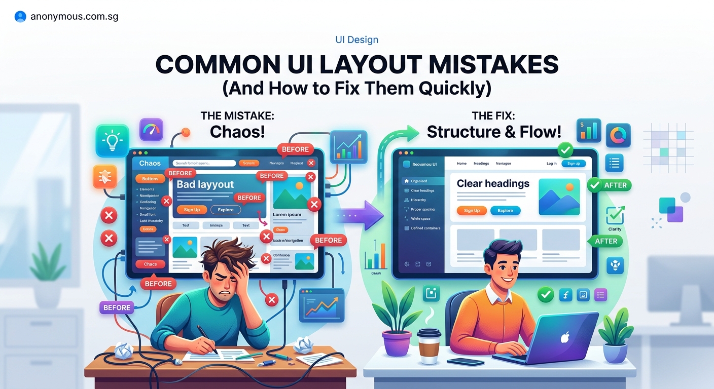
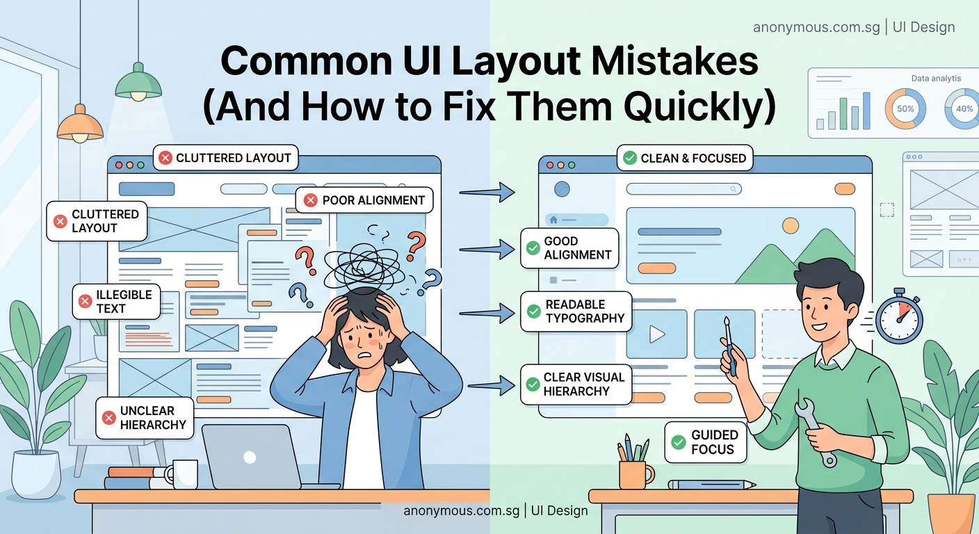
You just finished a design project and sent it for review. The feedback comes back harsh: the interface feels cluttered, buttons are hard to find, and text is barely readable. Sound familiar?
Most interface problems stem from a handful of repeatable errors. The good news? Once you recognize these patterns, you can fix them in minutes instead of hours.
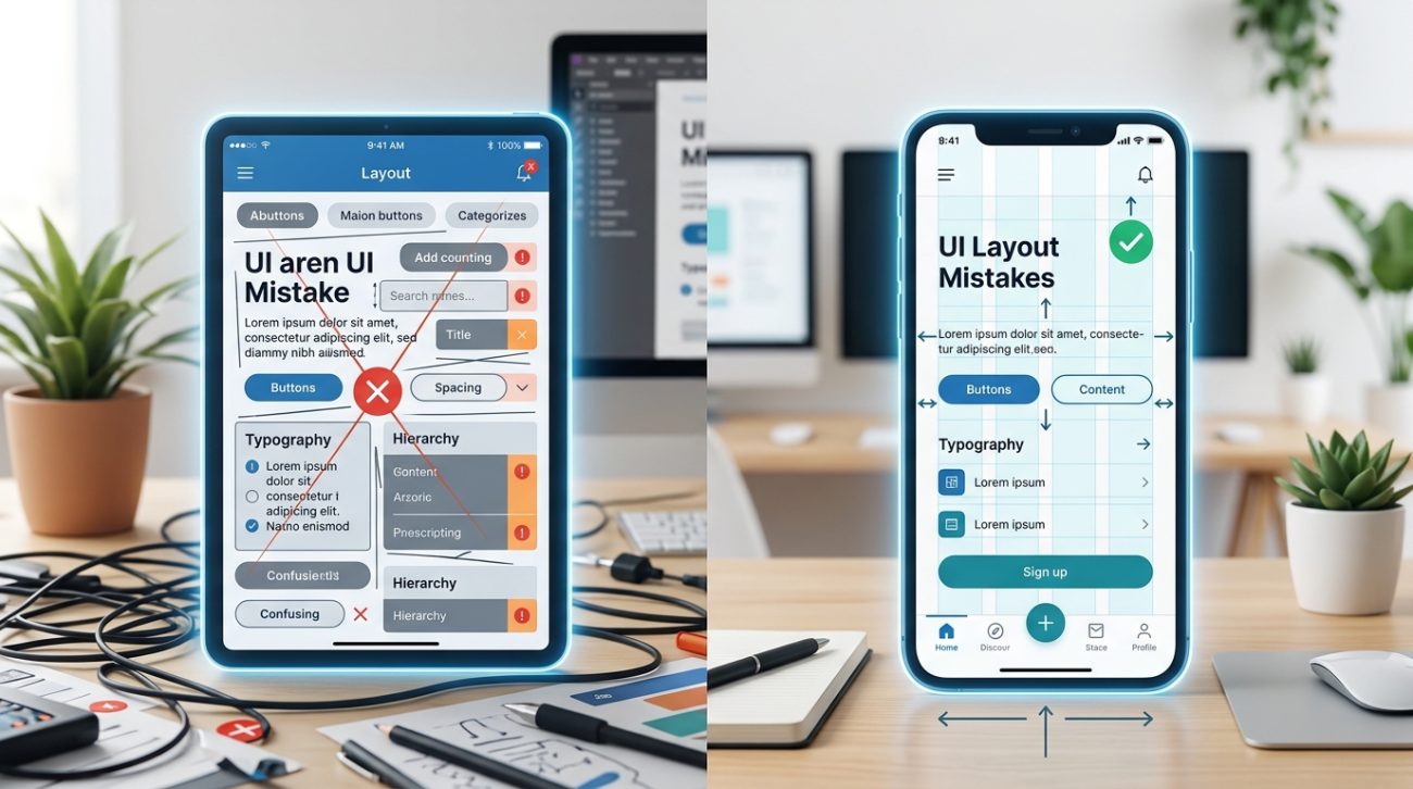
Common UI design mistakes like poor spacing, weak contrast, inconsistent alignment, and unclear hierarchy plague beginner interfaces. This guide identifies the seven most frequent errors and provides specific fixes you can apply immediately. Learn how to spot problems before users do, use proven layout principles, and build interfaces that feel professional from the first iteration.
Ignoring white space completely
Cramming elements together is the fastest way to make an interface feel overwhelming.
White space (or negative space) gives your content room to breathe. It creates visual separation between elements and guides the eye through the page naturally.
Beginners often think empty space is wasted space. That mindset leads to cluttered screens where nothing stands out.
The fix:
- Add at least 16px of padding inside containers.
- Space related elements closer together than unrelated ones.
- Use 24px to 32px of margin between major sections.
Check your design at 50% zoom. If everything blurs together into a gray block, you need more spacing.
Using too many font sizes
When every heading uses a different size, nothing feels important.
Typography hierarchy should have three to five levels maximum. Body text, subheadings, main headings, and maybe a display size for hero sections.
More than that creates visual noise. Users can’t tell what to read first.
Here’s a simple scale:
| Element Type | Size | Weight | Use Case |
|---|---|---|---|
| Body text | 16px | Regular | Paragraphs, descriptions |
| Small heading | 20px | Semibold | Card titles, labels |
| Section heading | 28px | Bold | Page sections |
| Page title | 40px | Bold | Hero, main titles |
Stick to this system across your entire project. Consistency builds trust.
If you’re struggling with font choices, typography hierarchy in UI design: 5 rules that make screens instantly readable breaks down the principles that separate amateur work from professional interfaces.
Forgetting about color contrast
Low contrast text is one of the most common UI design mistakes, and it makes interfaces unusable for millions of people.
If your text color is #999999 on a white background, you’re failing accessibility standards. Light gray text might look modern, but it’s unreadable in bright light or for users with vision impairments.
Minimum contrast ratios:
- Normal text: 4.5:1
- Large text (18px+): 3:1
- UI elements: 3:1
Use a contrast checker before finalizing any color combination. WebAIM has a free tool that takes five seconds to use.
Dark text on light backgrounds or light text on dark backgrounds almost always works. Avoid medium tones for text entirely.
What is color contrast and why does it make or break your designs? covers the technical side and shows you how to test your work properly.
Misaligning elements randomly
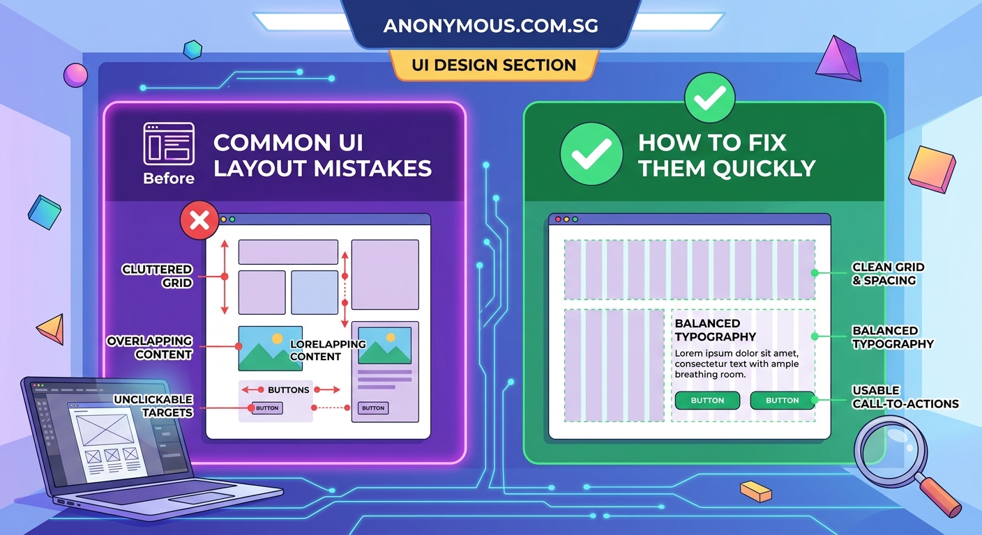
Nothing screams amateur louder than elements that don’t line up.
Your eye naturally looks for alignment. When buttons, text blocks, and images sit at random positions, the interface feels chaotic even if you can’t pinpoint why.
Three alignment rules:
- Left-align body text for readability
- Center-align sparingly (hero sections, modals)
- Use a grid system with consistent columns
Turn on alignment guides in your design tool. If an element doesn’t snap to a guide, it probably shouldn’t be there.
Create an 8px grid and make every measurement a multiple of 8. This keeps spacing consistent and makes development easier.
“Good alignment is invisible. Users never notice it, but they immediately feel when it’s missing. It’s the difference between a professional interface and a student project.” — Designer at a Fortune 500 tech company
Making buttons that don’t look clickable
Flat design trends led to buttons that look like labels.
Users shouldn’t have to guess what’s clickable. Buttons need visual affordance: shadows, borders, color fills, or hover states that signal interactivity.
Button checklist:
- Minimum touch target of 44x44px
- Clear background color different from surrounding elements
- Padding of at least 12px vertical, 24px horizontal
- Hover and active states that provide feedback
Text links are fine for secondary actions, but primary actions need obvious buttons.
If you’re building a design system from scratch, how to create a consistent design system for your first app walks through the component library setup that prevents these problems.
Overusing different colors
Every color should have a purpose.
When you use six different colors for six different buttons, users can’t build a mental model. They don’t know which colors mean action, which mean danger, and which are just decoration.
Standard color system:
- Primary: Main actions (blue, green)
- Secondary: Less important actions (gray)
- Success: Confirmations (green)
- Warning: Caution states (yellow, orange)
- Danger: Destructive actions (red)
- Neutral: Text, borders (gray scale)
That’s it. Six color roles maximum.
Apply the 60-30-10 rule: 60% neutral background, 30% secondary color, 10% accent color for calls to action.
Building mobile layouts that don’t scale
Designing for desktop first creates problems you’ll spend hours fixing later.
Mobile screens force you to prioritize. What’s actually important? What can wait? Desktop layouts hide these decisions under extra space.
Mobile-first checklist:
- Design at 375px width first
- Stack elements vertically by default
- Make tap targets at least 44px
- Keep forms to single columns
- Test on an actual device, not just in your browser
Once the mobile layout works, expanding to tablet and desktop becomes straightforward. You’re adding space, not cramming content into less room.
Mobile-first UI design: a practical guide for small screens shows you the exact workflow professional designers use to build responsive interfaces efficiently.
Spotting problems before users do
Run through this checklist before calling any interface done:
- Zoom out to 50%. Does the hierarchy still work?
- Squint at the screen. Do important elements stand out?
- Tab through with your keyboard. Is the focus order logical?
- Check on your phone. Are touch targets big enough?
- Use a contrast checker. Does everything pass WCAG AA?
These five checks catch 80% of common UI design mistakes.
Print your design and mark it up with a red pen. Physical distance helps you see problems you miss on screen.
Building your interface foundation
The difference between beginner and professional interfaces isn’t talent or expensive tools.
It’s knowing which rules to follow and which ones to break. Start with the fundamentals: spacing, hierarchy, contrast, alignment. Master those before experimenting with trends.
Every interface you build should be slightly better than the last. Fix one category of mistakes at a time. Focus on spacing this week. Tackle color contrast next week.
Your eye will develop. Mistakes that were invisible six months ago will jump out at you. That’s growth. Keep building, keep reviewing your work, and keep learning from what doesn’t work. The best designers aren’t the ones who never make mistakes. They’re the ones who spot them fastest and know exactly how to fix them.