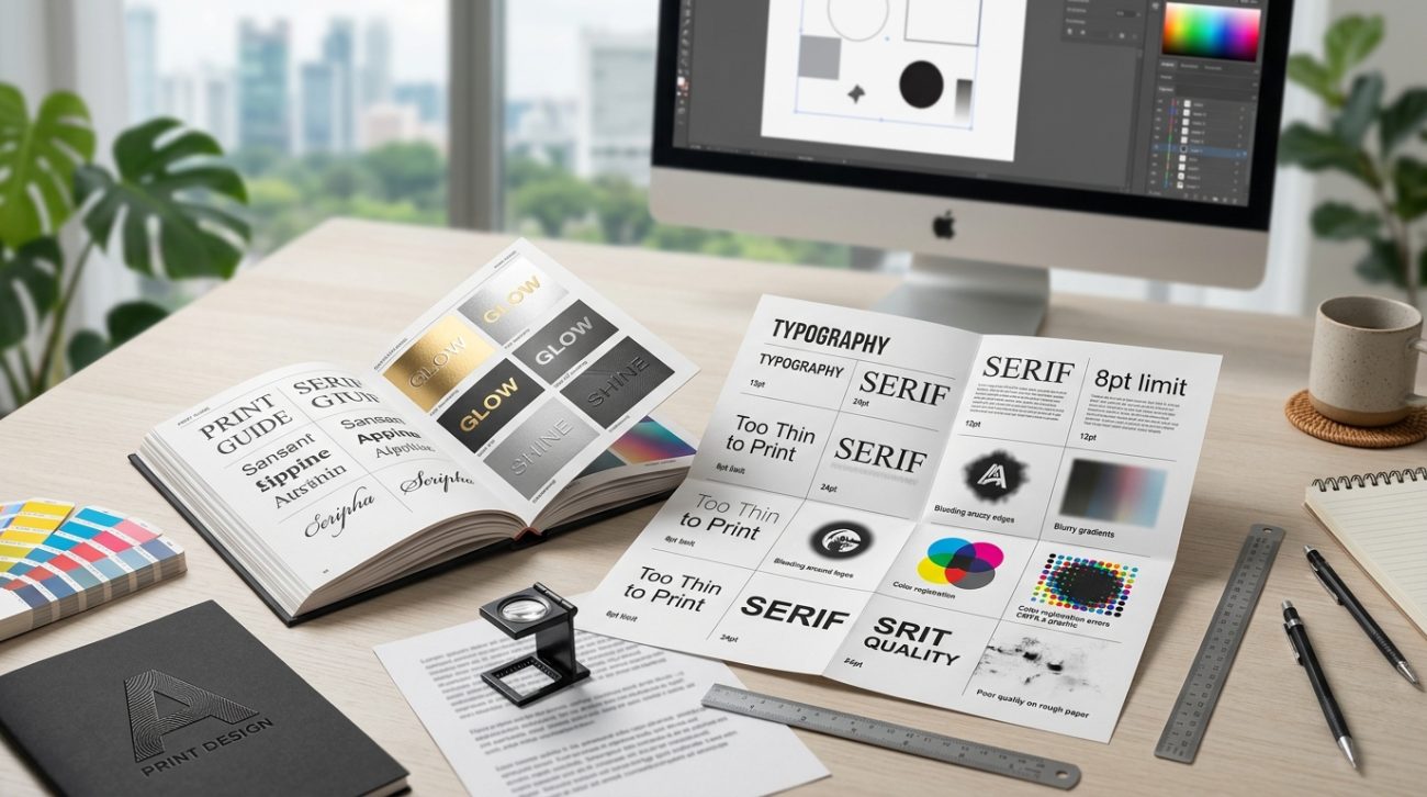
Your design looks perfect on screen. You hit export, send the file to the printer, and wait for the magic.
Then you get the call. The text is too thin. The embossing won’t work. The foil can’t follow those curves. Your beautiful typography just became a production nightmare.
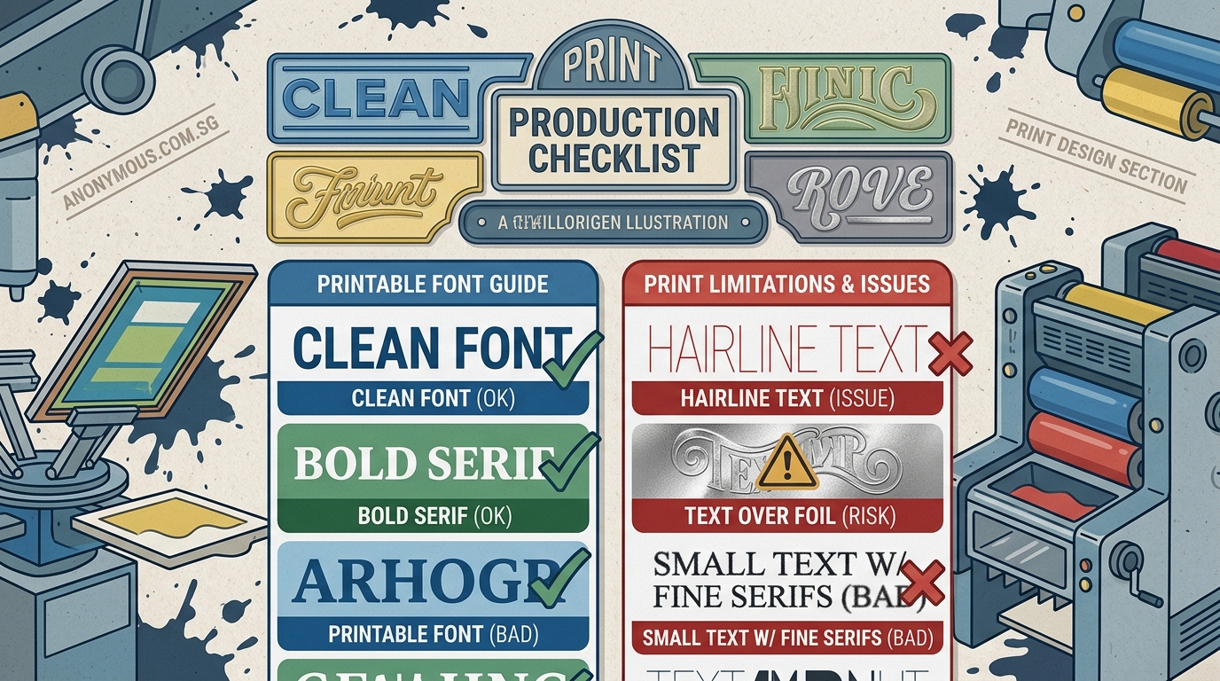
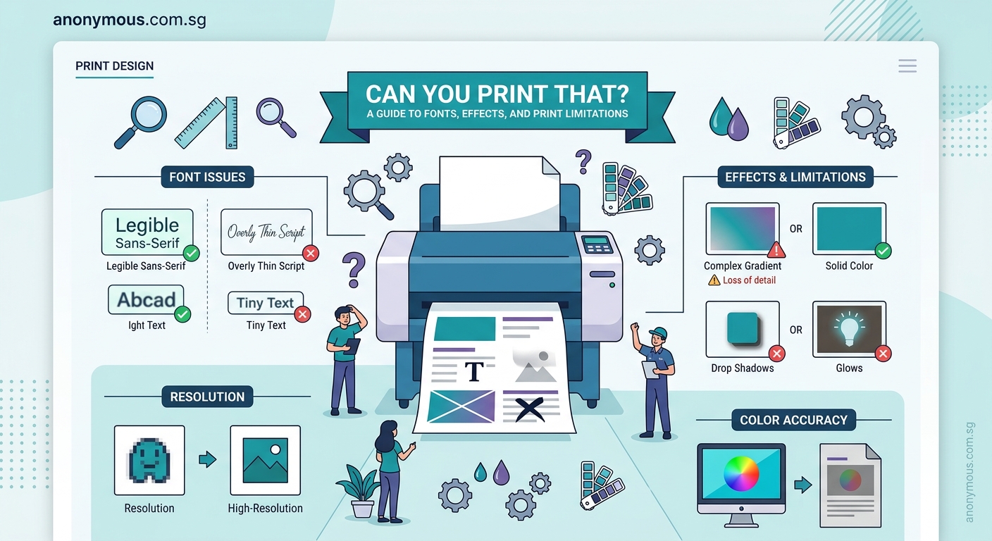
Font printing limitations affect stroke weight, detail complexity, specialty finishes, and material compatibility. Understanding minimum line thickness, contrast ratios, and production methods before you design saves time, money, and client relationships. Most print failures happen because designers choose fonts optimized for screens, not physical materials. Test early, communicate with your printer, and keep fallback options ready.
Why screens lie about what will print
Your monitor displays fonts using light pixels. Print uses ink, foil, embossing dies, or laser etching on physical surfaces.
That delicate hairline serif? It’s three pixels wide on your Retina display. On paper, it’s 0.25 points. Many printing processes can’t reliably reproduce anything thinner than 0.5 points.
Ultra-thin fonts like Helvetica Neue UltraLight or Raleway Thin look elegant on screen. They disappear or break apart in offset printing. They vanish completely in screen printing. They’re impossible to emboss or deboss with any clarity.
The contrast between thick and strong strokes matters too. Didone fonts like Bodoni have extreme contrast. The thick parts print beautifully. The thin parts often fail, especially at small sizes or on textured paper.
Your design software shows you a simulation. The printer deals with physics.
Minimum stroke weights for different print methods
Different printing processes have different tolerances. Here’s what actually works.
| Print Method | Minimum Stroke Weight | Best Font Styles | Avoid |
|---|---|---|---|
| Offset printing | 0.5 pt | Medium to Bold weights | Hairline serifs, Ultra-thin |
| Digital printing | 0.4 pt | Regular to Bold | Extreme contrast fonts |
| Screen printing | 1.0 pt | Bold, Sans-serif | Any thin strokes, fine details |
| Letterpress | 0.75 pt | Medium to Bold | Delicate scripts, thin serifs |
| Foil stamping | 1.0 pt | Bold, simple shapes | Intricate details, thin lines |
| Embossing/Debossing | 1.5 pt | Bold, geometric | Scripts, thin serifs, small text |
| Laser engraving | 0.3 pt | Any weight | Very small text on curves |
These numbers assume standard paper stock and normal viewing distances. Textured papers, dark inks on dark stock, or specialty materials require even heavier weights.
If you’re designing business cards with letterpress finishing, don’t choose Futura Light. Use Futura Medium or Bold.
Text effects that fail in production
Drop shadows look great on Instagram posts. They create registration nightmares in print.
Here’s what happens. Each color in offset printing requires a separate plate. Your drop shadow needs perfect alignment between the text plate and the shadow plate. Any misalignment creates blurry, doubled text.
The smaller the text, the worse the problem. Body text with drop shadows? Almost guaranteed to look terrible.
Other effects that cause problems:
- Outer glows: Require precise color registration and often print muddy
- Gradient fills on text: Color shifts are visible in large text, unpredictable in small text
- Thin outlines: Anything under 1pt often disappears or prints inconsistently
- Transparency effects: Flatten unpredictably, especially over images
- Multiple stroke effects: Registration issues multiply with each layer
Specialty finishes add another layer of complexity. Foil stamping can’t follow intricate script fonts with loops and swashes. The die can’t cut that precisely. The foil won’t release cleanly.
Embossing needs substantial stroke weight to create visible depth. That elegant light italic? It won’t emboss. You’ll get a barely visible impression that looks like a printing error.
“I tell designers to design twice: once for how it looks, once for how it’s made. If you can’t explain to the press operator how your effect should work, it probably won’t.” – Print production manager with 20 years experience
Size matters more than you think
An 8pt font on screen is readable. An 8pt font printed on textured cardstock is a blur.
Minimum readable sizes by print method:
- Offset printing on smooth paper: 6pt for body text, 8pt for textured stock
- Digital printing: 7pt for most fonts, 9pt for thin or script fonts
- Screen printing: 10pt minimum, 12pt recommended for anything important
- Foil stamping: 12pt for detailed fonts, 18pt for scripts
- Embossing: 14pt minimum, 18pt for reliable depth
- Laser engraving on curved surfaces: 10pt minimum
These assume medium-weight fonts with good contrast. Thin fonts need larger sizes. Bold fonts can go slightly smaller.
Small text with specialty finishes almost never works. That 8pt foil-stamped tagline on your business card? It will either fail to stamp or look like a metallic smudge.
When you’re building a brand style guide, specify minimum print sizes for each font weight. Your future self will thank you.
Font families that handle print well
Some typefaces were designed for print. They have the stroke weight, contrast ratios, and details that survive production.
Reliable choices for most print projects:
- Garamond (classic book typeface, proven for centuries)
- Caslon (excellent at small sizes, good ink traps)
- Helvetica or Univers (medium and bold weights)
- Futura (medium and bold, not light or thin)
- Trade Gothic (workhorse sans-serif)
- Minion Pro (designed for book printing)
- Myriad Pro (Adobe’s reliable sans-serif)
Fonts that cause problems:
- Didot (extreme contrast, thin strokes fail)
- Bodoni (same issues as Didot)
- Any font with “Thin,” “UltraLight,” or “Hairline” in the name
- Elaborate script fonts with fine flourishes
- Fonts with very small counters (the enclosed spaces in letters)
- Condensed fonts at small sizes
The perfect font pairing for your logo might not work for your business cards. Always have a print-safe alternative ready.
Testing before you commit
You can’t trust your screen. You need physical tests.
Here’s the process that saves money and relationships:
-
Print test sheets on your home printer using the actual fonts and sizes. If details disappear on a good inkjet, they’ll definitely fail in production.
-
Order sample prints from your actual printer before running the full job. Most printers offer this. Use it.
-
Test on the actual paper stock you’ll use for the final job. Smooth coated paper is forgiving. Textured uncoated paper hides details.
-
Check at actual viewing distance. That business card will be viewed from 18 inches away, not 3 inches.
-
Test in poor lighting. Your design won’t always be viewed under perfect conditions.
For specialty finishes, request physical samples of similar work. If your printer has never foil-stamped a script font that thin, they probably can’t do it reliably.
When you’re setting up print files, include notes about any elements that might cause production issues. Good printers will flag problems before running the job.
Material compatibility changes everything
Paper isn’t the only printing surface. Different materials have different limitations.
Fabric printing (t-shirts, tote bags): Bold sans-serifs only. Minimum 1.5pt stroke weight. No fine details. The fabric texture destroys anything delicate.
Plastic or metal printing: Smooth surfaces allow finer detail than textured ones. But curved surfaces distort text. Keep fonts simple and bold.
Wood engraving: Grain direction affects legibility. Sans-serifs work better than serifs. Minimum 12pt for reliable results.
Glass etching: Similar to engraving. Bold fonts with simple shapes. Script fonts almost always fail.
Vinyl cutting: The blade can’t follow intricate paths. Fonts need substantial stroke weight and simple shapes. Thin serifs break off.
If you’re designing for multiple materials, choose fonts that work on the most restrictive surface. A font that works on fabric will work on paper. The reverse isn’t true.
Understanding color mode differences is just as critical as understanding font limitations. Both affect your final output.
How to adapt screen-optimized designs for print
You’ve designed something beautiful for digital. Now the client wants it printed.
Don’t just export and hope.
Increase font weights by one or two steps. Regular becomes Medium. Medium becomes Bold. This compensates for ink spread and paper absorption.
Simplify effects. Remove drop shadows, outer glows, and gradient fills. Use solid colors. Add visual interest through layout and color blocking instead.
Increase contrast. Light gray text on white backgrounds looks fine on screens. It disappears in print. Use darker colors.
Check your leading (line spacing). Text that looks fine with tight leading on screen becomes hard to read in print. Add 2-3 points.
Remove transparency. Flatten everything. What you see is what you get.
Test small text. Anything under 10pt needs scrutiny. Can you read it clearly when printed at actual size?
The typography mistakes that are merely annoying on screen become deal-breakers in print.
Communicating with your print vendor
Your printer is your ally, not your enemy. They want your job to succeed.
Give them information upfront:
- Font names and weights
- Any effects applied to text
- Specialty finishes you want
- Paper stock preferences
- Quantity and timeline
Ask specific questions:
- “Can you reliably print this font at 8pt on uncoated stock?”
- “Will this script font work with foil stamping?”
- “What’s the thinnest stroke weight you recommend for this paper?”
Request a proof before the full run. Not a PDF proof. A physical printed proof on the actual paper stock.
If they say something won’t work, believe them. They’ve seen thousands of jobs. They know what fails.
Have backup options ready. If your first-choice font won’t foil stamp cleanly, what’s your second choice?
Good printers will suggest alternatives. They might recommend a slightly bolder weight or a different finish that achieves a similar effect.
Building print-safe brand systems
If your brand will appear in both digital and print, plan for both from the start.
Specify two versions of your typography in your brand system:
Digital typography: Can use thinner weights, more variety, subtle effects.
Print typography: Heavier weights, simpler effects, proven reliability.
This isn’t cheating. It’s smart design.
Coca-Cola uses different versions of their logo for different applications. The embossed version on a glass bottle is simpler than the version on their website. Both are recognizably Coca-Cola.
Document your print specifications:
- Minimum font sizes for each weight
- Approved fonts for specialty finishes
- Fallback fonts if primary choices don’t work
- Prohibited effects for print applications
Include physical samples in your brand guidelines. Show what works and what doesn’t. Future designers will appreciate the clarity.
Common mistakes and how to avoid them
| Mistake | Why It Fails | Fix |
|---|---|---|
| Using display fonts at small sizes | Details disappear, becomes illegible | Use fonts designed for text at small sizes |
| Thin fonts on textured paper | Paper texture breaks up thin strokes | Increase weight or choose smooth paper |
| White text with drop shadow | Registration issues, looks muddy | Use solid white, add contrast through background |
| Scripts for embossing | Die can’t follow intricate curves | Use bold geometric fonts |
| Tight kerning in small text | Letters blur together | Increase tracking by 10-20 units |
| Reversed text (white on dark) at small sizes | Ink spread makes text thinner | Increase weight, increase size, or avoid |
The pattern is clear. What works on screen often fails in print. Design with physical constraints in mind.
When font limitations become creative opportunities
Constraints force creativity.
Maybe you can’t use that delicate script font for foil stamping. But you can use a bold geometric sans-serif and create visual interest through color, layout, and negative space.
Maybe your text is too small for the paper stock you love. But increasing the size creates more impact anyway.
Maybe that elaborate effect won’t print. But the simpler version is more elegant.
Print limitations push you toward clarity. Toward boldness. Toward designs that communicate instantly.
The most memorable printed pieces often use simple typography executed perfectly. Think of classic book covers. Iconic posters. Timeless business cards.
They work because the designers understood their medium.
Making font choices that survive production
Start with the end in mind.
Before you choose a font, know how it will be printed. Know the material. Know the finish. Know the size.
Test early and often. Don’t wait until you’ve finished the entire design to discover your font choice won’t work.
Build relationships with good printers. Ask questions. Learn from their experience.
Maintain a library of print-safe fonts. When you find typefaces that work reliably, use them again.
Document what works and what doesn’t. Keep notes on successful projects. Learn from failures.
Remember that font printing limitations aren’t obstacles. They’re guardrails that keep your designs in the realm of the possible.
The best print designers don’t fight against these limitations. They work within them to create something even better than their original vision.
Your next print project will be smoother, cheaper, and more successful when you design with production in mind from the very first font choice.