
Your designer just sent over a logo in the wrong shade of blue. Again. Your social media manager is using a different font than your website. And your sales deck looks like it came from a completely different company.
Sound familiar? You’re not alone. Most small businesses struggle with brand consistency because they either don’t have a style guide, or they have one that nobody opens.
A brand style guide documents your visual and written identity so everyone creates consistent materials. The best guides are simple, accessible, and focused on real use cases. Include your logo variations, color codes, typography rules, image style, and voice guidelines. Keep it under 20 pages, make it searchable, and update it as your brand grows.
What makes a style guide actually useful
Most brand guides fail because they’re too complicated or too vague. They sit in a folder somewhere, gathering digital dust while your team guesses at brand decisions.
A useful style guide answers specific questions your team actually asks. Not theoretical brand philosophy. Real problems like “Which logo do I use on a dark background?” or “Can I use emojis in customer emails?”
The difference between a decorative PDF and a working tool comes down to three things:
- Accessibility: Can your team find it in under 30 seconds?
- Clarity: Does it show, not just tell?
- Relevance: Does it cover the situations your team faces daily?
Think of your style guide as an instruction manual, not a coffee table book. It needs to solve problems fast.
The essential components you need
Start with these six sections. You can always add more later, but these cover 90% of daily brand decisions.
Logo usage rules
Show every version of your logo with clear labels. Include the primary version, horizontal and vertical layouts, icon-only versions, and any special variations.
For each version, specify:
- Minimum size for print and digital
- Clear space requirements
- Acceptable background colors
- What NOT to do (stretched logos, wrong colors, added effects)
Create a simple grid showing your logo on white, black, and colored backgrounds. This visual reference prevents most logo mistakes.
Color palette with exact codes
List your brand colors with all the codes someone might need:
| Color Name | Hex | RGB | CMYK | Pantone |
|---|---|---|---|---|
| Primary Blue | #2B5BA6 | 43, 91, 166 | 74, 45, 0, 35 | 2728 C |
| Accent Gold | #C8B88A | 200, 184, 138 | 0, 8, 31, 22 | 4535 C |
| Neutral Gray | #6B7280 | 107, 114, 128 | 16, 11, 0, 50 | Cool Gray 9 C |
Include usage notes. Which color dominates? Which is for accents only? What combinations work for text and backgrounds?
Show examples of good and bad color use. A single image of a well-balanced design teaches more than paragraphs of explanation.
Typography that makes sense
Specify your fonts for different uses:
- Headings: Font name, weights you use, size ranges
- Body text: Font name, recommended size, line spacing
- Special uses: Captions, buttons, quotes
Include fallback fonts for situations where your primary typeface isn’t available. If you use a custom font on your website, what should your team use in Word documents or email?
Add a sample layout showing your typography in action. Real sentences in real sizes beat abstract font specimens.
Image and photography style
This section prevents your Instagram from looking nothing like your website. Define your visual style with examples:
- Photo style (bright and airy vs. moody and dramatic)
- Subject matter (people vs. products vs. lifestyle)
- Composition preferences (centered, rule of thirds, negative space)
- Filters or editing style
- What to avoid (stock photo clichés, inconsistent lighting)
Create a mood board with 6 to 8 images that capture your visual direction. This gives your team a target to match.
Voice and tone guidelines
Your brand voice should sound consistent whether someone reads your website, social posts, or customer service emails. But tone can flex based on context.
Define your voice with 3 to 5 characteristics. Instead of vague words like “professional,” get specific:
- We use contractions and write like we talk
- We explain complex ideas in simple terms
- We’re helpful, not salesy
- We use humor, but never sarcasm
- We avoid jargon and industry buzzwords
Then show how tone adjusts:
- Social media: More casual, emoji-friendly, conversational
- Website copy: Confident, clear, benefit-focused
- Error messages: Empathetic, solution-oriented, never blaming
- Customer support: Patient, thorough, friendly
Include before-and-after examples. Show a sentence that’s off-brand, then the corrected version.
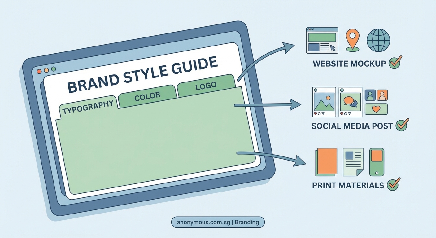
Practical application examples
This is the section that makes your guide actually useful. Show your brand elements in real contexts:
- Business card layout
- Email signature format
- Social media post templates
- Presentation slide examples
- Website button styles
- Packaging or product applications
Each example should be annotated. Point out which fonts, colors, and spacing rules are in play.
How to build your guide step by step
Creating a comprehensive style guide feels overwhelming. Break it into manageable phases.
Phase one: Audit what you have
Gather every piece of branded material you can find. Website screenshots, social posts, printed materials, presentations, email templates.
Lay them out and look for inconsistencies. Make a list of every decision that varies: logo sizes, color shades, font choices, image styles, writing tone.
These inconsistencies become your guide’s priorities. Document the decisions that cause the most confusion first.
Phase two: Make the hard decisions
You can’t document standards you haven’t decided on. This phase requires choices.
Pick your primary logo version. Choose your exact brand colors (no more “blue-ish”). Select your official fonts. Define your photo style.
Get input from your team, but don’t design by committee. Someone needs to make final calls and move forward.
Phase three: Document with examples
Start a simple document. Google Docs or Notion works fine for version one. You can make it prettier later.
For each element, follow this pattern:
- Show the correct version
- Explain when and how to use it
- Show common mistakes to avoid
- Provide the technical specs (sizes, codes, file names)
Use screenshots and mockups liberally. Visual examples communicate faster than text.
Phase four: Test with your team
Before you call it done, have team members use the draft guide for real projects. Watch where they get stuck or confused.
Ask specific questions:
- Could you find what you needed?
- Were the instructions clear?
- What’s missing?
- What sections did you skip?
Revise based on actual use, not assumptions.
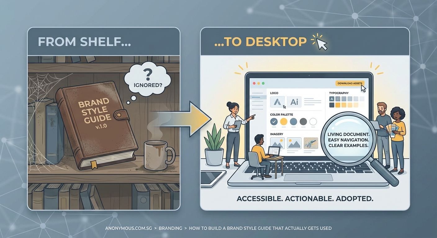
Phase five: Make it accessible
Your finished guide needs a permanent, easy-to-find home. Options include:
- Shared folder with a memorable name
- Page on your company intranet
- Dedicated website or subdomain
- Design tool like Figma with view-only access
- Brand management platform
Whatever you choose, make sure everyone knows where it lives and can access it without asking permission.
Create a short URL or bookmark. Send it in onboarding materials. Reference it in project briefs.
Common mistakes that kill adoption
Even well-made guides fail if you make these errors.
Making it too long. Your team won’t read 50 pages. Aim for 15 to 20 pages maximum. If you have more content, split it into a basic guide and advanced resources.
Using design jargon. Not everyone knows what kerning or leading means. Use plain language. When technical terms are necessary, define them.
Forgetting to update it. Brands change. When you update your logo or adjust your colors, update the guide immediately. An outdated guide is worse than no guide.
Hiding it behind barriers. Requiring special software to view your guide, or making people request access, guarantees nobody will use it.
Skipping the why. When you explain WHY a rule exists, people follow it more consistently. “Use our primary blue for all CTAs because testing showed it converts 23% better” works better than “Always use primary blue.”
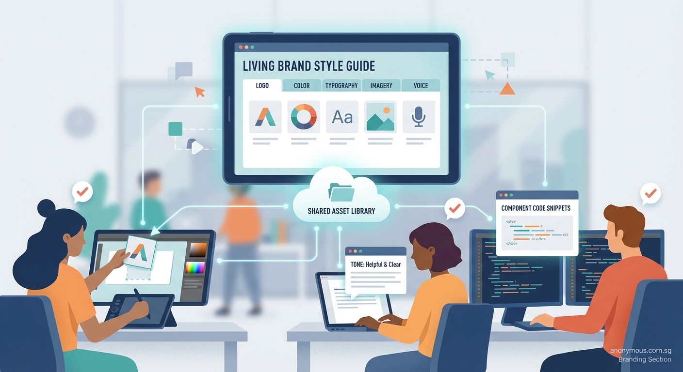
“A brand guide should be a living document that grows with your company. The moment you treat it as finished and unchangeable, it becomes irrelevant.”
Tools and templates to speed things up
You don’t need to start from scratch. Several tools make style guide creation easier.
Figma or Adobe XD let you create interactive guides with live color and text styles. Team members can copy exact specs directly from the file.
Notion or Confluence work well for text-heavy guides with embedded images. Easy to update and search.
Frontify or Brandpad are dedicated brand management platforms. More expensive, but they include asset libraries and approval workflows.
Canva Brand Kit offers a simplified style guide built into their design tool. Good for small teams already using Canva.
For your first version, even a well-organized Google Doc with clear headings and good examples will work. Perfect is the enemy of done.
Keeping your guide alive and relevant
Launch day isn’t the finish line. A style guide needs maintenance.
Set a calendar reminder to review your guide every six months. Check for:
- Outdated examples or screenshots
- New use cases that need documentation
- Rules nobody follows (maybe they need revision)
- Feedback from team members
When someone asks a brand question that’s not in the guide, that’s a gap. Add it.
Create a simple feedback system. A shared doc where team members can suggest additions or flag confusing sections keeps your guide improving.
Celebrate when your guide prevents mistakes or speeds up work. Share examples in team meetings: “This campaign stayed perfectly on-brand because everyone referenced the style guide.”
Making consistency feel natural
The goal isn’t a beautiful document. The goal is a team that creates consistent, recognizable brand materials without thinking about it.
Your style guide is training wheels. At first, people will reference it constantly. Eventually, the decisions become automatic. Your designer will know which blue to use. Your writer will match the brand voice naturally.
But those training wheels need to be there when people need them. Keep your guide simple, visual, and accessible. Update it when your brand changes. Make it easy to use, not impressive to look at.
Start small if you need to. A one-page reference sheet beats a 40-page PDF that nobody opens. You can always expand as needs grow.
Your brand is what people experience across every touchpoint. A good style guide makes those experiences feel connected and intentional. It turns your brand from an idea into something your whole team can build together.