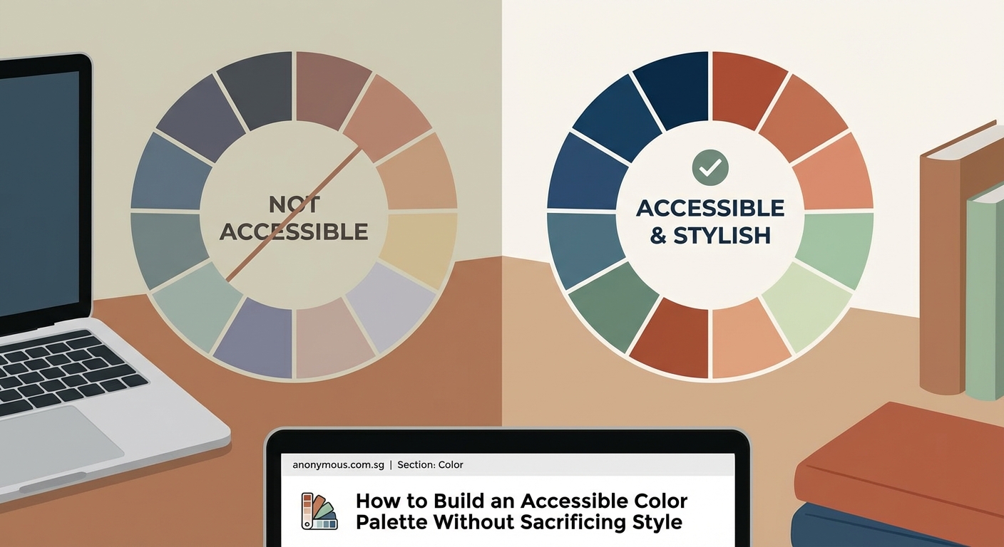
You’ve chosen the perfect shade of blue for your brand. It looks stunning on screen. Then you run a contrast checker and watch your design dreams crumble because it fails accessibility standards.
This happens more often than you’d think. Beautiful color palettes often clash with WCAG requirements, leaving designers torn between aesthetics and inclusivity.
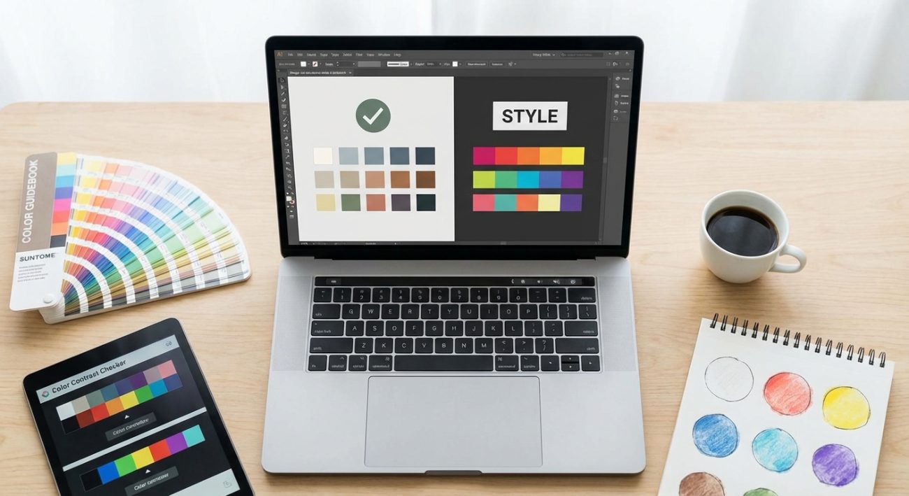
The good news? You don’t have to choose. Creating an accessible color palette that looks professional and passes compliance checks is entirely possible with the right approach.
Building accessible color palettes requires testing contrast ratios against WCAG standards while maintaining visual hierarchy. Start with a base palette, test combinations systematically, adjust values for compliance, and document approved pairings. Tools like contrast checkers and color blindness simulators help ensure your palette works for everyone without sacrificing design quality or brand identity.
Understanding WCAG contrast requirements
WCAG guidelines exist for a reason. About 1 in 12 men and 1 in 200 women have some form of color vision deficiency. Low vision affects millions more.
The standards break down into three levels: A, AA, and AAA. Most organizations aim for AA compliance, which requires:
- Normal text (under 18pt or 14pt bold): 4.5:1 contrast ratio minimum
- Large text (18pt and above or 14pt bold and above): 3:1 contrast ratio minimum
- UI components and graphics: 3:1 contrast ratio minimum
These numbers represent the difference in luminance between foreground and background colors. A ratio of 4.5:1 means the lighter color is 4.5 times more luminous than the darker one.
Level AAA raises the bar to 7:1 for normal text and 4.5:1 for large text. While AAA offers better accessibility, it’s not always practical for every design element.
“Contrast ratios aren’t about limiting creativity. They’re about ensuring your message reaches everyone, regardless of visual ability. Think of them as design constraints that push you toward stronger solutions.”
Starting with your base colors
Before you test anything, you need colors to work with. Start by selecting your primary brand colors or design foundation.
Pick 2 to 3 core colors that represent your brand identity. These become your anchors. Everything else builds from here.
For each core color, you’ll eventually need multiple shades. But don’t generate those yet. First, test whether your core colors can work together at all.
If you’re working with an existing brand that has accessibility issues, you have two paths:
- Adjust the existing colors slightly to meet standards
- Keep the original colors for specific uses (like logos) and create compliant alternatives for text and UI
The second approach works well when brand recognition matters. You preserve the original colors in contexts where contrast isn’t critical, like logos on white backgrounds.
Testing your color combinations systematically
This is where most designers get stuck. You can’t just eyeball contrast. You need to test every combination you plan to use.
Create a simple grid. List your colors down the left side. List them again across the top. Test each intersection.
| Background | Text Color 1 | Text Color 2 | Text Color 3 |
|---|---|---|---|
| White | 4.5:1 ✓ | 2.1:1 ✗ | 8.2:1 ✓ |
| Light Gray | 3.8:1 ✗ | 1.5:1 ✗ | 6.1:1 ✓ |
| Dark Blue | 12.3:1 ✓ | 5.2:1 ✓ | 1.9:1 ✗ |
Use a contrast checker tool. WebAIM’s contrast checker is reliable and free. Input your hex codes, get your ratio, move on.
Mark each combination as pass or fail for both normal and large text. This grid becomes your reference document.
You’ll notice patterns. Light colors on light backgrounds fail. Dark on dark fails. But you’ll also find surprising combinations that work beautifully and meet standards.
Building a complete palette with tints and shades
Now that you know which base combinations work, expand your palette with variations.
For each core color, create a scale of 5 to 9 values. This gives you flexibility for different UI states, hover effects, and visual hierarchy.
The process looks like this:
- Take your base color (let’s say a medium blue at #3B82F6)
- Create lighter tints by mixing with white
- Create darker shades by mixing with black
- Test each new value against your most common backgrounds
- Keep the ones that pass, adjust or discard the ones that don’t
Most design systems use a 100 to 900 scale, where 100 is lightest and 900 is darkest. This naming convention makes it easy to reference colors in code and documentation.
Your 500 value typically matches your original brand color. Then you build out from there.
Handling tricky colors like yellow and orange
Some colors resist accessibility. Yellow is notorious. Pure yellow on white fails contrast checks spectacularly.
Orange sits in an awkward middle zone. It’s neither light enough nor dark enough to work in many contexts.
Here’s how to handle problem colors:
For yellow:
– Darken it significantly for text use (aim for a gold or amber tone)
– Reserve bright yellow for large elements, icons, or illustrations
– Use it as an accent, not for body text
– Pair it with very dark backgrounds when possible
For orange:
– Test both lighter and darker versions
– Often, going darker works better than going lighter
– Consider using it primarily for large text or buttons
– Pair with white text when using orange as a background
For pastels:
– Accept that pastels work best as backgrounds, not text colors
– Create darker versions specifically for text
– Use them for large decorative elements where contrast isn’t critical
Don’t force a color to work everywhere. It’s fine to have colors that serve specific purposes. When you choose brand colors that actually convert customers, you’ll find that strategic color use matters more than using every color in every context.
Testing for color blindness
Contrast ratios don’t tell the whole story. Two colors might have sufficient contrast but still be indistinguishable to someone with color blindness.
The most common types are:
- Deuteranopia (red-green color blindness, affecting about 6% of men)
- Protanopia (another form of red-green color blindness)
- Tritanopia (blue-yellow color blindness, much rarer)
Use a color blindness simulator to view your palette through different types of color vision. Several free tools exist online.
Look for these problems:
- Colors that appear identical under simulation
- Insufficient differentiation in charts or data visualization
- Status indicators (like red for error, green for success) that rely solely on color
The fix usually involves one of these strategies:
- Increase the lightness difference between colors
- Add patterns, icons, or text labels alongside color
- Choose colors from different areas of the color wheel
- Use both color and position to convey meaning
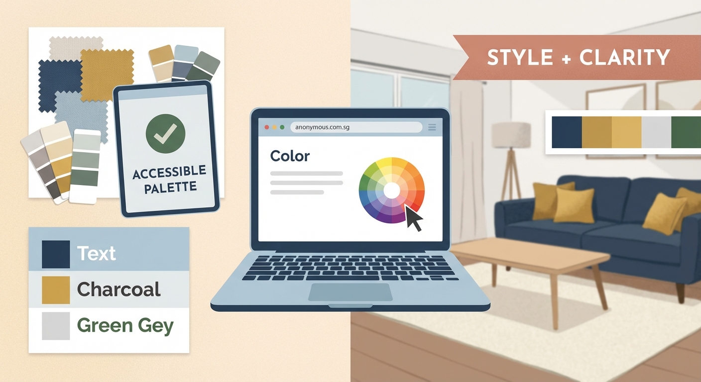
Documenting your accessible palette
Once you’ve built and tested your palette, document it thoroughly. Future you (and your teammates) will thank you.
Your documentation should include:
- Hex codes, RGB values, and HSL values for each color
- Approved text and background combinations with their contrast ratios
- Usage guidelines (when to use each color)
- Colors to avoid pairing together
- Special notes about color blindness considerations
This documentation often lives in a brand style guide that actually gets used. Make it accessible and searchable.
Create visual examples showing correct and incorrect usage. Show the same button in compliant and non-compliant color combinations. These examples prevent mistakes better than written rules alone.
Include code snippets if your team works with CSS variables or design tokens. Make it easy to implement your palette correctly.
Common mistakes that break accessibility
Even with good intentions, designers make predictable errors. Here are the biggest ones:
| Mistake | Why It Fails | Better Approach |
|---|---|---|
| Using brand colors everywhere | Not all brand colors work for text | Create text-specific versions |
| Assuming light gray text is elegant | Often falls below 4.5:1 ratio | Test first, adjust if needed |
| Relying only on color for meaning | Fails for color blind users | Add icons, labels, or patterns |
| Forgetting about UI states | Hover/focus states often have worse contrast | Test interactive states separately |
| Skipping mobile testing | Colors look different on various screens | Check on actual devices |
The “elegant light gray text” trap catches many designers. That subtle #767676 gray on white background? It’s only 4.54:1. Just barely passes. On some screens, it might look worse.
Go darker than you think you need to. #595959 gives you 7:1, which provides much better readability without looking harsh.
Tools that speed up the process
You don’t need to do all this manually. Several tools make creating accessible palettes faster.
Contrast checkers:
– WebAIM Contrast Checker (simple, reliable)
– Contrast Ratio by Lea Verou (clean interface)
– Accessible Colors (suggests fixes automatically)
Palette generators:
– Coolors (can filter by contrast requirements)
– Adobe Color (includes accessibility tools)
– Accessible Color Palette Builder (specifically designed for WCAG)
Color blindness simulators:
– Coblis (web-based, covers multiple types)
– Color Oracle (desktop app for Mac, Windows, Linux)
– Chromatic Vision Simulator (mobile app)
Browser extensions:
– WAVE (evaluates whole pages)
– axe DevTools (comprehensive accessibility testing)
– Stark (integrates with design tools)
Most design tools now include accessibility features. Figma has built-in contrast checking. Sketch has plugins. Adobe XD offers similar functionality.
Use these tools early and often. Don’t wait until the end of your design process to check accessibility.
Maintaining visual appeal with constraints
Here’s the truth: constraints often improve design. Accessible color palettes force you to be more intentional.
When you can’t rely on subtle color differences, you use other design elements. Typography hierarchy becomes more important. Spacing matters more. Typography mistakes become more obvious and more critical to avoid.
This makes your designs stronger, not weaker.
Look at brands with excellent accessible palettes. Stripe uses high contrast throughout their interface. It looks modern and clean, not clinical. GitHub’s design system prioritizes accessibility without sacrificing personality.
These brands prove that accessible doesn’t mean boring. It means thoughtful.
Use bold color in strategic places. Save your brightest, most saturated colors for large elements, illustrations, and decorative touches. Use your compliant, slightly toned-down versions for text and functional UI.
This creates visual interest while maintaining readability. The contrast (pun intended) between decorative and functional color use adds sophistication.
Adapting palettes for dark mode
Dark mode complicates everything. Colors that work on white backgrounds often fail on dark ones.
You need separate testing for dark mode. The same color combinations don’t transfer directly.
White text on dark backgrounds needs the same 4.5:1 ratio. But pure white (#FFFFFF) on pure black (#000000) creates too much contrast. It’s harsh and causes eye strain.
Better approach:
- Use off-white (like #E8E8E8) instead of pure white for text
- Use dark gray (like #121212) instead of pure black for backgrounds
- Reduce the intensity of accent colors in dark mode
- Test everything again with your contrast checker
Many brands create two separate palettes: one for light mode, one for dark. The color relationships stay consistent, but the specific values change.
Document both sets of values. Show which light mode color corresponds to which dark mode color.
Making accessibility part of your workflow
The real challenge isn’t learning these techniques. It’s remembering to use them consistently.
Build accessibility checks into your process from the start. Don’t treat it as a final quality check. Make it part of your initial design decisions.
When choosing colors for a new project:
- Select your base colors with accessibility in mind
- Test combinations before building full mockups
- Create your expanded palette with compliant values
- Document approved combinations as you go
- Review with color blindness simulators before finalizing
- Share your accessible palette with the whole team
This prevents the frustrating cycle of designing something beautiful, then having to redesign it when it fails accessibility testing.
Train your eye to recognize contrast issues. After a while, you’ll instinctively know which combinations will pass. You’ll choose accessible colors naturally.
Your palette is ready to work
You now have a complete process for building color palettes that look great and work for everyone. No more choosing between beauty and accessibility. No more last-minute redesigns when compliance testing reveals problems.
Start your next project by testing contrast early. Build your expanded palette systematically. Document everything clearly. Your designs will be stronger, your users will be happier, and you’ll spend less time fixing avoidable problems.
Accessible color isn’t a limitation. It’s a foundation for better design decisions. Use it that way.