
Choosing the wrong brand colors can cost you customers before they even read your headline. The right palette, however, can increase brand recognition by up to 80% and make your business feel instantly trustworthy. For small business owners and entrepreneurs, color isn’t just about aesthetics. It’s a conversion tool that either pulls customers closer or pushes them away.
Brand colors influence customer behavior and purchasing decisions. This guide shows you how to choose brand colors using psychology, competitor analysis, and practical testing methods. You’ll learn to build a palette that reflects your values, stands out in your market, and converts browsers into buyers through strategic color application across all touchpoints.
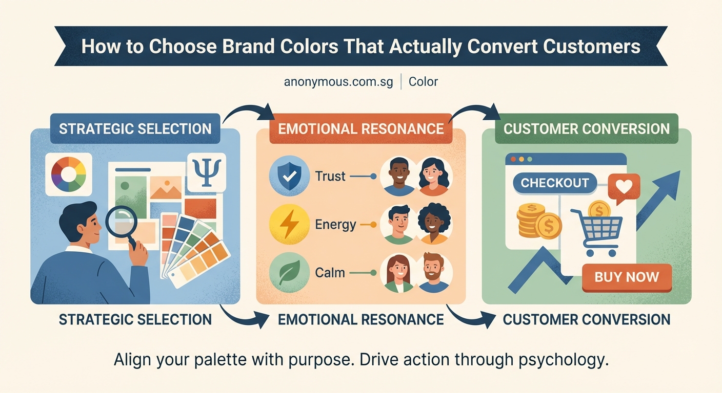
Why color matters more than you think
Color affects decision making at a subconscious level. Studies show that 85% of consumers cite color as the primary reason they choose one product over another. Your brain processes visual information 60,000 times faster than text, which means your brand colors speak before your words do.
This isn’t about picking your favorite shade of blue. It’s about understanding what colors communicate to your specific audience and using that knowledge to build trust, create urgency, or convey luxury depending on your business goals.
A coffee shop targeting busy professionals might use energizing oranges and warm browns. A financial advisor serving retirees would likely choose calming blues and trustworthy greens. Same industry category, different audiences, completely different color strategies.
Understanding color psychology for business

Every color triggers emotional responses. These responses vary by culture and context, but certain patterns hold true across most Western markets.
Red increases heart rate and creates urgency. It works well for clearance sales, food brands, and calls to action. Think of how many “Buy Now” buttons are red.
Blue builds trust and stability. Banks, insurance companies, and healthcare providers rely on blue because it makes people feel secure. It’s the most universally liked color.
Green represents growth, health, and money. Organic brands, financial services, and wellness companies use green to align with these associations.
Yellow grabs attention and conveys optimism. It’s great for highlighting important information but can strain the eyes if overused.
Purple suggests luxury, creativity, and wisdom. Beauty brands and premium products often incorporate purple to elevate their perceived value.
Orange combines red’s energy with yellow’s friendliness. It’s approachable and works well for brands targeting young families or creative industries.
Black communicates sophistication and exclusivity. Luxury brands use black to create a sense of premium quality and timelessness.
The practical process for choosing your colors
Here’s a step-by-step method that removes guesswork and gives you a palette that actually works for your business.
-
Define your brand personality first. Write down five adjectives that describe how you want customers to feel about your business. Are you playful or serious? Affordable or premium? Traditional or innovative? These words will guide your color choices.
-
Research your competitors thoroughly. Visit the websites of your top five competitors and screenshot their color palettes. Look for patterns. If everyone in your industry uses blue, you have two options: use blue to fit in and build immediate category recognition, or choose a contrasting color to stand out. Both strategies work depending on your market position.
-
Choose your primary brand color. This is the color that will appear most often in your branding. It should align with your brand personality and either complement or contrast with your competitive landscape. Test it by imagining it on your logo, website header, and business cards.
-
Select two to three supporting colors. These should work harmoniously with your primary color. Use the 60-30-10 rule: 60% primary color, 30% secondary color, 10% accent color. Your accent color should provide contrast for calls to action.
-
Add neutral colors for balance. Every palette needs neutrals for text, backgrounds, and breathing room. Choose shades of gray, beige, or off-white that don’t compete with your brand colors.
-
Test your palette in real contexts. Create mockups of your website, social media posts, and marketing materials using your chosen colors. Does the text remain readable? Do the colors work together across different mediums? Does your call-to-action button stand out?
Building a palette that converts
Your color palette needs to work across every customer touchpoint. Here’s how different businesses approach this challenge.
A local bakery might use:
– Warm terracotta as the primary color to evoke homemade comfort
– Cream as the secondary color for backgrounds and packaging
– Deep plum as an accent for special promotions
An accounting firm might choose:
– Navy blue as the primary color to communicate trust and professionalism
– Light gray for backgrounds and secondary elements
– Bright teal as an accent to modernize the traditional industry feel
A fitness studio could select:
– Energetic coral as the primary color to motivate and excite
– Charcoal gray for contrast and sophistication
– Bright lime green as an accent for calls to action
Notice how each palette tells a different story and targets a different emotional response.
Common mistakes that hurt conversions
Many businesses sabotage their own success by making these color errors.
| Mistake | Why It Hurts | Better Approach |
|---|---|---|
| Using too many colors | Creates visual chaos and weakens brand recognition | Stick to 3-5 colors maximum including neutrals |
| Choosing colors you personally like | Your preferences don’t matter if they don’t resonate with customers | Base decisions on audience research and psychology |
| Ignoring accessibility | Low contrast makes text unreadable for many users | Ensure 4.5:1 contrast ratio for body text, 3:1 for large text |
| Following trends blindly | Trendy colors date your brand and require frequent updates | Choose timeless colors that reflect your values |
| Forgetting about print | Colors look different on screen versus paper | Test your palette in both digital and physical formats |
The accessibility issue deserves special attention. If customers can’t read your text because it lacks contrast with the background, they’ll leave. Tools like WebAIM’s contrast checker help you verify your combinations meet WCAG standards.
Testing colors before you commit
Never finalize your palette without testing it with real people. Here are three methods that work for small businesses on tight budgets.
The A/B test method: If you already have a website or social media presence, create two versions of the same post or landing page with different color schemes. Run them simultaneously and measure which generates more clicks, sign-ups, or sales.
The feedback session: Show your color palette to 10-15 people who match your target customer profile. Ask them what words come to mind when they see the colors. Do their responses align with your brand personality? If not, adjust.
The application test: Create mockups of your business cards, website, packaging, and social media profiles using your proposed colors. Live with these mockups for a week. Do the colors still feel right? Do they work across all applications? This waiting period often reveals issues you miss in the excitement of initial selection.
“The best brand colors are the ones customers don’t consciously notice but subconsciously trust. They should feel inevitable, like your brand couldn’t possibly use any other palette.” — Experienced brand strategist
Using color strategically across your business
Once you’ve chosen your palette, consistency matters more than perfection. Here’s where each color should appear.
Primary color dominates your logo, website header, and main brand materials. It’s the color people will associate most strongly with your business.
Secondary color supports your primary color in graphics, section backgrounds, and secondary brand materials. It provides visual interest without competing for attention.
Accent color appears on buttons, links, and calls to action. This is your conversion color. It should contrast sharply with your primary and secondary colors to draw the eye exactly where you want it.
Neutral colors create breathing room and ensure readability. Use them for body text, backgrounds, and areas where you want content, not color, to be the focus.
A restaurant might use their primary color for the logo and menu headers, secondary color for section dividers and table tents, accent color for “Order Now” buttons on their website, and neutrals for menu descriptions and body text.
Adapting colors for different platforms
Your colors need to work everywhere your brand appears, but each platform has different requirements.
Websites give you the most control. Use your full palette but ensure sufficient white space so colors don’t overwhelm visitors.
Social media requires bolder, more saturated colors because posts compete with hundreds of others in a feed. Your colors need to stop the scroll.
Print materials like business cards and brochures often show colors differently than screens. Always request printed proofs before ordering large quantities.
Packaging presents unique challenges. Colors need to work under store lighting, stand out on shelves next to competitors, and remain consistent across different materials like cardboard, plastic, or glass.
Signage must be visible from a distance and in various lighting conditions. High contrast becomes even more critical here.
When to break your own color rules
Consistency builds recognition, but strategic variation can boost conversions in specific situations.
Use a different accent color for urgent promotions or limited-time offers. If your normal accent is teal, switching to red for a flash sale creates visual disruption that signals something special is happening.
Seasonal campaigns can incorporate temporary palette shifts. A winter holiday campaign might add gold or silver to your usual colors without abandoning your core identity.
Special product lines or sub-brands might warrant their own color variations. A law firm with a serious navy palette might use softer blues and greens for their family law division to feel more approachable.
The key is making these variations intentional and temporary. Always return to your core palette so customers maintain a clear mental image of your brand.
Measuring color performance over time
Your initial color choices aren’t permanent. Track these metrics to understand if your palette is working.
- Brand recognition: Survey customers after six months. Can they identify your brand by color alone?
- Conversion rates: Monitor whether button colors and call-to-action elements are generating clicks.
- Time on site: Do your website colors encourage people to stay and explore?
- Social engagement: Do posts using your brand colors get more interaction than generic images?
- Customer feedback: Pay attention to comments about your visual identity, both positive and negative.
If metrics show problems, make small adjustments rather than complete overhauls. Changing your accent color is less disruptive than changing your primary brand color.
Your palette is ready to work
Choosing brand colors doesn’t require a design degree or an expensive agency. It requires understanding your audience, knowing what emotions you want to trigger, and testing your choices in real-world applications. Start with the personality words that define your business, research what your competitors are doing, and build a palette that either fits in or stands out based on your strategic goals. Test your colors with actual customers, apply them consistently across all touchpoints, and measure their impact on your business metrics. Your brand colors are working for you right now, whether you chose them intentionally or not. Make sure they’re telling the story you want customers to hear.