You’ve designed dozens of logos, but the font combinations never feel quite right. One typeface looks too formal. Another feels too playful. Together, they clash instead of complement.
The problem isn’t your taste. It’s that pairing fonts requires understanding specific principles that make typefaces work in harmony. Most designers skip these fundamentals and rely on trial and error, wasting hours shuffling through font menus.
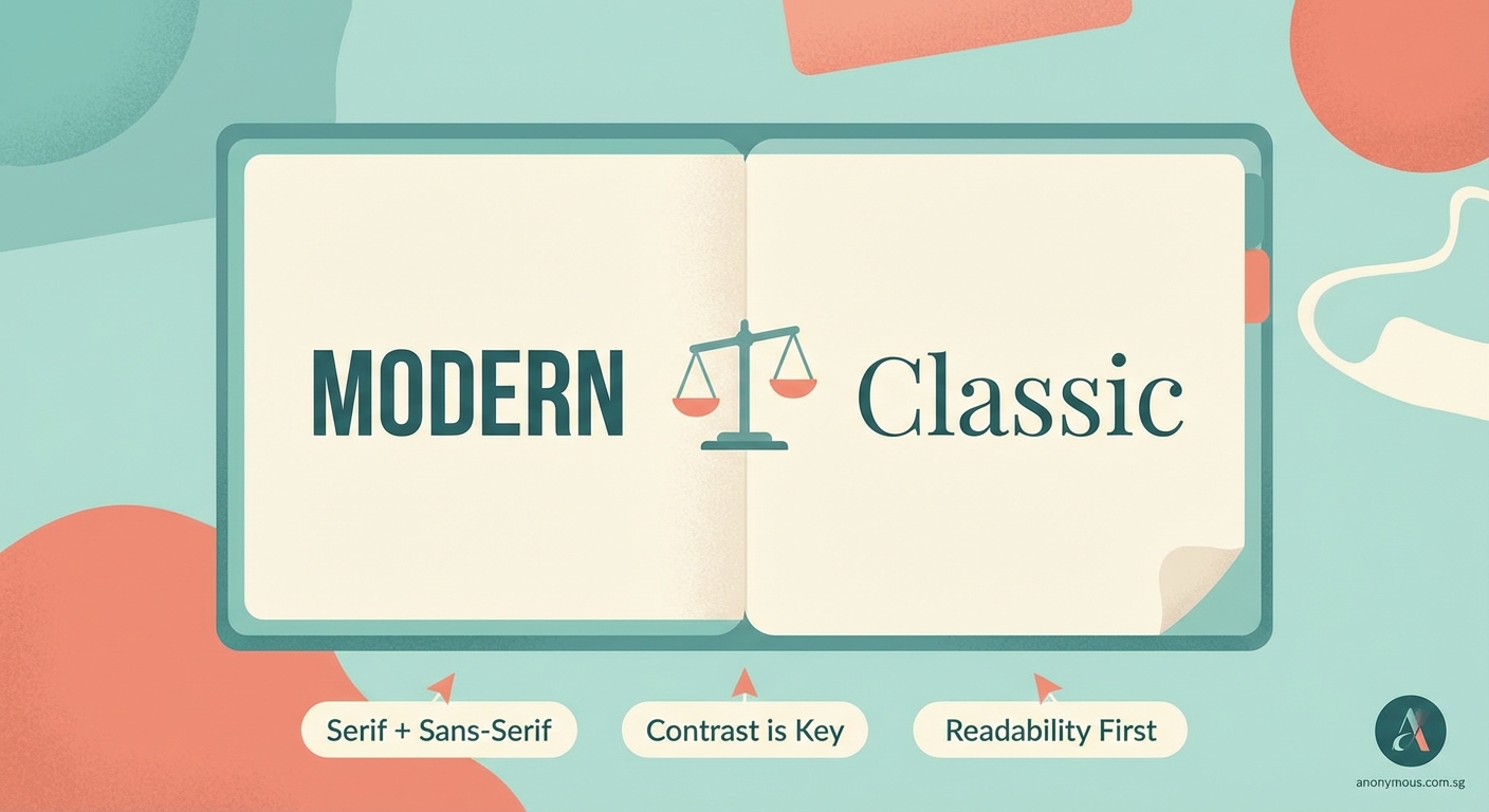
Successful font pairing for logo design relies on three core principles: contrast in style or weight, clear visual hierarchy, and shared characteristics like x-height or mood. Master these fundamentals, test combinations in context, and limit yourself to two or three typefaces maximum. Apply these rules consistently, and your logo typography will look polished and intentional every time you design.
Understanding why font pairing matters for logos
Logos live everywhere. Business cards, websites, billboards, app icons. Each context demands that your typefaces remain legible and recognizable.
Poor font combinations create visual noise. They confuse viewers about what to read first. They make brands look amateur or inconsistent.
Strong pairings do the opposite. They guide the eye. They reinforce brand personality. They make logos memorable without requiring extra decoration.
Typography carries emotional weight. A serif paired with a geometric sans can signal tradition meeting innovation. A script alongside a bold sans might communicate elegance with confidence. These combinations tell stories before anyone reads a single word.
The three principles that make fonts work together
Every successful pairing follows at least one of these rules. Often, they follow all three.
Contrast creates visual interest
Fonts need to look different enough that each serves a distinct purpose. Pairing two similar sans serifs usually creates confusion rather than harmony.
Effective contrast comes from:
- Serif versus sans serif
- Heavy weight versus light weight
- Condensed versus wide proportions
- Geometric versus humanist structures
- Upright versus italic angles
A bold slab serif for a company name paired with a light sans serif for a tagline creates instant hierarchy. The weights and categories differ enough that each element claims its own space.
Avoid pairing fonts that compete. Two decorative scripts fight for attention. Two medium-weight sans serifs blur together. The contrast must be obvious enough to feel intentional.
Hierarchy guides the viewer’s eye
Logos often contain multiple text elements. Company name, tagline, location, year established. Each piece needs a clear reading order.
Typography establishes this order through size, weight, and style. The primary typeface carries the brand name. The secondary typeface handles supporting information.
Your font pairing should make this distinction effortless. The viewer shouldn’t have to guess which text matters most.
Size differences help, but typeface choice amplifies the effect. A commanding display font for the main text paired with a neutral text font for details creates natural flow.
Shared characteristics create unity
Fonts that share certain traits feel related even when they contrast in other ways. This shared DNA keeps pairings cohesive.
Look for fonts that match in:
- X-height (the height of lowercase letters)
- Stroke contrast (thick versus thin parts of letters)
- Geometric proportions
- Historical period or style movement
- Overall mood or personality
A mid-century geometric sans pairs beautifully with a mid-century serif because they share the same design era. Their proportions and details echo each other even though one has serifs and one doesn’t.
This principle prevents pairings from feeling random. The fonts look like they belong to the same family, even when they come from different typeface designers.
A practical process for choosing font pairs
Stop opening your font menu and scrolling aimlessly. Follow these steps instead.
-
Define your brand personality in three adjectives. Professional, approachable, innovative. Bold, playful, trustworthy. Whatever fits your project.
-
Choose your primary font first. This typeface carries the brand name and does most of the heavy lifting. Pick something that embodies your core adjectives.
-
Test your primary font alone. Does it work at multiple sizes? Does it remain legible when reversed out of a background? Can it stand on its own if needed?
-
Select a contrasting secondary font. Use the contrast principle. If your primary is a bold serif, try a light sans. If your primary is geometric, try something humanist.
-
Check for shared characteristics. Do the x-heights align? Do the letterforms share similar proportions? Does the mood feel consistent?
-
Test the pairing in context. Set the actual logo text. View it at business card size and billboard size. Print it. Look at it on your phone. The pairing should work everywhere.
This process takes 20 minutes instead of two hours of random combinations. You make decisions based on principles instead of gut feelings.
Common pairing strategies that work
Certain combinations appear repeatedly in professional branding because they simply work. You don’t need to reinvent typography every time you design a logo.
“The best font pairings feel invisible. Viewers focus on the brand message, not the typeface choices. When typography does its job well, nobody notices the mechanics.” — Anonymous Designer
Here are reliable approaches:
Classic serif plus modern sans
A traditional serif like Garamond or Baskerville paired with a clean sans like Helvetica or Futura. This combination signals timeless quality with contemporary sensibility.
Geometric sans plus humanist sans
Two sans serifs can work if they differ enough in structure. A geometric like Gotham paired with a humanist like Gill Sans creates subtle contrast while maintaining a modern feel.
Slab serif plus light sans
Bold slab serifs like Rockwell or Archer command attention. Pair them with a thin sans serif for supporting text. The weight contrast does all the work.
Display font plus neutral text font
If you choose an ornate or distinctive display typeface for the brand name, pair it with the most neutral text font you can find. Let the display font shine without competition.
Same family, different weights
Many typeface families include both serif and sans versions, or offer extreme weight variations. Using fonts from the same family guarantees harmony because the designer built compatibility into the system.
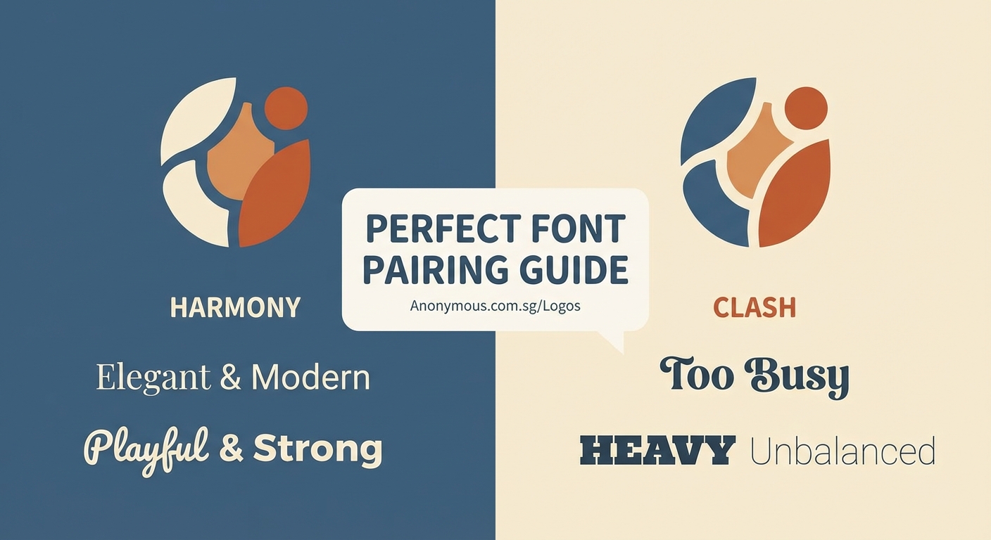
Mistakes that break font pairings
Knowing what to avoid saves as much time as knowing what to choose.
| Mistake | Why it fails | Better approach |
|---|---|---|
| Pairing two decorative fonts | Both demand attention; neither wins | Use one decorative, one neutral |
| Choosing fonts that are too similar | Creates confusion instead of hierarchy | Increase contrast in weight or style |
| Ignoring x-height differences | Text looks misaligned even when it isn’t | Match x-heights or adjust sizing |
| Using more than three typefaces | Looks chaotic and unplanned | Limit to two, maximum three fonts |
| Forgetting to test at small sizes | Pairings that work large fail small | Always test at business card scale |
| Picking fonts from different eras randomly | Creates visual dissonance | Choose fonts from the same period or intentionally mix for effect |
The three-font maximum rule deserves emphasis. Logos need simplicity. Every additional typeface fragments the visual identity and weakens brand recognition.
If you need a third font, make it a different weight or style from the same family as one of your first two choices. This adds variety without adding visual complexity.
Testing your pairings before finalizing
Theory only takes you so far. Real-world testing reveals whether your pairing actually works.
Print your logo at actual size. Business cards are typically 3.5 by 2 inches. Can you read both fonts clearly? Do they maintain their contrast?
View your logo on a phone screen. Mobile devices show logos at tiny dimensions. Thin fonts disappear. Intricate serifs turn muddy. Your pairing needs to survive extreme reduction.
Reverse your logo out of a dark background. White text on black reveals different problems than black on white. Some font pairings lose their distinction when reversed.
Show your logo to someone unfamiliar with the project. Ask them which text they read first. If they don’t naturally follow your intended hierarchy, your pairing needs adjustment.
Test your logo in motion. Websites animate. Social media auto-plays video. Your font pairing should remain recognizable even when viewers see it for half a second.
These tests catch problems before you deliver final files. They’re the difference between a pairing that looks good in your design software and one that works in the real world.
Adjusting spacing and sizing for better harmony
Font pairing isn’t just about choosing typefaces. How you set them matters just as much.
Letter spacing affects how fonts relate to each other. Tight tracking makes text feel dense and serious. Loose tracking creates breathing room and elegance.
When pairing a condensed font with a regular-width font, adjust letter spacing so the overall texture matches. The condensed font might need slightly looser tracking to balance against the wider font.
Size relationships create hierarchy. Your secondary font shouldn’t be 90% the size of your primary font. That’s too close. It should be notably smaller, maybe 50% to 70%, so the difference feels intentional.
Baseline alignment keeps pairings looking professional. When setting a brand name and tagline, align them carefully. Center alignment works for symmetrical logos. Left alignment works for wordmarks. Misaligned baselines look careless.
Line spacing matters when logos include multiple lines of text. Too tight, and the fonts crash into each other. Too loose, and they feel disconnected. Adjust leading until the spacing feels balanced.
Building a personal library of reliable pairs
You don’t need to solve font pairing from scratch every time you design. Build a collection of combinations you trust.
Start a document with screenshots of pairings you’ve used successfully. Note which fonts you combined and for what type of brand. Tag them by industry or personality.
Collect examples from brands you admire. Screenshot their logos. Identify the typefaces using font identification tools. Study why those particular combinations work.
Create templates with your favorite pairings already set up. When you start a new logo project, you can test your concept with proven combinations before exploring new options.
This library becomes a design asset. It speeds up your process. It gives you a foundation to build on rather than starting from zero every time.
Update your library as your taste evolves. Remove pairings that feel dated. Add new combinations as you discover them. Your library should grow with your skills.
Making font pairing feel natural
The best logo typography looks effortless. Viewers assume the fonts were always meant to go together.
That effortlessness comes from practice. The more pairings you create, the faster you recognize what works. You start to see patterns. You develop intuition.
But intuition still needs grounding in principles. Contrast, hierarchy, and shared characteristics aren’t rules to break once you’re experienced. They’re the foundation that makes intuition reliable.
Start with these fundamentals. Test combinations in real contexts. Build your library. Your font pairing skills will improve with every logo you design.
The next time you open that font menu, you won’t scroll aimlessly. You’ll know exactly what you’re looking for and why it will work.