You’ve spent hours perfecting your design. Colors are balanced. Typography is crisp. Layout is flawless. Then the printed piece arrives and it feels… wrong. The paper is too flimsy for your premium branding. Or too thick for your mailer. Or the finish makes your photos look muddy. Paper stock can make or break a print project, yet it’s often the last decision designers make.
Choosing the right paper stock means matching weight, finish, and texture to your project’s purpose and budget. Business cards need heavier stock (300+ gsm), brochures work best on coated paper for vibrant images, and letterheads require uncoated stock for easy writing. Understanding these fundamentals helps you avoid costly reprints and ensures your design translates beautifully from screen to print.
Understanding paper weight and thickness
Paper weight confuses people because different regions use different measurement systems. In the US, you’ll see pounds (lb). In Singapore and most of the world, you’ll see grams per square meter (gsm).
Here’s what matters: higher numbers mean thicker, heavier paper.
A standard office printer paper is 80 gsm or 20 lb. That’s your baseline. Anything below feels cheap. Anything significantly above costs more but communicates quality.
For most projects, you want paper that feels substantial without becoming impractical. A flimsy business card gets tossed. A brochure too thick to fold properly frustrates readers.
| Project Type | Recommended Weight | Why It Works |
|---|---|---|
| Business cards | 300-400 gsm | Feels premium, resists bending in wallets |
| Flyers | 130-170 gsm | Affordable, easy to distribute, sturdy enough |
| Brochures | 150-200 gsm | Folds cleanly, feels quality without bulk |
| Posters | 150-200 gsm | Hangs well, resists curling |
| Letterheads | 100-120 gsm | Prints easily, feels professional, works with printers |
| Magazines | 90-130 gsm | Keeps page count manageable, turns easily |
The weight you choose directly affects postage costs too. If you’re printing 5,000 direct mail pieces, the difference between 130 gsm and 170 gsm can add hundreds to your shipping budget.
Coated versus uncoated finishes
This decision changes how your design looks and feels in someone’s hands.
Coated paper has a layer applied to the surface. This makes it smoother and helps ink sit on top rather than absorb into the fibers. Photos look sharper. Colors appear more saturated. The finish can be glossy, silk, or matte.
Uncoated paper has no surface treatment. It feels more natural and textured. Ink absorbs into the fibers, creating a softer, warmer look. It’s easier to write on, which matters for forms, notepads, and letterheads.
Glossy coated paper reflects light. It makes images pop with vibrant colors and high contrast. Use it for product catalogs, photo books, and anything where visual impact matters most. The downside? Glare under certain lighting and fingerprints show easily.
Matte coated paper offers the color vibrancy of coating without the shine. It feels more sophisticated and reduces glare. Perfect for annual reports, high-end brochures, and portfolios where you want rich images but a refined feel.
Silk or satin finishes sit between glossy and matte. They provide good color reproduction with a subtle sheen. Many designers prefer this middle ground for versatile marketing materials.
Uncoated paper works beautifully for projects where readability and writability matter. Novels, workbooks, stationery, and anything requiring a natural, tactile experience. The tradeoff is that photos won’t have the same punch as on coated stock.
If your design includes both text-heavy sections and photography, consider a coated stock with a matte or silk finish. You get good image quality without sacrificing readability or creating too much glare.
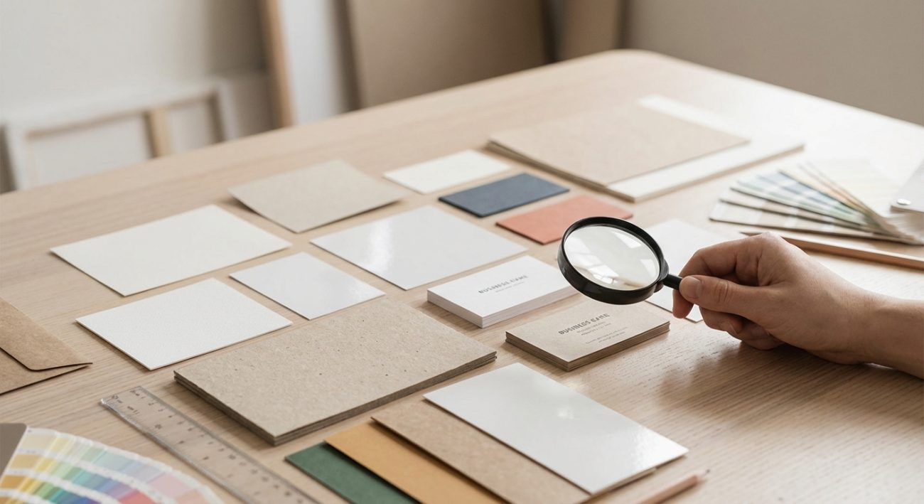
Matching texture to brand personality
Texture communicates before anyone reads a word. Smooth, coated stocks feel modern and polished. Textured, uncoated stocks feel organic and authentic.
Think about what you want people to feel when they touch your printed piece.
A tech startup might choose ultra-smooth, bright white coated stock to convey innovation and precision. A craft brewery might select a rough, uncoated kraft paper to emphasize authenticity and handmade quality. A luxury brand might use cotton or linen textured paper to signal exclusivity.
Common texture options include:
- Smooth: Clean, modern, professional. Works for corporate materials and tech brands.
- Laid: Subtle horizontal lines visible when held to light. Classic, elegant, often used for stationery.
- Linen: Fabric-like texture. Sophisticated, traditional, popular for invitations and certificates.
- Felt: Soft, slightly fuzzy surface. Warm and approachable, good for nonprofits and community organizations.
- Vellum: Slightly toothy surface. Versatile and professional without being too formal.
- Kraft: Rough, brown, recycled look. Eco-friendly, rustic, authentic.
Your texture choice should align with decisions you’ve already made about typography and color. Just as you would choose the perfect font for your brand identity to match your brand personality, paper texture reinforces those same values.
The step-by-step selection process
Here’s how to choose paper stock for printing without getting overwhelmed:
-
Define your project’s purpose. Is this a throwaway flyer or a keepsake invitation? A quick reference guide or a coffee table book? Purpose determines budget and durability requirements.
-
Consider your audience. Corporate executives expect different tactile experiences than college students. Parents of young children need different durability than art collectors.
-
Review your design elements. Photo-heavy designs need coated stock. Text-heavy designs work better uncoated. Designs with large solid color areas may show imperfections more on textured stock.
-
Set your budget. Premium stocks can cost three to five times more than standard options. Multiply that by your print quantity and factor in shipping weight.
-
Request sample packs. Most printers offer sample kits showing their available stocks. Touch them. Write on them. Hold them up to light. This beats guessing from online descriptions.
-
Test print if possible. For large runs or critical projects, print a small batch on your chosen stock first. Colors can shift between different papers.
-
Confirm with your printer. Not all stocks work with all printing methods. Digital presses handle different weights than offset presses. Make sure your printer can run your chosen stock.
Common mistakes and how to avoid them
| Mistake | Why It Happens | How to Fix It |
|---|---|---|
| Choosing stock before finalizing design | Designers pick paper they like without considering design needs | Design first, then select stock that enhances those specific elements |
| Ignoring end use | Focusing only on appearance without thinking about function | Ask how the piece will be used, stored, and handled |
| Skipping samples | Relying on online descriptions or previous experience with similar names | Always request physical samples for important projects |
| Forgetting about finishing | Not considering how coating affects folding, scoring, or binding | Discuss finishing requirements with your printer before selecting stock |
| Overlooking environmental impact | Not asking about recycled content or sustainable sourcing | Request FSC-certified or recycled options if sustainability matters to your brand |
| Mismatching weight to quantity | Choosing heavy stock for high-volume mailings | Calculate total weight and postage before committing to stock |
Many of these mistakes stem from the same root cause as typography mistakes that make your designs look unprofessional. They happen when designers focus on individual elements without considering the complete user experience.
Special stocks for specific applications
Beyond standard coated and uncoated options, specialty stocks solve specific design challenges.
Synthetic papers resist water, tearing, and chemicals. They’re perfect for outdoor signage, maps, menus, and anything exposed to harsh conditions. They cost more but last significantly longer.
Recycled stocks vary widely in quality. Some look and feel identical to virgin paper. Others have visible flecks and a grayer tone. Check the post-consumer waste percentage if environmental credentials matter.
Metallic papers have embedded metallic particles that create shimmer. They work beautifully for invitations and premium packaging but require careful color management since the base affects how inks appear.
Textured art papers include options like watercolor paper, canvas, and handmade sheets. These make statements but have limitations for detailed graphics and small text.
Carbonless papers allow multi-part forms without messy carbon sheets. Essential for invoices, receipts, and order forms where copies matter.
Security papers include features like watermarks, security fibers, or heat-sensitive elements. Necessary for certificates, tickets, and documents where forgery prevention matters.
How printing method affects paper choice
Your printing method limits your paper options more than you might expect.
Digital printing works with a wide range of weights but performs best on smoother stocks. Very textured papers can cause toner adhesion problems. Most digital presses handle 80-350 gsm comfortably.
Offset printing handles the widest range of stocks, from very thin (45 gsm) to very thick (600 gsm). It works beautifully on textured stocks and delivers the most accurate color reproduction.
Screen printing works on almost anything, including very heavy boards, fabrics, and plastics. It’s ideal when you need to print on unusual substrates.
Letterpress requires soft, thick stocks that can accept the impression. Cotton or soft uncoated papers work best. Standard coated stocks don’t show the debossed effect well.
Before you finalize your stock choice, confirm compatibility with your chosen printing method. This is as critical as making sure you set up print files that won’t get rejected by printers.
Balancing quality and budget
Premium paper stocks can consume 30-50% of your total print budget. That’s not always justified.
For short-lived materials like event flyers or sale announcements, mid-range stocks make more sense than premium options. Save your budget for pieces with longer shelf lives.
For brand-building materials like business cards, presentation folders, and product brochures, invest in better stock. These pieces represent your brand repeatedly over time.
Consider hybrid approaches. Print your main brochure on premium stock but use standard stock for supplementary inserts. Use premium business cards for principals but good-quality standard stock for general staff.
Buy in larger quantities when possible. The price per unit drops significantly at higher volumes. If you’ll need business cards over the next year, printing 2,000 at once costs less per card than printing 500 four times.
Testing before committing to large runs
Never print 10,000 pieces without testing first.
Order a small proof run on your selected stock. Check these elements:
- Color accuracy: Does your brand color match your expectations? Some stocks shift colors slightly.
- Image quality: Do photos look sharp? Are gradients smooth?
- Readability: Is body text easy to read? Are reversed-out elements clear?
- Folding and scoring: If your piece folds, does it crease cleanly or crack?
- Overall feel: Does it communicate what you want when someone holds it?
This small investment prevents expensive mistakes. Reprinting 10,000 brochures because the paper feels cheap costs far more than a 50-piece test run.
Creating consistency across your brand materials
Different projects need different stocks, but your brand should feel cohesive.
Document your paper choices in your brand style guide that actually gets used. Specify exact stock names, weights, and finishes for each application.
For example:
– Business cards: 350 gsm silk coated
– Letterhead: 120 gsm uncoated white
– Brochures: 170 gsm matte coated
– Folders: 300 gsm uncoated with matte lamination
This prevents the common problem where different team members or vendors choose slightly different stocks, creating a disjointed brand experience.
Environmental considerations matter
Sustainable paper choices increasingly matter to clients and customers.
Look for these certifications:
– FSC (Forest Stewardship Council): Paper from responsibly managed forests
– PEFC (Programme for the Endorsement of Forest Certification): Similar to FSC with different standards
– PCW (Post-Consumer Waste): Percentage of recycled content from used products
Higher recycled content doesn’t always mean lower quality. Many recycled stocks now match virgin paper in brightness, smoothness, and printability.
Consider the full lifecycle. A slightly heavier stock that lasts longer might be more sustainable than a lighter stock that gets replaced frequently.
Making your final decision
You’ve learned the fundamentals. You understand weights, finishes, and textures. You know how to match stock to purpose.
Now make your decision with confidence.
Start with samples. Request them from your printer or paper suppliers. Touch different options. Compare them side by side. Imagine your design on each one.
Consult with your printer. They’ve seen thousands of projects and know which stocks work best for different applications. They can warn you about potential problems before you commit.
Trust your instincts. If a stock feels right in your hands and aligns with your budget, it’s probably the right choice.
Paper stock isn’t just a technical specification. It’s part of your design. It affects how people perceive your message before they read a single word. Choose thoughtfully, and your printed pieces will communicate exactly what you intend.