Your customer sees your Instagram post in the morning, visits your website at lunch, and receives your email newsletter in the evening. If each feels like it came from a different company, you’ve got a problem.
Brand consistency isn’t about being boring. It’s about being recognizable. When someone can spot your brand in two seconds flat, whether they’re scrolling social media or walking past your storefront, you’ve done something right.
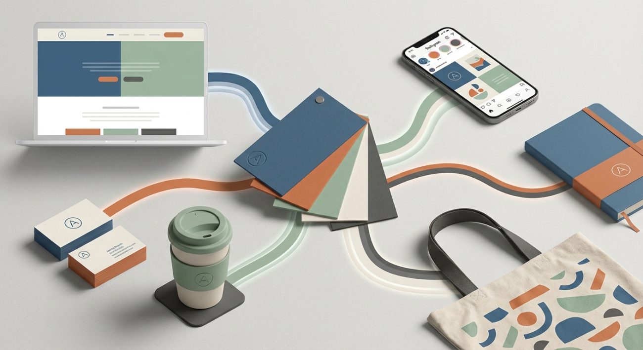
Creating a cohesive brand across touchpoints means maintaining consistent visual elements, messaging, and personality everywhere customers interact with you. This builds recognition, trust, and professionalism. Start by documenting your core brand elements, then systematically apply them to each customer interaction point, from your website to packaging to social media.
Why Brand Cohesion Actually Matters
Think about the brands you trust most. Apple. Nike. Your favorite local coffee shop.
They all look and feel the same everywhere you encounter them.
That consistency creates familiarity. Familiarity builds trust. Trust drives sales.
When your brand looks different across platforms, customers get confused. Confused customers don’t convert. They bounce to competitors who seem more put together.
A study by Lucidpress found that consistent branding increases revenue by up to 23%. That’s not because consistency is magic. It’s because customers remember you, recognize you, and feel confident buying from you.
Map Every Place Your Brand Shows Up
Before you can make everything consistent, you need to know where everything lives.
Start by listing every single touchpoint where customers encounter your brand:
- Your website and landing pages
- Social media profiles (Instagram, Facebook, LinkedIn, TikTok)
- Email newsletters and automated sequences
- Business cards and printed materials
- Packaging and product inserts
- Physical storefronts or pop-up displays
- Online ads and sponsored content
- Customer service interactions (chat, phone, email)
- Invoices and receipts
- Presentation decks and proposals
Don’t skip the small stuff. Your email signature counts. Your Zoom background counts. The hold music on your phone line counts.
Every interaction is a chance to reinforce who you are or accidentally confuse people.
Build Your Brand Foundation First
You can’t create consistency without knowing what you’re being consistent about.
Your brand foundation includes these core elements:
Visual identity: Logo variations, color palette, typography system, photography style, graphic elements, and spacing rules.
Voice and tone: How you sound in writing. Are you formal or casual? Funny or serious? Technical or accessible?
Brand values: What you stand for. What you won’t compromise on. What makes you different from competitors.
Key messages: Your tagline, value proposition, and the three things you want every customer to remember about you.
Document all of this in one place. A brand style guide makes this easy to reference and share with team members or contractors.
The Step-by-Step Process for Brand Consistency
Here’s how to systematically roll out cohesive branding across all your touchpoints.
1. Audit Your Current State
Take screenshots of everything. Your website homepage. Your last five Instagram posts. Your email template. Your business card.
Put them all in one document or folder.
Look at them side by side. Be honest about what you see.
Do they look like they came from the same company? Would a stranger know they’re related?
Note every inconsistency:
– Different logo versions or colors
– Mismatched fonts
– Varying photo styles
– Conflicting tone in copy
– Different design treatments
This audit shows you exactly where the gaps are.
2. Prioritize High-Impact Touchpoints
You can’t fix everything at once. Start where it matters most.
Prioritize touchpoints based on two factors: how many people see them and how important they are to conversions.
Your website homepage gets priority over your fax cover sheet (if you even still use fax).
Your Instagram feed matters more than your LinkedIn banner if that’s where your customers actually hang out.
Focus on the touchpoints that generate the most customer interactions first.
3. Create Templates for Repeating Formats
Every time you design something from scratch, you risk inconsistency.
Templates solve this problem.
Build reusable templates for:
– Social media posts (feed posts, stories, reels covers)
– Email newsletters
– Presentation decks
– Printed materials (flyers, brochures, business cards)
– Website page layouts
– Proposal documents
Your templates should lock in fonts, colors, logo placement, and spacing. Leave room for custom content, but make the structure consistent.
Tools like Canva, Figma, or Adobe Express make template creation accessible even if you’re not a designer. You can also find template alternatives that give you a head start.
4. Establish Visual Rules
Create clear guidelines for how visual elements work together.
Color usage: Define primary colors (used most often), secondary colors (for accents), and neutral colors (for backgrounds and text). Specify when to use each.
If you haven’t chosen your palette yet, learn how to choose brand colors that actually work for your audience.
Typography hierarchy: Choose one or two font families. Assign specific fonts to specific uses (headings, body text, captions). Set size and weight rules.
Avoid common typography mistakes that make your brand look amateur.
Logo variations: Create versions for different contexts (full color, white, black, horizontal, stacked). Specify minimum sizes and clear space requirements.
Poor logo execution can undermine your entire brand. Watch out for logo design mistakes that damage credibility.
Photography style: Decide on filters, lighting, composition, and subject matter. Bright and airy? Dark and moody? Candid or staged?
5. Write Voice and Tone Guidelines
Visual consistency matters, but so does how you sound.
Your Instagram captions, website copy, and customer service emails should all feel like they come from the same personality.
Define your voice with specific descriptors:
– We are: conversational, helpful, confident
– We are not: stuffy, condescending, overly technical
Then give examples. Show what good copy looks like versus what doesn’t fit your brand.
Include a banned words list. If you never want to sound corporate, ban phrases like “synergy” and “best in class.”
6. Set Up Approval Workflows
Even with perfect templates and guidelines, humans make mistakes.
Create a simple approval process before anything goes public.
For small teams, this might just be a second pair of eyes checking that fonts and colors match your brand.
For larger teams, you might need formal review stages with specific people responsible for brand compliance.
The goal isn’t bureaucracy. It’s catching inconsistencies before your customers do.
Common Touchpoint Mistakes and How to Fix Them
| Mistake | Why It Happens | How to Fix It |
|---|---|---|
| Different logo colors across platforms | RGB vs CMYK vs hex color confusion | Document exact color codes for digital (hex), print (CMYK), and screen (RGB) |
| Inconsistent social media post designs | Creating each post from scratch | Build 5-10 post templates and rotate them |
| Website doesn’t match print materials | Different designers or eras | Redesign older materials to match your current brand |
| Email signatures vary by team member | No standard template provided | Create one approved signature and distribute it |
| Packaging looks nothing like digital brand | Outsourced to different vendor | Share brand guidelines with all vendors and suppliers |
Make Your Brand Memorable Through Consistency
Psychology plays a huge role in brand recognition.
The mere exposure effect means people prefer things they’ve seen before. Consistency gives them more chances to see and remember your brand elements.
What makes a brand memorable often comes down to repetition with variation. You repeat core elements (colors, fonts, style) but vary the content and context.
This creates pattern recognition in your customer’s brain. They start to associate certain colors, shapes, or styles with you automatically.
That’s when brand equity kicks in. Your visual identity becomes valuable on its own, separate from your product or service.
Maintaining Consistency as You Grow
Brand cohesion gets harder as your team expands.
More people creating content means more chances for inconsistency.
Here’s how to scale without losing control:
Centralize brand assets: Keep all logos, fonts, templates, and guidelines in one shared location. Google Drive, Dropbox, or dedicated brand management platforms all work.
Onboard every new team member: Make brand training part of your onboarding process. Show them where to find assets and how to use them.
Regular brand audits: Every quarter, review your touchpoints again. Look for drift. Correct it before it spreads.
Update guidelines as you evolve: Your brand will change over time. That’s fine. Just document the changes and roll them out everywhere at once.
Special Considerations for Different Touchpoints
Some touchpoints have unique constraints that make consistency tricky.
Print materials: Colors look different on screen versus paper. Always request physical proofs before large print runs. Learn how to set up print files properly to avoid surprises.
Social media platforms: Each platform has different image dimensions and technical requirements. Create platform-specific templates that maintain your brand within those constraints.
For Instagram specifically, designing carousel posts requires balancing platform best practices with brand consistency.
Digital interfaces: If you have an app or web-based tool, essential UI components need to follow your brand while also meeting usability standards.
Physical spaces: Storefronts, trade show booths, and office spaces are touchpoints too. Use your brand colors in paint, furniture, and signage.
When to Break Your Own Rules
Consistency matters, but so does context.
There are times when strict adherence to brand guidelines makes you look tone-deaf.
If you’re posting about a serious industry issue, your usual playful tone might not fit.
If you’re collaborating with another brand, you might need to blend visual styles.
If a platform has technical limitations, you might need to adapt your templates.
The key is intentional deviation, not accidental inconsistency.
Know your rules well enough to know when breaking them serves a purpose.
“Consistency is not about rigidity. It’s about creating a recognizable thread that runs through everything you do, even when the context changes.” – Marty Neumeier, brand strategist
Measuring Brand Cohesion Success
How do you know if your consistency efforts are working?
Track these indicators:
Brand recall: Ask customers how they found you. If they say “I recognized your style,” you’re doing it right.
Time to recognition: How long does it take someone to identify your content as yours? Test this by showing people your posts without logos or names.
Customer trust scores: Survey customers about how professional and trustworthy your brand feels. Consistency should improve these scores over time.
Conversion rates: As brand recognition improves, conversion rates typically increase. Track this across touchpoints.
Team compliance: What percentage of created content follows brand guidelines on the first try? This should increase as templates and training improve.
Your Brand Touchpoint Checklist
Use this checklist to ensure you’ve covered all the bases:
- [ ] Documented core brand elements (colors, fonts, logo, voice)
- [ ] Mapped all customer touchpoints
- [ ] Audited current state for inconsistencies
- [ ] Created templates for repeating formats
- [ ] Established visual and verbal guidelines
- [ ] Set up centralized asset storage
- [ ] Implemented approval workflows
- [ ] Trained team members on brand standards
- [ ] Scheduled regular brand audits
- [ ] Updated all high-priority touchpoints
Building Recognition One Touchpoint at a Time
Creating a cohesive brand doesn’t happen overnight.
Start with your most visible touchpoints. Get those right. Then move to the next tier.
Every time you align another customer interaction with your brand standards, you’re building recognition. You’re making it easier for people to remember you, trust you, and choose you.
The investment you make in consistency today pays dividends for years. Because once people recognize your brand instantly, you’ve created something valuable that competitors can’t easily copy.
Your brand becomes shorthand for quality, reliability, and everything you stand for. That’s worth the effort of making sure your Instagram posts match your business cards.