Your feed is packed with hundreds of posts competing for attention. Most get ignored in under half a second. The difference between content that gets scrolled past and content that stops thumbs mid-swipe comes down to a few simple principles that anyone can master.
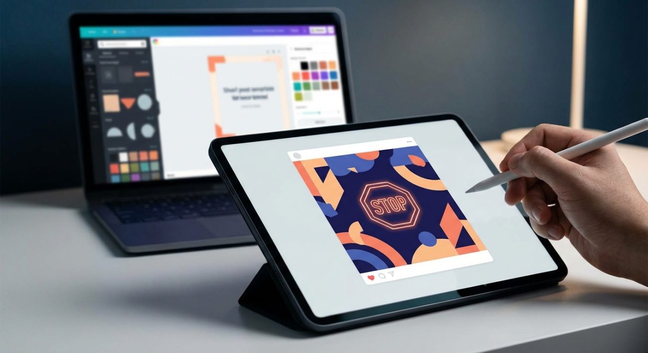
Creating scroll stopping social media content doesn’t require design school or expensive software. Focus on strong visual contrast, clear focal points, strategic color use, and emotion-driven messaging. Apply the three-second rule: if your message isn’t clear in three seconds, simplify it. Use consistent brand elements, test different formats, and analyze what resonates with your audience. These practical techniques work across all platforms and skill levels.
Understanding what makes people stop scrolling
People scroll social media on autopilot. Their brains filter out anything that looks like generic content or advertising.
You need to interrupt that pattern.
The human eye naturally gravitates toward faces, unexpected shapes, high contrast, and movement. Your content needs at least one of these elements to register in someone’s peripheral vision.
Research shows users spend an average of 1.7 seconds looking at a social media post. That’s your window.
Your content must communicate value instantly. No buildup. No mystery that requires reading three paragraphs to understand.
Think about the last post that made you stop. It probably surprised you, made you feel something, or promised information you wanted right away.
The three-second clarity test
Before you publish anything, show it to someone for three seconds. Then hide it.
Ask them what they remember.
If they can’t tell you the main point, your content fails the test. Simplify until the message is obvious at a glance.
This applies to every format:
– Static images need one clear focal point
– Videos need hooks in the first frame
– Carousels need compelling first slides
– Text posts need powerful opening lines
Most creators pack too much into one post. They want to say everything at once.
Resist that urge.
One post, one message. Make it impossible to misunderstand.
Visual hierarchy that guides the eye
Your content needs a clear path for the eye to follow. Start with the most important element and build from there.
Use size to show importance. The biggest element gets seen first. Make your main message or key visual the largest thing in the frame.
Contrast creates separation. Light text on dark backgrounds or dark text on light backgrounds. Avoid medium gray on slightly darker gray.
White space gives eyes a place to rest. Cramming every pixel with content makes everything harder to process. Empty space actually increases comprehension.
Alignment creates order. Line up elements along invisible grids. Random placement looks amateurish and confuses viewers.
Color psychology that triggers responses
Different colors create different emotional responses. Use this intentionally.
Red signals urgency, excitement, or warning. It raises heart rate slightly. Use it for calls to action or limited-time offers.
Blue builds trust and calm. Most corporate brands use blue for this reason. It works for professional services and financial content.
Yellow grabs attention and suggests optimism. It’s hard to ignore but can feel overwhelming if overused.
Green represents growth, health, or environmental themes. It feels natural and reassuring.
Black and white create sophistication and clarity. High contrast makes text readable and designs feel premium.
How to choose brand colors that actually convert customers can help you build a consistent palette that supports your message.
Don’t use more than three main colors per post. More than that creates visual chaos.
Typography that people actually read
Font choice affects readability more than most people realize.
Sans-serif fonts (without the little feet on letters) work better on screens. They stay clear even when viewed on small devices.
Serif fonts (with decorative feet) can work for headlines but avoid them for body text on social media.
Font size matters enormously. If someone needs to zoom in to read your text, you’ve already lost them.
Minimum readable sizes:
– Instagram posts: 30pt for body text
– Facebook graphics: 24pt minimum
– LinkedIn images: 28pt or larger
– Twitter/X images: 32pt for key text
Line spacing affects comprehension. Cramped lines blur together. Add 1.5x spacing between lines for easy reading.
7 typography mistakes that make your designs look unprofessional covers common errors that hurt readability.
The power of faces and human elements
Posts with human faces get 38% more engagement than posts without them.
Our brains are wired to notice faces. We can’t help it.
Use real photos of real people when possible. Stock photos with obviously fake smiles get ignored. Authentic expressions create connection.
Eye direction matters. If the person in your image looks at the camera, viewers feel addressed directly. If they look at your text or product, viewers follow their gaze.
Emotions are contagious. A genuinely happy face makes viewers feel happier. An intrigued expression makes them curious.
Even simple illustrations of faces work better than abstract shapes or objects alone.
Strategic use of negative space
Empty space isn’t wasted space. It’s a design tool.
Negative space around your main element makes it stand out. Think of it as a spotlight effect.
Compare these approaches:
| Crowded Design | Spacious Design |
|---|---|
| Every corner filled | Breathing room around elements |
| Multiple competing focal points | One clear subject |
| Eye doesn’t know where to look | Attention flows naturally |
| Feels overwhelming | Feels premium |
| Message gets lost | Message stands out |
Professional designs often use 30-40% negative space. That might feel like too much at first, but it works.
Creating pattern interrupts in feeds
Your content appears in a stream of similar-looking posts. You need to break the pattern.
If everyone posts square images, try vertical. If feeds are full of photos, post bold text on colored backgrounds. If video dominates, a striking still image stands out.
Pattern interrupts include:
– Unusual aspect ratios
– Unexpected color combinations
– Contrarian statements
– Questions that challenge assumptions
– Formats different from your usual posts
Don’t be different just for the sake of it. The interruption should serve your message.
The hook, value, action framework
Every piece of content needs three components working together.
- Hook (first 0.5 seconds): Stops the scroll with visual or emotional appeal
- Value (next 2 seconds): Delivers the promised information or emotion
- Action (final element): Tells viewers what to do next
Most creators focus only on the hook. They create clickbait that disappoints.
The value section must deliver on the hook’s promise. If your hook asks a question, answer it. If it promises a tip, provide it.
The action can be subtle. It might be “save this post” or “tag someone who needs this” or “follow for more.”
Make the action easy and relevant to the content.
Consistency builds recognition
Your audience should recognize your content before reading your username.
This doesn’t mean every post looks identical. It means they share recognizable elements.
Consistent elements might include:
– Color palette (2-3 main colors)
– Font choices (1-2 typefaces)
– Layout style (grid structure or free-form)
– Logo placement
– Filter or editing style
– Content format mix
How to build a brand style guide that actually gets used helps you document these choices so you can maintain consistency.
Consistency builds trust. When people see your content repeatedly and it always delivers value, they stop scrolling automatically when they see your style.
Testing what actually works
Assumptions about what will perform well are often wrong. Test everything.
Create two versions of the same post with one variable changed. Different headlines, different images, different colors.
Post them at different times or to different audience segments. Track which performs better.
Variables worth testing:
– Text overlay vs. no text
– Photos vs. graphics
– Questions vs. statements
– Warm colors vs. cool colors
– Close-ups vs. wide shots
Most social platforms provide analytics showing which posts get the most saves, shares, and engagement time (not just likes).
Saves indicate value. People want to reference your content later.
Shares indicate resonance. Your content expressed something they wanted to tell others.
Time spent shows genuine interest. Someone actually consumed your content instead of just tapping like and moving on.
Double down on what works. Stop doing what doesn’t.
Platform-specific optimization
Each platform has different user behavior and technical requirements.
Instagram users expect polished visuals. They scroll fast and respond to aesthetics. Use 4:5 ratio for feed posts to take up maximum screen space.
Facebook users engage more with authentic, personal content. They’ll read longer captions. Use 1200 x 630px for optimal display.
LinkedIn audiences want professional value. They respond to insights and business lessons. Use 1200 x 627px for articles and 1080 x 1080px for standard posts.
Twitter/X moves incredibly fast. Bold, simple graphics with minimal text work best. Use 1600 x 900px for maximum impact.
TikTok and Reels demand vertical video (9:16). The first frame needs to hook immediately because users swipe away in milliseconds.
Pinterest users actively search for ideas. Use tall vertical images (1000 x 1500px) with clear text describing the content.
How to design eye-catching Instagram carousel posts that stop the scroll provides specific tactics for one of the highest-engagement formats.
Simple tools that deliver professional results
You don’t need Photoshop or a design degree.
Canva offers templates and drag-and-drop editing. The free version handles most needs. The pro version adds brand kit features and more templates.
Adobe Express provides similar functionality with Adobe’s design DNA. Good for quick graphics and video clips.
Figma works well for those who want more control. It has a steeper learning curve but offers professional capabilities for free.
Remove.bg strips backgrounds from photos instantly. Useful for product shots or creating layered designs.
Unsplash and Pexels provide free high-quality photos. Always check licenses, but most allow commercial use.
Coolors.co generates color palettes. Put in one color you like and it suggests complementary options.
The tool matters less than understanding design principles. A skilled creator makes better content in Canva than an amateur makes in Photoshop.
Common mistakes that kill engagement
Even good content fails when these errors creep in.
Too much text: If your image is mostly words, it’s not a graphic. It’s a document. Social media users won’t read paragraphs on images.
Low contrast: Text that’s hard to read gets ignored. Always test readability by viewing your content at thumbnail size.
Unclear purpose: If viewers can’t tell within three seconds what your post is about, they’ll keep scrolling.
Inconsistent branding: Random styles make you look unprofessional and prevent recognition.
Ignoring mobile: Over 80% of social media use happens on phones. If your content only looks good on desktop, it fails for most viewers.
Following trends blindly: Jumping on every trend makes you look desperate. Only use trends that align with your message and audience.
Forgetting accessibility: Add alt text to images. Use sufficient color contrast. Make sure your message works even without sound on videos.
Measuring real impact
Vanity metrics feel good but don’t always indicate success.
Likes are easy to get but don’t mean much. Someone double-tapping while scrolling isn’t engaged.
Comments show deeper engagement. People took time to respond. Read them to understand what resonates.
Saves indicate your content has lasting value. This metric often correlates with actual business results.
Click-throughs matter if your goal is traffic. Track whether people actually visit your website or landing page.
Follower growth rate shows whether your content attracts new audience members. Slow, steady growth from quality content beats viral spikes that don’t stick.
Conversion tracking connects social content to business outcomes. Use UTM parameters and platform pixels to see which posts lead to sales or sign-ups.
“The best social media content doesn’t just stop the scroll. It starts conversations, builds relationships, and creates genuine value for your audience. Focus on serving them, and the engagement follows naturally.”
Making your content work harder
Repurpose successful content across platforms and formats.
A popular Instagram post can become a Pinterest pin, a LinkedIn article excerpt, a Twitter thread, and a blog post expansion.
Create content banks. When you make one piece of content, create variations at the same time. Different headlines, different crops, different color schemes.
Build templates for recurring content types. Birthday announcements, product launches, testimonials, tips. Having a template makes creation faster and maintains consistency.
Batch create when possible. Set aside time to create multiple posts at once. You’ll work more efficiently and maintain better style consistency.
Schedule posts in advance but stay flexible. Leave room for real-time content and trending topics.
Archive your best-performing content. Revisit it every few months to understand what worked and why.
Creating content that converts scrollers into followers
Stopping the scroll is just the first step. You want people to follow you for more.
Every post should give viewers a reason to see more from you. This might be:
– Promising similar valuable content regularly
– Teasing upcoming posts or series
– Showing personality that people want to engage with
– Demonstrating expertise worth following
– Creating curiosity about what you’ll share next
Your profile needs to deliver on the promise your content makes. If someone clicks through after seeing a great post, your bio and feed should reinforce that they’ll get more of what attracted them.
Pin your best content to your profile. Make it easy for new visitors to see your strongest work immediately.
Putting it all together
Creating scroll stopping social media content comes down to respecting your audience’s time and attention.
Make your message clear instantly. Use visual hierarchy to guide the eye. Choose colors intentionally. Keep designs simple and uncluttered. Test what works for your specific audience. Stay consistent so people recognize your content.
Start with one platform and master it before spreading yourself thin. Create a small library of templates that reflect your brand. Spend more time on strategy and less time reinventing the wheel for every post.
The goal isn’t to trick people into stopping. It’s to create content valuable enough that stopping benefits them. Do that consistently, and you’ll build an audience that actively looks for your posts instead of scrolling past them.