
Reading text on a screen shouldn’t feel like work. Yet most websites and apps make users strain to understand their content. Poor font choices, cramped spacing, and weak contrast turn simple reading into a frustrating experience that drives people away.
Good readability isn’t about making text bigger. It’s about creating a visual system where every element works together to help users consume information effortlessly.
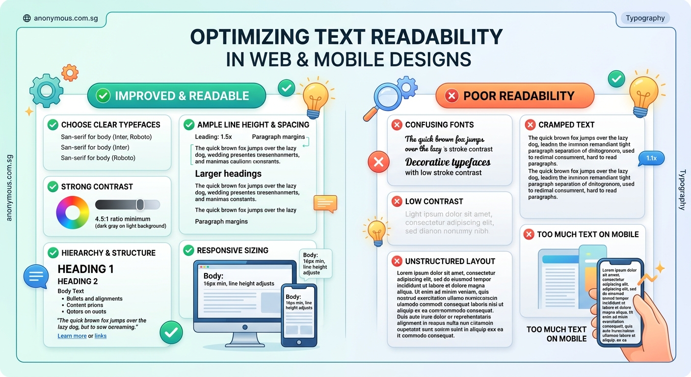
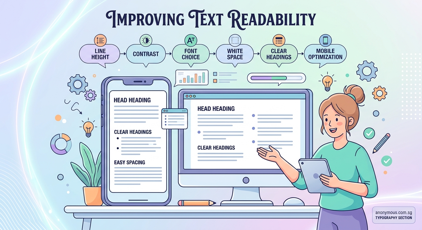
Text readability depends on five core elements: font selection, size and scale, line spacing, color contrast, and visual hierarchy. Master these fundamentals and your designs will immediately feel more professional and accessible. Users will read more, understand faster, and engage longer with your content. These principles apply equally to websites, mobile apps, and any digital interface where text appears.
Choose fonts designed for screen reading
Not all typefaces work well on digital screens. Fonts designed for print often fail when rendered at small sizes on varying pixel densities.
Sans-serif fonts typically perform better for body text on screens. Their clean letterforms remain legible even at smaller sizes. Fonts like Inter, Roboto, and Open Sans were specifically designed for digital interfaces.
Serif fonts can work beautifully for headlines and larger text. They add personality and help break up visual monotony. But reserve them for sizes above 18px where their details remain clear.
Avoid decorative or script fonts for body text entirely. They sacrifice legibility for style. Save these for short headlines or accent text where users only need to read a few words.
Test your font choices on actual devices. What looks crisp on your desktop monitor might blur on older phones or low-resolution screens.
Set appropriate font sizes for different contexts
Font size directly impacts how easily users can read your content. Too small and people strain. Too large and text becomes overwhelming.
Body text should never fall below 16px on web or mobile. Studies consistently show that smaller sizes slow reading speed and increase eye fatigue. Many designers now use 18px or 20px as their baseline for improved comfort.
Create a clear size hierarchy:
- Body text: 16-20px
- Small text (captions, labels): 14-16px
- H3 subheadings: 20-24px
- H2 headings: 28-36px
- H1 titles: 40-60px
Mobile interfaces need special attention. Fingers are less precise than mouse cursors. Touch targets should be at least 44px tall, which means button text needs sufficient size to remain readable within that space.
Consider your audience. Older users benefit from slightly larger default sizes. Educational content for children needs even larger text with generous spacing.
The what is font hierarchy and why does it matter for readability guide offers deeper strategies for building effective size systems.
Master line spacing for comfortable reading
Line height (also called leading) controls the vertical space between lines of text. Get this wrong and even beautiful typography becomes difficult to read.
The default line height in most design tools is too tight for comfortable reading. A good starting point is 1.5 times your font size. For 16px text, use 24px line height.
Longer lines need more spacing. When text stretches across wide screens, increase line height to 1.6 or even 1.7. This prevents users’ eyes from losing their place when jumping to the next line.
Shorter lines can use tighter spacing. Mobile interfaces with narrow columns work well at 1.4 line height because the eye travels less distance.
Headlines need less space than body text. Large headings at 1.2 or 1.3 line height create visual impact without feeling cramped.
Here’s a practical comparison:
| Text Type | Font Size | Recommended Line Height | Ratio |
|---|---|---|---|
| Body text (desktop) | 18px | 28-30px | 1.5-1.6 |
| Body text (mobile) | 16px | 24px | 1.5 |
| Long-form articles | 20px | 34px | 1.7 |
| Captions | 14px | 20px | 1.4 |
| Headings | 36px | 44px | 1.2 |
Optimize line length for reading flow
Line length (measure) affects how easily users can track from one line to the next. Too long and eyes get lost. Too short and reading feels choppy.
The ideal line length contains 50-75 characters including spaces. This range allows comfortable eye movement without excessive head turning or frequent line breaks.
On desktop screens, limit text columns to around 600-700px wide. This naturally creates appropriate line lengths for most font sizes.
Mobile screens automatically constrain line length, but watch for very wide phones in landscape mode. Consider adding maximum width constraints to prevent text from stretching too far.
Multi-column layouts need careful planning. Each column should maintain appropriate line length. Don’t just split existing paragraphs into narrow columns that force users to jump between sections constantly.
“The single most important typography decision you can make is line length. Get that right and everything else becomes easier. Get it wrong and no amount of font tweaking will save your design.” – Matthew Butterick, Typography for Lawyers
Create sufficient color contrast
Low contrast is one of the most common readability problems. Text that looks fine to you might be invisible to users with visual impairments or those reading in bright sunlight.
WCAG (Web Content Accessibility Guidelines) provides clear standards. Normal text needs a contrast ratio of at least 4.5:1 against its background. Large text (18px bold or 24px regular) needs 3:1 minimum.
Pure black on pure white (#000000 on #FFFFFF) provides maximum contrast but can feel harsh. Many designers prefer softer combinations like dark gray on off-white (#333333 on #FAFAFA) which still meet accessibility standards while feeling more comfortable.
Colored text requires extra attention. Light blue on white rarely provides sufficient contrast. Test every color combination with a contrast checker before finalizing your palette.
The what is color contrast and why does it make or break your designs article explains how to build accessible color systems from the start.
Never rely on color alone to convey information. Users with color blindness need alternative cues like icons, underlines, or text labels.
Build clear visual hierarchy
Visual hierarchy guides users through your content in order of importance. Without it, everything competes for attention equally and nothing stands out.
Follow these steps to create effective hierarchy:
- Identify the most important information users need first
- Make that element largest or boldest
- Create distinct size differences between hierarchy levels (at least 2-4px jumps)
- Use weight variations (regular, medium, bold) to add depth
- Test by squinting at your design to see what stands out
Size isn’t the only hierarchy tool. Weight, color, and spacing all contribute. A medium-weight heading in a bright accent color can command more attention than a larger heading in gray.
Consistency matters more than specific sizes. Users learn your system as they scroll. When H2 headings suddenly change size or style, it breaks their mental model and creates confusion.
Establish your hierarchy rules early and document them in a style guide. This ensures consistency across pages and makes collaboration easier when multiple designers work on the same project.
Adjust spacing between elements
White space (negative space) gives text room to breathe. Cramped layouts make reading exhausting even when individual typography choices are correct.
Paragraph spacing should be larger than line height. If your line height is 28px, set paragraph spacing to 32-40px. This creates clear visual breaks that help users process information in chunks.
Margins around text blocks prevent content from touching screen edges. Mobile designs need at least 16-20px side margins. Desktop layouts can use more generous spacing.
Section spacing should be significantly larger than paragraph spacing. When transitioning from one topic to another, add 60-80px of vertical space to signal the shift.
Buttons and interactive elements need breathing room too. Place at least 24px of space above and below buttons to prevent accidental taps and improve visual clarity.
The understanding white space in ui design for beginners resource shows how professional designers use spacing strategically.
Optimize for mobile screens
Mobile readability faces unique challenges. Smaller screens, varying pixel densities, and outdoor lighting conditions all affect legibility.
Increase base font size on mobile. What works at 16px on desktop should probably be 17-18px on phones. The extra size compensates for smaller physical screen dimensions.
Avoid justified text alignment on mobile. The narrow columns create awkward spacing gaps that disrupt reading flow. Stick with left-aligned text for body content.
Break long paragraphs into shorter chunks. Mobile users scroll quickly and scan aggressively. Paragraphs longer than 3-4 lines feel intimidating on small screens.
Test in actual lighting conditions. Take your phone outside and review your designs in bright sunlight. Text that looks fine indoors often disappears in harsh light.
Consider thumb zones when placing text near interactive elements. Users shouldn’t accidentally tap buttons while trying to select or highlight text.
The mobile first ui design practical guide for small screens covers additional mobile-specific considerations.
Handle responsive typography properly
Text needs to adapt smoothly across screen sizes. Static font sizes that work on desktop often fail on mobile or tablets.
Use relative units like rem or em instead of fixed pixels. This allows text to scale based on user preferences and device settings. Someone who increases their system font size for accessibility will see your text scale appropriately.
Implement fluid typography with CSS clamp() or viewport units. This creates smooth size transitions as screens resize rather than abrupt jumps at breakpoints.
Set minimum and maximum sizes to prevent extremes. Text shouldn’t shrink below readable sizes on small screens or grow comically large on wide monitors.
Test at multiple viewport widths, not just common breakpoints. Tablets, folding phones, and browser windows at odd sizes all need consideration.
Adjust line height and spacing along with font size. Larger text at wider viewports needs proportionally more line spacing to maintain readability.
Avoid common typography mistakes
Even experienced designers make predictable errors that harm readability. Watch for these issues:
Using too many fonts. Stick to one or two font families maximum. More creates visual chaos and slows page load times.
Insufficient contrast in dark mode. Light text on dark backgrounds needs careful attention. Pure white on pure black can create halation effects. Use slightly dimmed whites (#E0E0E0) on slightly lifted blacks (#1A1A1A).
Ignoring accessibility standards. Meeting WCAG guidelines isn’t optional. Inaccessible text excludes real users and can create legal liability.
Inconsistent hierarchy. When similar elements use different styles across pages, users can’t build mental models. Document your typography system and follow it religiously.
Overlooking font loading. Web fonts that load slowly create jarring layout shifts. Use font-display: swap and consider system font stacks as fallbacks.
The 7 typography mistakes that make your designs look unprofessional article identifies additional pitfalls to avoid.
Test readability with real users
Your own assessment isn’t enough. What feels readable to you might not work for your actual audience.
Conduct simple readability tests:
- Ask users to read a paragraph aloud and time how long it takes
- Have them identify specific information within body text
- Request feedback about comfort level after reading several screens
- Test with users wearing glasses, in bright light, or on older devices
Use analytics to identify problem areas. High bounce rates on text-heavy pages might indicate readability issues. Short time-on-page despite long content suggests users can’t engage with your text.
A/B test typography changes when possible. Try different font sizes, line heights, or color combinations and measure which version keeps users engaged longer.
Accessibility testing tools catch technical issues but can’t evaluate subjective comfort. Combine automated checks with real human feedback for complete assessment.
Document your typography system
Once you establish working typography rules, document them so everyone on your team can maintain consistency.
Create a typography scale that lists all text styles with their properties:
- Style name (H1, Body, Caption, etc.)
- Font family
- Font size (with responsive values)
- Font weight
- Line height
- Letter spacing
- Color values
Include usage guidelines. Explain when to use each style and provide examples of correct application.
The how to build a brand style guide that actually gets used guide shows how to create documentation that teams will actually reference.
Build component libraries in your design tools. Figma, Sketch, and Adobe XD all support text styles that propagate updates across files. When you refine your typography, changes cascade automatically.
Share your system with developers. Provide CSS variables or design tokens that translate your decisions into code. This prevents the disconnect between design files and production.
Making text readable is making design usable
Readability isn’t a bonus feature you add after finishing visual design. It’s the foundation that makes everything else work.
Start your next project by establishing typography rules first. Choose your fonts, set your sizes, and test your contrast before adding colors, images, or complex layouts. This approach ensures readability stays central rather than becoming an afterthought you try to fix later.
Users won’t notice great typography. They’ll simply read more, understand better, and accomplish their goals faster. That’s exactly the point.