
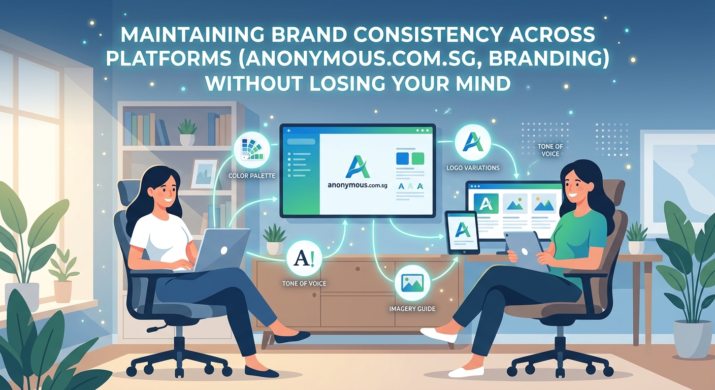
Your Instagram looks polished. Your website feels professional. But your LinkedIn header uses the wrong logo, and your email newsletter has three different font choices. Sound familiar?
Brand inconsistency happens when you’re juggling too many platforms with too little time. One team member posts from their phone. Another uses last year’s color palette. Someone else grabs a random template and calls it good enough.
The result? Your audience sees a fragmented identity that erodes trust.
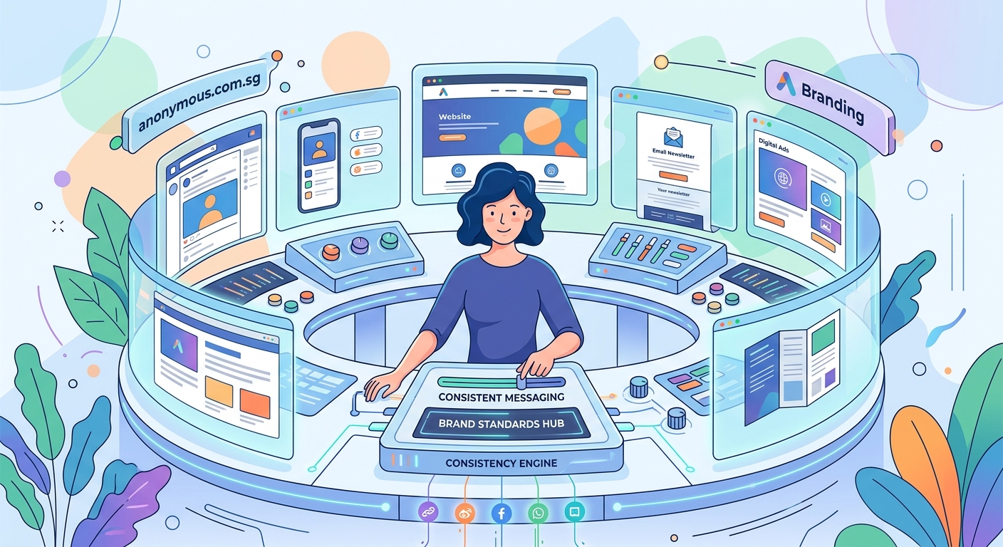
Maintaining brand consistency across platforms requires three core elements: a centralized asset library, clear usage guidelines, and simple approval workflows. This approach eliminates guesswork, reduces design time by up to 70%, and ensures every touchpoint reinforces your brand identity. The secret isn’t perfection, it’s creating systems that make consistency the easiest option for everyone on your team.
Why brand consistency breaks down across platforms
Every platform has different technical requirements. Instagram needs square images. LinkedIn prefers horizontal banners. Email headers demand specific pixel dimensions.
Most teams adapt by creating custom designs for each channel. That works until someone uses the wrong shade of blue. Or picks a font that’s not in your brand guidelines. Or exports a logo at 72 DPI when it needs to be 300.
The problem isn’t laziness. It’s lack of systems.
When your brand assets live in seven different folders, three Google Drives, and someone’s personal Dropbox, inconsistency becomes inevitable. Team members can’t find the right files. They don’t know which version is current. They make their best guess and move on.
Here’s what typically goes wrong:
- Logo files scattered across devices with unclear naming conventions
- Color codes saved in random documents instead of one source of truth
- Font files missing from team computers, forcing substitutions
- Outdated templates still circulating from last year’s rebrand
- No clear process for who approves what before it goes live
Build a single source of truth for all brand assets
Centralization solves 80% of consistency problems.
Create one location where every approved asset lives. Not scattered files. Not multiple versions. One organized library that everyone can access.
Here’s how to structure it:
- Set up a shared cloud folder with clear naming conventions
- Create subfolders for logos, fonts, color palettes, templates, and guidelines
- Include multiple file formats for each asset (PNG, SVG, PDF, etc.)
- Add a README file explaining what each folder contains
- Remove all outdated files immediately after any rebrand or update
Name your files descriptively. Instead of “logo_final_v3.png,” use “CompanyName_Logo_Primary_FullColor_RGB.png.” This tells anyone exactly what they’re looking at.
Store color codes in multiple formats. Include HEX for web, RGB for screens, CMYK for print, and Pantone for professional printing. When someone needs your brand blue, they shouldn’t have to convert it themselves.
Font management matters more than most teams realize. If you’re using custom typography for your brand identity, make sure licensed font files are available to everyone who needs them. Include web font links, desktop installation files, and backup Google Font alternatives.
Create platform-specific templates that lock in your brand
Templates remove decision fatigue.
Instead of designing from scratch every time, your team grabs a pre-approved template and swaps in new content. The fonts stay consistent. The colors remain on-brand. The spacing follows your visual system.
Build templates for your most common use cases:
- Social media posts (Instagram, Facebook, LinkedIn, Twitter)
- Email newsletters and promotional campaigns
- Presentation decks for sales and pitches
- Print materials like business cards and flyers
- Website graphics and blog featured images
Each template should include locked elements that can’t be accidentally changed. In Canva, you can lock layers. In Adobe products, use template files with protected layers. In Google Slides, set master slide layouts.
The goal is making it harder to break your brand guidelines than to follow them.
Include usage notes directly in your template files. Add a text box explaining which fonts to use, where logos can be placed, and what colors are approved. When someone opens the file six months from now, they shouldn’t need to hunt for instructions.
Building templates that people actually use requires understanding your team’s workflow. If they work primarily on mobile, create mobile-friendly templates. If they batch content on Fridays, build templates that make batch creation easy.
Document your brand guidelines in a way people will actually reference
A 47-page brand book gathering dust helps no one.
Your guidelines need to be accessible, scannable, and practical. Think less corporate manual, more visual reference guide.
Here’s what to include:
| Element | What to Document | Why It Matters |
|---|---|---|
| Logo usage | Minimum sizes, clear space, incorrect uses | Prevents stretched, pixelated, or poorly placed logos |
| Color palette | Primary, secondary, accent colors with all code formats | Ensures exact color matches across all materials |
| Typography | Font families, sizes, weights, hierarchy rules | Maintains readable, professional text treatment |
| Photography style | Tone, composition, filters, subject matter | Creates cohesive visual storytelling |
| Voice and tone | Word choices, sentence structure, brand personality | Keeps messaging consistent across writers |
| Spacing rules | Margins, padding, layout grids | Prevents cramped or unbalanced designs |
Keep it visual. Show examples of correct usage alongside common mistakes. A side-by-side comparison teaches faster than paragraphs of explanation.
Make it searchable. If your guidelines live in a PDF, add bookmarks and a table of contents. Better yet, create a simple website or Notion page where team members can search for specific answers.
A brand style guide that actually gets used focuses on the questions your team asks most often. If everyone keeps asking about logo placement, lead with that. If color confusion causes the most errors, make your palette the most prominent section.
“The best brand guidelines are the ones your team doesn’t need to reference because the systems make consistency automatic.” — Sarah Chen, Brand Strategist
Set up approval workflows that catch mistakes before they go live
Even with perfect templates and clear guidelines, mistakes happen.
An approval process creates a safety net. Someone reviews posts, emails, and graphics before they reach your audience. This person checks for brand consistency, not just typos.
Keep the process simple:
- Creator makes content using approved templates
- Creator submits for review through designated channel (Slack, email, project management tool)
- Brand guardian reviews within 24 hours
- Approved content gets published; rejected content gets specific feedback
- Common mistakes get added to guidelines to prevent future issues
Don’t create bottlenecks. If every Instagram caption needs three levels of approval, your team will find workarounds. Match your approval intensity to the platform’s permanence and reach.
A LinkedIn post seen by 200 people needs less scrutiny than a billboard seen by 200,000. An Instagram Story that disappears in 24 hours requires lighter review than a website homepage that stays live for months.
Assign clear roles. One person shouldn’t approve everything unless your team is tiny. Distribute responsibility based on expertise. Your designer reviews visual consistency. Your copywriter checks voice and tone. Your marketing manager handles strategy alignment.
Audit your existing platforms for consistency gaps
You can’t fix what you haven’t identified.
Schedule a quarterly brand audit where you review every active platform. Take screenshots. Compare them side by side. Look for variations in logos, colors, fonts, imagery, and messaging.
Common inconsistencies to check:
- Logo versions (Are some platforms using an outdated logo?)
- Color accuracy (Is your brand blue the same shade everywhere?)
- Font choices (Are all platforms using approved typefaces?)
- Image style (Do photos and graphics feel cohesive?)
- Bio and description language (Is your value proposition consistent?)
- Profile and cover images (Are dimensions optimized and on-brand?)
Create a simple spreadsheet tracking each platform and its compliance with your brand standards. Rate each element as compliant, needs minor fixes, or needs major overhaul.
Running a thorough brand audit reveals patterns. Maybe your team consistently struggles with LinkedIn because the dimensions are tricky. Maybe Instagram Stories always use off-brand fonts because the mobile app makes it hard to upload custom fonts.
These patterns tell you where to focus your systems improvements.
Batch create content to maintain visual cohesion
Consistency improves when you create multiple pieces in one sitting.
Your design choices stay fresh in your mind. You’re working with the same color palette, the same fonts, the same templates. The result naturally feels more cohesive than content created sporadically over weeks.
Set aside dedicated time for content creation. Maybe it’s Friday afternoons. Maybe it’s the first Monday of each month. The schedule matters less than the consistency.
During these sessions:
- Open all relevant templates at once
- Keep your brand guidelines visible on a second screen
- Use the same asset library for all pieces
- Export everything in the correct formats for each platform
- Review the full batch for visual consistency before scheduling
This approach works especially well for social media. Creating a month of social graphics in one session ensures your feed looks intentionally curated rather than randomly assembled.
Batching also reveals repetition before it becomes a problem. When you see twelve posts side by side, you’ll notice if you’ve used the same background color too many times or if your layouts lack variety within your brand system.
Train your team on brand standards and platform requirements
Your brand guidelines only work if people know they exist.
New team members need onboarding. Existing team members need refreshers. Freelancers and contractors need clear instructions before they create anything.
Create a simple onboarding checklist:
- Tour of brand asset library and how to access it
- Review of brand guidelines with emphasis on most common mistakes
- Walkthrough of template library and how to use each type
- Explanation of approval workflow and who to contact with questions
- Practice exercise creating one piece of content with feedback
Make brand training part of every new hire’s first week. Don’t assume they’ll figure it out by observing. Explicit instruction prevents expensive mistakes.
For existing team members, share monthly tips highlighting one aspect of your brand standards. Maybe March focuses on logo usage. April covers color application. May addresses typography hierarchy.
These bite-sized reminders keep brand consistency top of mind without requiring everyone to reread 40 pages of guidelines.
Use tools that enforce consistency automatically
The right tools make brand compliance effortless.
Brand management platforms like Brandfolder, Frontify, or Canva for Teams centralize assets and enforce usage rules. They prevent people from using outdated logos or wrong color codes because those options simply aren’t available.
Look for tools that:
- Store all brand assets in one searchable location
- Control access so only approved files are available
- Track usage across platforms and campaigns
- Update globally when you change a brand element
- Integrate with the design tools your team already uses
If enterprise solutions exceed your budget, simpler alternatives work too. A well-organized Google Drive with view-only permissions prevents accidental changes. Canva Brand Kit locks in your colors, fonts, and logos for all team members.
Understanding which design tools fit your workflow helps you choose solutions your team will actually adopt. The fanciest platform means nothing if everyone ignores it because it’s too complicated.
Handle platform limitations without compromising your brand
Some platforms restrict what you can do. Instagram Stories limits font choices. LinkedIn compresses images. Email clients strip custom fonts.
You can’t control these limitations. You can control how you adapt.
For font restrictions, establish fallback hierarchies. If your primary brand font isn’t available, which system font comes closest? Document this in your guidelines so everyone makes the same substitution.
For image compression, export at higher quality than you think necessary. Platforms will compress anyway. Starting with a crisp image means the compressed version still looks good.
For color accuracy, test how your brand colors appear on each platform. Some platforms shift hues slightly. If your brand blue looks purple on Instagram, adjust your export settings or choose a different shade from your extended palette.
Creating a color palette that works across both print and digital prevents these problems before they start. Build flexibility into your brand system rather than fighting against platform constraints.
Monitor consistency metrics that actually matter
What gets measured gets managed.
Track metrics that reveal consistency problems:
- Brand asset download frequency (Are people using the central library?)
- Template usage rates (Are templates being adopted or ignored?)
- Approval turnaround time (Are reviews creating bottlenecks?)
- Revision requests per piece (How often does content need brand corrections?)
- Platform audit scores (Is consistency improving or declining?)
Review these metrics quarterly. Look for trends. If template usage drops, ask why. Maybe they’re outdated. Maybe they don’t match current needs. Maybe people don’t know they exist.
If revision requests spike, dig deeper. Are guidelines unclear? Do templates need better instructions? Is training inadequate?
Metrics guide your improvements. They show where systems are working and where they need adjustment.
Plan for brand evolution without losing consistency
Brands change. You’ll update colors. Refresh your logo. Adopt new typography.
The key is managing these changes systematically across all platforms simultaneously.
When you rebrand:
- Update all files in your central asset library first
- Archive old assets in a clearly labeled “Deprecated” folder
- Update all templates with new brand elements
- Revise guidelines to reflect changes
- Create a platform-by-platform rollout checklist
- Set a deadline for completing updates across all channels
- Audit two weeks after rollout to catch any missed updates
Don’t let old and new brand elements coexist indefinitely. Set a firm cutoff date. After that date, the old logo shouldn’t appear anywhere.
Knowing when your brand needs a refresh helps you plan transitions strategically rather than making reactive changes that create temporary inconsistency.
Your brand deserves better than chaos
Brand consistency across multiple platforms isn’t about perfection. It’s about systems.
When your assets are organized, your guidelines are clear, and your workflows prevent mistakes, consistency becomes the default. Your team spends less time hunting for files and more time creating content that actually serves your audience.
Start small. Pick your three most important platforms. Get those perfectly aligned. Then expand to the next three. Within a quarter, you’ll have transformed a chaotic brand presence into a cohesive identity that builds trust with every interaction.
The tools exist. The templates are buildable. The systems are learnable. What you need now is commitment to implementation. Your brand consistency challenge isn’t permanent. It’s just a problem you haven’t systematized yet.