You’ve designed the perfect flyer. The colors pop, the layout sings, and your client loves it. Then the printer rejects your file. Again. Maybe it’s the wrong color mode, missing bleed, or a resolution issue you didn’t catch. Each rejection costs time, money, and credibility.
Print ready files need specific technical setup to pass printer requirements. You must use CMYK color mode, include 3mm bleed, maintain 300 DPI resolution, convert text to outlines, and save in PDF/X-1a or PDF/X-4 format. Getting these elements right the first time prevents rejection, saves money, and protects your professional reputation with clients and print vendors.
Understanding what makes a file print ready
A print ready file meets all technical specifications that commercial printers require to produce your design without modifications. These aren’t arbitrary rules. Printers need consistent standards because their machines cut, fold, and bind thousands of pieces per hour. One wrong setting can ruin an entire print run.
Most rejection emails mention the same handful of problems. Wrong color space tops the list, followed by insufficient resolution and missing bleed areas. Each mistake forces the printer to stop, contact you, wait for corrections, and restart the job. That delay affects their schedule and your deadline.
Professional printers use industrial equipment that differs dramatically from desktop printers. Your home inkjet might forgive a 150 DPI image or RGB colors. Commercial offset presses and digital production machines will not. They follow strict technical parameters, and your files must match those parameters exactly.
Setting up your document dimensions correctly
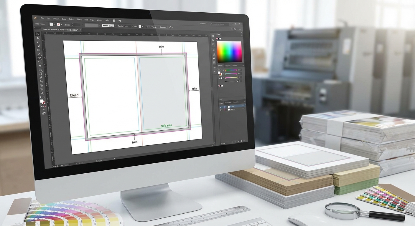
Start with the finished size your piece needs to be after trimming. If you want a 4×6 inch postcard, that’s your trim size. But you can’t design to exactly 4×6 inches. You need to add bleed.
Bleed is extra image area that extends beyond your trim line. Standard bleed measures 3mm (approximately 0.125 inches) on all sides. So that 4×6 inch postcard actually needs a document size of 4.25×6.25 inches when you include bleed.
Here’s why bleed matters. Industrial cutting machines slice through hundreds of sheets at once. Even with precision equipment, tiny variations happen. If your background color stops exactly at the trim line, any slight cutting variation leaves an ugly white edge. Bleed ensures that colors and images extend past the cut line, so minor shifts stay invisible.
Your software should show three zones:
- Bleed area: Where background colors and images extend
- Trim line: Where the cutter will slice
- Safe area: Where you keep text and logos (at least 3mm inside the trim line)
Most designers make this mistake: they place important text or logos right at the edge. Then cutting variations slice off part of a letter or crop a logo awkwardly. Keep all critical elements at least 3mm inside your trim line.
Choosing the right color mode for printing
Screens emit light. Paper reflects light. This fundamental difference explains why you must convert files from RGB to CMYK before sending them to a printer.
RGB (Red, Green, Blue) works for screens. Monitors create colors by mixing light. CMYK (Cyan, Magenta, Yellow, Black) works for print. Printers create colors by mixing ink on paper.
Many vibrant colors you see on screen simply cannot be reproduced with CMYK inks. That electric blue or neon green will shift to duller versions when printed. If you design in RGB and let the printer convert to CMYK, you lose control over how those colors shift.
Convert to CMYK early in your design process. Yes, the colors will look less vibrant on your screen. That’s accurate. What you see in CMYK mode closely matches what will come off the press.
Always design in CMYK from the start if the final output is print. Converting at the end often reveals colors that fall outside the printable gamut, forcing last minute design changes that could have been avoided.
Check your black text carefully. Pure black in CMYK is C:0 M:0 Y:0 K:100. Some designers accidentally create “rich black” (like C:60 M:40 Y:40 K:100) for body text. Rich black looks great for large areas, but small text printed with four ink colors can look blurry because of registration issues. Use pure black for text smaller than 24 points.
Nailing resolution and image quality
Resolution measures how many pixels fit into one inch. Print requires 300 pixels per inch (PPI) at the final output size. Not 72 PPI like web images. Not 150 PPI. Exactly 300 PPI or higher.
Here’s how to check if your image has enough resolution:
- Open the image in your editing software
- Look at the pixel dimensions (for example, 3000×2000 pixels)
- Divide each dimension by 300
- The result shows the maximum print size at 300 PPI
A 3000×2000 pixel image can print at 10×6.67 inches at 300 PPI. Try to print it larger, and the resolution drops below 300 PPI. The result looks pixelated or blurry.
Placing a low resolution image and scaling it up in your layout software does not add resolution. The printer sees the original low resolution file. If you start with a 1000×667 pixel image (which prints at 3.33×2.22 inches), scaling it to 10 inches wide in your layout gives you roughly 100 PPI. That will get rejected.
| Image Source | Typical Resolution | Print Quality |
|---|---|---|
| Professional photos | 300 PPI or higher | Excellent |
| Stock photos (high res) | 300 PPI | Excellent |
| Website downloads | 72 PPI | Poor, will be rejected |
| Screenshots | 72-150 PPI | Poor, will be rejected |
| Phone photos (modern) | 300+ PPI possible | Good if not cropped heavily |
Vector graphics (logos, icons, illustrations created in vector software) don’t have resolution limits. They scale infinitely without quality loss. That’s why printers prefer vector logos over rasterized versions.
Converting fonts to outlines
Your beautiful custom font looks perfect on your screen. You send the file to the printer. They open it, and the font is missing. The software substitutes a default font, ruining your design.
This happens because printers don’t have every font installed. Even if you tell them which fonts you used, license restrictions often prevent sharing font files.
The solution: convert text to outlines (also called converting to paths or curves). This transforms letters from editable text into vector shapes. The printer no longer needs the font file because the letter shapes are embedded as graphics.
Most design software has this option:
– Adobe Illustrator: Select text, then Type > Create Outlines
– Adobe InDesign: Select text, then Type > Create Outlines
– CorelDRAW: Select text, then Object > Convert to Curves
Before converting, save a copy of your original file with editable text. Once converted to outlines, you can’t edit the spelling or change fonts. You’ll need that original if the client requests text changes.
Small text (under 8 points) sometimes looks slightly different after outline conversion. Check carefully at 100% zoom. For body copy or large text blocks, consider embedding fonts in your PDF instead of outlining. Most modern PDF formats support font embedding.
Selecting the correct file format
PDF format is the industry standard for print files. But not just any PDF. You need a specific PDF standard designed for commercial printing.
PDF/X-1a is the most widely accepted format. This standard was created specifically for print production. It requires CMYK colors, embeds all fonts, and includes bleed information. Most importantly, it prevents RGB colors and transparency issues that cause printing problems.
PDF/X-4 is a newer standard that supports transparency and layers while maintaining print reliability. If your design uses transparency effects (drop shadows, opacity changes, blend modes), PDF/X-4 handles them better than PDF/X-1a.
When exporting your PDF, use these settings:
- Standard: PDF/X-1a:2001 or PDF/X-4
- Color conversion: Convert to CMYK
- Bleed: 3mm on all sides
- Marks and bleeds: Include crop marks (optional, check with your printer)
- Compression: Maximum quality for images
Never send these formats for commercial printing:
– PNG, JPG, or other image formats (unless specifically requested)
– Microsoft Word or PowerPoint files
– Editable design files without a PDF backup
– PDFs saved from web browsers
Some printers accept native files (like .AI or .INDD) but they’ll still want a reference PDF showing how the final piece should look. The PDF serves as a proof, ensuring both you and the printer see the same design.
Running preflight checks before sending
Preflight is the process of checking your file for common problems before sending it to print. Professional design software includes built in preflight tools.
Adobe InDesign has a preflight panel that constantly monitors your document. It flags issues like:
- Missing or low resolution images
- RGB colors in a CMYK document
- Overset text (text that doesn’t fit its frame)
- Missing fonts
- Elements outside the bleed area
Adobe Acrobat Pro can check PDFs after export. Open your PDF, go to Print Production > Preflight, and select a profile like “Digital printing” or “PDF/X-1a compliance.” The tool will list every problem it finds.
Many online printing services provide their own preflight tools. Upload your PDF and their system automatically checks for common issues. This catches problems before you submit the order, saving time and preventing rejection.
Create a personal preflight checklist:
- All images are CMYK and 300 PPI or higher
- Bleed extends 3mm beyond trim on all sides
- Important elements stay 3mm inside the trim line
- All fonts are outlined or embedded
- File is saved as PDF/X-1a or PDF/X-4
- Black text uses pure black (K:100) not rich black
- No RGB colors anywhere in the document
- File name clearly indicates version and date
Communicating with your printer
Different printers have different requirements. Always request a specifications sheet before starting your design. This document tells you exactly what that specific printer needs.
Specifications sheets typically include:
- Accepted file formats
- Required color mode
- Minimum and maximum resolution
- Bleed requirements
- Safe area margins
- Preferred fonts handling (outlined or embedded)
- Maximum file size
- Delivery method (upload, email, physical media)
If something in the specs confuses you, call and ask. Printers would rather answer questions upfront than deal with rejected files later. They want your job to succeed as much as you do.
Submit a test file for your first job with a new printer. Send your PDF a day or two before the final deadline. Ask them to check it and confirm everything looks correct. This trial run catches issues while you still have time to fix them.
Keep a paper proof or PDF proof from the printer before they run the full job. This proof shows exactly how your file will print, including colors, crops, and any potential issues. Approving a proof protects both you and the printer. If something prints wrong after you approved an accurate proof, that’s on you. If the printed piece doesn’t match the approved proof, the printer needs to rerun it.
Handling special finishes and effects
Special finishes like foil stamping, embossing, spot UV, or die cutting require additional file preparation. These effects need separate layers or files showing exactly where the special treatment goes.
For spot UV (a glossy coating applied to specific areas), you typically provide:
- Your main print file with all the regular design elements
- A separate spot UV file showing only the areas that get the coating (usually as solid black shapes)
Foil stamping works similarly. The foil file shows where metallic foil gets applied. This file needs to be vector based, not raster, because the stamping die is created from your vector artwork.
Die cutting (custom shapes instead of standard rectangles) requires a die line. This is a vector path showing exactly where the cutting blade should go. Use a specific spot color (often called “CutContour” or similar) so the printer can easily identify the cut path.
Printers provide templates for special finishes. Use their template as a starting point. It ensures your design aligns correctly with their production process.
Testing before committing to large runs
Never print 5,000 pieces without testing first. Order a small proof run or use the printer’s proofing service.
Digital proofs are PDFs or online previews. They show layout, text, and approximate colors. They’re better than nothing but can’t show exact color matching or paper texture.
Physical proofs are actual printed samples on the same paper stock and printing process you’ll use for the final run. They cost more but show exactly what you’ll get. Colors, paper feel, and finishing all match the production run.
If your budget allows, order 10 to 50 pieces as a test run before committing to thousands. Check them carefully:
- Do colors match your expectations?
- Is text sharp and readable?
- Are photos clear with good detail?
- Did any elements get cut off?
- Do folds land in the right places?
- Are special finishes applied correctly?
Fix any issues before ordering the full quantity. Reprinting 5,000 flyers because of a color problem costs far more than printing 25 test copies first.
Your path to rejection free printing
Print file preparation feels technical because it is. But these standards exist for good reasons. They ensure your design survives the transition from screen to paper without expensive surprises.
Master the basics (CMYK, 300 PPI, 3mm bleed, outlined fonts, PDF/X format) and you’ll avoid 95% of rejection issues. The remaining 5% comes from special cases or printer specific requirements, which you’ll learn by asking questions and building relationships with your print vendors.
Start your next print project by requesting specifications, setting up your document correctly from the beginning, and running preflight checks before export. Your printer will thank you, your clients will get their materials on time, and you’ll build a reputation as a designer who understands production. That reputation is worth more than any single print job.