Your logo is the face of your brand. It appears on everything from your website to your business cards, and it shapes first impressions in seconds. But here’s the problem: too many businesses chase design trends that look fresh today but feel dated within a year or two. That leaves you stuck with a logo that screams “2019” or worse, forces you into expensive rebrands every few years. The smartest approach? Build something timeless from the start.
Trendy logo design elements like excessive gradients, overly complex illustrations, and flavor-of-the-month fonts age poorly and force costly rebrands. Focus instead on simplicity, versatility, and strategic color choices that reflect your brand’s core values. A timeless logo adapts to new platforms without losing its identity, saving you money and building stronger brand recognition over time.
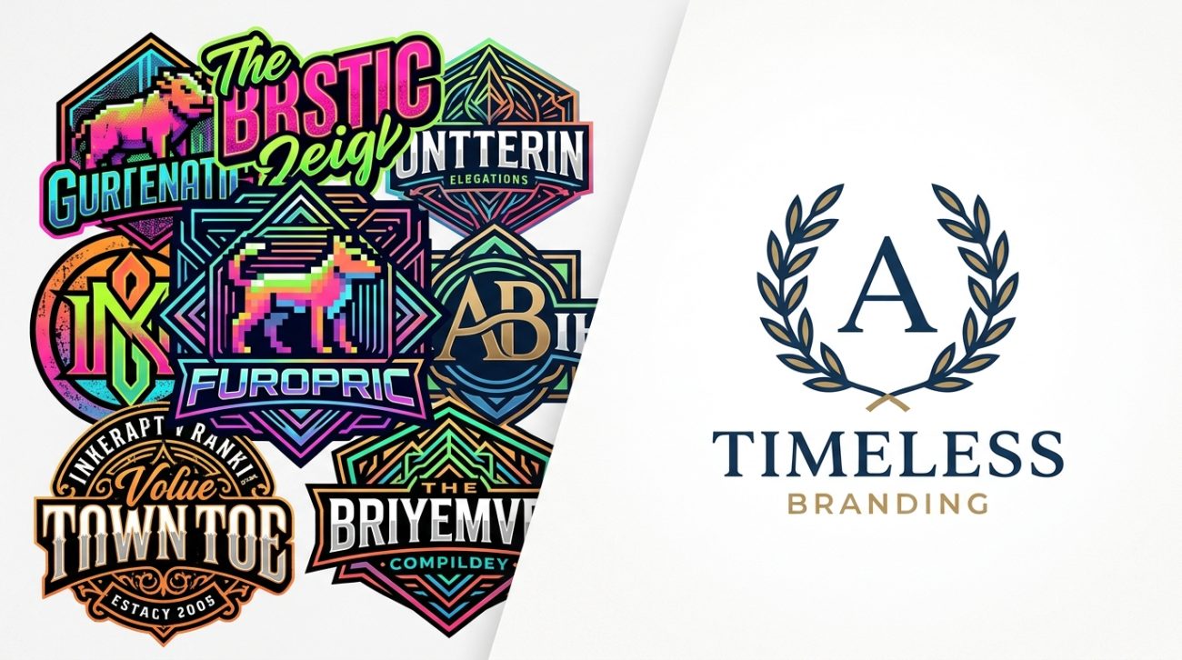
Overly complex gradients and 3D effects
Gradients can add depth when used sparingly. But when every element of your logo features multiple color transitions, metallic sheens, or embossed effects, you’re building a design that won’t scale well.
Think about where your logo needs to appear. Business cards. Social media avatars. Embroidered shirts. App icons at 60 pixels wide.
Complex gradients fall apart at small sizes. They muddy when printed on certain materials. They look inconsistent across different screens and color profiles.
The logos that stand the test of time use flat colors or subtle, intentional gradients that serve a purpose. Apple’s logo evolved away from the rainbow gradient. Instagram simplified its icon. These weren’t accidents.
If your designer suggests a gradient, ask why. What does it communicate that a solid color can’t? How will it look at 100 pixels? At 10,000 pixels on a billboard?
A logo should work in black and white first. If it doesn’t communicate your brand without color, adding gradients won’t fix the underlying weakness.
Chasing whatever style dominated last year
Every year brings a wave of design trends. Flat design. Brutalism. Glassmorphism. Claymorphic shapes. Memphis patterns.
These trends have their place in campaign work, web design, and experimental projects. But your logo isn’t a playground for experimentation.
When you build your brand identity around the trend of the moment, you’re setting a timer on your logo’s shelf life. In three years, people will look at it the same way we now view WordArt from the 1990s or the glossy Web 2.0 buttons from 2008.
Timeless logos borrow from enduring design principles instead:
- Strong geometric foundations
- Balanced negative space
- Clear hierarchy
- Purposeful symbolism
- Restrained color palettes
Look at brands that have maintained recognition for decades. Nike. McDonald’s. Target. Their logos might receive subtle refinements, but the core idea remains intact because it was never built on fleeting trends.
Your brand deserves the same longevity. Design for where your business will be in ten years, not where design blogs are today.
Using too many typefaces in one mark
Typography carries enormous weight in logo design. The right font communicates professionalism, creativity, reliability, or innovation before anyone reads a single word.
But mixing multiple typefaces in one logo rarely works. It creates visual noise. It suggests indecision. It makes your brand look like it couldn’t commit to an identity.
Some designers try to combine a serif headline font with a sans-serif tagline, then add a script accent for “personality.” The result feels cluttered and confused.
Stick to one typeface family for your primary logo. Two at the absolute maximum, and only if they serve distinctly different functions (like a bold wordmark paired with a subtle descriptor).
Better yet, consider commissioning custom lettering or modifying an existing font to make it uniquely yours. This approach gives you ownership and ensures your logo won’t look identical to three other companies using the same trendy font.
When evaluating fonts, test them at multiple sizes and weights. Make sure they remain legible when reversed out of a dark background. Check how they perform in both digital and print contexts.
If you need help selecting fonts that work across your entire brand system, learning how to choose the perfect font for your brand identity will save you from common pitfalls.
Generic symbols that could represent anything
Stock symbols and clip art have no place in professional logo design. Yet countless businesses still build their identities around generic icons: lightbulbs for ideas, globes for international reach, handshakes for partnerships.
These symbols communicate nothing unique about your business. They’re visual clichés that blend into the background.
Your logo should tell your specific story. What makes your approach different? What values drive your decisions? What experience do customers have with your brand?
A coffee shop doesn’t need a coffee cup in its logo. A tech company doesn’t need a circuit board. A consulting firm doesn’t need a rising graph.
The strongest logos either:
- Create original symbols with intentional meaning
- Use abstract marks that gain meaning through consistent application
- Focus entirely on distinctive typography without pictorial elements
FedEx hides an arrow in the negative space between letters. Amazon’s smile connects A to Z. These aren’t random choices or stock symbols. They’re purposeful design decisions that reinforce brand messages.
Before approving any symbol in your logo, ask whether it could work equally well for a competitor. If the answer is yes, keep pushing for something more distinctive.
Jumping on color trends without strategy
Color psychology matters in branding. But choosing colors because they’re trendy right now is a mistake that haunts businesses for years.
Remember when every tech startup used bright, saturated blues? Or when millennial pink dominated consumer brands? Or when everyone suddenly needed gradient backgrounds shifting from purple to orange?
These color trends cycle through industries like fashion trends. They feel current for a moment, then quickly date your brand.
Strategic color selection starts with understanding your audience and your positioning. What emotions do you want to trigger? What associations serve your brand goals? How do you want to stand apart from competitors?
| Approach | Problem | Better Alternative |
|---|---|---|
| Using trendy colors | Dates your brand within 2-3 years | Choose colors based on brand strategy and psychology |
| Copying competitor palettes | Makes you forgettable | Analyze competitor colors to find white space |
| Too many accent colors | Creates visual chaos | Limit to 2-3 core colors plus neutrals |
| Ignoring accessibility | Excludes users with vision differences | Test contrast ratios and colorblind scenarios |
Your color palette should work across every application. Digital and print. Light and dark backgrounds. Small icons and large installations.
Build a system that includes primary brand colors, secondary accent colors, and neutral tones for text and backgrounds. Document exact color values for RGB, CMYK, Pantone, and hex codes.
This level of detail belongs in your brand style guide that actually gets used, ensuring consistency as your team grows.
If you want deeper insight into selecting colors that drive business results, understanding how to choose brand colors that actually convert customers will transform your approach.
Overusing effects that don’t serve the message
Drop shadows. Outer glows. Inner bevels. Texture overlays. Stroke outlines.
Design software makes these effects easy to apply. That doesn’t mean you should use them.
Each effect you add increases complexity. It makes your logo harder to reproduce accurately. It creates more opportunities for inconsistency across applications.
Professional designers use effects intentionally and sparingly. A subtle shadow might help a logo stand out against busy photography. A texture might reinforce a handcrafted brand story.
But stacking multiple effects usually signals inexperience rather than sophistication.
The test: remove all effects and evaluate your logo as flat shapes and colors. If it loses all impact, the underlying design is weak. Effects are covering up problems instead of enhancing strengths.
Build logos that work as simple, clean marks first. Then consider whether any effects genuinely add value for specific applications.
Following design by committee
This isn’t a visual trend, but it’s a process mistake that leads to trendy, forgettable logos.
When you try to incorporate feedback from everyone in your organization, you end up with a logo that pleases no one and excites no one. It becomes a compromise instead of a clear statement.
Different stakeholders bring different preferences:
- The CEO wants something bold and modern
- The CFO prefers conservative and trustworthy
- Marketing wants eye-catching and shareable
- Sales wants professional and credible
- The founder’s spouse thinks it should include their favorite color
You can’t satisfy all these preferences simultaneously. Trying to do so produces muddled designs that chase multiple trends at once.
Successful logo development follows a clear process:
- Define brand strategy and positioning first
- Identify 2-3 decision makers with final approval authority
- Establish objective criteria for evaluating options
- Gather broad input during research, not during design review
- Trust experienced designers to translate strategy into visuals
- Make decisions based on strategy, not personal taste
This approach protects you from trend-chasing because decisions connect back to your brand’s core purpose rather than what feels current this month.
Ignoring how logos need to work today
Modern logos face technical demands that didn’t exist 20 years ago. Your mark needs to function across more contexts than ever:
- Social media profile pictures at 180×180 pixels
- App icons on phone home screens
- Email signatures at tiny sizes
- Billboards at massive scale
- Animated loading screens
- Dark mode interfaces
- Augmented reality environments
- Embroidered merchandise
- Laser engraving
- Single-color applications
Trendy logos often prioritize how they look in ideal conditions (like a full-color presentation on a designer’s screen) while failing in real-world applications.
Test your logo ruthlessly:
- Scale it down to 50 pixels wide
- Convert it to pure black and white
- Reverse it out of a dark background
- View it in grayscale
- Check it against colorblind simulation tools
- Print it on different paper stocks
- See how it looks in motion
Logos that pass these tests rely on strong fundamentals rather than trendy flourishes. They use clear shapes, appropriate detail levels, and versatile color systems.
Understanding common logo design mistakes that make your brand look unprofessional helps you avoid technical pitfalls that undermine even beautiful designs.
Forgetting that simplicity scales better
Complexity feels impressive during the design process. Intricate illustrations showcase skill. Detailed patterns demonstrate effort.
But simplicity wins in the long run.
Simple logos are easier to remember. They reproduce more reliably. They adapt to new contexts without breaking. They cost less to implement across all your materials.
This doesn’t mean boring. Simple doesn’t equal generic.
The Nike swoosh is simple. The Apple logo is simple. The Target bullseye is simple. Each one is also distinctive, memorable, and valuable.
Achieving meaningful simplicity requires more skill than adding complexity. It means distilling your brand down to its essence. Removing everything that doesn’t serve a purpose. Making intentional choices about every curve and angle.
When reviewing logo concepts, ask what you can remove without losing the core idea. If an element doesn’t contribute to recognition or meaning, it’s probably decoration you don’t need.
Timeless logos tend to be simpler than trendy ones because they focus on enduring ideas rather than current aesthetics.
Typography mistakes that age poorly
Certain font choices immediately date a design. Ultra-thin hairline fonts. Extremely condensed letterforms. Fonts with decorative swashes on every letter. Scripts that prioritize style over legibility.
These typography trends cycle through design communities, feel fresh for a moment, then quickly look outdated.
The fonts that endure share common characteristics:
- Clean letterforms that remain legible at any size
- Balanced proportions that don’t rely on extreme ratios
- Versatile weights that work in different contexts
- Distinctive features that don’t depend on decoration
- Professional construction with proper spacing and kerning
Custom typography often serves brands better than trendy commercial fonts. When you modify or create letterforms specifically for your brand, you own something unique that won’t appear in dozens of other logos next year.
If you’re working with existing fonts, choose ones with proven track records. Fonts that have remained popular for decades usually have staying power for good reasons.
Watch out for these red flags:
- Fonts that only became available in the past year
- Typefaces heavily promoted in design trend roundups
- Fonts with names like “Modern,” “Trendy,” or referencing current years
- Scripts that sacrifice readability for style
- Fonts with excessive alternate characters and ligatures
Learning to spot typography mistakes that make your designs look unprofessional will sharpen your eye for what works long-term.
Building logos that can’t evolve
Your business will change. You’ll add products. Enter new markets. Shift positioning. Refine your message.
Your logo needs to accommodate this evolution without requiring complete redesigns.
Trendy logos often paint brands into corners. They’re so specific to a particular moment, aesthetic, or offering that they can’t flex when the business grows.
Build flexibility into your visual identity system:
- Create a primary logo and simplified alternatives
- Develop both horizontal and stacked versions
- Design icon-only marks that work without text
- Establish clear rules for color variations
- Define minimum sizes and clearspace requirements
- Plan for animated and static versions
This systematic approach, common in professional branding, gives you options as your needs change. You can adapt without abandoning your core identity.
The brands with the longest-lasting logos treat them as systems rather than single static images. They build frameworks that can accommodate new applications while maintaining recognition.
Forgetting what makes brands actually memorable
Trends come and go. But the principles that make brands stick in people’s minds remain constant.
Recognition comes from consistency, not novelty. Meaning comes from authentic stories, not borrowed aesthetics. Trust comes from reliability, not whatever looks current.
The psychology behind what makes a brand memorable has more to do with how you use your logo than what’s in it.
A simple mark applied consistently across every touchpoint for years will build stronger recognition than a trendy logo that keeps changing.
This means:
- Using your logo the same way every time
- Maintaining consistent colors and spacing
- Applying it to everything your audience sees
- Resisting the urge to redesign every few years
- Building equity through repetition
Your logo is a container for meaning. It gains value through the experiences people have with your brand, not through design tricks.
Start with a mark that can carry that meaning for decades. Then commit to building associations through consistent, quality work.
Design for your business, not design awards
The logos that win design awards often differ from the logos that build successful businesses.
Award-winning work tends to push boundaries, experiment with new techniques, and showcase designer creativity. That’s appropriate for the design community.
But your logo exists to serve your business goals. It needs to connect with your specific audience. It should reflect your actual values and positioning.
This sometimes means making choices that feel less exciting to designers but work better for your market.
A law firm might need something more conservative than what’s trending. A children’s brand might benefit from playful elements that wouldn’t work for B2B software. A luxury product requires different signals than a budget alternative.
Know your audience. Understand what builds trust and recognition in your specific context. Then make design decisions that serve those needs rather than chasing what looks impressive in design galleries.
The best logo for your business is the one that helps you achieve your goals, not the one that collects awards.
Your logo should outlast the trends
Building a timeless logo isn’t about avoiding all contemporary design techniques. It’s about making strategic choices based on your brand’s needs rather than what happens to be popular this year.
Start with clarity about who you serve and what you stand for. Let that strategy guide every design decision. Test your options against real-world applications. Choose simplicity over complexity. Commit to consistency over constant change.
Your logo will gain value and recognition over time. But only if you build something worth keeping.