More than 60% of web traffic now comes from mobile devices. That number keeps climbing. If your interface doesn’t work perfectly on a smartphone, you’re losing users before they even see your content.
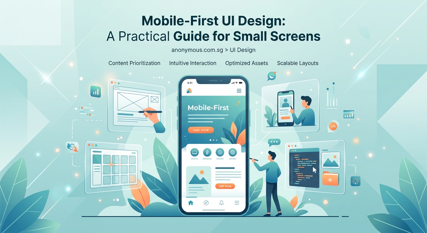
Mobile first design means building interfaces for small screens first, then scaling up to larger displays. This approach forces you to prioritize essential content, simplify navigation, and create faster-loading experiences. By starting with constraints, you build cleaner, more focused designs that work everywhere. This guide covers practical techniques, common mistakes, and proven patterns you can apply immediately to any project.
Why mobile first beats desktop first every time
Starting with desktop layouts feels natural. You have space. You can add features. You can experiment with complex navigation.
But that approach creates bloated interfaces.
When you design for desktop first, you try to cram everything into a smaller screen later. Features get hidden. Navigation becomes confusing. Performance suffers.
Mobile first flips that process.
You start with the smallest screen and the slowest connection. You identify what truly matters. You build a solid foundation. Then you enhance the experience as screen size increases.
This constraint breeds clarity. You can’t hide mediocre content behind fancy layouts. Every element must earn its place.
The three pillars of mobile first thinking
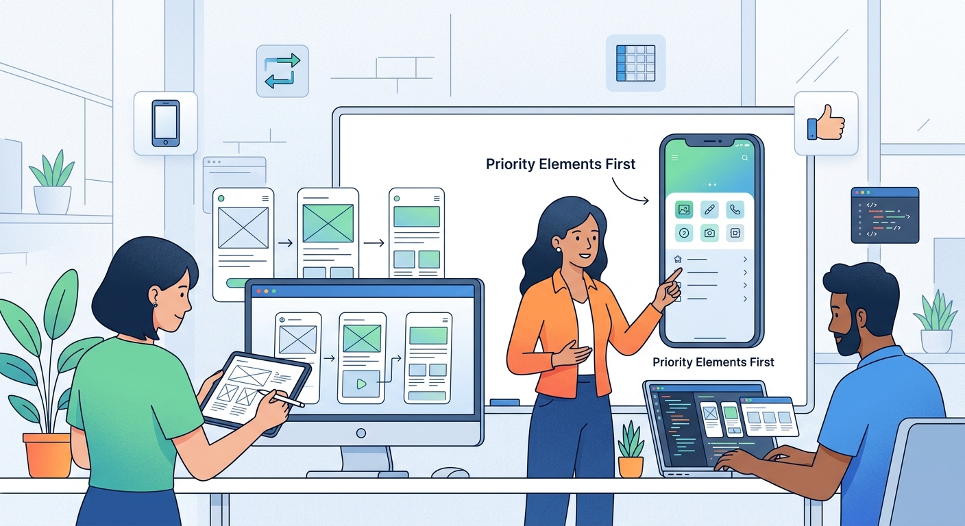
Mobile first isn’t just about screen width. It’s a mindset shift that affects every design decision.
Content hierarchy comes first. What does the user need right now? Not what looks impressive. Not what the stakeholder requested. What solves the user’s immediate problem?
Performance is non-negotiable. A beautiful interface that takes eight seconds to load is a failed interface. Mobile users often deal with spotty connections. Your design must account for that reality.
Touch targets matter more than you think. Fingers are bigger than mouse cursors. Buttons need breathing room. Interactive elements need clear spacing. If users keep tapping the wrong thing, your design failed.
How to structure your mobile first workflow
Here’s the process that works for most projects:
-
Define the core user task. Write it down in one sentence. Every design decision should support this task.
-
Sketch the smallest version first. Use a 320px width as your starting point. What absolutely must appear on screen?
-
Build the mobile layout in your design tool. Get the spacing right. Test the touch targets. Ensure the typography hierarchy in UI design: 5 rules that make screens instantly readable works at this size.
-
Add breakpoints as needed. Don’t jump straight to desktop. Add a tablet view. Then a laptop view. Scale thoughtfully.
-
Test on real devices. Simulators lie. Grab an actual phone. Use it outside in bright sunlight. Try it with one hand while holding coffee.
“The best mobile interfaces feel invisible. Users accomplish their task without thinking about the interface at all. That only happens when you’ve ruthlessly prioritized what matters.” — Luke Wroblewski, Product Director at Google
Common mobile first mistakes and how to avoid them
Even experienced designers stumble with mobile first approaches. Here are the traps to watch for:
| Mistake | Why it hurts | Better approach |
|---|---|---|
| Hiding navigation in hamburger menus by default | Users can’t see their options without tapping | Show 3-4 primary actions, hide secondary options |
| Using tiny font sizes to fit more content | Readability tanks, users squint and leave | Use 16px minimum for body text, embrace scrolling |
| Placing important actions at the bottom | Thumbs can’t reach comfortably on large phones | Position key actions in the middle third of the screen |
| Ignoring loading states | Users see blank screens and assume it’s broken | Design skeleton screens and progress indicators |
| Copying desktop patterns directly | Mouse interactions don’t translate to touch | Use native mobile patterns like swipe gestures |
Essential components for mobile interfaces
Every mobile interface needs these building blocks. Master them before adding complexity.
Navigation patterns that actually work
Tab bars work beautifully for 3-5 primary sections. They stay visible. Users know where they are.
Bottom navigation puts actions within thumb reach. Top navigation requires stretching.
Hamburger menus hide options. Use them for secondary features only. Never hide your primary navigation.
Forms that don’t frustrate users
Keep forms short. Ask for one piece of information at a time.
Use the right keyboard for each field. Number inputs should trigger the numeric keyboard. Email fields should show the @ symbol.
Show clear error messages next to the problem field. Don’t make users hunt for what went wrong.
Auto-fill should work seamlessly. Test it. If users have to type their address manually in 2024, you’ve failed.
Touch targets sized for human fingers
Apple recommends 44×44 pixels minimum. Google suggests 48×48 pixels. Split the difference and aim for 44-48 pixels.
Add spacing between interactive elements. If buttons sit too close together, users tap the wrong one.
Make the entire card tappable, not just the tiny text link inside it. Bigger targets reduce frustration.
Responsive breakpoints that make sense
Forget device-specific breakpoints. Design for content, not devices.
Start at 320px for small phones. This catches older devices still in use.
Add a breakpoint around 768px for tablets in portrait mode. Your layout can breathe here. Consider showing two columns instead of one.
Another breakpoint at 1024px handles tablets in landscape and smaller laptops. Navigation can expand. Sidebars become viable.
Finally, add a breakpoint at 1440px or higher for large desktop displays. Don’t let your content stretch infinitely. Cap the width and center it.
Between breakpoints, let elements scale fluidly. Use percentages and viewport units. Avoid fixed pixel widths.
Typography for small screens
Mobile screens pack 300-500 pixels per inch. Text looks sharp. But size still matters.
Use 16px as your minimum body text size. Anything smaller forces users to pinch and zoom.
Line height needs room to breathe. Aim for 1.5 to 1.6 times your font size. Cramped lines kill readability.
Line length matters more on mobile than desktop. Keep lines between 50-75 characters. Wider becomes exhausting to read.
What is font hierarchy and why does it matter for readability? becomes even more important on small screens where users scan quickly.
Color and contrast for outdoor viewing
Indoor lighting is forgiving. Outdoor sunlight reveals every contrast problem.
Aim for a 4.5:1 contrast ratio minimum between text and background. That’s the WCAG AA standard. Better yet, hit 7:1 for AAA compliance.
Light gray text on white backgrounds fails outdoors. Use darker grays. Test in bright conditions.
What is color contrast and why does it make or break your designs? explains the technical details, but the simple version is this: if you can’t read it in sunlight, fix it.
Images and media for mobile performance
Images slow down mobile experiences faster than anything else.
Serve appropriately sized images. Don’t send a 3000px wide image to a 375px wide screen. Use responsive images with srcset attributes.
Lazy load images below the fold. Users shouldn’t wait for images they might never see.
Use modern formats like WebP or AVIF. They compress better than JPEG without visible quality loss.
Videos should never autoplay. They eat data. They drain batteries. They annoy users. Provide a play button and let users decide.
Testing your mobile first design
Simulators help during development. Real devices reveal the truth.
Test on at least three devices: a small Android phone, a mid-size iPhone, and a tablet. Borrow them if you don’t own them.
Test with one hand. Most users hold their phone this way. Can they reach important buttons?
Test on a slow connection. Throttle your network speed in browser dev tools. Does the interface still feel responsive?
Test with actual content, not lorem ipsum. Real headlines break layouts. Real images have weird aspect ratios. Design for reality.
Building a mobile first design system
How to create a consistent design system for your first app starts with mobile components.
Define your spacing scale based on 8px increments. This creates visual rhythm and makes development easier.
Create component variants for different screen sizes. Your button might stack vertically on mobile but sit horizontally on desktop.
Document touch target sizes. Make it a rule, not a suggestion. Every interactive element meets the minimum size.
Build your color palette with contrast in mind. Test every combination. Document which pass accessibility standards.
Navigation patterns worth stealing
Bottom tab bars work for apps with 3-5 main sections. Instagram and Twitter use them because they work.
Sticky headers keep key actions visible while scrolling. But don’t let them consume too much vertical space. 60px maximum.
Expandable sections let users reveal details on demand. Accordions work well for FAQs and long content lists.
Swipe gestures feel natural on mobile. Swipe to delete. Swipe between screens. Just make sure the gesture is discoverable.
Forms that respect mobile users
One question per screen works better than long scrolling forms. Break complex forms into steps.
Use smart defaults. Pre-select the most common option. Reduce the number of taps required.
Show password requirements before users start typing. Don’t make them guess what you want.
Provide clear feedback. Show a checkmark when a field is complete. Highlight errors immediately.
Save progress automatically. Don’t make users lose their work if they switch apps.
Performance optimization for mobile
Minimize HTTP requests. Every request adds latency. Combine files where possible.
Compress everything. Text, images, and code should all be compressed before sending to the browser.
Use browser caching. Static assets shouldn’t need to be downloaded on every visit.
Defer non-critical JavaScript. Load what’s needed for the initial view first. Load everything else after.
Monitor your performance budget. Set limits for page weight and load time. Stay under them.
Accessibility isn’t optional on mobile
Screen readers work differently on mobile. Test with VoiceOver on iOS and TalkBack on Android.
Focus states need to be obvious. Keyboard navigation matters even on touch devices.
Provide text alternatives for images. Screen readers can’t describe visual content without alt text.
Make sure understanding white space in UI design: the beginner’s visual guide includes enough spacing for users with motor control challenges.
Gestures and interactions that feel natural
Tap is the most basic gesture. Make tappable areas obvious.
Swipe works for carousels and dismissing items. But provide alternative navigation for users who don’t discover the gesture.
Long press can reveal contextual menus. But don’t hide essential functions behind it.
Pinch to zoom should work on images and maps. Don’t disable it unless you have a good reason.
Pull to refresh feels natural in feeds and lists. Users expect it now.
Content strategy for small screens
Write shorter sentences. Mobile users skim aggressively.
Front-load important information. Put the conclusion first. Details can come later.
Break up text with subheadings. Walls of text look even bigger on small screens.
Use bullet lists for scannable content. Like this one:
- Each point should stand alone
- Keep points short and actionable
- Use parallel structure for consistency
- Limit lists to 5-7 items maximum
Mobile first doesn’t mean mobile only
Your mobile design is the foundation. But users on larger screens deserve an enhanced experience.
Add a sidebar on tablet and desktop. Show related content. Provide shortcuts to common tasks.
Expand navigation on larger screens. The full menu can be visible instead of hidden.
Show more content per screen. But don’t just make everything bigger. Rethink the layout to use the space effectively.
Consider multi-column layouts. Two or three columns work well on wide screens.
Tools that support mobile first workflows
Figma and Sketch both support responsive design. Use auto-layout features to create flexible components.
Browser dev tools let you test responsive layouts instantly. Chrome and Firefox both have excellent device simulators.
Real device testing platforms like BrowserStack show how your design looks on hundreds of devices.
Performance testing tools like Lighthouse identify bottlenecks and suggest improvements.
Maintaining your mobile first approach
Review analytics regularly. Which devices do your users actually use? Design for your audience, not assumptions.
Test new features on mobile first. If it doesn’t work on a small screen, rethink it.
Keep a device library. Collect old phones. They represent users who can’t afford the latest hardware.
Update your design system as patterns evolve. Mobile interfaces change quickly. Stay current.
Why small screens make you a better designer
Constraints force better decisions. You can’t hide weak content behind flashy animations.
Mobile first makes you prioritize ruthlessly. Every pixel matters. Every interaction must have purpose.
The discipline carries over to all your work. Even desktop designs become cleaner and more focused when you think mobile first.
Start your next project with the smallest screen. Build the foundation solid. Scale up thoughtfully. Your users will thank you with engagement, conversions, and loyalty.