You designed a beautiful flyer on your laptop. The colors looked vibrant, balanced, and exactly what … Why Your Color Choices Look Different on Screen vs PrintRead more
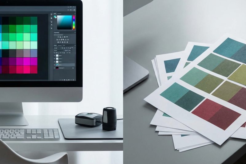
You designed a beautiful flyer on your laptop. The colors looked vibrant, balanced, and exactly what … Why Your Color Choices Look Different on Screen vs PrintRead more
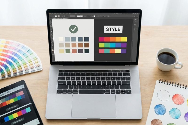
You’ve chosen the perfect shade of blue for your brand. It looks stunning on screen. Then … How to Build an Accessible Color Palette Without Sacrificing StyleRead more
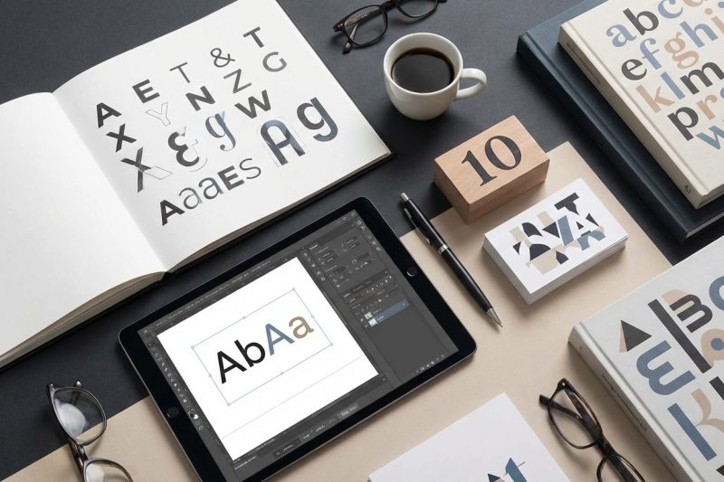
Typography is changing faster than ever. What worked last year already looks dated, and staying relevant … 10 Advanced Typography Techniques Used by Top Designers in 2024Read more
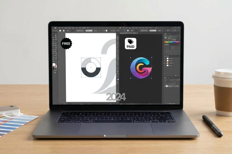
Choosing the right logo design software can feel overwhelming when you’re staring at dozens of options, … The Best Logo Design Software in 2024: Free and Paid Options ComparedRead more
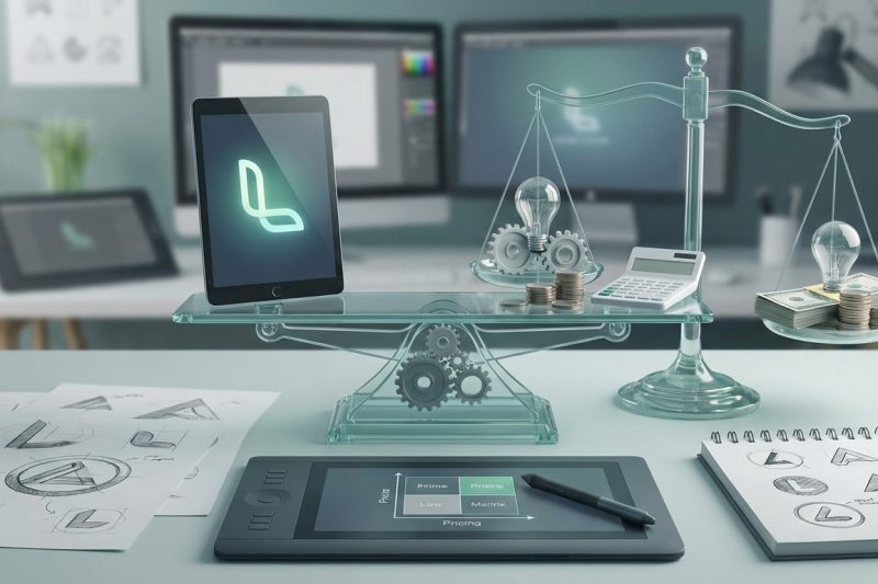
Pricing your logo design work can feel like guessing in the dark. Charge too little and … What to Charge for Logo Design: A Pricing Guide for Freelancers and AgenciesRead more
Your logo looks perfect on screen. Then you see it printed on a business card, and … How to Create a Cohesive Brand Color Palette That Works Across Print and DigitalRead more
Your brand was perfect three years ago. Now it feels like wearing a suit that no … When Should You Rebrand? 6 Clear Signs It’s Time for a Visual Identity RefreshRead more
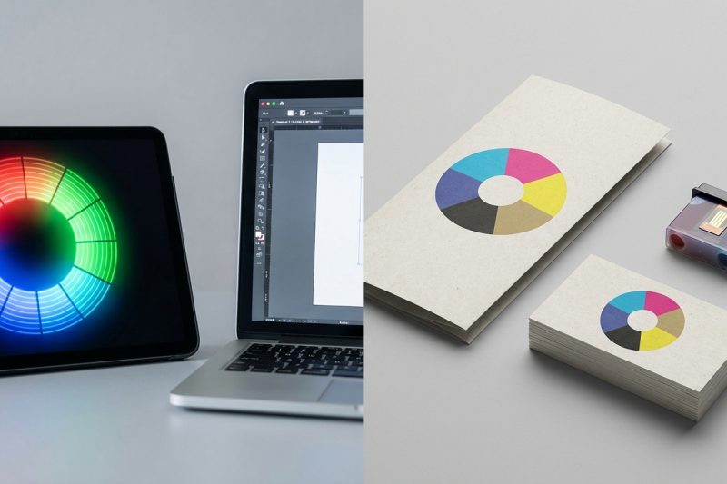
You send your design to the printer feeling confident. Days later, your printed materials arrive and the vibrant blues look muddy. The bright greens turned dull. Your client is unhappy, and you need…
You’ve designed dozens of logos, but the font combinations never feel quite right. One typeface looks too formal. Another feels too playful. Together, they clash instead of complement. The problem…
Getting your image cropped mid-face on Instagram feels terrible. Uploading a blurry cover photo to LinkedIn looks unprofessional. Wrong dimensions waste your time and hurt engagement. Social…