You’ve picked the perfect paint color, bought throw pillows, and added artwork. But somehow your room still feels off. The colors clash instead of complement, and nothing looks quite as polished as those magazine spreads.
Most DIY decorators struggle with color balance because they wing it. Professional designers rely on a simple formula that takes the guesswork out of color schemes.
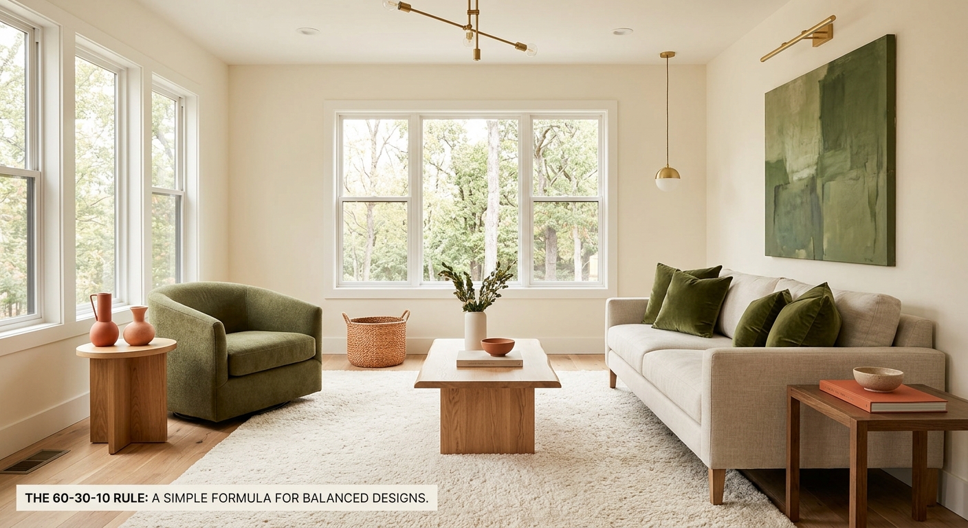
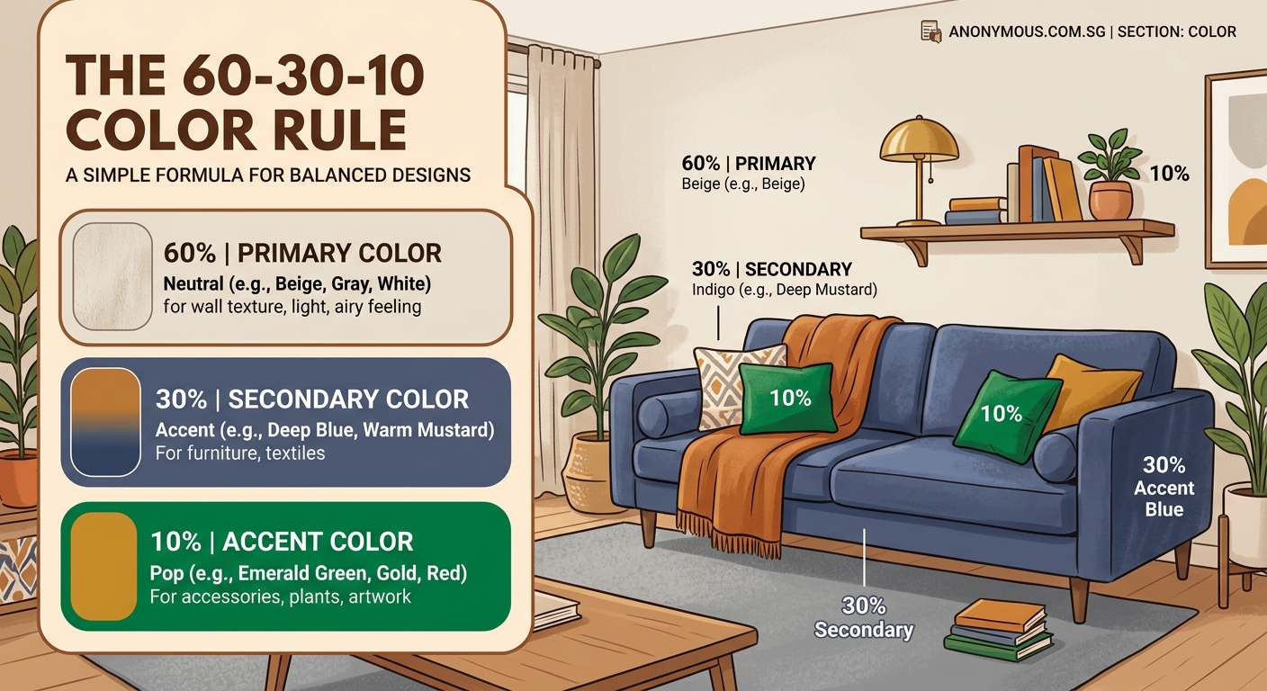
The 60-30-10 color rule divides your room into three proportions: 60% dominant color, 30% secondary color, and 10% accent color. This formula creates visual balance by establishing clear hierarchy. Your dominant color anchors the space, the secondary adds interest, and the accent provides personality. Apply it to walls, furniture, and decor for instant professional polish without design training.
Breaking down the formula
The 60-30-10 color rule splits your design into three distinct parts.
Your dominant color covers 60% of the space. This is usually your walls, large furniture pieces, or floor coverings. Think of it as the foundation that sets the mood.
The secondary color takes up 30%. This appears in smaller furniture, window treatments, bedding, or rugs. It supports the dominant color while adding depth.
Your accent color fills the remaining 10%. These are your throw pillows, artwork, decorative objects, and small details that catch the eye.
The proportions create natural visual hierarchy. Your eye moves from the calming dominant color to the supporting secondary, then lands on the exciting accent details.
Why this ratio actually works
Color balance isn’t arbitrary. The 60-30-10 split mirrors how our brains process visual information.
Too many competing colors create chaos. Your eye doesn’t know where to land. A room with five equal colors feels busy and uncomfortable.
Too few colors feel flat. A monochrome space lacks dimension and interest.
The 60-30-10 ratio hits the sweet spot. It provides enough variety to stay interesting while maintaining cohesion through clear dominance.
Professional interior designers have used this formula for decades because it works across different styles, from minimalist to maximalist.
Choosing your three colors
Start with your dominant color. Pick something you can live with long-term since it covers most of the space.
Neutrals work well here. Whites, grays, beiges, and soft taupes create a versatile foundation. But you can absolutely use bolder colors if that matches your style.
Your secondary color should complement the dominant without competing. If you went neutral for 60%, this is where you can introduce more personality.
The accent color is your wild card. This is where bold choices shine. Deep jewel tones, bright pops, or rich metallics all work beautifully in small doses.
Use a color wheel if you need help. Analogous colors (next to each other) create harmony. Complementary colors (opposite each other) add energy.
“The 60-30-10 rule isn’t about limiting creativity. It’s about giving your creative choices structure so they actually work together instead of fighting for attention.” – Interior designer Sarah Richardson
Applying the rule to your living room
Let’s walk through a real example.
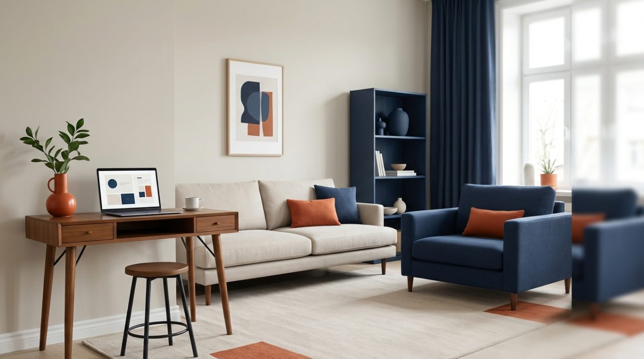
- Choose soft gray for your 60%. Paint three walls gray and select a gray sofa.
- Add navy blue as your 30%. Use it for curtains, an accent chair, and a large area rug.
- Finish with mustard yellow at 10%. Add yellow throw pillows, a table lamp, and a piece of wall art.
The gray anchors everything. The navy adds sophistication. The yellow brings warmth and personality.
You can flip the formula too. Use navy as your dominant color with gray walls and a navy sofa, gray as secondary in curtains and chairs, then yellow accents.
The proportions matter more than which specific color fills each role.
Common mistakes to avoid
| Mistake | Why it fails | Better approach |
|---|---|---|
| Using all three colors equally | Creates visual competition with no clear hierarchy | Stick to 60-30-10 proportions strictly |
| Choosing three bold colors | Overwhelms the space and tires the eye | Use bold colors only for smaller percentages |
| Ignoring existing fixed elements | Clashes with flooring, countertops, or built-ins | Start with what you can’t change |
| Forgetting about white and black | Misses opportunities for contrast and definition | Treat neutrals as bonus elements outside the rule |
| Applying the rule to individual items | Makes each piece fight for attention | Think room-wide, not object-by-object |
The biggest mistake is treating the rule as absolute law. It’s a guideline that creates balance, not a restriction.
Adapting the formula for different rooms
Bedrooms benefit from calmer proportions. Consider using 70% dominant and 20% secondary, keeping accents at 10%.
Kitchens often have fixed elements like cabinets and countertops. Count these in your percentages. White cabinets can be your 60%, wood counters your 30%, and colorful accessories your 10%.
Bathrooms work well with tile as the dominant color, towels and rugs as secondary, and small decor items as accents.
Home offices need focus. Keep your 60% neutral and calming, use your 30% for functional pieces like desk chairs, and save energizing colors for that 10% accent.
Testing your color scheme before committing
Paint samples on poster board instead of directly on walls. Move them around the room throughout the day to see how light affects them.
Collect fabric swatches for furniture and textiles. Lay them out in the proportions you plan to use. Does the balance feel right?
Use free apps or online tools to visualize your scheme. Upload a photo of your room and apply your chosen colors digitally.
Start with removable elements. Pillows, throws, and artwork let you test the 10% accent without permanent commitment.
If something feels off, adjust one color at a time. Usually the proportions are fine but one color choice needs tweaking.
Working with existing furniture and decor
You don’t need to start from scratch. The rule works with what you already own.
Identify your largest existing pieces. A brown leather sofa might become your 60%. Build your secondary and accent colors around it.
Slipcovers can change a sofa’s color without replacing it. Reupholstering chairs costs less than buying new furniture.
Paint is the easiest way to shift proportions. Changing wall color from neutral to bold instantly flips your 60% and 30% distribution.
Group smaller items to create color blocks. Five small blue objects scattered randomly read as clutter. Grouped together, they become an intentional 30% secondary color.
Seasonal variations using the same base
Keep your 60% and 30% consistent year-round. Swap only the 10% accents for seasonal refresh.
Summer might use coral and turquoise accents. Fall switches to burnt orange and deep burgundy. Winter brings in rich emerald or icy silver. Spring introduces fresh yellows and soft pinks.
This approach saves money. You’re only replacing pillows, small decor items, and maybe artwork.
Your room maintains its core identity while feeling seasonally appropriate. The psychology behind color meanings shifts with these small changes.
Extending the rule beyond single rooms
Creating a cohesive color scheme across all your brand touchpoints applies to homes too.
Use the same three colors throughout your home, but shift the proportions room by room. Your living room’s 60% becomes the bedroom’s 30%. The bedroom’s accent becomes the bathroom’s secondary.
This creates flow without monotony. Each space feels unique but connected.
Hallways act as transitions. Use all three colors in equal smaller doses to bridge different rooms.
Open floor plans need careful attention. Maintain the same 60% throughout the connected space, then vary secondary and accent colors by functional area.
Troubleshooting when something feels wrong
Your room feels boring? Your accent color is too timid. Go bolder with that 10%. It should create visual excitement.
Everything feels chaotic? You’ve probably exceeded 10% on your accent. Pull back on the bright pops.
The space looks washed out? Your 60% and 30% are too similar in value. Increase contrast between them.
One area dominates attention? Check your proportions. You might have accidentally created a 40-40-20 split instead of 60-30-10.
Colors look different than expected? Lighting matters enormously. What works in afternoon sun might fail under evening lamps. Test colors at different times before finalizing.
Combining the rule with other design principles
The 60-30-10 rule handles color distribution. Pair it with other fundamentals for better results.
Understanding white space in UI design translates to interior design too. Don’t fill every surface. Let your colors breathe.
Texture adds depth within your color scheme. Your 60% gray can include smooth painted walls, nubby linen curtains, and soft wool rugs, all in the same color family.
Scale matters. Large patterns in your 60%, medium patterns in your 30%, and small or solid in your 10% creates pleasing variety.
Color contrast between your three choices affects readability and comfort. Too little contrast feels muddy. Too much feels jarring.
Real room examples that nail the formula
A Scandinavian living room uses white (60%) on walls and a sofa, light wood tones (30%) in flooring and shelving, then black (10%) in lighting fixtures and picture frames.
A bohemian bedroom features terracotta (60%) on walls and bedding, cream (30%) in curtains and a rug, then teal (10%) in pillows and artwork.
A modern kitchen relies on gray cabinets (60%), white countertops and backsplash (30%), and brass hardware and fixtures (10%).
A coastal bathroom uses soft blue (60%) on walls and shower curtain, white (30%) in tile and towels, then coral (10%) in accessories and artwork.
Each example maintains clear proportions while expressing completely different styles.
Building confidence with color
Start small if you’re nervous. Apply the rule to one room first. See how it feels before expanding.
Neutrals offer safe practice. A beige, gray, and navy scheme teaches you the proportions without risk.
Take photos of rooms you love. Analyze their color distribution. You’ll start seeing the 60-30-10 pattern everywhere.
Trust the formula even when it feels counterintuitive. That bold accent that seems too bright at the paint store will work perfectly at 10%.
Your personal taste matters more than trends. The rule works with any three colors you genuinely love.
Making your color choices stick
Document your scheme. Write down the specific paint names, fabric swatches, and color codes. You’ll need them for touch-ups and additions.
Building a brand style guide for your home keeps everything consistent. Create a simple folder with your three colors and their applications.
Shop with swatches. Bring fabric samples or paint chips when buying new items. Phone photos never match real colors accurately.
Buy extra paint. Colors get discontinued. Having extra ensures future touch-ups match perfectly.
Share your scheme with family. Everyone adding random colors destroys the balance you’ve created.
Your room, your rules, your balance
The 60-30-10 color rule gives you structure without stealing creativity. It’s a starting point, not a prison.
Some rooms might work better at 70-20-10. Others might thrive at 50-30-20. The principle of establishing clear hierarchy through proportion remains valuable regardless of exact numbers.
What matters is intentional choice. Selecting three colors and distributing them thoughtfully beats randomly accumulating stuff in dozens of colors.
Your space should feel balanced and cohesive. The formula helps you get there without a design degree or expensive consultant.
Start with one room this weekend. Pick your three colors, check your proportions, and adjust what you already own. You’ll be amazed how much better everything looks when color has clear structure.