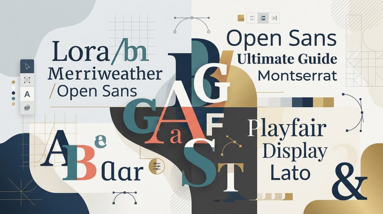
Choosing the right fonts for your design project can feel overwhelming when Google Fonts offers over 1,400 typefaces. The good news? You don’t need to be a typography expert to create beautiful, professional font combinations that work.
This google font pairing guide will show you exactly how to match fonts that complement each other, avoid common mistakes, and build a typography system that makes your designs look polished and intentional.
Successful Google Font pairing relies on contrast and harmony. Pair a distinctive display font with a neutral body font, maintain consistent weights across your pairing, and test readability at multiple sizes. Use no more than two font families per project, and always prioritize legibility over personality. This approach creates visual hierarchy while keeping your designs clean and professional.
Understanding the basics of font pairing
Before you start mixing typefaces, you need to understand what makes two fonts work together.
Font pairing is about creating visual contrast while maintaining harmony. Think of it like seasoning food. You want enough variety to keep things interesting, but not so much that flavors clash.
Every font has a personality. Some are formal and serious. Others feel playful or modern. Your job is to choose fonts whose personalities complement each other without competing for attention.
The most reliable approach? Pair one font that grabs attention with another that stays quietly readable.
The three font categories you need to know
Google Fonts organizes typefaces into five categories, but you only need to focus on three for most projects.
Serif fonts have small decorative strokes at the ends of letters. They feel traditional, trustworthy, and established. Think Playfair Display or Merriweather.
Sans serif fonts lack those decorative strokes. They look clean, modern, and approachable. Popular choices include Inter, Open Sans, and Roboto.
Display fonts are designed to grab attention at large sizes. They work beautifully for headlines but become hard to read in paragraphs. Examples include Bebas Neue and Righteous.
Most successful pairings combine fonts from different categories. A serif headline with a sans serif body creates instant contrast. A display font for titles with a neutral sans serif for everything else gives you personality without sacrificing readability.
The step-by-step process for pairing Google Fonts
Here’s a practical method you can follow every time you need to choose fonts.
-
Start with your body text font. This is the typeface people will read most. Choose something neutral and highly legible at 16px or smaller. Inter, Lato, and Source Sans Pro are solid starting points.
-
Test readability at actual size. Type out three paragraphs in your chosen font at 16px. Read it on your phone. If your eyes strain or the text feels cramped, pick a different font with more open letterforms.
-
Choose a contrasting headline font. If your body text is sans serif, try a serif or display font for headlines. If your body text is serif, pair it with a bold sans serif for headings.
-
Check weight compatibility. Your headline font should have enough weight options to create clear hierarchy. Look for families with at least regular, semibold, and bold weights.
-
Test the pairing in context. Create a simple mockup with a headline, subheading, and body paragraph. Does the headline feel too heavy? Does the body text disappear? Adjust weights and sizes until the hierarchy feels natural.
-
Verify performance. Some Google Fonts load faster than others. Stick to fonts with 10+ styles to ensure you have flexibility without adding multiple font families to your project.
This process takes 15 minutes the first few times. After you’ve done it a dozen times, you’ll make these decisions instinctively.
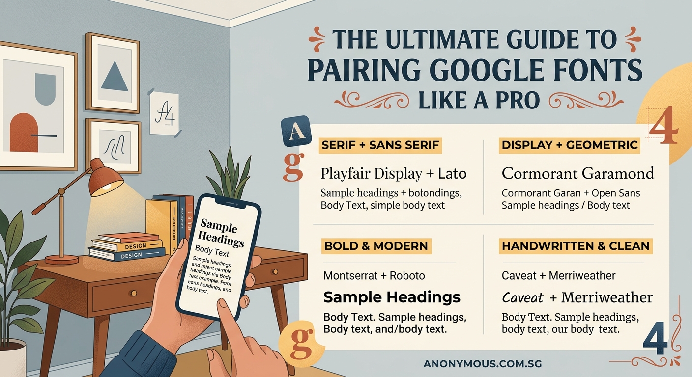
Proven Google Font pairing formulas that work
You don’t have to reinvent the wheel. These combinations have been tested across thousands of websites and consistently deliver professional results.
Classic serif and sans serif combinations
- Playfair Display + Source Sans Pro: Elegant headlines meet clean, readable body text. Perfect for editorial sites and portfolios.
- Merriweather + Open Sans: Both fonts have excellent readability. This pairing works for blogs, documentation, and content-heavy sites.
- Lora + Lato: Slightly more personality than Merriweather and Open Sans, but equally reliable.
Modern sans serif pairings
- Montserrat + Open Sans: Two sans serifs can work if they have different personalities. Montserrat has geometric character; Open Sans stays neutral.
- Raleway + Roboto: Similar logic. Raleway brings elegance to headlines while Roboto handles body text with zero fuss.
- Poppins + Inter: Both feel contemporary, but Poppins has more geometric personality for headlines.
Display and body combinations
- Bebas Neue + Lato: Bold, condensed headlines paired with approachable body text. Great for landing pages and marketing sites.
- Righteous + Roboto: Quirky headlines that grab attention, balanced by ultra-neutral body text.
- Oswald + Open Sans: Condensed headlines create vertical rhythm without overwhelming the layout.
These pairings work because they follow the contrast principle. One font has personality; the other provides stability.
If you’re building a complete brand system, learning how to choose the perfect font for your brand identity will help you make decisions that align with your overall visual strategy.
Common mistakes that ruin font pairings
Even experienced designers make these errors. Avoid them and your typography will instantly improve.
| Mistake | Why it fails | How to fix it |
|---|---|---|
| Pairing two fonts with similar personalities | Creates confusion instead of hierarchy | Choose fonts from different categories or with clear weight differences |
| Using too many font families | Fragments visual cohesion and slows page load | Stick to two families maximum; use weights for variety |
| Ignoring x-height differences | Makes text feel misaligned even when sizes match | Pick fonts with similar x-heights or adjust sizes manually |
| Choosing trendy fonts for body text | Reduces readability and dates your design | Save personality fonts for headlines only |
| Skipping mobile testing | Text that works on desktop often fails at small sizes | Always preview pairings on actual mobile devices |
The x-height issue trips up a lot of people. X-height is the height of lowercase letters like “x” or “a”. Two fonts set at 16px can look dramatically different if one has a tall x-height and the other has a short one.
When this happens, your carefully chosen pairing feels off even though you followed all the rules. The fix? Adjust the font size of one typeface until the visual weight feels balanced.
Understanding what is font hierarchy and why does it matter for readability will help you avoid many of these mistakes before they happen.
How to test and refine your font choices
Choosing fonts is only half the work. Testing ensures your pairing actually performs in real conditions.
Create a test document with these elements:
- Large headline (48px or larger)
- Subheading (24-32px)
- Body paragraph (16-18px)
- Small text like captions (14px)
- A bulleted list
- Bold and italic variations
Look at this document on your laptop, tablet, and phone. Read it in bright sunlight and dim lighting. If anything feels hard to read, adjust sizes or reconsider your pairing.
“The best font pairing is the one your readers don’t notice. When typography works, people focus on your content instead of your design choices.”
This quote captures the goal perfectly. Your fonts should support your message, not distract from it.
Pay special attention to line length and spacing. Even perfect font pairings fail if your lines are too long or your line height is too tight. Aim for 50-75 characters per line for body text, and set line height to 1.5 or 1.6 for comfortable reading.
Advanced techniques for sophisticated pairings
Once you’ve mastered basic pairing principles, these techniques add polish to your typography.
Using font weights to create hierarchy
You can create an entire design system with a single font family if it has enough weights. Inter, for example, offers nine weights from thin to black.
Try this approach:
- Headlines: Bold (700) or Black (900)
- Subheadings: Semibold (600)
- Body text: Regular (400)
- Captions: Regular (400) at smaller size
- Emphasis: Medium (500) or Semibold (600)
This strategy ensures perfect harmony because everything comes from the same family. It also loads faster than multiple font families.
Adjusting letter spacing for visual balance
Display fonts often need tighter letter spacing (tracking) at large sizes. Body text usually needs slightly looser tracking for improved readability.
Most design tools let you adjust letter spacing in pixels or ems. For headlines above 36px, try reducing letter spacing by 0.02em. For body text below 16px, increase it by 0.01em.
These tiny adjustments make a noticeable difference in how professional your typography looks.
Creating contrast through size relationships
The size ratio between your headline and body text affects how dramatic your hierarchy feels. A 3:1 ratio (48px headline, 16px body) creates strong contrast. A 2:1 ratio (32px headline, 16px body) feels more subtle.
Neither is wrong. Choose based on your content and brand personality. Bold brands can handle dramatic ratios. Professional services often prefer subtler relationships.
If you’re working on logo design, how to choose the perfect font pairing for your logo design covers specific considerations for pairing fonts in brand marks.
Practical tips for implementing Google Fonts
Technical implementation matters as much as aesthetic choices.
Loading fonts efficiently
Google Fonts makes it tempting to load every weight and style. Resist this urge. Each weight adds to page load time.
Only load the weights you actually use. If your design needs regular, semibold, and bold, load exactly those three weights. Skip thin, light, medium, and black unless your design specifically requires them.
For italic styles, the same rule applies. Load italic variants only if you use them for emphasis or captions.
Fallback fonts matter
Always specify fallback fonts in your CSS. If Google Fonts fails to load, your fallback determines whether your site stays readable or breaks completely.
For sans serif fonts, use this fallback stack:
font-family: 'Inter', -apple-system, BlinkMacSystemFont, 'Segoe UI', sans-serif;
For serif fonts:
font-family: 'Merriweather', Georgia, 'Times New Roman', serif;
This ensures your text displays in a similar system font if your primary choice doesn’t load.
Variable fonts for maximum flexibility
Some Google Fonts now offer variable versions. These single files contain all weights and styles, giving you infinite adjustment options with better performance than loading multiple static weights.
Variable fonts like Inter, Roboto Flex, and Recursive let you fine-tune weight, width, and other properties with precise control. They’re perfect for responsive designs where you want headlines to adjust weight based on screen size.
Learning about variable fonts explained: how to use them without slowing down your website will help you implement these modern typefaces effectively.
Building a reusable font pairing system
Once you find a pairing that works, document it so you can reuse it consistently.
Create a simple style guide that includes:
- Font family names and weights
- Size scales for different screen sizes
- Line height values
- Letter spacing adjustments
- Color specifications for text
This documentation becomes especially valuable when you’re working with a team or returning to a project months later. You won’t waste time remembering which weight you used for subheadings or what size looked right for captions.
Many designers maintain a personal library of proven pairings they can adapt for different projects. Build yours over time and you’ll spend less time experimenting and more time designing.
A comprehensive brand style guide that actually gets used should include detailed typography specifications so everyone on your team implements fonts consistently.
When to break the pairing rules
Rules exist to guide you, not limit you. Sometimes breaking conventional pairing wisdom creates exactly the effect you want.
Using three font families can work if you have a specific reason. Maybe you need a special font for numbers, quotes, or code snippets. Just make sure each font has a clear, distinct purpose.
Two display fonts can coexist if they serve different functions and have dramatically different personalities. A geometric sans serif for main headlines and a script font for accents might work for a wedding site or boutique brand.
Monospace fonts add technical credibility to developer tools, coding tutorials, or tech products. Pairing Roboto Mono with Inter creates a modern, technical feel that reinforces your expertise.
The key is intentionality. Break rules when you have a clear reason, not because you’re unsure what else to do.
If you’re wondering should you ever use more than two fonts in one design, that guide covers specific scenarios where additional typefaces make sense.
Accessibility considerations for font pairings
Beautiful typography means nothing if people can’t read it.
Choose fonts with clear letterforms and generous spacing. Avoid ultra-thin weights for body text. Stick to regular (400) or medium (500) weights for maximum legibility.
Ensure sufficient contrast between text and background. WCAG guidelines recommend a 4.5:1 contrast ratio for body text and 3:1 for large text (18px bold or 24px regular).
Some fonts look similar at small sizes, making it hard to distinguish letters. Test your pairing with words that contain similar characters: “Illinois” tests “I”, “l”, and “i”. “Barn” tests “a” and “r”. If letters blur together, choose a different font.
People with dyslexia often struggle with fonts that have ambiguous letterforms. While no single font solves all readability challenges, choosing typefaces with distinct characters helps. Open Sans, Lexend, and Atkinson Hyperlegible were designed with accessibility in mind.
Finding inspiration for your next pairing
Sometimes you need a starting point to get your creative process moving.
Browse Google Fonts directly. The site suggests popular pairings when you select a font. These recommendations come from actual usage data across millions of websites.
Look at websites you admire. Use browser developer tools to identify which fonts they’re using. Analyze why the pairing works. Is it the contrast? The weight relationship? The size ratio?
Typography showcase sites like Typewolf and Fonts In Use feature curated examples of font pairings in real projects. Study how professionals combine typefaces across different industries and design styles.
Create a swipe file of pairings that catch your eye. Screenshot examples and note what makes them effective. Over time, you’ll develop an intuitive sense for what works.
Putting your google font pairing guide knowledge to work
You now have a complete framework for choosing Google Fonts that work beautifully together.
Start with a neutral body font. Add a contrasting headline font. Test at actual sizes on real devices. Refine weights and spacing until the hierarchy feels natural. Document your choices for consistent implementation.
The pairings that work best are often simpler than you expect. A reliable sans serif for body text and a distinctive serif or display font for headlines will serve you well across hundreds of projects.
Typography is a skill you develop through practice. Each project teaches you something new about spacing, hierarchy, and readability. Trust the process, test your choices, and remember that the best font pairing is the one your readers don’t notice.