You spent weeks designing that interface. The layout looks solid. The colors feel right. But before you hand it off to developers or hit publish, there’s one more step most designers skip.
A final review.
Not a casual scroll through your artboards. A systematic check that catches the tiny details that separate polished work from amateur mistakes.
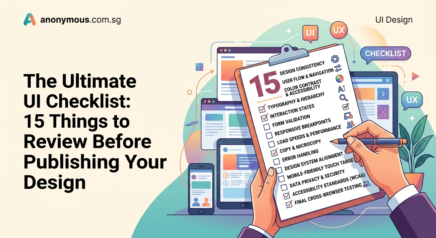
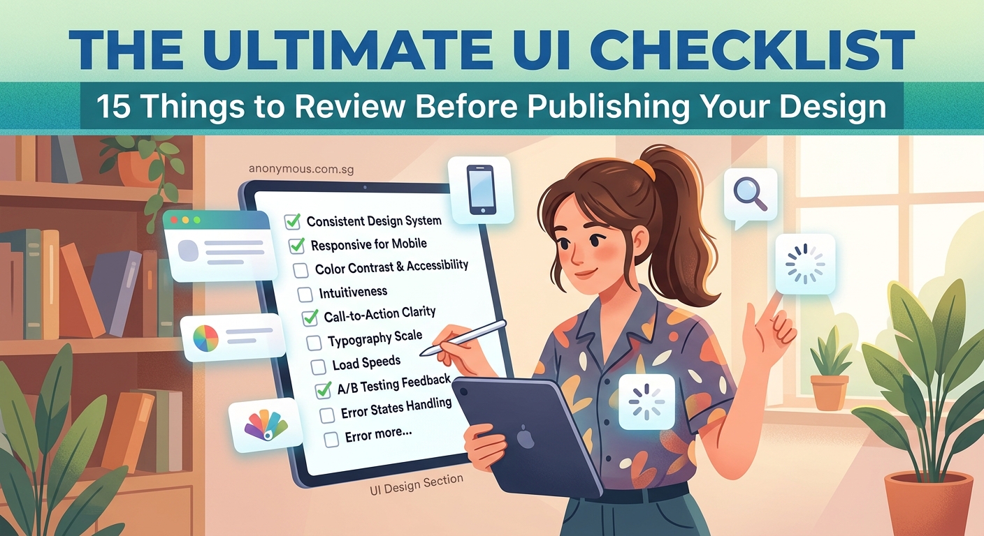
A UI design checklist helps you systematically review typography, spacing, colors, interactive states, accessibility, and responsiveness before launch. This process catches inconsistencies developers might miss and ensures your design works across all devices and user scenarios. Use this 15-point framework to review every project before handoff, reducing revisions and shipping more polished interfaces.
Typography consistency across all screens
Start with text. Open every screen side by side.
Check font sizes. Your headings should follow a consistent scale. If your main heading is 32px on the homepage, it should be 32px everywhere unless you have a documented reason to break that pattern.
Look at font weights. Body text should use the same weight across all pages. Buttons should match. Labels should match.
Line height matters more than most designers realize. Inconsistent line spacing makes interfaces feel unfinished. Set a ratio (1.5 for body text is a safe starting point) and stick to it.
Letter spacing needs attention too. Especially in all-caps labels or small text. Too tight and words blur together. Too loose and they fall apart.
Spacing and alignment that actually holds up
Spacing breaks more designs than color ever will.
Check your margins. Left and right edges should align across components. If your card has 24px padding, your form fields should probably match.
Vertical rhythm keeps screens readable. Space between sections should follow a system. Maybe 48px between major sections, 24px between related groups, 12px between form fields.
Grid alignment saves you from pixel-pushing later. Everything should snap to your layout grid. Text blocks, images, buttons, icons. If something looks off by a few pixels, it probably is.
“The difference between a good interface and a great one often comes down to 8 pixels of padding.” – Every designer who’s ever shipped something
Color usage and contrast ratios
Colors need to pass accessibility standards. Not just because it’s the right thing to do (though it is), but because low contrast text is hard for everyone to read.
Check your text against backgrounds. Body text should hit at least 4.5:1 contrast ratio. Headings can get away with 3:1 if they’re large enough.
Button states need distinct colors. Your primary button, hover state, active state, and disabled state should all be clearly different. Users shouldn’t have to guess if a button works.
Error states and success messages need high contrast too. Red text on a pink background might look pretty, but it won’t help users fix their mistakes.
Understanding color contrast becomes easier when you build contrast checking into your workflow from the start.
Interactive states for every clickable element
Buttons aren’t the only things users click.
Links need hover states. Cards need hover states. Tabs need active states. Form fields need focus states.
Make a list of every interactive element in your design. Then check that each one has:
- Default state
- Hover state
- Active/pressed state
- Focus state (for keyboard navigation)
- Disabled state (if applicable)
Missing states cause confusion. Users hover over something and nothing happens. They wonder if it’s broken or if they’re supposed to click it at all.
Form field validation and error handling
Forms fail more often than any other UI component.
Check every input field. What happens when a user types the wrong format? Where does the error message appear? How does the field look when it’s in an error state?
Success states matter too. When a user fills out a field correctly, give them feedback. A subtle green border or checkmark icon works.
Placeholder text shouldn’t be your only label. It disappears when users start typing, and then they forget what the field was for.
Required field indicators need to be obvious. An asterisk is fine, but make sure you explain what it means somewhere visible.
Responsive behavior at common breakpoints
Your design needs to work on more than just your laptop screen.
Check these widths at minimum:
- 375px (mobile)
- 768px (tablet portrait)
- 1024px (tablet landscape)
- 1440px (desktop)
Text should never run off the edge. Images should scale proportionally. Navigation should collapse into a menu on small screens.
Touch targets on mobile need to be at least 44x44px. Smaller than that and people will tap the wrong thing.
Horizontal scrolling is almost always a mistake. If your content doesn’t fit, stack it vertically or hide it behind a menu.
Icon consistency and sizing
Icons should come from the same family. Mixing outlined icons with filled icons looks sloppy.
Size them consistently. If your navigation icons are 24x24px, your form icons should probably match.
Alignment matters with icons too. They should sit on the same baseline as adjacent text. Center them vertically with their labels.
Color should match your text color in most cases. Icons aren’t decoration. They’re functional elements that support your content.
Loading states and empty states
What happens when data takes a few seconds to load? Users shouldn’t see a blank screen.
Skeleton screens work better than spinners in most cases. They show the structure of what’s coming and make the wait feel shorter.
Empty states need design too. What does your inbox look like with zero messages? Your dashboard with no data? These screens should guide users toward their first action.
Error states need clear next steps. “Something went wrong” doesn’t help anyone. Tell users what happened and what they can do about it.
Button hierarchy and placement
Not all buttons deserve the same visual weight.
Primary actions get the strongest visual treatment. Usually a filled button with your brand color.
Secondary actions get less emphasis. Outlined buttons or ghost buttons work well.
Destructive actions (like delete) should look different from primary actions. Red is common, but any color that stands out works.
Button placement follows reading patterns. Primary actions usually go on the right in Western interfaces. Cancel buttons go on the left.
Navigation clarity and structure
Users should never wonder where they are or how to get back.
Active page indicators need to be obvious. Highlight the current section in your navigation. Use a different color, underline, or background.
Breadcrumbs help on complex sites. They show the path from homepage to current page and let users backtrack easily.
Back buttons should go where users expect them. Top left on mobile. Browsers handle it on desktop.
Accessibility beyond color contrast
Keyboard navigation needs to work perfectly. Users should be able to tab through every interactive element in a logical order.
Focus indicators must be visible. The default browser outline is fine. Custom focus states are better if they’re more visible, not less.
Alt text for images isn’t optional. Screen readers need descriptions. Decorative images can use empty alt text, but functional images need real descriptions.
Heading hierarchy matters for screen readers. Don’t skip from H2 to H4 just because you like how H4 looks. Style your H3 to match instead.
Improving readability helps all users, not just those using assistive technology.
Content hierarchy and scannability
Users don’t read. They scan.
Your most important content should be the most visually prominent. Use size, weight, color, and spacing to create clear hierarchy.
Break up long paragraphs. Three to four lines max for body text. Shorter on mobile.
Lists make content scannable. Bullets for unordered information. Numbers for steps or rankings.
Subheadings every few paragraphs give readers landmarks. They make it easy to skip to relevant sections.
Consistent component styling
Every button should look like every other button. Every card should match every other card.
Build a component library if you haven’t already. Even a simple one in your design tool helps maintain consistency.
Document your patterns. What spacing do cards use? What shadow? What border radius? Write it down so you don’t have to remember.
Creating a consistent design system prevents the inconsistencies that creep in during long projects.
Mobile-specific interactions
Mobile isn’t just small desktop. It’s a different interaction model.
Swipe gestures need clear affordances. If users can swipe to delete, show a visual hint. Maybe the item shifts slightly on touch.
Pull to refresh should feel natural. Add some spring physics so it doesn’t feel stiff.
Bottom navigation works better than top navigation on phones. Thumbs reach the bottom easily. The top requires stretching.
Modals on mobile should be easy to dismiss. A close button in the corner is fine, but let users swipe down to close too.
File organization and handoff preparation
Developers shouldn’t have to hunt for assets.
Name your layers clearly. “Button primary” is better than “Rectangle 47.”
Group related elements. Keep all button variants together. All form fields together. All icons together.
Export assets at the right sizes. 1x, 2x, and 3x for iOS. Multiple densities for Android. SVG for icons when possible.
Document your decisions. Why did you choose that spacing? What’s the intended behavior for that interaction? Write it in your design file or in a separate doc.
Common layout mistakes often come from unclear documentation during handoff.
Common mistakes caught by checklists
Here’s what designers miss most often:
| Mistake | Why it happens | How to catch it |
|---|---|---|
| Inconsistent button padding | Eyeballing instead of measuring | Check padding values in design tool |
| Missing hover states | Designing only default states | Review every interactive element |
| Unreadable text on images | Looks fine with one photo | Test with multiple background images |
| Broken layouts at odd widths | Only testing common breakpoints | Resize browser slowly from 320px to 1920px |
| Inaccessible color combinations | Not checking contrast | Run automated accessibility checks |
| Misaligned elements | Working too zoomed in | Zoom out to 100% and check alignment |
Putting your checklist to work
Print this list. Tape it next to your monitor.
Go through it before every handoff. Not after you think you’re done. After you know you’re done.
You’ll catch things. Everyone does.
That button with 23px padding instead of 24px. That heading that’s 31px instead of 32px. That form field missing a focus state. Small things that add up to an interface that feels slightly off.
Your future self will thank you. So will your developers. And definitely your users.
Start with one project. Run through this checklist completely. Notice how many tiny fixes you make. That’s the difference between good work and polished work.
The best designers aren’t the ones who never make mistakes. They’re the ones who catch them before anyone else sees.