You open an app and know exactly where to look. The headline grabs you. The subheading explains. The body text feels easy to read. That’s not luck. It’s typography hierarchy doing its job.
Good hierarchy guides the eye without thinking. Bad hierarchy makes users work too hard, and they leave.
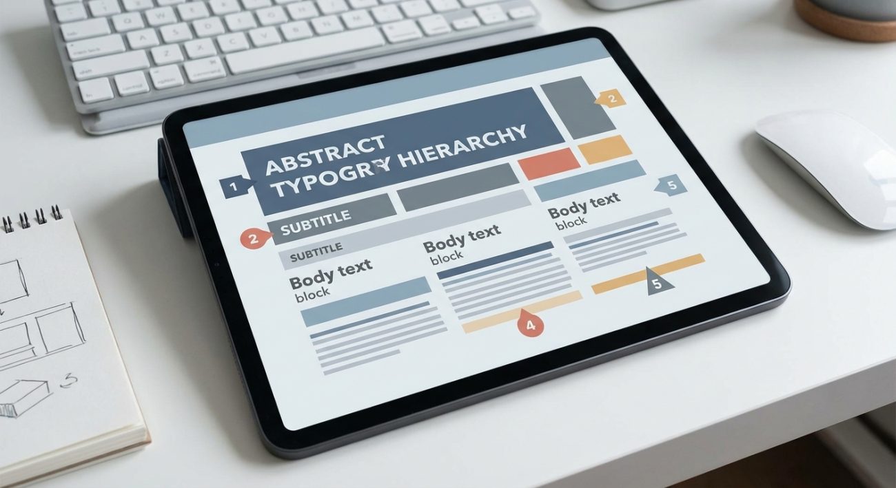
Typography hierarchy in UI design uses size, weight, spacing, and color to create visual order. Strong hierarchy lets users scan screens faster, find information easily, and feel confident navigating interfaces. Apply consistent type scales, limit font weights, and use whitespace strategically to build interfaces that feel intuitive from the first glance.
Why hierarchy matters more than typeface selection
Designers spend hours choosing fonts. They debate serifs versus sans-serifs. They test dozens of weights.
Then they apply those fonts without a clear system.
The typeface matters less than how you organize it. A single font family with proper hierarchy beats three beautiful fonts scattered randomly across a screen.
Hierarchy tells users what to read first, second, and third. It creates a visual path through content. When that path is clear, interfaces feel natural. When it’s missing, even simple screens feel confusing.
Users don’t read interfaces word by word. They scan. They look for patterns. They want to know where the important stuff lives.
Your job is to show them.
The five levels every interface needs
Most screens need five distinct type levels. Not three. Not seven. Five gives you enough range without creating chaos.
Here’s how they work:
- Display text for major headlines and hero sections (48px and up)
- Heading text for section titles and primary labels (32px to 40px)
- Subheading text for secondary labels and card titles (20px to 24px)
- Body text for paragraphs and readable content (16px to 18px)
- Caption text for metadata and supporting details (12px to 14px)
These sizes are starting points. Your actual scale depends on your base font size and screen density. The relationships between levels matter more than exact pixel values.
Each level should feel noticeably different from the next. If users squint to tell your heading from your subheading, the hierarchy isn’t working.
Test your scale by zooming out. The structure should still be obvious at 50% size. If everything blurs together, increase the contrast between levels.
Building a type scale that actually scales
Random font sizes break down fast. You add a new component. You need a size between your heading and body text. You pick 22px because it looks right.
Now you have six sizes. Then seven. Then twelve.
A modular scale prevents this. Pick a ratio and multiply up from your base size. Common ratios include 1.25 (major third), 1.333 (perfect fourth), and 1.5 (perfect fifth).
Start with 16px as your base. Apply a 1.25 ratio:
- 16px (base)
- 20px (16 × 1.25)
- 25px (20 × 1.25)
- 31px (25 × 1.25)
- 39px (31 × 1.25)
Round these to clean numbers: 16, 20, 24, 32, 40.
This gives you a harmonious scale where every size relates mathematically. Users won’t notice the math, but they’ll feel the consistency.
You can build this into your brand style guide to keep every screen consistent.
Weight and spacing do half the work
Size isn’t the only tool. Weight and spacing create hierarchy without changing font size at all.
A regular weight paragraph followed by a bold label creates instant separation. Same size, different importance.
Line height affects readability more than most designers realize. Body text needs breathing room. Set it between 1.4 and 1.6 times your font size. Tighter feels cramped. Looser breaks the flow.
Headings need less line height because they’re rarely more than two lines. Use 1.2 to 1.3 for headings. The tighter spacing makes them feel solid and unified.
Letter spacing (tracking) works differently at different sizes. Large display text often benefits from slight negative tracking (around -0.02em). Small caption text needs positive tracking (+0.02em to +0.04em) to stay legible.
Here’s a comparison:
| Element | Font Size | Weight | Line Height | Letter Spacing |
|---|---|---|---|---|
| Display | 48px | Bold | 1.2 | -0.02em |
| Heading | 32px | Semibold | 1.25 | 0 |
| Subheading | 20px | Medium | 1.3 | 0 |
| Body | 16px | Regular | 1.5 | 0 |
| Caption | 14px | Regular | 1.4 | +0.02em |
Apply these consistently and your screens instantly feel more polished. Avoid common typography mistakes that undermine your hierarchy.
Color and contrast as hierarchy tools
Color creates hierarchy without touching size or weight. A dark headline on a light background commands attention. A muted caption recedes.
Use a three-tier contrast system:
- High contrast for primary content (headings, body text, CTAs)
- Medium contrast for secondary content (subheadings, labels)
- Low contrast for tertiary content (captions, metadata, disabled states)
In practice, this might look like:
- Primary text: 90% black (#1a1a1a)
- Secondary text: 60% black (#666666)
- Tertiary text: 40% black (#999999)
These percentages shift based on your background color. The principle stays the same. Three distinct levels. Clear separation between them.
Color can also signal interactivity. Blue text often means a link. Users have learned this pattern. Breaking it creates confusion.
That doesn’t mean all links must be blue. It means interactive text should look different from static text. Underlines help. Hover states confirm.
When working with brand colors, maintain enough contrast for readability while expressing personality.
Alignment creates invisible structure
Left alignment is default for a reason. It creates a strong vertical edge that guides the eye down the page. Every line starts in the same place.
Center alignment works for short, isolated elements. A modal title. A hero headline. A single call to action.
Center alignment breaks down with multiple elements. Three centered paragraphs feel loose and disconnected. The eye has to hunt for the start of each line.
Right alignment is rare in UI design. It works for numeric data in tables or timestamps in messaging apps. Use it sparingly.
Consistent alignment across related elements creates grouping. Left-aligned labels with left-aligned values feel unified. Mix alignments randomly and the relationship breaks.
“Good typography is invisible. Great typography is felt but not noticed. Users should move through your interface without thinking about the text. They should just understand it.” – Anonymous designer
Whitespace is not empty space
Designers fear empty pixels. They want to fill every corner. This kills hierarchy.
Whitespace separates elements. It groups related content. It gives the eye places to rest.
Increase the space around headings. They need room to breathe. A heading crammed between paragraphs loses impact.
Use consistent spacing increments. Pick a base unit (often 8px) and multiply it. Spacing becomes 8, 16, 24, 32, 48, 64. This creates rhythm across your interface.
Tight spacing between related items. Loose spacing between sections. This proximity principle is fundamental to visual hierarchy.
A card with tight internal spacing and generous external padding feels like a single unit. Reduce the external padding and it blends into surrounding content.
When designing UI components, build whitespace into the component itself. Don’t rely on designers to add it later.
Responsive hierarchy shifts with screen size
Desktop hierarchy doesn’t translate directly to mobile. A 48px headline works on a 27-inch monitor. On a phone, it eats half the screen.
Scale down proportionally, but not equally. Large text scales more than small text.
Desktop to mobile ratios:
- Display: reduce by 30-40%
- Headings: reduce by 20-30%
- Body: reduce by 10-15%
- Captions: keep the same or reduce by 5%
A desktop scale of 48/32/20/16/14 might become 32/24/18/16/14 on mobile.
Line length matters more on small screens. Aim for 50-75 characters per line. Longer lines tire the eyes. Shorter lines feel choppy.
This often means reducing font size less and increasing padding more. The text stays readable, but the layout breathes.
Common hierarchy mistakes and fixes
Here are patterns that break hierarchy and how to fix them:
| Mistake | Why It Fails | Fix |
|---|---|---|
| Too many font sizes | Creates visual noise | Stick to five levels maximum |
| Insufficient size difference | Levels blur together | Increase contrast between levels by at least 20% |
| Inconsistent spacing | Breaks visual rhythm | Use multiples of a base unit (8px) |
| Overusing bold | Everything screams | Reserve bold for true emphasis |
| Centered paragraphs | Hard to scan | Left-align body text |
| Low contrast text | Accessibility failure | Meet WCAG AA standards (4.5:1 minimum) |
| Ignoring line length | Readability suffers | Keep lines between 50-75 characters |
Testing your hierarchy in real conditions
Your hierarchy looks perfect in Figma. Then you add real content and it falls apart.
Test with actual copy. Lorem ipsum hides problems. Real headlines are longer. Real labels are shorter. Real error messages wrap unexpectedly.
Check these scenarios:
- Extremely long headlines (product names, article titles)
- Very short labels (OK, Cancel, Yes, No)
- Numbers in different formats (dates, currency, percentages)
- Mixed content (text with icons, badges, or chips)
- Dynamic content (user-generated text, translations)
View your designs at different zoom levels. Users with vision impairments zoom to 200%. Does your hierarchy hold?
Test on actual devices, not just in responsive preview mode. Fonts render differently on iOS versus Android. A weight that looks perfect on Mac might feel too light on Windows.
Ask someone unfamiliar with your design to scan a screen for five seconds. Then ask what they remember. If they can’t recall the hierarchy, it’s not strong enough.
Maintaining hierarchy across your design system
Consistency is hard. Different designers interpret guidelines differently. Components drift over time.
Document your type scale with examples. Show the five levels in context. Include code snippets. Make it easy to implement correctly.
Create text styles or components in your design tool. Name them semantically: heading-1, heading-2, body-regular, caption-medium. Not by size or weight.
Semantic names survive redesigns. When you change your heading size from 32px to 36px, every instance updates automatically.
Build hierarchy into your design components. A card component should include proper heading and body text styles by default.
Review your interface regularly. Look for drift. New features often introduce new text styles. Consolidate them back into your system.
Hierarchy makes interfaces feel effortless
Strong typography hierarchy doesn’t call attention to itself. Users don’t think about your font sizes. They just move through your interface smoothly.
They find what they need. They understand relationships between elements. They feel confident clicking buttons and filling forms.
That confidence comes from clear visual order. From consistent spacing. From thoughtful contrast and alignment.
Start with your five type levels. Build a modular scale. Apply weight and spacing intentionally. Use color to reinforce importance. Give elements room to breathe.
Test with real content on real devices. Document your decisions. Make them easy to implement.
Your next interface will feel more intuitive from the first screen. Users might not notice your typography, but they’ll definitely notice how easy everything feels to read.