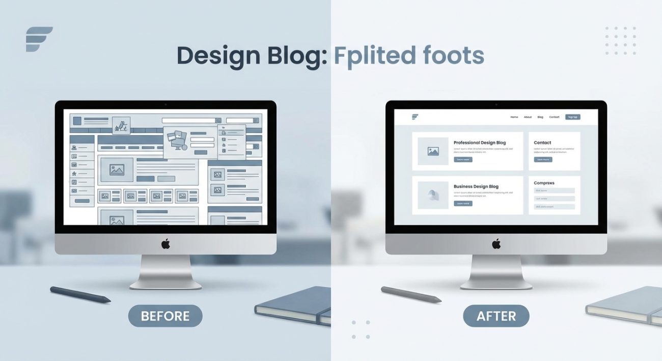
You’re staring at two screens. Both show the same button, same text, same colors. But one feels calm and professional. The other feels cramped and stressful. The difference? White space.
Most beginner designers think white space is just leftover area. It’s not. It’s one of the most powerful tools in your design arsenal, and learning to use it well will make your interfaces look instantly more polished.
White space in UI design refers to empty areas between elements, and it’s essential for readability, visual hierarchy, and user focus. Proper spacing makes interfaces feel professional and easy to use. Beginners often under-use it, leading to cluttered designs. Learning to add generous margins, padding, and line spacing will transform your work immediately and help users navigate your interfaces with confidence.
What white space actually means in interface design
White space is the empty area between and around design elements. It’s not always white. It can be gray, blue, textured, or any background color.
Some designers call it negative space. Others call it breathing room. The name doesn’t matter. What matters is understanding that this “empty” space does serious work.
White space groups related items together. It separates unrelated content. It guides the eye from one section to another. It gives users mental breaks between chunks of information.
Without enough white space, your interface becomes a wall of noise. Users can’t tell what’s important. They can’t find the button they need. They leave.
Why beginners struggle with spacing
New designers pack too much into every screen. It feels wasteful to leave areas empty. You think more content means more value.
That instinct is backwards.
Tight spacing makes everything compete for attention. Nothing stands out. Users feel overwhelmed before they even start reading.
Professional designers do the opposite. They add space deliberately. They let elements breathe. The result looks cleaner, simpler, and more trustworthy.
The two types of white space you need to know
Designers split white space into two categories: micro and macro.
Micro white space is the small breathing room between individual elements. This includes:
- Space between lines of text (line height)
- Padding inside buttons and cards
- Margins around icons
- Gaps between list items
- Letter spacing in headings
Macro white space is the larger empty area that structures your layout. This includes:
- Margins around the entire page
- Space between major sections
- Padding around hero images
- Empty columns in grid layouts
- Gaps between navigation items
Both types matter. Micro spacing improves readability. Macro spacing creates visual hierarchy and guides users through your interface.
How to add white space in five practical steps
Here’s a process you can follow right now to improve any interface design.
-
Start with default spacing, then double it. Most beginners use 8px or 12px margins. Try 24px or 32px instead. It will feel too spacious at first. That’s normal. Let your eyes adjust. You’ll notice the design becomes easier to scan.
-
Increase line height to 1.5 or 1.6. Body text needs room to breathe vertically. A line height of 1.5 means the space between lines equals half the font size. For 16px text, that’s 24px total line height. This single change makes paragraphs far more readable.
-
Add generous padding inside clickable elements. Buttons should have at least 12px to 16px of vertical padding and 24px to 32px of horizontal padding. This makes them easier to tap on mobile and gives them visual weight.
-
Use consistent spacing units. Pick a base unit like 8px and build everything around multiples of it. Use 8px, 16px, 24px, 32px, 40px, 48px. This creates rhythm and makes your layout feel intentional. Many essential UI components rely on consistent spacing to feel cohesive.
-
Leave empty space around focal points. If you want users to notice a call-to-action button, surround it with white space. Isolation draws attention. Crowding kills it.
Common spacing mistakes and how to fix them
| Mistake | Why it hurts | How to fix it |
|---|---|---|
| Equal spacing everywhere | No visual hierarchy, everything looks flat | Vary spacing to show relationships and importance |
| Text touching edges | Feels cramped and hard to read | Add minimum 16px padding on mobile, 24px on desktop |
| Inconsistent gaps | Layout feels chaotic and unplanned | Use a spacing scale (8px, 16px, 24px, etc.) |
| Ignoring line height | Paragraphs become walls of text | Set line height to 1.5 for body text, 1.2 for headings |
| Filling every pixel | Users feel overwhelmed and leave | Embrace emptiness as a design tool |
How white space creates visual hierarchy
Visual hierarchy tells users what to look at first, second, and third. White space is your main tool for building this hierarchy.
Elements surrounded by more space feel more important. Elements grouped tightly together feel related. Elements separated by large gaps feel like different topics.
Look at any landing page. The headline has huge margins above and below it. That space makes it the first thing you read. The subheading sits closer to the headline than to the body text. That proximity shows they’re related.
This isn’t accidental. It’s deliberate spacing that guides your eye through the page in the right order.
“White space is to be regarded as an active element, not a passive background.” This principle applies whether you’re designing interfaces or working on typography for brand identity.
Practical spacing values to start using today
Here are specific numbers you can apply to your next project. These aren’t rules. They’re starting points based on what works in real interfaces.
For body text:
– Font size: 16px minimum
– Line height: 1.5 to 1.6
– Paragraph spacing: 16px to 24px
– Max width: 600px to 700px
For buttons:
– Vertical padding: 12px to 16px
– Horizontal padding: 24px to 32px
– Space between buttons: 12px to 16px
For cards and containers:
– Internal padding: 24px to 32px
– Space between cards: 16px to 24px
– Margin from screen edge: 16px minimum on mobile
For sections:
– Space between major sections: 64px to 96px on desktop
– Space between minor sections: 32px to 48px
Testing if you have enough white space
Squint at your design or blur your screen. Can you still see clear groupings? Can you tell which elements belong together?
If everything blends into one gray blob, add more spacing.
If you can see distinct shapes and clusters, you’re on the right track.
Another test: show your design to someone for three seconds, then hide it. Ask them what they remember. If they can’t recall the main message or call to action, you probably need more white space around those elements.
White space on mobile vs desktop
Mobile screens are smaller, but that doesn’t mean you should reduce spacing. Users still need breathing room. In fact, generous spacing matters even more on mobile because touch targets need to be large enough to tap accurately.
Keep button padding the same or slightly larger on mobile. Reduce the number of items per row instead of shrinking spacing. Use vertical scrolling to give content room.
On desktop, you have more horizontal space. Use it to create wider margins and more dramatic separation between sections. Don’t just stretch content to fill the screen. Add space strategically.
How white space affects user behavior
Research shows that proper spacing improves comprehension and increases conversion rates. Users can process information faster when it’s well-spaced. They feel less cognitive load. They trust the interface more.
A cluttered checkout form makes users hesitate. A spacious one with clear groupings and breathing room feels easier to complete. The content is the same. The spacing changes everything.
This applies to every interface element. Navigation menus with tight spacing cause misclicks. Forms with cramped fields feel tedious. Dashboards packed with data overwhelm users before they start.
Add space, and behavior improves.
Balancing content density with breathing room
Sometimes you genuinely need to show a lot of information. Dashboards, data tables, and admin panels can’t always be minimal and spacious.
The solution isn’t to cram everything together. It’s to use spacing strategically to create clear sections and hierarchy even within dense layouts.
Group related data with consistent internal spacing. Separate different groups with larger gaps. Use background colors or subtle borders to define containers. Let users focus on one section at a time.
Even dense interfaces need micro white space. Line height still matters. Padding inside table cells still matters. These small touches keep the layout readable even when information density is high.
Building a spacing system for consistency
Professional designers don’t guess at spacing values. They build systems.
A spacing system is a set of predefined values you use throughout your design. The most common approach is a scale based on multiples of 4 or 8.
For example, an 8px scale looks like this: 8px, 16px, 24px, 32px, 40px, 48px, 56px, 64px, 72px, 80px.
You pick from these values instead of typing random numbers. This creates consistency across your entire interface. Buttons always have 16px vertical padding. Section breaks are always 64px. Cards always have 24px internal padding.
This system should live in your brand style guide alongside colors and typography.
Consistency makes your interface feel more professional. It also speeds up your design process because you’re not reinventing spacing every time.
Learning from real interface examples
Open any well-designed app or website. Screenshot it. Draw boxes around elements. Measure the spacing.
You’ll notice patterns. Headers have huge top margins. Related items sit close together. Unrelated sections have large gaps. Buttons have generous padding.
Do this with five or six interfaces you admire. You’ll start to internalize what good spacing looks like. You’ll develop an eye for it.
Then apply those patterns to your own work. Copy the spacing values. Adapt them to your content. See what works.
This hands-on learning beats theory every time.
Why your designs will improve immediately
White space is one of the fastest ways to level up your design skills. You don’t need to learn complex tools or master illustration. You just need to add more space.
Start with your next project. Double your current margins. Increase line height to 1.5. Add 32px of padding to your buttons. See how it feels.
The change will be dramatic. Your interface will look cleaner. More professional. Easier to use.
Users will notice too. They’ll find what they need faster. They’ll feel less stressed. They’ll trust your interface more.
That’s the power of empty space. It’s not empty at all. It’s doing the work that makes everything else succeed.