Choosing the right colors can make or break your design project. You’ve probably noticed how some designs feel energizing while others seem calming, but understanding why that happens and how to control it is where most beginners get stuck.
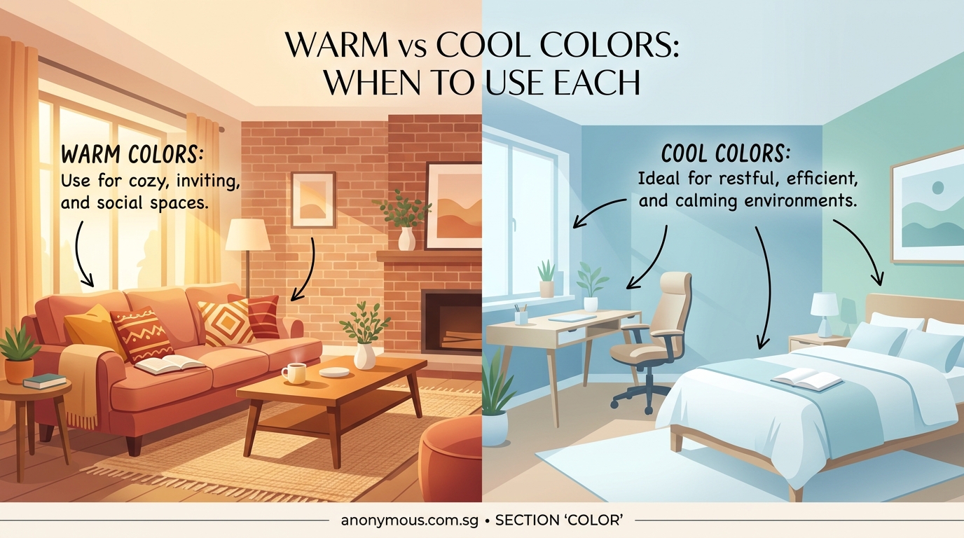
Warm colors (reds, oranges, yellows) create energy and urgency, perfect for calls to action and food brands. Cool colors (blues, greens, purples) build trust and calm, ideal for healthcare and tech. Understanding when to use each temperature helps you control the emotional response your designs trigger, making your work more intentional and effective.
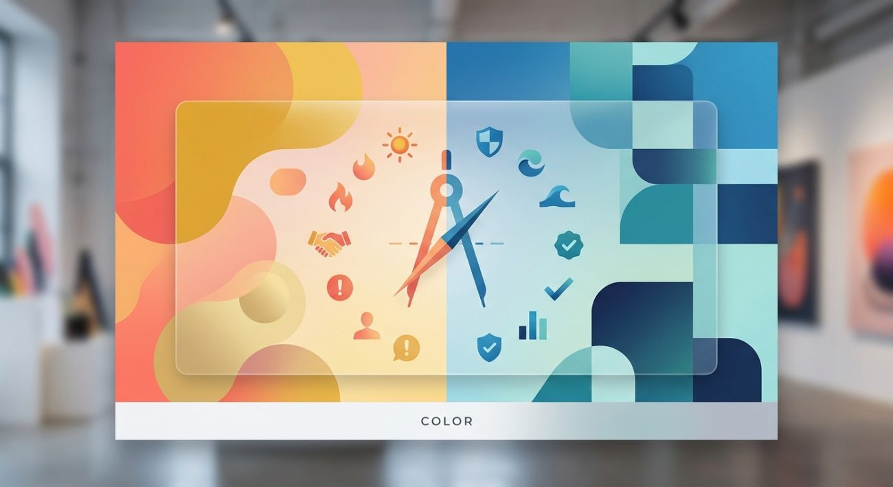
Understanding color temperature in practical terms
Color temperature isn’t about actual heat. It describes the emotional feeling colors create.
Warm colors sit on the red side of the color wheel. They include reds, oranges, yellows, and warm variations of other hues. Think sunset, fire, autumn leaves.
Cool colors live on the blue side. Blues, greens, purples, and their variations fall here. Think ocean, sky, winter morning.
This matters because viewers respond to these temperatures instinctively. A red button feels more urgent than a blue one. A green background feels more restful than an orange one.
You don’t need to memorize complex theory. Just remember that warm pushes forward, cool recedes backward.
When warm colors work best in your designs
Warm colors grab attention fast. Use them when you need immediate action or want to create excitement.
Food and restaurant branding
Warm colors stimulate appetite. Red, orange, and yellow appear constantly in restaurant logos and menus because they make food look more appealing. McDonald’s, Pizza Hut, and Subway all use warm palettes for this exact reason.
Sale announcements and urgency
Red creates urgency better than any other color. That’s why clearance signs, limited time offers, and countdown timers almost always use red or orange. The color triggers a faster decision response in viewers.
Energy and movement
Fitness brands, sports teams, and youth-focused products benefit from warm colors. Orange and red communicate energy and action. They make static designs feel more dynamic.
Call to action buttons
Testing consistently shows warm-colored buttons (especially orange and red) get more clicks than cool alternatives. The contrast draws the eye, and the warmth suggests forward movement.
Use warm colors sparingly in large areas. They can overwhelm viewers if you apply them to entire backgrounds. Reserve them for accents and focal points where you need attention.
When cool colors serve your design better
Cool colors build different emotional responses. They work best when you need trust, professionalism, or calm.
Healthcare and wellness
Blue and green dominate medical branding because they communicate cleanliness, calm, and trustworthiness. Patients feel more comfortable with cool palettes in clinical settings.
Technology and finance
Banks, insurance companies, and tech startups favor blue for good reason. It suggests stability, security, and intelligence. PayPal, Facebook, and IBM all rely on blue as their primary brand color.
Luxury and sophistication
Deep purples and navy blues create premium feelings. High-end brands use cool colors to suggest exclusivity and refinement. They feel more controlled than warm alternatives.
Backgrounds and reading spaces
Cool colors recede visually, making them perfect for backgrounds. Light blues and greens reduce eye strain and help text stand out. Educational platforms and reading apps use cool backgrounds to improve focus.
Mixing warm and cool colors effectively
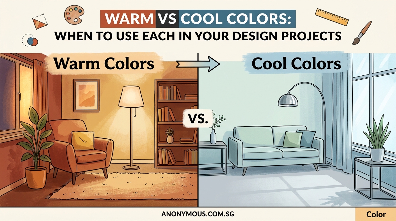
You rarely need to choose only one temperature. Most successful designs blend both.
The 60-30-10 color rule helps here. Use 60% of your dominant temperature, 30% of your secondary color, and 10% of the opposite temperature as an accent.
Complementary contrast
Pairing warm and cool creates visual interest. Orange text on a blue background pops because the temperatures contrast. This works for highlighting important information or creating focal points.
Temperature transitions
You can create depth by shifting from warm foregrounds to cool backgrounds. Warm elements appear closer to viewers, while cool elements recede. This natural visual hierarchy helps guide attention through your design.
Neutral bridges
Grays, tans, and off-whites sit between warm and cool. They let you use both temperatures without clash. A warm accent color and a cool primary color both work when separated by neutral space.
Common mistakes when choosing color temperature
Ignoring context
A color that works for a children’s toy brand fails for a law firm. Always consider your audience and industry before defaulting to warm or cool.
Temperature inconsistency
Mixing warm and cool versions of the same hue confuses viewers. If you choose blue as your primary color, stick with cool blues throughout. Don’t jump between warm navy and cool cyan.
Forgetting accessibility
Color contrast matters more than temperature. A warm yellow might look energetic, but it disappears against white backgrounds. Test your combinations for readability.
Overusing warm colors
New designers often use too much red or orange, creating aggressive designs that tire viewers. Balance warm accents with cooler neutrals.
Step-by-step process for choosing temperature
Follow this method when starting any design project:
-
Define the emotional goal. Write down three feelings you want viewers to experience. Energized and urgent? Use warm. Calm and trustworthy? Use cool.
-
Research your industry standards. Look at five successful competitors. Notice which temperature dominates. You can choose differently, but understand the norm first.
-
Test both options. Create two quick mockups, one warm-dominant and one cool-dominant. Show them to people outside your project. Ask which feels more appropriate for your goal.
-
Apply the 60-30-10 split. Once you choose your dominant temperature, select your specific colors and distribute them across your design using this ratio.
-
Check contrast and accessibility. Use a color contrast checker to verify your combinations meet WCAG standards.
Real-world examples across design types
Logo design
A bakery logo benefits from warm oranges and reds (appetite stimulation). A dental clinic logo needs cool blues and greens (cleanliness and calm). Your choice should match the service emotion.
Website headers
E-commerce sites selling products often use warm headers to create shopping excitement. Service-based businesses use cool headers to build professional trust. The temperature sets the tone for the entire user experience.
Social media graphics
Announcement posts perform better with warm accents that grab attention in busy feeds. Educational content works better with cool palettes that suggest thoughtful information. Match temperature to post purpose.
Print materials
Restaurant menus use warm colors to make dishes appealing. Medical brochures use cool colors to reduce patient anxiety. The physical context matters as much as digital.
How temperature affects different design elements
| Element | Warm Temperature Effect | Cool Temperature Effect |
|---|---|---|
| Backgrounds | Energizing but can overwhelm | Calming and easy on eyes |
| Text | Grabs attention, harder to read in bulk | Professional, better for long reading |
| Buttons | Higher click rates, more urgent feeling | Lower urgency, suggests thoughtful action |
| Icons | Playful and approachable | Clean and professional |
| Borders | Active and bold | Subtle and refined |
Temperature considerations for different media
Print projects
Colors shift between screen and print. Warm colors often appear more intense on paper than on screens. Cool colors can lose vibrancy. Always request a proof before final printing, and remember that CMYK vs RGB affects how temperatures translate.
Digital screens
Blue light from screens makes cool colors appear more vibrant. Warm colors can look muddy on some displays. Test your designs on multiple devices to see how temperature shifts across screens.
Mobile interfaces
Smaller screens benefit from higher contrast between warm and cool elements. Temperature differences help create clear visual hierarchy when you have limited space.
Building a temperature-balanced brand palette
Start with your primary brand color. Decide if it should be warm or cool based on your industry and goals.
Add two supporting colors:
- One from the same temperature family (creates harmony)
- One neutral that bridges to the opposite temperature (creates flexibility)
Include one accent color from the opposite temperature. This gives you contrast options for calls to action or special highlights.
Document these choices in a brand style guide so your temperature decisions stay consistent across all materials.
Temperature and cultural considerations
Color temperature meanings shift across cultures. Red signals danger in Western design but represents luck and celebration in Chinese culture. Blue suggests trust in American design but can represent mourning in some Middle Eastern contexts.
Research your specific audience. Don’t assume temperature associations work universally.
Quick temperature adjustments that fix common problems
Design feels aggressive
Replace warm backgrounds with cool ones. Keep warm colors only for small accents and buttons.
Design feels boring
Add a warm accent color to an all-cool palette. Even a small amount of orange or red creates energy.
Elements blend together
Increase temperature contrast between foreground and background. Warm text on cool backgrounds (or vice versa) improves separation.
Brand feels inconsistent
Check if you’re mixing warm and cool versions of your brand colors. Standardize to one temperature direction.
Testing your temperature choices
Show your design to five people unfamiliar with the project. Ask them:
- What emotion does this create?
- What action does this encourage?
- Does this feel professional or casual?
Their answers reveal if your temperature choice matches your intention. If responses don’t align with your goals, adjust your warm/cool balance.
Temperature in seasonal and time-sensitive designs
Holiday designs benefit from temperature matching. Summer promotions work with warm yellows and oranges. Winter sales perform better with cool blues and silvers.
Event invitations follow similar patterns. Wedding invitations often use cool colors for elegance. Birthday party invites use warm colors for celebration and fun.
Advanced temperature techniques
Temperature gradients
Transitioning from warm to cool within a single element creates depth and movement. Sunset gradients (warm orange to cool purple) appear frequently in modern app interfaces.
Temperature isolation
Placing a single warm element in an entirely cool design (or vice versa) creates powerful focal points. The temperature contrast draws attention more effectively than size or position alone.
Monochromatic temperature shifts
You can create interest using only one hue by shifting its temperature. A warm red and a cool red together provide contrast while maintaining color unity.
Choosing temperature for specific design goals
Increase conversions
Use cool colors for your overall design to build trust. Add warm buttons for calls to action. This combination gives viewers comfort while encouraging action.
Improve readability
Cool backgrounds with dark text create the least eye strain. Warm backgrounds work for short bursts but tire readers over time.
Create brand recognition
Choose one temperature as your signature. Coca-Cola owns warm red. Tiffany owns cool blue. Consistency builds recognition faster than variety.
Stand out from competitors
If everyone in your industry uses cool colors, consider warm alternatives. Temperature differentiation helps you stand out, but make sure it still fits your brand personality.
Temperature and color psychology combined
Temperature works alongside color psychology to create meaning. A warm blue feels more approachable than a cool blue. A cool red feels more sophisticated than a warm red.
You control both the hue and its temperature. Don’t treat them as separate choices. They work together to create your final emotional impact.
Making temperature work across your entire brand system
Once you establish temperature preferences, apply them consistently. Your logo, website, social media graphics, and print materials should all follow the same temperature logic.
This doesn’t mean using identical colors everywhere. It means maintaining the same warm or cool dominance across all touchpoints. A primarily cool brand can use warm accents, but those accents should appear in similar ways across different materials.
Your next steps with color temperature
Start your next project by choosing temperature before choosing specific colors. This single decision narrows your options and makes color selection faster and more intentional.
Create two versions of your current project, one warm-dominant and one cool-dominant. Compare them. Notice how the temperature shift changes the entire feeling, even when everything else stays the same. That awareness will transform how you approach every future design decision.
Temperature isn’t complicated. It’s just about understanding whether you want to energize or calm your audience. Make that choice first, and the rest of your color decisions become much clearer.