You’ve designed the perfect business card. Colors look great. Typography is on point. You send it to the printer feeling confident.
Then it comes back with thin white borders around the edges. Or worse, your background color is cut off awkwardly. Your carefully crafted design now looks amateur.
This happens because you didn’t set up bleed correctly.
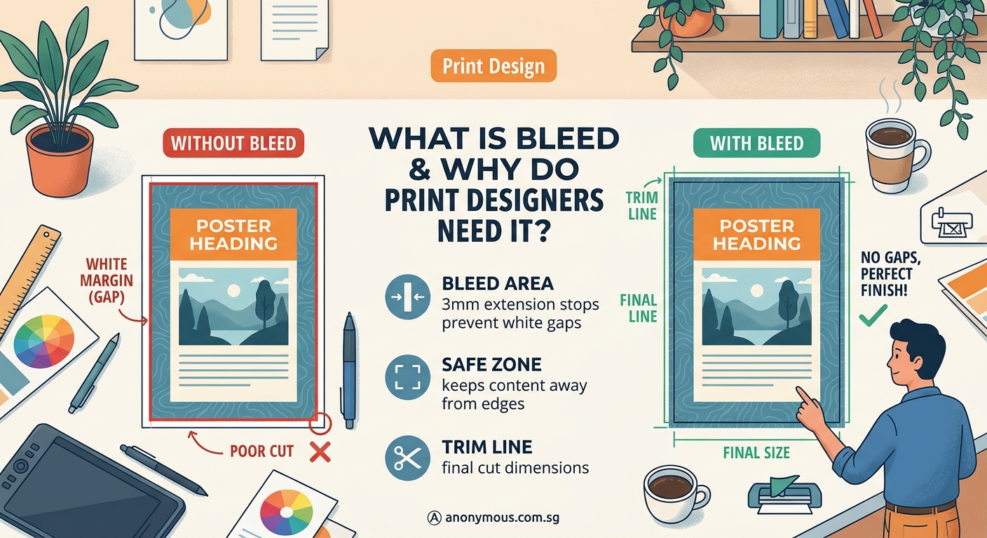
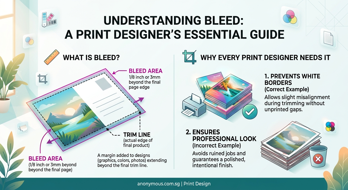
Bleed is the extra design area that extends beyond the final trim size of your printed piece. It prevents white edges and ensures your design reaches the paper’s edge after cutting. Standard bleed is 3mm (0.125 inches) on all sides. Without it, your prints will have unintended borders or awkward crop marks that make your work look unprofessional.
Understanding bleed in print design
Bleed refers to the area of your design that extends past the final cut line.
When printers cut paper, the blade can shift slightly. Even a millimeter off creates visible white edges if your background stops exactly at the trim line.
Think of it like wallpaper. You always cut it slightly larger than needed, then trim the excess. The same principle applies to printing.
The extra area gives the cutting blade room for error. Your design elements that should reach the edge actually go beyond it. After trimming, the design appears to “bleed” right to the edge of the paper.
Most print shops require 3mm (or 0.125 inches) of bleed on all sides. Some large format printers ask for 5mm.
Here’s what happens without proper bleed:
- White slivers appear along edges
- Background colors look cut off
- Images appear cropped incorrectly
- The entire piece looks amateurish
Setting up your files with bleed from the start saves money, time, and embarrassment.
How printing and cutting actually works
Commercial printing isn’t like your home printer.
Print shops use large sheets of paper. They print multiple copies of your design on one big sheet, then cut them apart using industrial guillotine cutters.
These cutters are accurate, but not perfect. Paper can shift. The blade can move a fraction of a millimeter. Temperature and humidity affect paper dimensions.
When you’re printing hundreds or thousands of pieces, even tiny variations become visible.
The printer aims for the trim line (also called the cut line). But they need extra design area beyond that line to account for movement.
That’s your bleed area.
After cutting, the bleed gets trimmed away. What remains is your design extending perfectly to the edge.
Setting up bleed in your design files
Start with the right document size before you begin designing.
Let’s say you’re creating a standard business card: 90mm x 55mm.
With 3mm bleed on all sides, your document size should be 96mm x 61mm.
Here’s the math:
* Width: 90mm + 3mm (left) + 3mm (right) = 96mm
* Height: 55mm + 3mm (top) + 3mm (bottom) = 61mm
Your actual design stays within the 90mm x 55mm area. But background colors, images, and any elements touching the edge must extend into that extra 3mm zone.
Step-by-step setup process
- Calculate your final size plus bleed (add 6mm total for 3mm bleed on each side)
- Create your document at the larger size
- Add guides showing the actual trim line
- Extend all edge elements into the bleed area
- Keep important text and logos away from the trim line (add a 3mm safe zone)
Most design software has built-in bleed settings. Use them.
In Adobe Illustrator, InDesign, or Photoshop, you can set bleed when creating a new document. The software adds red guide lines showing where the bleed ends.
Your printer will also provide a template. Use it. These templates show exactly where to place your design elements.
The three critical zones in print design
Every print file has three important areas.
Bleed area: Everything beyond the trim line. Extends 3mm past the final size. Background elements must reach here.
Trim line: Where the paper gets cut. This is your final size. The printer aims to cut exactly here.
Safe area: At least 3mm inside the trim line. Keep all text, logos, and important elements within this zone. If the cut shifts slightly, nothing important gets chopped off.
Here’s how they work together:
| Zone | Purpose | What goes here |
|---|---|---|
| Bleed area | Prevents white edges | Background colors, patterns, images that touch edges |
| Trim line | Final cut location | Design boundary, not a design element |
| Safe area | Protected zone | Text, logos, important graphics, contact information |
Think of it like a target. The safe area is the bullseye. The trim line is the next ring. The bleed area is the outer ring.
Common bleed mistakes that ruin prints
New designers make the same errors repeatedly.
Stopping the background at the trim line: Your background color or image ends exactly where the cut happens. Any shift creates white edges. Always extend backgrounds into the bleed.
Placing text too close to the edge: Text sits right at the trim line. A slight cutting variation chops off letters. Keep text at least 3mm inside the trim line.
Forgetting bleed on some sides: You add bleed to top and bottom but forget left and right. All four sides need equal bleed.
Using white borders intentionally: You want a white frame around your design, so you create a white rectangle inside the trim line. This rarely prints evenly. If you want borders, make them thick enough (at least 5mm) that slight variations don’t look like mistakes.
Not checking printer requirements: You assume 3mm bleed is universal. Some printers want 5mm. Always confirm before finalizing your design.
Ignoring the safe zone: You put your phone number 2mm from the edge. It gets cut off. Text needs breathing room.
Professional printers check files before printing. But they won’t redesign for you. If your file lacks proper bleed, they’ll either print it as-is (with white edges) or contact you for revisions. Both options delay your project.
Different print projects need different bleed
Not every project uses the same bleed specifications.
Business cards, postcards, flyers: Standard 3mm bleed on all sides.
Booklets and magazines: 3mm bleed, but watch the spine. Elements crossing the center fold need careful positioning. The binding eats up about 3mm of space.
Posters and banners: Often require 5mm bleed due to larger cutting tools and material flexibility.
Stickers and labels: Die-cut items need bleed around the entire custom shape, not just straight edges.
Books with perfect binding: The spine area needs extra consideration. Pages lose about 3-6mm in the binding process.
Large format printing (banners, vehicle wraps, building signage) uses bigger bleed measurements. The larger the final size, the more room for cutting variation.
Always check with your specific printer. They’ll provide technical specifications for each project type.
How to check your bleed before sending files
Run through this checklist before submitting files to your printer.
- Turn on bleed guides in your design software
- Zoom to 100% and check all four edges
- Confirm background elements extend past the trim line
- Verify text and logos sit inside the safe zone
- Check that your document size includes bleed
- Review the printer’s template if they provided one
- Export with crop marks and bleed settings enabled
When exporting PDFs, most software asks if you want to include bleed. Say yes.
The PDF should show crop marks (small lines at corners) indicating where to cut. The bleed area appears beyond these marks.
If you’re unsure, ask your printer to review your file before printing the full run. Most will check a proof for free. It’s cheaper to fix issues before printing than to reprint everything.
You can also reference guides about how to set up print files that won’t get rejected by printers for additional technical requirements.
Bleed in different design software
Each program handles bleed slightly differently.
Adobe InDesign: Set bleed when creating a new document. Go to File > Document Setup to adjust later. Bleed settings appear in the export dialog when saving PDFs.
Adobe Illustrator: Create your artboard at the final trim size. Add bleed in File > Document Setup. Or manually create a larger artboard and add trim marks.
Adobe Photoshop: Set canvas size to include bleed. Add guides for trim and safe zones manually. Photoshop doesn’t have automatic bleed tools like InDesign.
Canva: Doesn’t have built-in bleed settings. You need to manually increase your canvas size and extend design elements. Not ideal for professional printing.
Affinity Publisher and Designer: Similar to Adobe products. Set bleed in document setup. Export options include bleed and crop marks.
For professional print work, use professional tools. Consumer design apps often lack proper print preparation features. Understanding why your color choices look different on screen vs print is equally important for quality results.
Real-world examples of bleed in action
Let’s look at specific scenarios.
Example 1: Business card with full-color background
Your card is 90mm x 55mm. You’re using a deep blue background.
Wrong approach: Create a 90mm x 55mm document. Fill it with blue. Export.
Right approach: Create a 96mm x 61mm document. Fill the entire canvas with blue (including bleed area). Place your logo and text within the 90mm x 55mm safe zone. Add 3mm guides showing the trim line.
Example 2: Postcard with photo background
Your postcard is 6 inches x 4 inches. You’re using a photo as the background.
Wrong approach: Place a 6×4 inch photo on a 6×4 inch canvas.
Right approach: Create a 6.25 x 4.25 inch canvas (adding 0.125 inch bleed). Use a photo that’s at least 6.25 x 4.25 inches. Position it to extend beyond all edges. Keep text inside the 6×4 inch safe zone.
Example 3: Flyer with white background and colored border
You want a green border around a white flyer.
Wrong approach: Create a white background with a thin green line at the edge. The cut will likely miss the line or cut through it unevenly.
Right approach: Either extend the green border into the bleed area (making it thicker), or skip the border entirely. Thin borders at the trim line never look professional.
When you don’t need bleed
Not every print project requires bleed.
If nothing in your design touches the edge, you don’t need bleed. A white border around everything eliminates the need.
For example:
* A business card with a white border that’s at least 5mm thick
* A flyer with all content centered and surrounded by white space
* Letterhead with text and logos positioned away from all edges
However, most designers still set up files with bleed anyway. It’s standard practice. It also gives you flexibility if you decide to extend elements to the edge later.
Digital printing on pre-cut sheets sometimes doesn’t require bleed. But confirm with your printer first.
Bleed and color mode work together
Setting up bleed correctly matters, but so does using the right color mode.
Print uses CMYK (cyan, magenta, yellow, black). Screens use RGB (red, green, blue).
If you design in RGB and forget to convert to CMYK, your colors will shift when printed. Even with perfect bleed, the final piece won’t match your expectations.
Always design print projects in CMYK from the start. This ensures what you see is close to what you’ll get. Learn more about CMYK vs RGB and when to use each color mode for print projects.
Resolution matters too. Print requires 300 DPI (dots per inch). Screen graphics only need 72 DPI. Low-resolution images look pixelated when printed, even with correct bleed.
Teaching clients about bleed
If you’re designing for clients, you’ll need to explain bleed.
Most clients don’t understand printing technicalities. They see your design on screen and assume that’s exactly what prints.
Use simple language:
“I’m adding extra space around the edges of your design. The printer will cut it off. This prevents white borders from appearing.”
Show them a visual. Create a mockup with and without bleed. Demonstrate what happens when the cut is slightly off.
Many clients worry you’re cutting off their design. Reassure them that important elements stay safe inside the trim line.
Some clients insist on placing text or logos right at the edge. Explain the risk. Show examples of prints gone wrong. If they still insist, get written approval. You’ve done your job by warning them.
Print preparation beyond bleed
Bleed is just one part of print-ready files.
You also need:
- Correct color mode (CMYK)
- Proper resolution (300 DPI minimum)
- Embedded fonts or outlined text
- Flattened transparency
- Correct file format (usually PDF/X-1a or PDF/X-4)
Before sending any file to print, run through comprehensive pre-flight checks every designer should run before sending files to print.
Missing any of these requirements can result in rejected files, reprints, or disappointing results.
Building bleed into your workflow
Make bleed setup automatic.
Create templates for common projects. Set them up with proper bleed, trim lines, and safe zones. Save them. Reuse them.
Most designers maintain a library of templates:
* Business cards (standard and custom sizes)
* Postcards (4×6, 5×7, etc.)
* Flyers (A4, A5, letter, etc.)
* Brochures (tri-fold, bi-fold, etc.)
Starting each project with the correct template eliminates errors.
If you’re building a consistent system across multiple projects, consider how a proper brand style guide that actually gets used can include print specifications.
Troubleshooting bleed issues
Your printer rejected your file. Now what?
Problem: “Your file has no bleed.”
Solution: Increase your canvas size by 6mm (or 0.25 inches). Extend background elements to fill the new space. Re-export.
Problem: “Your bleed is inconsistent.”
Solution: Check all four sides. Make sure each side has equal bleed. Sometimes designers accidentally crop one side.
Problem: “Important elements are too close to the trim line.”
Solution: Move text and logos at least 3mm away from the edge. Resize if necessary.
Problem: “Your background doesn’t extend into the bleed.”
Solution: Extend your background image or color to cover the entire canvas, including bleed area.
Most printers will tell you exactly what’s wrong. Fix it and resubmit. Don’t argue or try to explain why you think it’s fine. They print hundreds of jobs daily. They know what works.
Why professional designers never skip bleed
Bleed separates amateur work from professional results.
Experienced designers set up bleed automatically. It’s muscle memory. They don’t even think about it.
New designers often skip it because:
* They don’t understand why it matters
* They forget
* They’re used to designing for screens
* They think it’s optional
It’s not optional for professional print work.
Every design that goes to a commercial printer needs proper bleed. No exceptions.
The few extra minutes setting up your file correctly saves hours of reprinting and the embarrassment of delivering subpar work to clients.
Your next print project starts here
Now you understand what bleed is, why it matters, and how to set it up correctly.
Start your next print project with a proper template. Add 3mm bleed on all sides. Extend your backgrounds into that space. Keep your text safe inside the trim line.
Your prints will come back looking exactly as you designed them. No white edges. No awkward crops. Just clean, professional results that make you look like you know what you’re doing.
Because now you do.