Good interfaces feel invisible. You tap a button and something happens. You scan a menu and find what you need. You complete a task without thinking twice.
Bad interfaces make you work. They hide important actions behind vague icons. They force you to guess where things are. They leave you frustrated and clicking around aimlessly.
The difference between these two experiences comes down to principles. Not trends. Not personal taste. Principles that have been tested across thousands of products and millions of users.
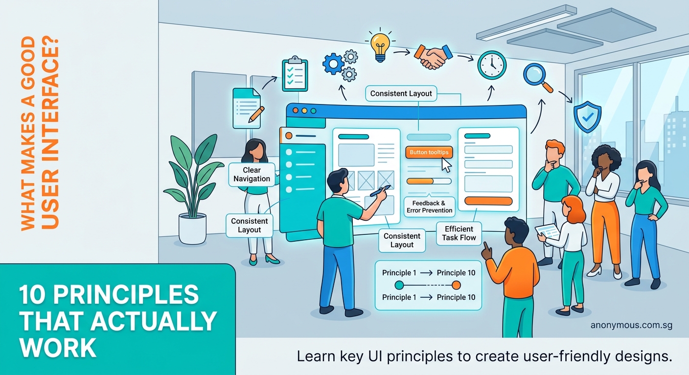
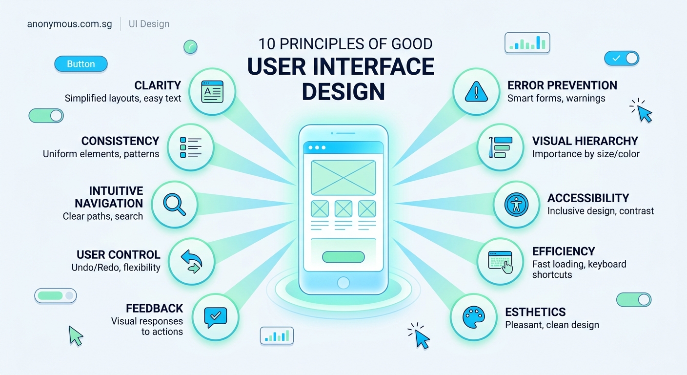
User interface design principles are foundational guidelines that help designers create intuitive, accessible, and effective digital products. These principles include consistency, clear visual hierarchy, immediate feedback, error prevention, and accessibility. Mastering them transforms confusing interfaces into experiences that feel natural and effortless. This guide covers ten core principles with practical examples you can apply to your next project today.
Why principles matter more than patterns
Design patterns change. What worked on desktop feels clunky on mobile. What looked modern five years ago now feels dated.
Principles stay constant because they’re rooted in how humans perceive and process information. They’re based on cognitive psychology, usability research, and decades of testing.
When you understand the principles behind good interface design, you can adapt to any platform, any trend, any constraint. You’re not copying what others do. You’re making informed decisions based on how people actually use interfaces.
Consistency creates confidence
Users learn your interface once. Then they expect it to work the same way everywhere.
If your primary button is blue with rounded corners on one screen, it should look identical on every other screen. If tapping the top left corner goes back in one section, it should do the same thing everywhere else.
Consistency applies to:
- Button styles and placement
- Color meanings (red for delete, green for confirm)
- Icon usage and labeling
- Spacing and alignment
- Typography hierarchy
- Interaction patterns
When interfaces behave predictably, users feel confident. They can focus on their task instead of relearning your system on every screen.
Breaking consistency should be intentional. Use it to signal something truly different or important, not because you got bored with your own design system.
Building a design system for your first app helps maintain this consistency across your entire product.
Visual hierarchy guides attention
Your interface contains dozens of elements competing for attention. Visual hierarchy tells users where to look first, second, and third.
Size matters most. Larger elements get noticed first. Your most important action should be the most prominent.
Weight comes next. Bold text stands out from regular text. Heavy elements feel more important than light ones.
Color creates emphasis. High contrast draws the eye. Muted tones recede into the background.
Position influences priority. Users scan screens in predictable patterns. Top and left areas get more attention in Western interfaces.
Here’s a simple hierarchy test: blur your interface. The elements you can still distinguish are the ones getting the most visual weight. If the wrong things stand out, adjust your hierarchy.
| Hierarchy Tool | Purpose | Example |
|---|---|---|
| Size | Show importance | Large headlines, small captions |
| Weight | Add emphasis | Bold for primary actions |
| Color | Create contrast | Bright buttons on neutral backgrounds |
| Position | Guide flow | Primary actions in top right |
| Spacing | Group related items | Tight spacing within groups, loose between |
Understanding typography hierarchy in UI design helps you structure information effectively.
Feedback confirms every action
Users need to know their actions registered. Without feedback, they’ll tap again. And again. And maybe give up.
Immediate feedback prevents confusion. When someone taps a button, something should happen within 100 milliseconds. A color change. A subtle animation. A loading indicator.
Types of feedback to include:
- Button states (default, hover, active, disabled)
- Loading indicators for processes over one second
- Success messages after completing actions
- Error messages when something goes wrong
- Progress indicators for multi-step processes
The feedback should match the action’s importance. Deleting an account deserves more dramatic feedback than marking an email as read.
“Good design is actually a lot harder to notice than poor design, in part because good designs fit our needs so well that the design is invisible.” — Don Norman, author of The Design of Everyday Things
Simplicity reduces cognitive load
Every element in your interface requires mental energy to process. Buttons to evaluate. Text to read. Options to consider.
Cognitive load is the mental effort needed to use your interface. High cognitive load exhausts users. They make mistakes. They miss important information. They abandon tasks.
Reduce cognitive load by:
- Removing unnecessary elements
- Breaking complex tasks into smaller steps
- Using familiar patterns instead of inventing new ones
- Providing clear labels instead of relying on icons alone
- Showing only relevant options based on context
The best interfaces do one thing exceptionally well. They don’t try to be everything to everyone.
Ask yourself: does this element help users complete their task? If not, remove it.
Clear navigation prevents getting lost
Users should always know where they are, where they came from, and where they can go next.
Navigation systems need three components:
- Current location indicator (highlighted menu item, breadcrumbs, page title)
- Clear path forward (obvious next steps, calls to action)
- Way to go back (back button, breadcrumbs, persistent menu)
Keep navigation consistent across your entire product. The main menu shouldn’t move. Core actions shouldn’t hide.
For complex products, use multiple navigation patterns together. A top menu for main sections. A sidebar for subsections. Breadcrumbs for deep hierarchies.
Test your navigation by asking someone unfamiliar with your product to complete a task. Watch where they get confused. That’s where your navigation fails.
Learning how to choose the right navigation pattern helps you make better structural decisions.
Accessibility isn’t optional
Accessible design benefits everyone, not just users with disabilities.
Color contrast helps people using screens in bright sunlight. Keyboard navigation helps power users who prefer shortcuts. Clear labels help anyone learning your interface for the first time.
Core accessibility requirements:
- Text contrast ratio of at least 4.5:1 for body text
- All interactive elements keyboard accessible
- Clear focus indicators showing where you are
- Alternative text for images and icons
- Form labels that explain what’s needed
- Error messages that describe how to fix problems
Don’t rely on color alone to convey information. Add icons, labels, or patterns to support color coding.
Make interactive elements large enough to tap easily. Apple recommends 44×44 pixels. Google suggests 48×48 pixels. Either works better than tiny 20-pixel touch targets.
Building an accessible color palette without sacrificing style ensures your designs work for everyone.
Error prevention beats error handling
The best error message is the one users never see.
Prevent errors by:
- Disabling actions that aren’t currently available
- Providing clear constraints (character limits, file size requirements)
- Using appropriate input types (number pads for phone numbers)
- Offering suggestions and autocomplete
- Confirming destructive actions before executing them
When errors do happen, explain what went wrong and how to fix it. “Invalid email” is useless. “Email addresses need an @ symbol” helps users correct the problem.
Place error messages next to the field that caused them. Users shouldn’t have to hunt for what went wrong.
White space creates breathing room
White space (or negative space) is the empty area between elements. It’s not wasted space. It’s essential for clarity.
Proper spacing:
- Groups related elements together
- Separates distinct sections
- Creates visual rhythm
- Improves readability
- Makes interfaces feel less cluttered
Cramped interfaces feel overwhelming. Generous spacing feels calm and organized.
Use spacing consistently. If you put 20 pixels between paragraphs, use 20 pixels everywhere. If section breaks get 40 pixels, keep that standard throughout.
The beginner’s visual guide to white space shows exactly how spacing transforms interfaces.
Responsive design adapts to context
Your interface will be used on different devices, different screen sizes, different orientations.
Responsive design means your interface adapts to these contexts automatically. Not just shrinking everything down, but reorganizing content to work on each screen size.
Key responsive considerations:
- Touch targets larger on mobile (fingers are less precise than cursors)
- Navigation simplified on small screens (hamburger menus, bottom tabs)
- Content prioritized differently (most important information first)
- Images and media that scale appropriately
- Text that remains readable without zooming
Test your designs on actual devices, not just in browser simulators. Real phones reveal problems simulators miss.
Common mistakes that break these principles
Even experienced designers sometimes violate core principles. Here are patterns to avoid:
| Mistake | Why It Fails | Better Approach |
|---|---|---|
| Mystery meat navigation | Icons without labels confuse users | Add text labels to icons |
| Invisible affordances | Flat design hides what’s clickable | Use subtle shadows, borders, or color |
| Overwhelming forms | Long forms intimidate users | Break into steps or show only required fields |
| Vague error messages | Users can’t fix what they don’t understand | Explain the problem and solution |
| Inconsistent patterns | Users have to relearn each screen | Document and follow your design system |
Avoiding common UI component mistakes keeps your interfaces professional and usable.
Applying principles to real projects
Understanding principles is one thing. Applying them is another.
Start with one principle per project. Pick the weakest area of your current interface and focus on improving it.
Working on an app with confusing navigation? Focus on the navigation principle. Redesign your menu structure. Add breadcrumbs. Test with real users.
Building forms that users abandon? Focus on error prevention and feedback. Add inline validation. Provide helpful hints. Show progress indicators.
Document your decisions. When you choose a button style or spacing value, write down why. This creates a foundation for consistency as your product grows.
Review existing products you admire. Identify which principles they apply well. Notice how they handle edge cases and complex interactions.
Mastering essential UI components gives you a practical toolkit for applying these principles.
Principles evolve with technology
These principles remain constant, but how we apply them changes as technology evolves.
Voice interfaces need feedback through sound instead of visuals. Augmented reality interfaces need spatial awareness. Gesture-based interfaces need clear affordances showing what movements do what.
The core principle stays the same: provide clear feedback. The implementation adapts to the medium.
Stay curious about new interaction patterns. Test them against fundamental principles. Ask whether they truly improve usability or just look novel.
Testing validates your decisions
You can follow every principle perfectly and still build something users struggle with. That’s why testing matters.
Watch real people use your interface. Don’t explain anything. Don’t help. Just observe.
Notice where they pause. Where they tap the wrong thing. Where they give up.
These moments reveal where your interface breaks principles. Maybe your visual hierarchy emphasizes the wrong element. Maybe your feedback is too subtle. Maybe your navigation doesn’t match users’ mental models.
Fix the biggest problems first. Test again. Repeat.
Building interfaces that feel effortless
Great interfaces disappear. Users accomplish their goals without thinking about the design.
That invisibility comes from applying principles consistently. From understanding how people perceive and process information. From testing and refining based on real behavior.
Start with these ten principles. Apply them to your next project. Watch how they transform confusing interfaces into experiences that feel natural and intuitive.
The best part? These principles work for any interface, any platform, any audience. They’re not trends that will fade. They’re foundational guidelines that make digital products genuinely better.
Your users won’t notice good interface design. They’ll just wonder why your product feels so much easier to use than everything else.