You’ve built a clean interface. The layout feels balanced. The colors work. But something still looks wrong. Your buttons don’t feel polished, and you can’t figure out why.
The problem isn’t your skill level. Most button design issues come from five specific mistakes that even experienced designers make. Once you spot them, they’re simple to correct.
Unprofessional buttons usually stem from poor padding, weak contrast, inconsistent sizing, mismatched typography, or missing states. Each issue has a straightforward fix you can apply immediately. Master these five fundamentals and your buttons will instantly feel more polished, trustworthy, and ready for production work.
The padding problem that ruins everything
Padding creates breathing room between your button text and its edges. Get it wrong and your buttons look cramped or bloated.
Too little padding makes text feel squeezed. The button appears tense, like it’s barely containing the label. Too much padding creates the opposite problem. Your button becomes a giant blob that dominates the screen.
The standard approach works well for most cases. Use 12px to 16px vertical padding and 24px to 32px horizontal padding for medium-sized buttons. This creates a comfortable click target without wasting space.
Adjust these values proportionally for different button sizes. Small buttons might use 8px vertical and 16px horizontal. Large hero buttons could go up to 20px vertical and 48px horizontal.
Professional designers maintain consistent padding ratios across button sizes. If your medium button uses a 1:2 ratio of vertical to horizontal padding, your small and large buttons should follow the same proportion.
Test your padding by looking at the button from across the room. The text should feel centered and comfortable, not fighting for space or floating in an ocean of emptiness.
Contrast failures that kill trust
Low contrast between button text and background makes your interface feel uncertain. Users squint. They hesitate. They wonder if the button even works.
Many designers pick colors that look good together but fail accessibility standards. A light blue button with white text might feel modern, but if the contrast ratio falls below 4.5:1, it’s unprofessional.
Use a contrast checker before finalizing button colors. Your text should pass WCAG AA standards at minimum. AAA is better.
Here’s how different contrast levels affect perception:
| Contrast Ratio | User Experience | Professional Status |
|---|---|---|
| Below 3:1 | Users struggle to read | Fails basic standards |
| 3:1 to 4.49:1 | Readable but borderline | Acceptable for large text only |
| 4.5:1 to 7:1 | Clear and accessible | Professional baseline |
| Above 7:1 | Excellent readability | Exceeds standards |
Primary action buttons need the strongest contrast. Secondary buttons can use slightly lower contrast to create visual hierarchy, but never drop below the 4.5:1 threshold.
The same principle applies to button states. Your hover, active, and disabled states need sufficient contrast too. A disabled button that’s barely distinguishable from an active one confuses users.
Size inconsistencies that break rhythm
Your interface has three different button sizes scattered across the same page. Each one uses a different height. The inconsistency screams amateur.
Professional interfaces establish a size system and stick to it. You might have small (32px height), medium (40px height), and large (48px height) buttons. That’s it. Every button falls into one of these categories.
Create a simple sizing scale:
- Define your base button height (usually 40px for medium)
- Create a small version at 80% of base (32px)
- Create a large version at 120% of base (48px)
- Use these three sizes everywhere
The same discipline applies to width. Buttons can be auto-width based on content, or fixed-width for specific layouts. Pick one approach per context and maintain it.
Icon buttons need special attention. A 40px tall text button should pair with a 40px by 40px icon button. Mixing a 40px text button with a 36px icon button creates visual noise.
Consistent sizing creates rhythm. Users can scan your interface and immediately understand button hierarchy without thinking about it.
Typography choices that undermine credibility
Your button uses a decorative script font. Or maybe it’s set in the same thin weight as your body text. Either way, it doesn’t feel clickable.
Button text needs to be bold enough to feel interactive. Medium weight (500) is the minimum. Semibold (600) or bold (700) works better for most interfaces.
Font size matters just as much. Too small and the button feels timid. Too large and it overwhelms the design. A good starting point is 14px to 16px for medium buttons.
Letter spacing can improve readability. Adding 0.025em to 0.05em of letter spacing makes button text feel more open and easier to scan. This technique works especially well with all-caps labels.
Speaking of all-caps, use it sparingly. All-caps labels work for small, secondary actions. Primary buttons usually feel better with sentence case or title case.
Your button font should match your interface typography system. If your headings use a specific typeface, your buttons might too. If you’re working within 7 essential UI components every beginner designer should master, consistency becomes even more important.
Avoid these typography mistakes:
- Using body text weight for buttons
- Setting button text below 14px
- Mixing fonts randomly across button types
- Ignoring line height (1.5 works well)
- Forgetting to test text at different zoom levels
Missing states that confuse users
You designed a beautiful default button. But you forgot about hover, active, focus, and disabled states. Now users can’t tell if their click registered.
Every button needs at least four states:
- Default – The resting appearance
- Hover – Visual feedback when cursor is over the button
- Active – The moment of click or tap
- Disabled – When the action isn’t available
Add a focus state for keyboard navigation. Users tabbing through your interface need to see where they are.
The hover state should be obvious but not jarring. Darkening the background by 10% to 15% works well. Or lighten it if you’re starting with a dark button.
Active states need to feel pressed. Slightly darken the color and maybe shift the button down by 1px or 2px. This creates the illusion of physical depth.
Disabled buttons should look inactive. Reduce opacity to 40% to 50%, or use a light gray. Make sure disabled buttons don’t respond to hover or click events.
Here’s a practical state progression:
Default: #0066CC background
Hover: #0052A3 background (15% darker)
Active: #003D7A background (25% darker, 1px down)
Disabled: #0066CC at 40% opacity
Focus: #0066CC with 3px outline
Test your states by clicking through your interface. Each interaction should provide clear feedback. If you’re wondering whether a state change is visible enough, it probably isn’t.
The alignment and spacing trap
Your buttons are the right size with perfect padding. But they’re scattered randomly across containers. Some align left, others center, a few float right with no clear logic.
Alignment creates order. Primary actions typically align right in forms and dialogs. This follows the natural reading flow and places the most important action closest to the next step.
Secondary actions go left. Cancel buttons, back buttons, and alternative options sit on the opposite side from primary actions. This separation prevents accidental clicks.
When stacking buttons vertically, align them consistently. Full-width stacked buttons work well in mobile layouts. Just make sure the spacing between stacked buttons matches your spacing system.
Button groups need breathing room. Place 8px to 12px between buttons in a horizontal group. This creates clear separation without feeling disconnected.
The spacing around buttons matters too. Give buttons at least 16px to 24px of margin from other elements. Cramming a button right against a form field or text block makes both elements feel claustrophobic.
Center alignment works for standalone call-to-action buttons, especially in hero sections or empty states. But avoid centering buttons in forms or dense interfaces where left or right alignment creates clearer flow.
Consider these spacing guidelines:
- Between grouped buttons: 8px to 12px
- Above/below buttons in forms: 16px to 24px
- Around standalone CTAs: 32px to 48px
- Between button and container edge: 16px minimum
Building a button system that scales
Individual fixes help, but a systematic approach prevents future problems. Create a button component library that defines every variation you need.
Start by documenting your button variants:
- Primary (high emphasis actions)
- Secondary (medium emphasis actions)
- Tertiary (low emphasis actions)
- Danger (destructive actions)
- Ghost (minimal visual weight)
Each variant needs all five states defined. Write down the exact hex codes, padding values, and typography settings. This documentation becomes your source of truth.
If you’re building a broader design system, buttons should align with your overall approach. The principles in how to build a brand style guide that actually gets used apply directly to component libraries.
Code your buttons as reusable components. Whether you’re using React, Vue, or plain HTML/CSS, create a single button component that accepts props for variant, size, and state.
Test your button system across different contexts. Drop a primary button into a light background, then a dark one. Place it next to different colored elements. Make sure it remains readable and professional everywhere.
Update your system when you spot inconsistencies. Found a button that doesn’t match your specs? Fix it and document why the exception exists, or update the component to prevent future drift.
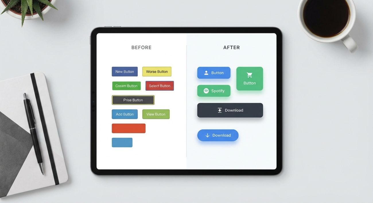
Real examples of button improvements
Theory helps, but seeing actual before-and-after comparisons makes the concepts stick.
A login button with 6px vertical padding feels cramped. Increasing to 14px vertical padding immediately improves the design. The button becomes easier to click and more visually balanced.
A pale blue button with white text at 2.8:1 contrast looks modern but fails accessibility. Darkening the blue to achieve 4.7:1 contrast maintains the color while improving readability.
Three different button heights (38px, 42px, 45px) on the same page create visual chaos. Standardizing to 40px for all medium buttons brings instant cohesion.
A submit button using regular weight (400) font feels uncertain. Switching to semibold (600) makes the action feel confident and clickable.
A button with only default and hover states leaves users guessing during the click. Adding active and focus states provides essential feedback for every interaction.
These aren’t dramatic redesigns. Small, specific adjustments create professional results.
Tools that catch button mistakes
Manual inspection works, but tools can catch problems you might miss.
Browser developer tools let you inspect padding, margins, and colors. Right-click any button, select “Inspect,” and verify the actual CSS values match your intentions.
Contrast checkers like WebAIM’s tool or Colorable help you test color combinations. Paste in your background and text colors to get an instant contrast ratio.
Design tools like Figma and Sketch have plugins for checking accessibility and consistency. Install a contrast checker plugin and an alignment guide plugin to catch issues during design.
Screenshot your interface and view it at thumbnail size. Buttons that look fine at full size might reveal spacing or sizing problems when viewed small.
Test on actual devices. A button that feels perfect on your 27-inch monitor might be too small on a phone. Responsive testing tools help, but nothing beats real hardware.
Share your work with other designers. Fresh eyes spot inconsistencies you’ve become blind to after hours of staring at the same interface.
Common questions about button design
Should all buttons have rounded corners?
Not necessarily. Border radius is a style choice. Fully rounded buttons (border-radius: 24px or higher) feel friendly. Sharp corners (border-radius: 0) feel technical. Subtle rounding (border-radius: 4px to 8px) works for most interfaces. Pick one approach and stay consistent.
How many button variants do I actually need?
Most interfaces work well with three to five variants. Primary, secondary, and tertiary cover most cases. Add a danger variant for destructive actions. Ghost buttons work for low-emphasis actions. More variants create confusion.
What about icon-only buttons?
Icon-only buttons work for common actions (search, menu, close) where the icon meaning is universal. Always include a tooltip or aria-label for accessibility. When in doubt, add text.
Can I use gradients on buttons?
Gradients can work but they’re easy to overdo. If you use gradients, keep them subtle and maintain sufficient contrast between text and all parts of the gradient. Flat colors are safer for beginners.
How do I handle button text that’s too long?
Rewrite the text. Button labels should be concise actions (Submit, Save Changes, Create Account). If you can’t shorten the text, consider a different UI pattern. Buttons aren’t meant for paragraphs.
Why buttons reveal your design maturity
Buttons seem simple. They’re just rectangles with text. But they touch every part of interface design: typography, color, spacing, interaction, accessibility.
When your buttons look unprofessional, it’s rarely because you lack talent. You’re probably missing systematic thinking. You’re designing each button as a one-off instead of building a coherent system.
Professional designers obsess over these details. They notice when padding is off by 2px. They check contrast ratios religiously. They test every state before shipping.
The good news? You don’t need years of experience to get this right. You need attention to detail and a willingness to establish standards. Many of the same principles that make buttons work also apply to 7 typography mistakes that make your designs look unprofessional.
Start with the five core issues: padding, contrast, sizing, typography, and states. Fix these and your buttons will immediately feel more polished.
Then build a system. Document your decisions. Create reusable components. Test across contexts.
Your buttons are fixable right now
You don’t need to rebuild your entire interface. Pick one button. Check its padding against the guidelines above. Verify the contrast ratio. Make sure all five states exist and provide clear feedback.
Fix that one button properly. Then use it as a template for the rest.
Professional button design isn’t about artistic genius. It’s about consistent application of proven principles. You already know what to do. Now you just need to do it systematically.
Your buttons can look professional by the end of today. Start with the most visible button in your interface and work from there.