You downloaded a free template, filled in your content, and hit publish. But something feels off. Your site looks exactly like dozens of others, and visitors can tell you used a template within seconds of landing on your homepage.
The good news? You don’t need to hire a designer or start from scratch. A few intentional tweaks can transform a generic template into something that feels custom and professional.
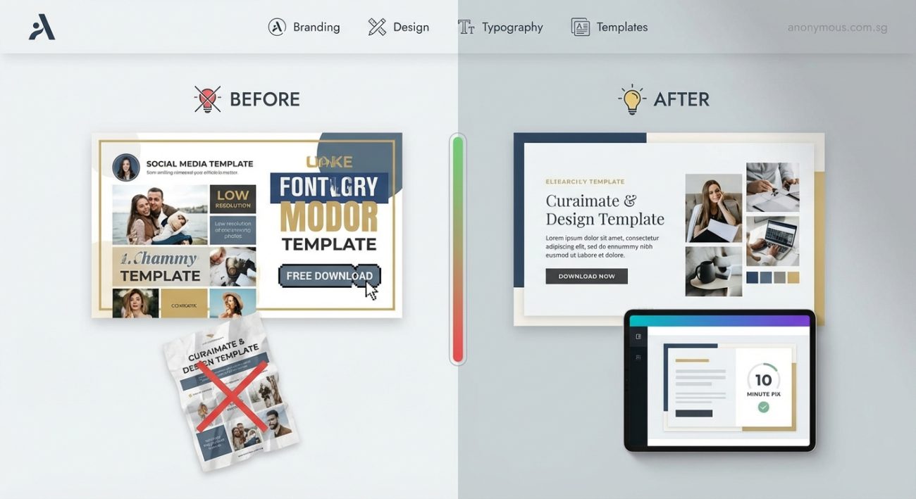
Templates look cheap when they’re left unchanged. Swap default fonts, adjust spacing, replace stock photos with real images, and customize colors to match your brand. These small changes take under an hour but make your site look intentionally designed instead of pulled straight from a download library.
Why Templates Scream “Template”
Templates are built for maximum flexibility. That means they use neutral colors, safe fonts, and generic layouts that work for everyone but feel special to no one.
When you leave the defaults untouched, your site blends into the background. Visitors recognize the structure from other sites they’ve seen. They assume you took shortcuts everywhere else too.
The template itself isn’t the problem. It’s the lack of personalization.
Change Your Fonts First
Default template fonts are chosen for compatibility, not personality. Swapping them out is the fastest way to change how your site feels.
Most templates use system fonts like Arial, Helvetica, or Georgia. These are safe but forgettable. Replacing them with a more distinctive pairing immediately separates your site from the pack.
Here’s how to do it:
- Pick one font for headings and one for body text.
- Use a service like Google Fonts to find free options.
- Replace the template’s font declarations in your CSS or theme settings.
Avoid using more than two font families. Three at most if you need an accent font for buttons or labels.
“Typography is the detail that separates amateur sites from professional ones. You don’t need expensive fonts. You just need intentional choices.” — Anonymous Design Team
If you’re not sure where to start, try pairing a bold sans-serif for headings with a clean serif or neutral sans-serif for body text. Check out how to choose the perfect font for your brand identity for a deeper breakdown.
Adjust Spacing to Match Your Content
Templates are designed with placeholder content that rarely matches your actual text. That’s why sections often feel cramped or weirdly spaced once you add your own words.
Adjusting padding and margins makes everything feel more intentional.
Here’s what to look for:
- Too much white space around short paragraphs
- Text that runs too close to images
- Buttons that sit awkwardly near section edges
- Headers that crowd the content below them
You don’t need to know CSS to fix this. Most modern website builders let you adjust spacing with sliders or input fields.
Start by increasing the space between sections. Then tighten up the space between related elements like a heading and its paragraph. This creates visual hierarchy and makes your layout feel purposeful.
Replace Stock Photos With Real Images
Nothing kills credibility faster than overused stock photos. You know the ones: people in business casual laughing at salads, diverse teams high-fiving in glass offices, someone pointing at a laptop screen.
Templates come with these because they’re safe and inoffensive. But they also scream “I didn’t put in the effort.”
You don’t need a professional photographer. You just need images that reflect your actual business.
Here are some alternatives:
- Photos of your workspace, products, or team
- Screenshots of your work or process
- Simple graphics or illustrations you create in Canva
- Authentic customer photos (with permission)
If you absolutely must use stock photos, avoid the clichés. Look for images with natural lighting, real expressions, and less obvious staging. Unsplash and Pexels have better options than the default template libraries.
Customize Your Color Palette
Templates use neutral color schemes because they need to work for any brand. That’s why so many default to blue, gray, and white.
Your brand isn’t neutral. Your colors shouldn’t be either.
Pick two or three brand colors and replace the template defaults. This doesn’t mean recoloring everything. It means using your colors strategically in buttons, headings, links, and accents.
Here’s a simple process:
- Choose one primary color for buttons and calls to action.
- Pick a secondary color for accents and highlights.
- Use neutrals (black, white, gray) for backgrounds and body text.
Avoid using too many colors. Restraint looks more professional than a rainbow.
If you haven’t defined your brand colors yet, start with how to choose brand colors that actually convert customers.
Fix Common Typography Mistakes
Even after changing fonts, most DIY sites still have typography problems that make them look unfinished.
Here’s a comparison of what makes text look cheap versus polished:
| Cheap Typography | Professional Typography |
|---|---|
| All caps everywhere | Sentence case for body, selective caps for headings |
| Centered paragraphs | Left-aligned body text, centered only for short headlines |
| Tiny line height (text feels cramped) | Line height of 1.5 to 1.8 for readability |
| Too many font sizes | Consistent size scale (e.g., 16px, 20px, 28px, 40px) |
| Mixing bold, italic, and underline | One emphasis style per element |
The biggest mistake? Using too many font sizes. Pick three to five sizes and stick to them across your entire site.
Also, avoid typography mistakes that make your designs look unprofessional like inconsistent alignment or overusing decorative fonts.
Simplify Your Navigation
Templates often include every possible menu item: Home, About, Services, Portfolio, Blog, Testimonials, Contact, FAQ, Resources, Shop.
Your visitors don’t need all of that. They need clarity.
Cut your navigation down to the essentials. Most sites only need four to six top-level menu items.
Ask yourself:
- What do first-time visitors need to understand my business?
- What action do I want them to take?
- What questions do they need answered before they convert?
Everything else can go in the footer or a secondary menu.
A cleaner navigation makes your site feel more intentional and easier to use.
Remove Unnecessary Sections
Templates come loaded with sections you probably don’t need: counters showing “500+ happy clients,” partner logo grids, timeline widgets, three-column feature blocks.
These exist to showcase the template’s flexibility. They’re not meant to stay on your live site.
Walk through each page and ask: “Does this section serve my visitors or my business goals?”
If the answer is no, delete it.
Fewer sections mean less clutter, faster load times, and a more focused message. Your site will feel custom because it’s tailored to your actual needs instead of the template designer’s guesses.
Use Consistent Button Styles
Templates often include multiple button styles: outlined, filled, rounded, square, gradient, flat.
Pick one primary style and one secondary style. Use them consistently across your entire site.
For example:
- Primary buttons (solid color, rounded corners) for main actions like “Get Started” or “Buy Now”
- Secondary buttons (outlined or ghost style) for less important actions like “Learn More”
Don’t mix styles within the same section. It looks indecisive and unpolished.
Add White Space Strategically
Cramming content into every available pixel makes your site feel overwhelming. White space (or negative space) gives your content room to breathe.
This doesn’t mean leaving huge empty gaps. It means being intentional about where content starts and stops.
Try these adjustments:
- Increase padding inside content boxes
- Add margin between sections
- Let images stand alone instead of crowding them with text
- Give headers space above and below
White space makes your site feel more expensive and easier to scan. It’s one of the simplest ways to look more professional without changing your content.
Create a Consistent Visual Style
Templates pull images, icons, and graphics from different sources. That’s why your homepage might have flat icons, your about page has realistic illustrations, and your blog uses random stock photos.
This inconsistency breaks the illusion of a custom site.
Choose one visual style and stick to it:
- All photos have similar lighting and color grading
- All icons follow the same style (line icons, filled icons, or illustrated icons)
- All graphics use your brand colors
You can build this consistency with a brand style guide that actually gets used to keep everything aligned.
Personalize Your Copy
Templates come with placeholder copy that sounds like every other business in your industry. Generic headlines like “We Deliver Results” or “Your Success Is Our Mission” don’t differentiate you.
Rewrite every headline, subheading, and call to action in your own voice. Be specific about what you do and who you help.
Instead of “Professional Services for Your Business,” try “Marketing strategy for yoga studios that hate social media.”
Specificity makes you memorable. Generic copy makes you forgettable.
Test on Different Devices
Your template might look great on your desktop but fall apart on mobile. Most visitors will see your site on their phones first.
Check how your site looks on:
- Large desktop screens
- Laptops
- Tablets in both orientations
- Phones of different sizes
Look for text that’s too small, buttons that are hard to tap, images that don’t resize properly, and navigation that breaks.
Most website builders have preview modes. Use them. Better yet, pull up your site on your actual phone and click around.
Your Site Doesn’t Need to Look Custom Everywhere
You don’t need to redesign every template element. Focus on the parts visitors see first: your homepage hero, your navigation, your about section, and your primary call to action.
These high-impact areas shape first impressions. Get them right and visitors won’t notice that your footer or blog layout came from a template.
Perfectionism kills progress. Make the important parts feel intentional, and you’ll look more professional than 90% of template users who change nothing at all.
Small Changes Make the Biggest Difference
You don’t need a custom site to look professional. You just need to make a template your own.
Swap the fonts. Adjust the spacing. Replace the stock photos. Customize the colors. Remove what you don’t need. Keep what serves your visitors.
These aren’t complicated changes. They’re intentional ones. And intention is what separates a template site from one that feels designed just for you.
Start with one section today. Change the fonts in your header. Replace one stock photo. Adjust the spacing around your hero text. Then move to the next section tomorrow.
Your site will stop looking like a template the moment you stop treating it like one.