You’ve spent hours perfecting your design on screen. The colors are vibrant, the contrast is beautiful, everything looks exactly how you want it. Then you print it, and the result is a muddy, washed-out disappointment that barely resembles what you created. Sound familiar? You’re not alone, and more importantly, it’s not your fault.
Screens emit light using RGB colors while printers use CMYK ink on paper. This fundamental difference, combined with uncalibrated monitors and incorrect color profiles, causes the mismatch you see. The solution involves calibrating your display, working in the right color space, and creating test prints to dial in your adjustments before final production.
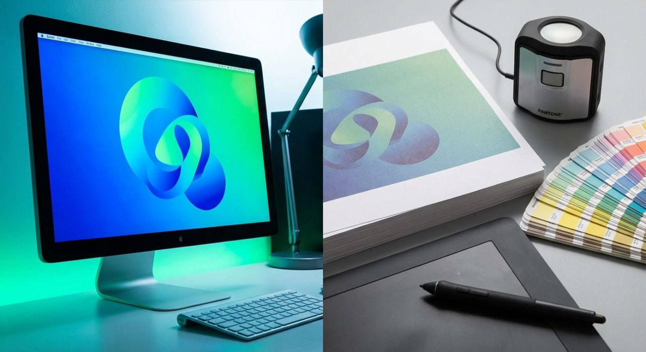
The science behind the color shift
Your screen and your printer speak two completely different color languages.
Monitors create colors by emitting light through tiny red, green, and blue pixels. This is called RGB (Red, Green, Blue) color mode. When all three colors shine at full brightness, you see white. Turn them all off, and you get black.
Printers work the opposite way. They apply cyan, magenta, yellow, and black ink onto paper. This is CMYK (Cyan, Magenta, Yellow, Key/Black) color mode. The paper starts white, and the ink absorbs certain wavelengths of light to create color.
Think of it like this: RGB adds light to create color. CMYK subtracts light by absorbing it.
The RGB color space can produce millions of colors that simply cannot be reproduced with physical ink. Those electric blues, neon greens, and glowing oranges you see on screen? Many of them fall outside the CMYK gamut entirely.
Your monitor can display approximately 16.7 million colors. A standard printer can only reproduce about 55,000 of those.
That’s the first reason your prints look different.
Your monitor is lying to you
Even if you were working in CMYK from the start, there’s another problem: your monitor probably isn’t showing you accurate colors.
Most monitors come from the factory with brightness cranked up and colors oversaturated. Manufacturers do this because brighter, punchier displays look better in stores. They catch your eye. They make you want to buy.
But they don’t show you reality.
Your monitor’s brightness, contrast, color temperature, and gamma settings all affect how colors appear. If you’ve never calibrated your display, you’re essentially designing blind.
Different monitor technologies also reproduce colors differently. An IPS panel, a TN panel, and an OLED screen will all show the same image with noticeable variations.
Room lighting affects perception too. The same print will look different under warm incandescent bulbs, cool fluorescent tubes, and natural daylight. Your brain adjusts for this automatically when you’re looking at your screen, but the printed result is fixed.
How to calibrate your monitor properly
You need to start with an accurate baseline.
Professional designers use hardware calibrators like the X-Rite i1Display or Datacolor SpyderX. These devices measure your actual screen output and create a custom color profile.
If you’re not ready to invest in hardware, you can use your operating system’s built-in calibration tools. They’re not perfect, but they’re better than nothing.
For Windows, search for “Calibrate display color” in settings. For Mac, open System Preferences, go to Displays, then Color, and click Calibrate.
Follow the on-screen instructions to adjust:
- Brightness and contrast
- Gamma (the relationship between input signal and brightness)
- Color temperature (warm vs. cool white point)
- RGB balance
Do this in a room with consistent, neutral lighting. Avoid direct sunlight or colored walls that might reflect onto your screen.
Calibrate at the same time of day you typically work. Your perception changes throughout the day as your eyes tire.
Save the calibrated profile and set it as your default. Recalibrate every month or two, as monitors drift over time.
Setting up your files for print success
Before you even start designing, you need to work in the right color mode.
Most design software defaults to RGB because that’s what screens use. For print work, you need to switch to CMYK before you begin.
In Adobe Photoshop: Image > Mode > CMYK Color
In Illustrator: File > Document Color Mode > CMYK Color
In InDesign: Create a new document and select CMYK in the Color settings
Converting from RGB to CMYK after you’ve finished designing will change your colors. Some will shift dramatically. It’s better to start in CMYK so you see those limitations from the beginning.
Set your black to rich black, not pure black. Pure black (100% K) looks flat and washed out. Rich black uses a mix of all four inks:
- C: 60%
- M: 40%
- Y: 40%
- K: 100%
This creates a deeper, more saturated black that looks professional.
For images, embed the correct color profile. The most common is “U.S. Web Coated (SWOP) v2” for general printing. Your printer may specify a different profile, so always check.
Understanding how to set up print files that won’t get rejected by printers will save you hours of frustration and wasted paper.
The test print workflow that actually works
You can’t fix what you can’t measure. Test prints are not optional.
Here’s the step-by-step process:
-
Print a test sheet on your actual paper stock. Different papers absorb ink differently. Glossy paper produces more vibrant colors than matte. Textured paper dulls everything slightly. You need to test on the exact paper you’ll use for the final job.
-
Wait for the ink to fully dry. Wet ink looks darker and more saturated. Give it at least 30 minutes, or overnight for best results.
-
Compare under proper lighting. Use daylight-balanced LED bulbs (5000K-6500K) or natural indirect sunlight. Avoid yellow tungsten bulbs or green fluorescent tubes.
-
Document the differences. Take notes or photos. Which colors shifted? Are things too dark or too light? Is there a color cast (too warm/orange or too cool/blue)?
-
Make targeted adjustments in your file. Don’t try to fix everything at once. Adjust one variable at a time: brightness, saturation, individual color channels.
-
Print another test. Repeat the process until the print matches your calibrated screen as closely as possible.
-
Save your settings. Once you’ve dialed in the corrections, save them as a preset or template for future projects using the same printer and paper.
This iterative process takes time, but you only need to do it once per printer/paper combination.
“The difference between amateur and professional printing isn’t expensive equipment. It’s the discipline to test, measure, and refine before committing to a full run.” — Print production specialist
Common mistakes and how to avoid them
Let’s look at the most frequent errors and their solutions:
| Mistake | Why it happens | How to fix it |
|---|---|---|
| Colors look dull and flat | RGB colors exceed CMYK gamut | Work in CMYK from the start; use soft proofing |
| Everything prints too dark | Monitor brightness too high | Calibrate to 120 cd/m² brightness |
| Skin tones look wrong | Incorrect color profile | Use the printer’s recommended ICC profile |
| Colors shift between prints | Inconsistent paper or ink | Buy paper in bulk; use genuine ink cartridges |
| Reds turn orange or brown | CMYK can’t reproduce vibrant reds | Add more magenta; reduce yellow slightly |
| Blues look purple | CMYK limitation | Increase cyan; reduce magenta |
The biggest mistake is assuming your first print will be perfect. It won’t. Build testing time into your workflow.
Soft proofing saves paper and money
Soft proofing lets you preview how your design will look when printed, right on your calibrated screen.
In Photoshop, go to View > Proof Setup > Custom. Select your printer’s ICC profile and turn on “Simulate Paper Color” and “Simulate Black Ink.”
Your image will shift to show how it will actually print. It often looks worse at first, duller and flatter. That’s reality.
Now you can make adjustments before wasting ink and paper.
Zoom to 100% when soft proofing. Zooming in or out changes how your eye perceives color.
Keep your original RGB file as a master. Create a separate CMYK version for print. That way you always have the full-color original for screen use.
Paper matters more than you think
The paper you choose dramatically affects the final result.
Coated papers (glossy or satin) have a smooth surface that doesn’t absorb much ink. Colors stay vibrant and saturated. Blacks look deep.
Uncoated papers (matte or textured) absorb ink like a sponge. Colors appear softer and more muted. Blacks can look gray.
The whiteness of the paper also matters. Bright white paper makes colors pop. Cream or off-white paper creates a warmer, vintage feel but reduces color intensity.
Different papers require different ink densities. Your printer’s ICC profile should account for this, but you may need to adjust manually.
Request sample packs from paper suppliers. Print the same image on multiple stocks to see which gives you the result you want.
Understanding color profiles and why they matter
Color profiles are translation dictionaries between devices.
Your camera has a profile. Your monitor has a profile. Your printer has a profile. Each one describes how that device interprets color data.
When you embed a profile in your image file, you’re telling the next device in the chain: “Here’s what these numbers mean. Translate them appropriately for your own color space.”
Without profiles, every device guesses. And they all guess differently.
The most important profiles for print work:
- sRGB: Standard for web and most cameras. Smaller color space, good compatibility.
- Adobe RGB: Larger color space than sRGB. Better for print, especially for saturated colors.
- ProPhoto RGB: Huge color space. Overkill for most work, but useful for high-end photo editing.
- SWOP CMYK: Standard for commercial printing in the US.
- Fogra39: European printing standard.
Always ask your printer which profile they prefer. Using the wrong one guarantees color shifts.
Maintaining consistency across your brand materials means working with the same color profiles and settings. If you’re building visual identity systems, how to choose brand colors that actually convert customers offers practical guidance on selecting colors that work both on screen and in print.
Dealing with specific color problems
Some colors are notoriously difficult to reproduce in print.
Bright oranges and reds: CMYK struggles here. Increase magenta and yellow, but don’t expect the electric glow you see on screen. Consider spot colors (Pantone) for critical brand colors.
Vibrant greens: Often turn muddy or too yellow. Boost cyan and reduce yellow slightly.
Deep purples: Tend to shift toward blue. Add more magenta and a touch of black.
Neutral grays: Often pick up a color cast (usually cyan or magenta). Use equal parts CMY, or use only black (K) for true neutral grays.
Pure white: Can’t be printed. It’s the color of the paper. Leave those areas unprinted.
For logos and brand elements where exact color matching is critical, consider using Pantone spot colors instead of CMYK. Spot colors are pre-mixed inks that produce consistent, predictable results.
Just remember that spot colors cost more and require additional press runs.
The role of resolution and sharpening
Color isn’t the only factor that makes prints look different.
Screens display at 72-96 pixels per inch (PPI). Printers need 300 dots per inch (DPI) or higher for crisp results.
If your image resolution is too low, it will look pixelated and blurry when printed, even if the colors are perfect.
Always design at final print size and 300 DPI minimum. For large-format posters viewed from a distance, you can sometimes get away with 150 DPI.
Sharpening also looks different on screen vs. print. What looks perfectly sharp on your monitor may appear soft when printed. What looks over-sharpened on screen might be just right on paper.
Apply sharpening as the last step, after you’ve resized to final print dimensions. Use “Unsharp Mask” or “Smart Sharpen” in Photoshop with these conservative settings:
- Amount: 80-120%
- Radius: 1.0-1.5 pixels
- Threshold: 0-4 levels
Print a test to verify. Adjust if needed.
When to use a professional print service
Home printers are convenient but limited.
Consumer inkjet printers use four or six ink cartridges and have a smaller color gamut than professional equipment. They’re fine for proofs and personal projects, but not for client work or anything that needs to look polished.
Professional print services use:
- Higher-quality inks with better color accuracy
- More ink colors (8, 10, or even 12 cartridges)
- Better paper options
- Proper color management workflows
- Consistent, repeatable results
They also offer hard proofs, which are test prints on the actual production equipment and paper. This eliminates guesswork.
For business cards, brochures, posters, or anything representing your brand, use a professional service.
For personal photos or home projects, a well-calibrated home printer can produce excellent results if you follow the steps above.
Your print-ready checklist
Before you send files to print, verify:
- [ ] Document is in CMYK color mode
- [ ] Resolution is 300 DPI at final print size
- [ ] Correct color profile is embedded
- [ ] Blacks are rich black (not 100% K only)
- [ ] Fonts are outlined or embedded
- [ ] Bleed is included (usually 3mm on all sides)
- [ ] Images are high enough resolution
- [ ] You’ve done at least one test print
- [ ] File is saved in the correct format (usually PDF/X-1a or PDF/X-4)
Missing any of these will cause problems.
Making color matching part of your design process
The best way to handle screen-to-print differences is to account for them from the beginning.
Start every print project in CMYK. Use soft proofing throughout your design process. Print tests early and often.
Build a reference library of printed samples. When you nail the colors on a project, keep a print as a reference for future work.
Create presets in your software for different printers and paper stocks. This saves setup time and ensures consistency.
If you’re designing brand systems that need to work across multiple media, understanding how to build a brand style guide that actually gets used helps you document color values for both screen and print applications.
Why your eyes adapt but prints don’t
Here’s something most people don’t realize: your brain is constantly adjusting what you see.
This is called chromatic adaptation. Your visual system compensates for different lighting conditions so that a white shirt looks white whether you’re indoors under tungsten bulbs or outside in blue-tinted daylight.
Your monitor benefits from this. Your brain adjusts for the backlight, the ambient room lighting, even your own fatigue level.
A printed page has no such advantage. It reflects whatever light hits it. The ink on paper is fixed. It can’t adapt.
This is why the same print looks different under office fluorescents, warm home lighting, and natural daylight. The print hasn’t changed, but the light illuminating it has.
When you’re evaluating prints, use consistent, color-neutral lighting. A daylight-balanced light box is ideal, but any 5000K-6500K LED bulb works well enough.
From screen to paper without the frustration
Understanding why prints look different from your screen removes the mystery and the frustration.
It’s not magic, and it’s not random. It’s physics, chemistry, and technology working in predictable ways.
Screens add light. Printers subtract it. RGB contains colors CMYK can’t reproduce. Uncalibrated monitors lie to you. Paper absorbs ink differently.
But now you know how to work with these limitations instead of fighting them.
Calibrate your monitor. Work in CMYK. Use the right color profiles. Test early and often. Adjust based on real printed results, not what you see on screen.
The gap between screen and print will never completely disappear, but you can narrow it to the point where it doesn’t matter.
Your next print will match your vision. And the one after that. And every one after that, because you’ve built a reliable, repeatable process that accounts for how color actually works in the physical world.