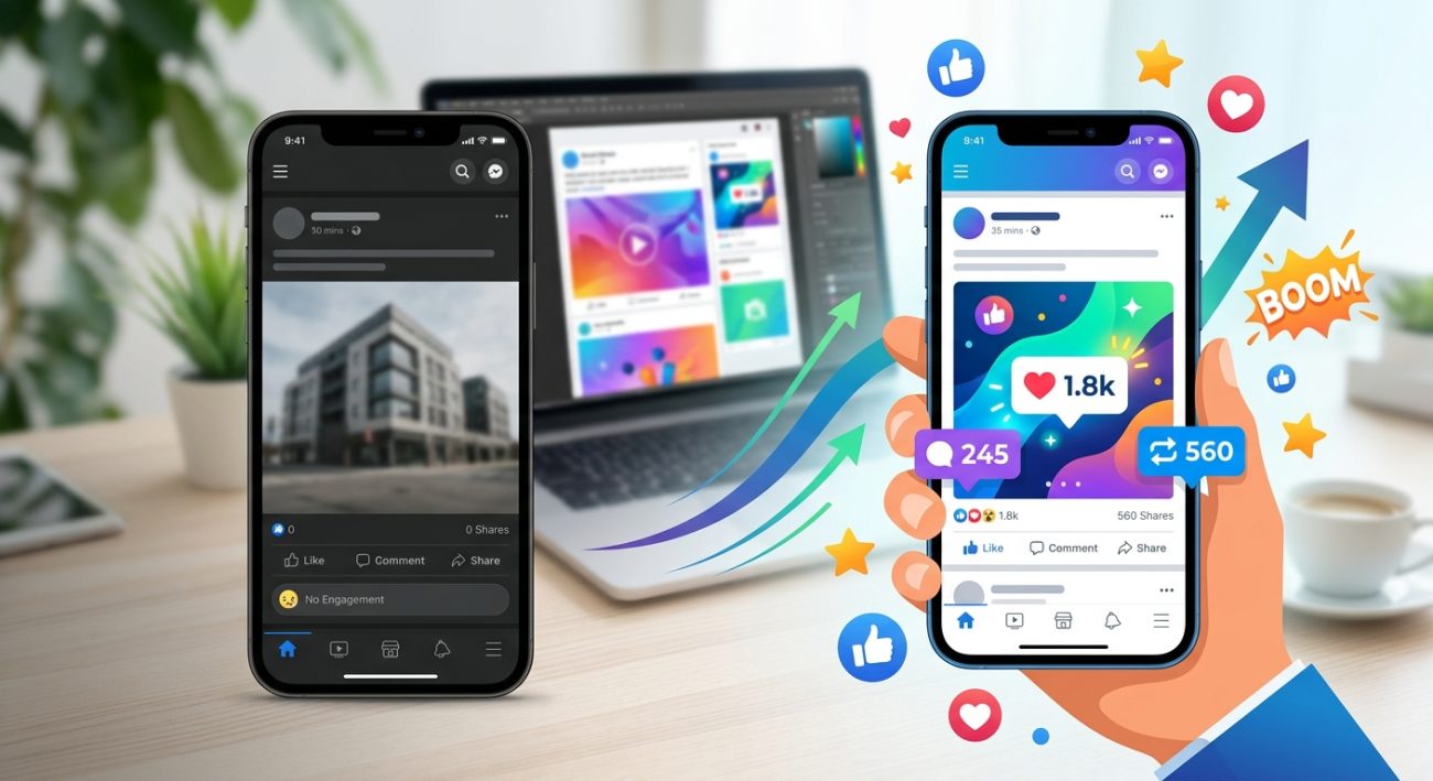
You post consistently. You follow the trends. You add hashtags. Yet your social media engagement sits at zero.
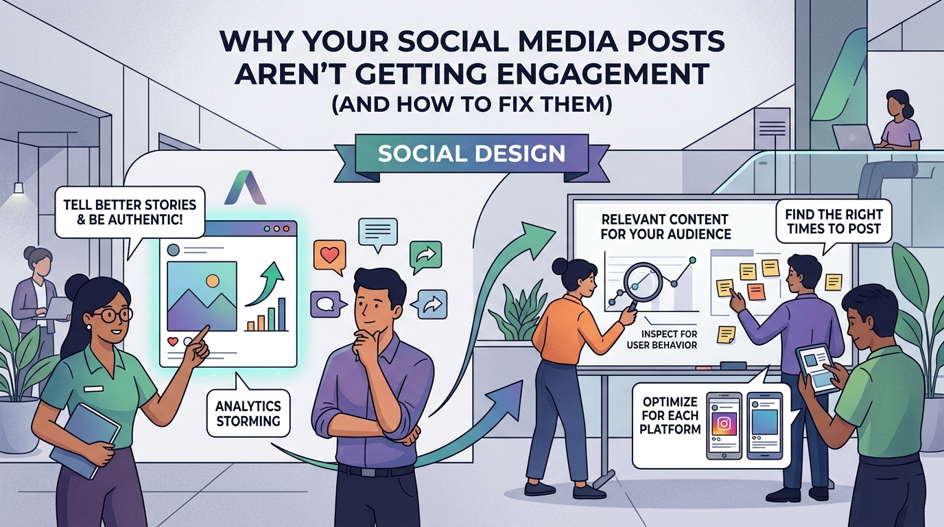
The problem isn’t your posting schedule or your caption length. It’s your design. Most low engagement stems from visual mistakes that make people scroll past your content without a second glance. The good news? These mistakes are fixable once you know what to look for.
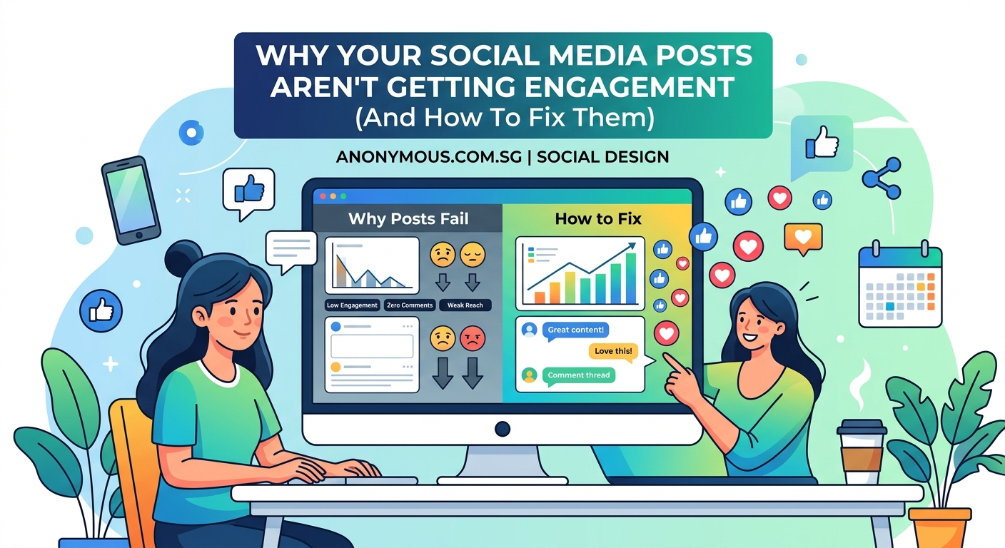
Low social media engagement usually stems from visual design problems, not content quality. Poor color contrast, weak hierarchy, inconsistent branding, wrong image dimensions, and cluttered layouts stop people from engaging. Fixing these five design issues can dramatically improve your engagement rates without changing your posting strategy or spending money on ads.
Your visuals lack contrast
People scroll social media feeds at lightning speed. Your post has less than one second to catch attention.
Low contrast makes your text disappear into your background. Light gray text on white backgrounds? Invisible. Pale yellow text on cream? Same problem.
Here’s what actually works:
- Dark text on light backgrounds (minimum 4.5:1 contrast ratio)
- Light text on dark backgrounds with proper weight
- Bold colors that pop against neutral bases
- High contrast borders around key elements
Test your contrast using free tools before posting. If you squint and can’t read it easily, your audience won’t either.
What is color contrast and why does it make or break your designs covers the technical details that help your posts stand out in crowded feeds.
Your hierarchy is backwards
Your eye should land on the most important element first. Then move to supporting details. Then to your call to action.
Most low engagement posts reverse this order. The brand logo dominates. The main message hides in small text. The call to action gets buried at the bottom in tiny font.
Fix your hierarchy with this approach:
- Make your main message the largest element (40-60% of your design space)
- Use medium size for supporting details (20-30% of space)
- Keep branding subtle but present (10-15% of space)
- Make your CTA clear and actionable in contrasting color
People process visual hierarchy in milliseconds. Get it wrong and they scroll. Get it right and they stop.
“The biggest mistake I see in social media design is treating every element as equally important. Nothing stands out, so nothing gets remembered.” – Design psychology research shows hierarchy drives 73% of initial engagement decisions.
Your brand looks different every time
Inconsistent branding confuses your audience. They don’t recognize your posts in their feed. They don’t build visual memory of your content.
One day you post in blue. Next day in red. Different fonts each week. Random layouts. No cohesive style.
This inconsistency kills engagement because people can’t identify your content at a glance. Building recognition takes repetition with consistent visual elements.
Create a simple brand system:
- Pick 2-3 brand colors and stick to them
- Choose 1-2 fonts maximum
- Use the same layout template family
- Keep your logo placement consistent
- Maintain similar spacing and margins
How to build a brand style guide that actually gets used walks through creating a system you’ll actually follow.
Your images are the wrong size
Posting images in incorrect dimensions guarantees poor engagement. Platforms crop your content unpredictably. Important elements get cut off. Text becomes unreadable.
Instagram squares crop differently than Instagram stories. Facebook feed posts need different dimensions than LinkedIn carousel posts. TikTok vertical video won’t work on YouTube shorts without adjustment.
| Platform | Format | Optimal Dimensions | Aspect Ratio |
|---|---|---|---|
| Instagram Feed | Square | 1080 x 1080 px | 1:1 |
| Instagram Story | Vertical | 1080 x 1920 px | 9:16 |
| Facebook Post | Landscape | 1200 x 630 px | 1.91:1 |
| LinkedIn Post | Landscape | 1200 x 627 px | 1.91:1 |
| Twitter Post | Landscape | 1200 x 675 px | 16:9 |
| Pinterest Pin | Vertical | 1000 x 1500 px | 2:3 |
Design for the platform. Not for convenience.
The ultimate guide to social media image dimensions for 2024 provides updated specs for every major platform.
You’re cramming too much into one post
Cluttered designs perform poorly. Too many messages. Too many images. Too much text. Too many colors. Too many fonts.
Your audience can’t process everything in one second. They get overwhelmed and scroll past.
Simplify ruthlessly:
- One main message per post
- One primary visual element
- One clear call to action
- Plenty of white space around elements
- Maximum of three colors per design
White space isn’t wasted space. It gives your content room to breathe. It directs attention to what matters.
Think of your social post like a billboard. Drivers passing at 60 mph can’t read paragraphs. They need one clear message they can absorb instantly.
Your text is unreadable on mobile
Over 80% of social media happens on phones. Yet many posts use tiny text that’s impossible to read on small screens.
Minimum readable font size on mobile is 14pt. Anything smaller forces people to zoom in. They won’t. They’ll scroll instead.
Mobile readability checklist:
- Use sans serif fonts (they read clearer on screens)
- Keep font size at 18pt or larger for body text
- Make headlines at least 24pt
- Avoid script fonts or decorative typefaces
- Test your design on an actual phone before posting
What is font hierarchy and why does it matter for readability explains how to structure text for maximum impact on any screen size.
You’re not matching platform culture
Each social platform has its own visual language. Instagram favors polished aesthetics. LinkedIn prefers professional charts and data. TikTok rewards raw, authentic content. Pinterest loves vertical inspirational imagery.
Posting the same design across all platforms ignores these cultural differences. Your polished Instagram carousel flops on TikTok. Your casual TikTok video looks unprofessional on LinkedIn.
Adapt your design to platform expectations:
- Instagram: High quality photography, cohesive color palettes, aesthetic consistency
- LinkedIn: Professional graphics, data visualizations, clean layouts, business appropriate
- TikTok: Authentic, less polished, text overlays, trending formats
- Pinterest: Vertical formats, inspirational imagery, clear text overlays
- Twitter: Simple graphics, meme formats, screenshot text, reaction images
Same message, different packaging.
Your call to action is invisible
You created beautiful design. You crafted the perfect message. But you forgot to tell people what to do next.
Or worse, your CTA blends into the background. Same color as surrounding elements. Same size as body text. Buried at the bottom where nobody looks.
Strong CTAs share these traits:
- Contrasting color that pops (often your brand accent color)
- Button or box shape that signals clickability
- Action oriented text (“Save this post” not “Click here”)
- Strategic placement (top right or bottom center work best)
- Adequate size (at least 15% of total design space)
Test this: Show your post to someone for two seconds. Ask them what action you want them to take. If they can’t answer immediately, your CTA needs work.
You’re ignoring engagement patterns
Different content types drive different engagement behaviors. Carousels get saves. Video gets shares. Single images get likes. Polls get comments.
Posting only single image quotes? You’ll get likes but no meaningful engagement. Only posting videos? You might get shares but no saves for later reference.
Balance your content types:
- Educational carousels (high saves, good for algorithm)
- Behind the scenes video (high shares, builds connection)
- Data visualizations (high screenshot saves)
- Question posts (high comments)
- Before/after transformations (high engagement across all metrics)
How to design eye-catching Instagram carousel posts that stop the scroll breaks down the format that consistently drives the highest engagement rates.
Your color choices repel your audience
Color psychology affects engagement more than most creators realize. Wrong colors for your message create subconscious friction.
Promoting a calming meditation app with aggressive red and orange? Mismatch. Selling luxury products with neon colors? Disconnect. Sharing financial advice with chaotic rainbow gradients? Confusion.
Match colors to your message:
- Blue: Trust, professionalism, calm (financial services, healthcare, tech)
- Green: Growth, health, nature (wellness, sustainability, finance)
- Red: Urgency, passion, energy (sales, food, entertainment)
- Purple: Creativity, luxury, wisdom (beauty, education, premium products)
- Yellow: Optimism, clarity, warmth (children’s products, food, happiness)
How to choose brand colors that actually convert customers provides a framework for selecting colors that resonate with your specific audience.
You’re using templates without customization
Free templates are helpful starting points. But posting them unchanged makes your content look generic. Your audience has seen that exact design 47 times this week.
Template fatigue is real. People scroll past designs they recognize as templates because they assume the content is also recycled.
Customize every template:
- Change the color palette to match your brand
- Swap default fonts for your brand typography
- Adjust spacing and margins
- Add your own graphics or icons
- Modify the layout structure
- Include brand specific elements
How to customize free design templates without looking generic shows you exactly which elements to change for maximum impact with minimum effort.
Your timing doesn’t match your design
Posting holiday content with generic design? Missed opportunity. Sharing trending topics with outdated visual styles? Disconnect.
Your design should reflect the moment. Timely content with timeless design feels off. Evergreen content with trendy design confuses people.
Align design with content timing:
- Trending topics: Use current design trends, bold colors, dynamic layouts
- Seasonal content: Incorporate seasonal colors and imagery
- Evergreen education: Clean, classic design that won’t look dated
- Time sensitive offers: Urgent design elements, countdown visuals, high contrast
Match your visual urgency to your message urgency.
Design fixes you can implement today
Stop posting and start fixing. Here’s your action plan:
- Audit your last 10 posts for contrast issues using a contrast checker
- Create a simple brand color palette (3 colors maximum) and save it
- Download correct image dimension templates for your top 2 platforms
- Design one post with 50% white space to test engagement difference
- Make your next CTA button 3x larger than you think it should be
Track engagement on posts before and after these fixes. The difference will be obvious within one week.
The 7 biggest social media design mistakes that make your brand look unprofessional covers additional pitfalls to avoid as you refine your approach.
Common design mistakes and their fixes
| Mistake | Why It Kills Engagement | The Fix |
|---|---|---|
| Text over busy backgrounds | Can’t read the message | Use solid color overlays at 70% opacity |
| Too many fonts | Looks chaotic and unprofessional | Stick to one font family with different weights |
| Centered text blocks | Hard to read, looks amateur | Left align text, center only headlines |
| Pixelated images | Signals low quality content | Use images at 2x your final display size |
| Ignored safe zones | Platform UI covers your content | Keep important elements 10% from edges |
Each fix takes less than five minutes to implement. The engagement improvement is immediate.
Why design beats content quality
You might have the best advice in your industry. The most helpful tips. The most valuable insights.
None of it matters if your design makes people scroll past.
Design is the gatekeeper to your content. Poor design means your content never gets read. Great design earns you the chance to deliver your message.
Think of design as the packaging. Content as the product. Amazing products in terrible packaging sit on shelves. Average products in great packaging fly off shelves.
Your content deserves packaging that matches its quality.
Start with one platform, one fix
Don’t try to fix everything everywhere at once. That leads to overwhelm and abandoned efforts.
Pick your most important platform. Implement one fix from this guide. Post consistently with that fix for one week. Measure the engagement difference.
Then add the next fix. Then the next.
Small improvements compound. Three months of weekly fixes transforms your entire social presence.
Your audience is waiting for content they can actually see, read, and engage with. Give them design that works as hard as your message does.