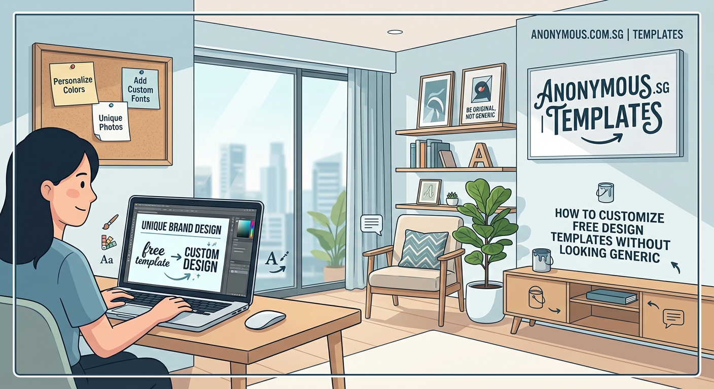
You download a beautiful free template, fill in your text, and hit publish. Then you see the exact same design on three other websites. That sinking feeling hits hard.
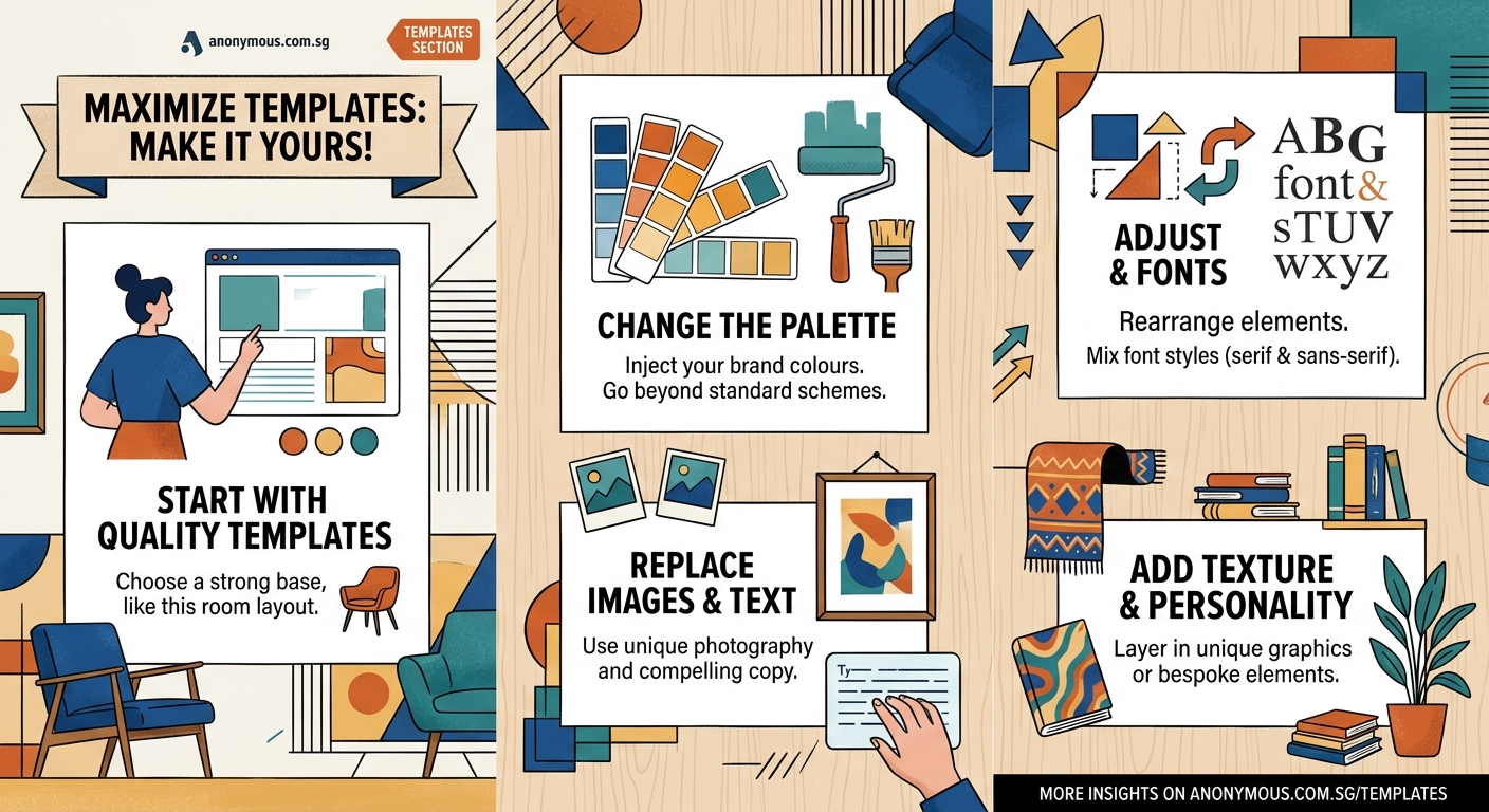
Free templates are fantastic starting points, but they need your personal touch to stand out. The good news? You don’t need advanced design skills or expensive software to make a template truly yours. Small changes in the right places can transform cookie-cutter designs into something that feels custom-made.
Customizing design templates effectively requires changing fonts, adjusting colors beyond the obvious swaps, modifying layouts and spacing, replacing stock images with authentic visuals, and adding unique graphic elements. These strategic changes transform generic templates into distinctive designs that reflect your brand while maintaining professional quality. Most customization can happen using free tools and takes less time than starting from scratch.
Why templates feel generic in the first place
Templates become recognizable because thousands of people use them exactly as downloaded. The default font pairings, color schemes, and layouts remain untouched. Stock photos from the same free libraries appear everywhere.
Design platforms want templates to appeal to the widest audience possible. They choose safe, neutral options that work for anyone. That universal appeal is exactly what makes them forgettable.
The solution isn’t avoiding templates entirely. It’s understanding which elements signal “template” to viewers and changing those specific parts.
Start with typography changes
Fonts carry enormous visual weight. Swapping out the default typefaces instantly changes how your design feels.
Most templates use popular Google Fonts like Montserrat, Roboto, or Open Sans. These are solid choices but overused. Browse beyond the first page of font libraries to find alternatives with similar characteristics but fresher appearances.
Pair fonts intentionally:
- Choose one font for headings that has personality
- Select a readable font for body text that complements without competing
- Limit yourself to two or three fonts maximum across the entire design
Adjust the font weights too. If the template uses regular weight for headings, try bold or semibold instead. Change the letter spacing on titles to create more breathing room or tighter cohesion depending on your brand personality.
Line height matters more than most people realize. Increase the spacing between lines of body text to improve readability and give your design a more premium feel. Templates often use tight line heights to fit more content, but generous spacing looks more professional.
Rework the color palette strategically
Changing colors seems obvious, but most people only swap the primary color and call it done. That’s not enough.
Templates typically include a primary color, secondary color, and neutral backgrounds. Go deeper than surface-level swaps.
Create a complete custom palette:
- Choose a primary brand color that reflects your personality
- Select 2-3 complementary accent colors for variety
- Pick specific shades of gray instead of pure black and white
- Add a subtle background tint instead of stark white
Use color in unexpected places. If the template has colored text on white backgrounds, try reversing it with white text on colored sections. Change the color of borders, dividers, and decorative elements.
Consider color psychology for your audience. Financial services might lean toward blues and greens for trust. Creative businesses can use bolder, warmer palettes. Your color choices should feel intentional, not random.
Test your colors for accessibility. Sufficient contrast between text and backgrounds isn’t just good practice; it makes your design more readable for everyone.
Modify layouts and spacing
Layout changes have massive impact with relatively little effort. Templates follow predictable patterns because they work, but small adjustments make them feel custom.
Adjust white space first. Increase padding around sections, add more margin between elements, and let your design breathe. Cramped layouts scream template. Generous spacing suggests custom work.
Try these layout modifications:
- Change section order to match your content priorities
- Adjust column widths in multi-column layouts
- Modify image sizes and aspect ratios
- Reposition call-to-action buttons or contact forms
- Remove sections you don’t need entirely
Break the grid occasionally. If everything aligns perfectly, it looks template-like. Offset an image slightly, overlap elements intentionally, or let one section extend beyond the standard margins.
Asymmetry creates visual interest. Templates favor balanced, centered layouts because they’re safe. Shifting weight to one side or creating intentional imbalance makes designs more dynamic.
Change alignment patterns. If all text is centered, try left-aligning some sections. If everything is left-aligned, center your hero section for emphasis.
Replace stock imagery with authentic visuals
Stock photos are the biggest template giveaway. Those same smiling people in conference rooms appear on thousands of websites.
You don’t need professional photography to improve this. Authentic, imperfect photos of your actual business, products, or work often perform better than polished stock images.
Image replacement strategies:
- Use your own photos, even if taken on a smartphone
- Choose less obvious stock photos from smaller libraries
- Apply consistent filters or color overlays to create cohesion
- Crop images differently than the template suggests
- Mix photos with illustrations or graphics
If you must use stock photos, edit them. Apply a color wash that matches your brand palette. Add a subtle texture overlay. Crop them unexpectedly. These small changes make generic images feel more integrated.
Consider replacing some photos with graphics, patterns, or solid colors. Not every section needs an image. Sometimes a bold color block with text makes a stronger statement.
Add unique graphic elements
Small custom graphics separate your design from the template masses. These don’t need to be complex.
Simple shapes, lines, and patterns can become signature elements. A curved line that appears across multiple pages, a specific corner treatment on images, or a unique bullet point style all contribute to a distinctive look.
Easy graphic additions:
- Custom icons instead of template defaults
- Decorative shapes behind headings or images
- Patterned backgrounds in specific sections
- Unique dividers between content blocks
- Branded badges or stamps
Create a signature element that appears consistently. This could be a specific shape, a textured background, or a decorative flourish. Repetition of this element across your design builds brand recognition.
Many free design tools include shape libraries. Combine basic shapes in unexpected ways to create something that feels custom. A circle overlapping a rectangle, rotated squares creating a pattern, or curved lines framing content all work well.
Adjust micro-interactions and details
Details matter. Small refinements throughout your design compound into a polished, custom appearance.
| Element | Template Default | Custom Alternative |
|---|---|---|
| Buttons | Solid color, sharp corners | Subtle gradient, rounded corners, shadow |
| Links | Blue underline | Brand color, different hover effect |
| Headings | Plain text | Subtle background shape or accent line |
| Lists | Standard bullets | Custom icons or numbered badges |
| Forms | Basic inputs | Styled fields with focus states |
Button styling deserves special attention. Change the border radius, add a subtle shadow, include a hover animation, or use an outline style instead of solid fill. These small touches make interactive elements feel intentional.
Adjust how elements appear on hover or click if your template includes interactive components. A smooth color transition, slight scale change, or shadow effect adds polish.
Typography details like drop caps on first paragraphs, styled pull quotes, or decorative number treatments for statistics create visual interest without cluttering your design.
Work within your brand personality
Every customization decision should align with your brand character. A law firm and a children’s party planner should never look similar, even if they start with the same template.
Think about adjectives that describe your brand. Professional, playful, luxurious, approachable, bold, or minimal? Let these words guide your choices.
A playful brand might use rounded shapes, bright colors, and casual fonts. A luxury brand would choose elegant typefaces, muted sophisticated colors, and generous white space. A bold brand could feature strong contrasts, large typography, and unexpected color combinations.
“The best designs don’t just look good; they feel like the brand they represent. Your template customizations should reinforce your brand personality at every touchpoint, from color choices to the shapes you use to frame content.”
Consistency matters more than individual clever ideas. Choose a direction and apply it throughout. Three well-executed customizations applied consistently beat ten different ideas fighting for attention.
Common customization mistakes to avoid
Knowing what not to do saves time and improves results.
Over-customizing is as bad as under-customizing. Changing everything destroys the template’s inherent structure and balance. Templates work because designers already solved layout and hierarchy problems. Respect that foundation.
Using too many fonts, colors, or graphic styles creates chaos. Restraint looks professional. Pick a few strong customizations and execute them well.
Ignoring mobile responsiveness when making changes causes problems. Test how your customizations look on smaller screens. That creative layout might break on phones.
Sacrificing readability for style never works. If your custom font is hard to read or your color choices reduce contrast, you’ve gone too far. Function first, then form.
Copying another customized template defeats the purpose. You’ll just look like a different website instead of the original template. Draw inspiration broadly, but make choices that fit your specific brand.
Tools that make customization easier
You don’t need Adobe Creative Suite to customize templates effectively. Free and affordable tools handle most tasks.
Canva offers extensive template libraries with built-in customization tools. You can modify nearly every element without design experience. The free version includes enough features for most small businesses.
Figma provides more advanced capabilities for those comfortable with design tools. It’s free for individual use and handles complex customizations well.
Google Fonts gives you thousands of free typefaces. Preview fonts in context before downloading to see how they’ll actually look in your design.
Coolors and Adobe Color help generate custom color palettes. Input your primary brand color and these tools suggest complementary options.
Unsplash, Pexels, and Pixabay offer free stock photos. While still stock imagery, these libraries have less obvious, overused options than template defaults.
Remove.bg strips backgrounds from images automatically, letting you layer photos creatively or place them on custom backgrounds.
Testing your customized design
Step back and evaluate your work objectively. Show your design to someone unfamiliar with templates and ask if it looks custom or generic. Fresh eyes spot issues you’ve become blind to.
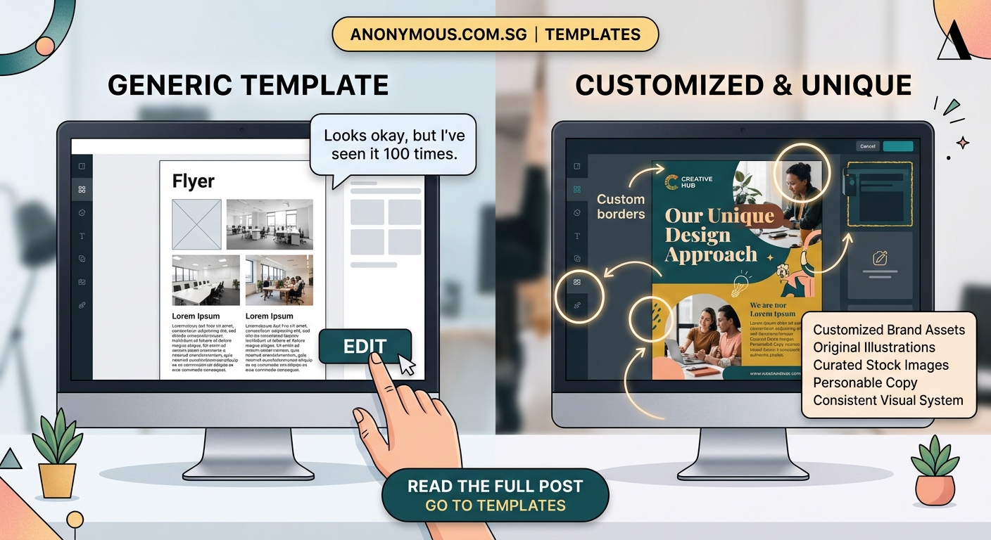
Compare your customized version side-by-side with the original template. The differences should be immediately obvious. If you have to look closely to spot changes, you haven’t customized enough.
Check your design against competitor websites. Does it stand out, or does it blend in? Your goal is distinctiveness within your industry, not just difference from the original template.
Test across devices and browsers. Your customizations should enhance the design everywhere, not just on your computer screen.
Get feedback from your target audience if possible. They’re the ones who need to connect with your design. Their perspective matters most.
Making templates work for your brand
Templates aren’t creative limitations. They’re time-saving foundations that let you focus on strategic customization instead of starting from scratch.
The key is knowing which changes create the biggest impact. Typography, color, spacing, imagery, and small graphic details transform generic templates into distinctive designs that represent your brand authentically.
Start with one template and customize it thoroughly rather than switching templates constantly. Consistency across your materials builds recognition. Apply your customizations to every piece of content you create.
Your customized template becomes a design system. Document your choices so you can replicate them. Note your fonts, colors, spacing preferences, and graphic treatments. This consistency is what makes brands look professional and established.
Budget constraints don’t mean settling for generic design. They mean being strategic about where you invest your effort. Templates handle the structural heavy lifting. You add the personality that makes them yours.