Creating a clear and compelling visual hierarchy through typography is a cornerstone of effective design. When done right, it guides viewers effortlessly through your content, emphasizing the most important information without overwhelming them. A well-structured typography scale hierarchy helps you communicate your message with clarity and style, making every piece of text serve its purpose. Whether you’re designing a website, a poster, or an app interface, mastering this skill can dramatically elevate your work.
A typography scale hierarchy organizes text by size, weight, and style to create a visual flow that highlights key messages and improves readability. Applying a consistent scale and thoughtful contrast guides viewers through your content effortlessly. Mastering this makes your designs more professional, clear, and engaging, ensuring your message lands exactly as intended.
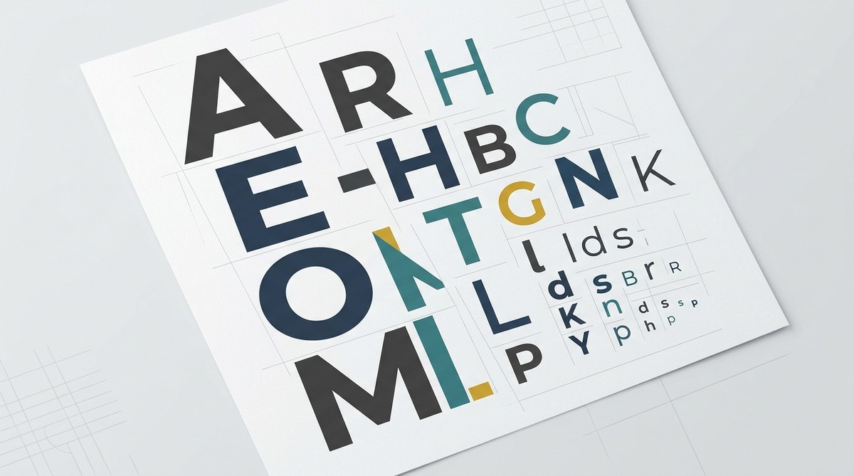
Understanding the Importance of Typography Scale Hierarchy
Typography hierarchy is the art of arranging text elements so that the most important information stands out. Think of it like a conversation where some words are spoken louder or in a different tone to grab attention. In visual terms, this involves varying font sizes, weights, and styles to create a sense of order. The goal is to help viewers scan your content quickly and absorb key points without confusion or fatigue.
Without a clear hierarchy, even the most beautiful design can become confusing. Text can blend together, making navigation difficult or diluting your message. When hierarchy is well-structured, it improves comprehension, directs focus, and lends a professional polish that resonates with your audience.
Building a Typography Scale Hierarchy Step-by-Step
Designing an effective typography scale hierarchy involves a systematic approach. Here are practical steps to get you started:
1. Define Your Content’s Core Structure
Begin by understanding the types of text you need to communicate. Common categories include:
– Main headings (H1)
– Subheadings (H2, H3)
– Body text
– Captions and labels
– Callouts or highlights
Knowing what content you’ll have helps determine the scale and style for each.
2. Establish a Base Font Size
Choose a comfortable base size for body text, typically between 16px and 18px. This size should be legible across devices and accessible for most users. For example, set your body text at 16px.
3. Create a Modular Scale
Develop a consistent sizing system using a scale factor—common choices include 1.25x or 1.5x. This means each step up or down is multiplied or divided by that factor, maintaining harmony across levels.
For example:
– Body text: 16px
– H3: 20px (16px x 1.25)
– H2: 25px (20px x 1.25)
– H1: 31px (25px x 1.25)
This relative sizing helps your hierarchy feel natural and cohesive.
4. Use Font Weight and Style to Add Contrast
Size alone isn’t enough. Vary font weights—regular, semi-bold, bold—to emphasize importance. Italics or uppercase can be used sparingly for additional emphasis, but avoid overdoing it.
5. Apply Consistent Line Height and Spacing
Line height improves readability. For body text, a line height of 1.5 times the font size is a good starting point. Spacing between different text levels should be sufficient to create separation but not so much that it breaks visual flow.
6. Test Responsiveness and Accessibility
Ensure your hierarchy adapts well to smaller screens. Use relative units like rem or em instead of px for scalability. Check color contrast and font sizes to meet accessibility standards.
Practical Techniques and Common Mistakes
Here’s a quick reference to help you refine your typographic hierarchy:
| Technique | What to Do | Common Mistake | Why It Matters |
|---|---|---|---|
| Use a modular scale | Use a consistent scale factor for sizes | Random size choices | Ensures visual harmony and clarity |
| Emphasize with weight | Use font weights to indicate importance | Overusing bold or italics | Creates confusion and reduces impact |
| Maintain line spacing | Keep line height proportional to font size | Crowded or sparse lines | Enhances readability and comfort |
| Limit font choices | Stick to 1-2 typefaces | Mixing too many fonts | Keeps hierarchy clear and consistent |
| Prioritize contrast | Use color, size, and weight to differentiate | Low contrast between levels | Helps viewers distinguish content levels |
“A strong typographic hierarchy is like a well-organized conversation. It guides the viewer naturally and makes your message memorable,” advises seasoned designer Emma Lee.
Common Techniques for Effective Hierarchy
- Scaling sizes relative to a base font creates a predictable, easy-to-scan structure.
- Varying weights helps emphasize key points without increasing size.
- Using color and contrast adds visual cues for importance.
- Alignment and spacing reinforce the order and flow of information.
- Responsive adjustments ensure hierarchy remains effective on all devices.
Typical Mistakes to Avoid
- Using too many fonts or inconsistent sizes.
- Overusing bold or italics that diminish their impact.
- Neglecting accessibility by choosing low-contrast colors or tiny text.
- Ignoring device responsiveness, leading to unreadable text on smaller screens.
- Failing to establish a clear visual flow, causing confusion.
Final Tips for Seamless Hierarchy
- Keep your scale simple and consistent.
- Use contrast thoughtfully to highlight key content.
- Test your typography on different devices and lighting conditions.
- Be intentional with every style choice—each should serve a purpose.
- Review your hierarchy regularly as your content evolves.
A Final Word on Applying Your Hierarchy Skills
Creating a confident typography scale hierarchy isn’t about rigid rules. It’s about understanding your content and guiding viewers smoothly through it. Keep your scale logical, your contrast deliberate, and your spacing consistent. With practice, your designs will communicate more clearly and look more polished. Remember, good typography doesn’t just look nice— it makes your message impossible to miss.
Building visual clarity through thoughtful typography
Encourage yourself to experiment with different scales, weights, and colors. Use mockups and real content to see how your hierarchy performs in context. Applying these principles will help your work stand out and ensure your message hits home every time.