Getting your image cropped mid-face on Instagram feels terrible. Uploading a blurry cover photo to LinkedIn looks unprofessional. Wrong dimensions waste your time and hurt engagement.
Social platforms update their specs constantly. What worked last year might look stretched or pixelated today. You need current, accurate measurements you can trust.
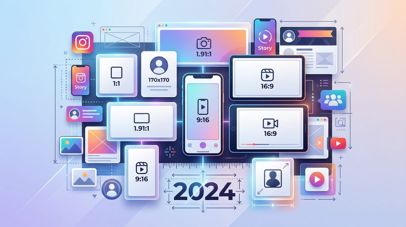
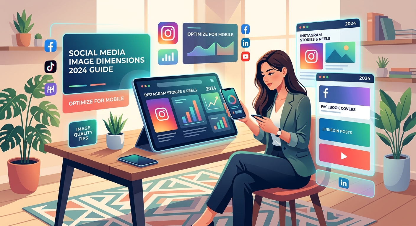
Each social platform requires specific image dimensions for optimal display. Using incorrect sizes leads to cropping, pixelation, and poor engagement. This guide provides exact measurements for profile pictures, cover photos, posts, and ads across Facebook, Instagram, Twitter, LinkedIn, Pinterest, and YouTube. Bookmark this reference to create properly formatted visuals every time you design content.
Why Image Dimensions Matter More Than You Think
Social platforms automatically resize images that don’t match their specs. That automatic resizing rarely works in your favor.
Upload an image that’s too small and it gets stretched. The result looks blurry and amateur. Upload something too large and the platform crops it, often cutting off faces or important text.
Each network has different requirements for different image types. A Facebook cover photo needs different dimensions than an Instagram story. A LinkedIn banner follows completely different rules than a Twitter header.
Getting dimensions right affects three things that matter:
- Your content looks professional and intentional
- Important visual elements don’t get cropped out
- Images load faster because they’re optimized for each platform
Design teams waste hours recreating assets in different sizes. Having the right specs from the start saves that time.
Facebook Image Sizes for 2024
Facebook remains one of the largest platforms, with billions of active users. Their image requirements cover everything from personal profiles to business pages.
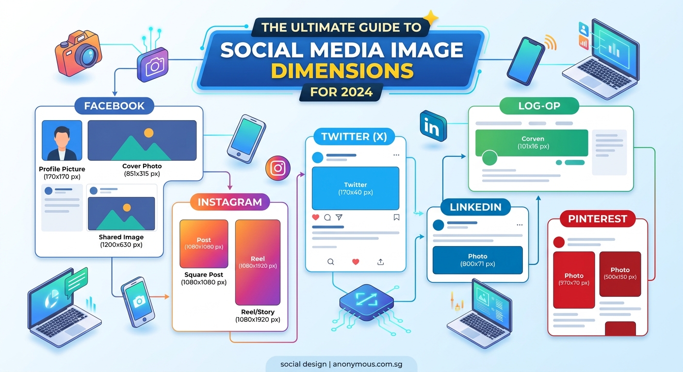
Profile Picture: 180 x 180 pixels minimum, displays at 170 x 170 on desktop and 128 x 128 on mobile. Upload at least 360 x 360 for retina displays.
Cover Photo: 820 x 312 pixels for desktop, 640 x 360 for mobile. Facebook displays at 820 x 312 but you should design for the mobile crop too.
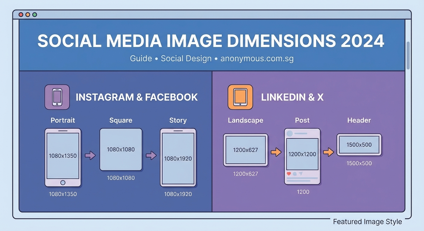
Shared Image Post: 1200 x 630 pixels works best. This ratio prevents cropping in news feeds.
Shared Link Preview: 1200 x 630 pixels. Same as image posts for consistency.
Facebook Stories: 1080 x 1920 pixels (9:16 ratio). Design with safe zones 250 pixels from top and bottom.
Event Cover Photo: 1920 x 1080 pixels minimum. Keep important content centered.
Facebook Ads: Multiple formats exist, but 1200 x 628 pixels works for most feed placements.
Create a template file at the largest size you need. Then resize down for specific placements. This maintains quality better than enlarging small images.
Instagram Dimensions That Actually Work
Instagram started as a square photo app. Now it supports multiple aspect ratios, but certain sizes perform better.
Profile Picture: 320 x 320 pixels minimum, displays as a circle. Keep important elements centered.
Square Feed Post: 1080 x 1080 pixels. The classic Instagram format still gets great engagement.
Landscape Feed Post: 1080 x 566 pixels (1.91:1 ratio). Maximum width without cropping.
Portrait Feed Post: 1080 x 1350 pixels (4:5 ratio). This vertical format shows more content in feeds.
Instagram Stories: 1080 x 1920 pixels (9:16 ratio). Leave 250 pixel margins at top and bottom for UI elements.
Instagram Reels: 1080 x 1920 pixels (9:16 ratio). Same as Stories for consistency.
IGTV Cover: 420 x 654 pixels (1:1.55 ratio). Appears in your profile grid.
Instagram compresses images heavily. Always upload at maximum quality settings. Use PNG for graphics with text, JPG for photos.
The platform displays images differently in feeds versus profiles. Test how your content looks in both places before posting important campaigns.
Twitter Image Specifications
Twitter moves fast. Images need to grab attention in crowded timelines.
Profile Picture: 400 x 400 pixels minimum. Displays as a circle, so center your subject.
Header Photo: 1500 x 500 pixels. This banner appears at the top of your profile.
In-Stream Photo: 1600 x 900 pixels for landscape, 1200 x 1200 for square. Twitter shows 2:1 ratio images without cropping.
Twitter Card Image: 1200 x 628 pixels. Used when sharing links with preview images.
Twitter crops images to 2:1 in timelines. If you upload a square image, the top and bottom get cut off. Design with this crop in mind or stick to landscape orientations.
File size matters on Twitter. Keep images under 5MB for faster loading. The platform supports PNG, JPG, and GIF formats.
LinkedIn Professional Image Standards
LinkedIn audiences expect polished, professional visuals. Blurry or poorly sized images hurt your credibility.
Profile Picture: 400 x 400 pixels. Displays at various sizes across the platform.
Background Photo: 1584 x 396 pixels. This banner sits behind your profile information.
Company Logo: 300 x 300 pixels minimum, 768 x 768 recommended for sharp display.
Company Cover Image: 1128 x 191 pixels. Appears at the top of company pages.
Shared Image Post: 1200 x 627 pixels. This size works well in feeds without cropping.
Shared Link Preview: 1200 x 627 pixels. Matches the shared image post dimensions.
Article Cover Image: 1200 x 627 pixels. Shows when you publish LinkedIn articles.
LinkedIn compresses images less aggressively than other platforms. This makes it ideal for infographics and detailed charts. Take advantage of that by uploading high-quality assets.
Professional headshots work better than casual photos. Keep backgrounds simple and faces clearly visible.
Pinterest Pin Dimensions
Pinterest is a visual search engine. Proper dimensions help your pins get discovered and saved.
Profile Picture: 165 x 165 pixels. Appears small, so use simple, recognizable images.
Board Cover: 222 x 150 pixels. Represents your board in grid views.
Standard Pin: 1000 x 1500 pixels (2:3 ratio). Vertical pins perform better than horizontal.
Long Pin: 1000 x 2100 pixels. Maximum length before Pinterest truncates.
Square Pin: 1000 x 1000 pixels. Works but gets less engagement than vertical.
Pinterest favors tall, vertical images. They take up more screen space in feeds and get noticed more. The ideal aspect ratio sits between 2:3 and 1:2.1.
Add text overlays to pins. Many users browse without reading captions. Your image should communicate value on its own.
YouTube Visual Assets
YouTube content needs thumbnails that stop scrollers and channel art that builds brand recognition.
Channel Profile Picture: 800 x 800 pixels. Displays at different sizes across devices.
Channel Cover Photo: 2560 x 1440 pixels. The safe area that shows on all devices is 1546 x 423 pixels.
Video Thumbnail: 1280 x 720 pixels (16:9 ratio). This is what viewers see before clicking.
YouTube Story: 1080 x 1920 pixels (9:16 ratio). Similar to Instagram Stories.
Thumbnails make or break video performance. Use bold text, high contrast, and expressive faces. Design thumbnails that read clearly even at small sizes.
The channel banner displays differently on TV, desktop, tablet, and mobile. Keep critical elements in the safe zone that shows everywhere.
Creating a Workflow That Saves Time
Recreating every image in six different sizes sounds exhausting. Smart designers create systems that automate the boring parts.
Here’s a practical workflow:
- Design your primary asset at the largest size you need
- Create templates for each platform with guides showing safe zones
- Use batch export features to generate multiple sizes at once
- Keep a swipe file of properly sized assets you can reference
- Build a checklist of required sizes for each campaign
Most design tools let you create artboards for different platforms. Set these up once and reuse them for every project.
| Platform | Primary Size | Aspect Ratio | Safe Zone |
|---|---|---|---|
| Instagram Feed | 1080 x 1080 | 1:1 | Full frame |
| Instagram Story | 1080 x 1920 | 9:16 | 250px margins |
| Facebook Post | 1200 x 630 | 1.91:1 | Full frame |
| LinkedIn Post | 1200 x 627 | 1.91:1 | Full frame |
| Pinterest Pin | 1000 x 1500 | 2:3 | Full frame |
| Twitter Post | 1600 x 900 | 16:9 | Center weighted |
Save these templates in your design software. When you start a new project, open the template instead of creating artboards from scratch.
Common Sizing Mistakes and How to Avoid Them
Even experienced designers make these errors. Knowing them helps you skip the frustration.
Designing at 72 DPI: Many platforms display images on retina screens. Design at 144 DPI or higher, then export at appropriate file sizes.
Ignoring mobile crops: What looks perfect on desktop often gets cropped on mobile. Preview your designs on actual devices.
Using the same image everywhere: Each platform has a different audience and context. Optimize your message for each one.
Forgetting about profile picture circles: Square designs get cropped into circles on most platforms. Keep important elements centered.
Not testing before launching: Upload test images to check how they actually display. Screenshots from design software don’t show real-world rendering.
Putting text too close to edges: Platforms crop images differently. Leave margins around important text and faces.
“The biggest mistake I see is designers creating one size and forcing it everywhere. Each platform deserves content optimized for how people use it. A vertical Pinterest pin and a horizontal LinkedIn banner serve completely different purposes.” — Sarah Chen, Social Media Design Lead
File Formats and Compression Tips
Dimensions are half the equation. File format and compression affect quality and loading speed.
Use PNG for: Graphics with text, logos, illustrations with sharp edges, images requiring transparency.
Use JPG for: Photographs, images with gradients, content where file size matters more than perfect quality.
Avoid GIF for: Static images. GIF files are larger than PNG or JPG for non-animated content.
Use MP4 for: Video content on all platforms. Better compression than other video formats.
Most platforms compress uploaded images. Upload the highest quality version you have. Let the platform handle compression rather than doing it yourself.
Instagram compression is particularly aggressive. Export JPGs at 100% quality. Instagram will compress them, but starting with maximum quality gives better final results.
File size limits vary by platform:
- Facebook: 4MB for images, 1GB for videos
- Instagram: No stated limit but compression increases above 1MB
- Twitter: 5MB for images, 512MB for videos
- LinkedIn: 10MB for images, 5GB for videos
- Pinterest: 32MB for images and videos
Staying under these limits prevents upload errors and ensures faster loading for viewers.
Adapting Designs Across Multiple Platforms
You created a beautiful square Instagram post. Now you need it for LinkedIn, Twitter, and Facebook too.
Start with the largest canvas you might need. Design with flexibility in mind. Keep critical elements like faces, logos, and text in the center third of your composition.
This center-weighted approach means you can crop to different aspect ratios without losing important content. A 1920 x 1920 pixel square can be cropped to 1200 x 630 for Facebook or 1000 x 1500 for Pinterest while keeping the core message intact.
Create multiple versions rather than one-size-fits-all compromises. A design optimized for vertical Pinterest won’t work well as a horizontal Twitter image. Spend the extra 10 minutes creating platform-specific versions.
Some elements you can reuse across platforms:
- Core brand colors and fonts
- Main message or headline
- Key visual elements like product shots
- Logo placement and sizing
Elements that should change:
- Aspect ratio and overall dimensions
- Text size (readable at different scales)
- Amount of detail (mobile vs desktop viewing)
- Call to action placement
Tools That Make Sizing Easier
You don’t need to memorize every dimension. Smart tools handle the technical details.
Canva: Pre-built templates for every major platform. Resize designs with one click.
Adobe Express: Similar template approach with Adobe’s design tools.
Figma: Create component libraries with all your platform sizes. Design once, export everywhere.
Photoshop: Artboard features let you design multiple sizes in one document.
Sketch: Similar to Figma with strong export options.
Browser extensions and plugins can automate exports. Set up your sizes once, then generate all versions with a single command.
Bookmark a reference sheet with current dimensions. Platform specs change occasionally. Check for updates every few months.
Staying Current When Platforms Update
Social networks update their image requirements without much warning. A size that worked last month might not work today.
Follow official developer blogs for each platform. They announce spec changes there first. Twitter, Facebook, Instagram, and LinkedIn all maintain documentation for designers.
Join design communities where professionals share updates. Someone usually notices spec changes within days.
Test your templates quarterly. Create a test image and upload it to each platform. Verify it displays correctly. This catches changes before they affect real campaigns.
Keep a changelog of when you last verified each platform’s specs. Note the date and source. This helps you track when information might be outdated.
Making Image Sizes Work for You
Perfect dimensions don’t guarantee engagement. But wrong dimensions definitely hurt it.
Treat sizing as a baseline requirement, not the end goal. Get the technical specs right so your creative work can shine.
Build templates today that save hours tomorrow. Set up your design files with proper artboards. Create a reference document you can check without searching online.
Your audience judges content in seconds. Blurry, cropped, or stretched images make them scroll past. Sharp, properly sized visuals give your message a fighting chance.
Start with one platform. Get those specs locked in. Then expand to others. You’ll build a library of templates that makes every future project faster.