You send your design to the printer feeling confident. Days later, your printed materials arrive and the vibrant blues look muddy. The bright greens turned dull. Your client is unhappy, and you need to reprint everything at your own expense.
This happens because you used the wrong color mode.
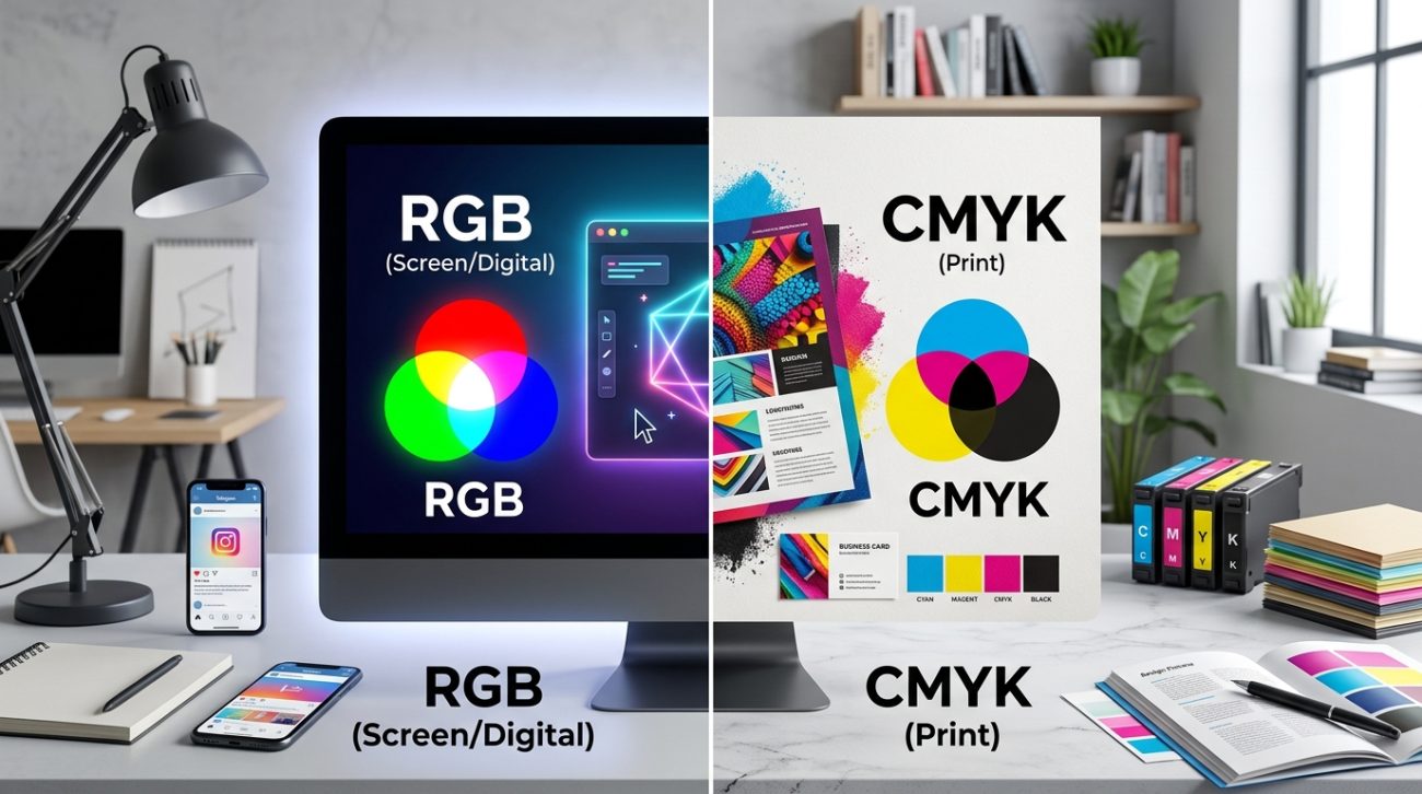
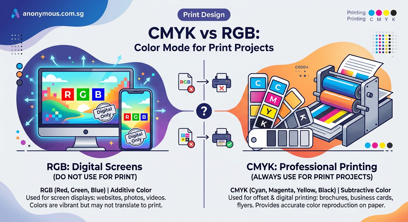
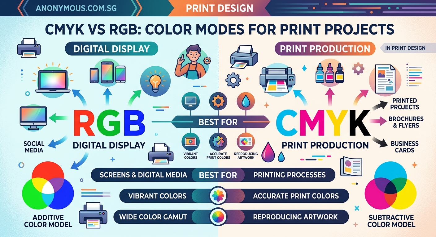
CMYK is for print projects and uses cyan, magenta, yellow, and black inks. RGB is for screens and uses red, green, and blue light. Using the wrong mode causes color shifts during printing. Always design in CMYK for anything that will be physically printed, and convert RGB files before sending them to your print shop to ensure accurate color reproduction.
Understanding how each color mode works
RGB stands for red, green, and blue. These are the three colors of light that screens emit to create every color you see on your monitor, phone, or television.
Think of RGB as additive color. When you combine all three colors at full intensity, you get white light. When all three are absent, you get black. This matches how light works in the real world.
Your eyes see the world through light. Screens replicate this by shining different combinations of red, green, and blue directly at you.
CMYK stands for cyan, magenta, yellow, and key (black). These are the four ink colors that printers use to create printed materials.
CMYK is subtractive color. Inks absorb certain wavelengths of light and reflect others. When you layer cyan, magenta, and yellow inks together, they theoretically create black. In practice, they create a muddy brown, which is why printers add pure black ink as the fourth color.
Paper starts white. Each layer of ink subtracts brightness until you reach the darkest tones.
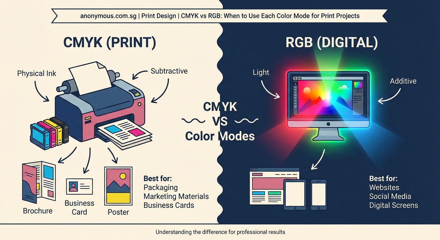
The fundamental difference is light versus ink. RGB creates colors by emitting light. CMYK creates colors by absorbing light.
Why the color mode matters for your print projects
RGB can display colors that CMYK cannot reproduce with ink. Bright, glowing greens and electric blues look stunning on screen but fall outside the range of what printing inks can achieve.
This range of reproducible colors is called the color gamut. RGB has a much wider gamut than CMYK.
When you send an RGB file to a commercial printer, the printing software must convert those colors to CMYK. This conversion happens automatically, but not always the way you want.
Bright RGB colors get shifted to the nearest CMYK equivalent. Those vibrant screen colors become noticeably duller on paper. Blues shift toward purple. Greens lose their brightness. Reds can look flat.
You lose control over how this conversion happens if you let the printer do it. Different printers use different conversion methods. The results vary.
Designing in CMYK from the start gives you full control. You see exactly what colors are achievable with ink. You make informed decisions about your color palette. You avoid surprises when the printed materials arrive.
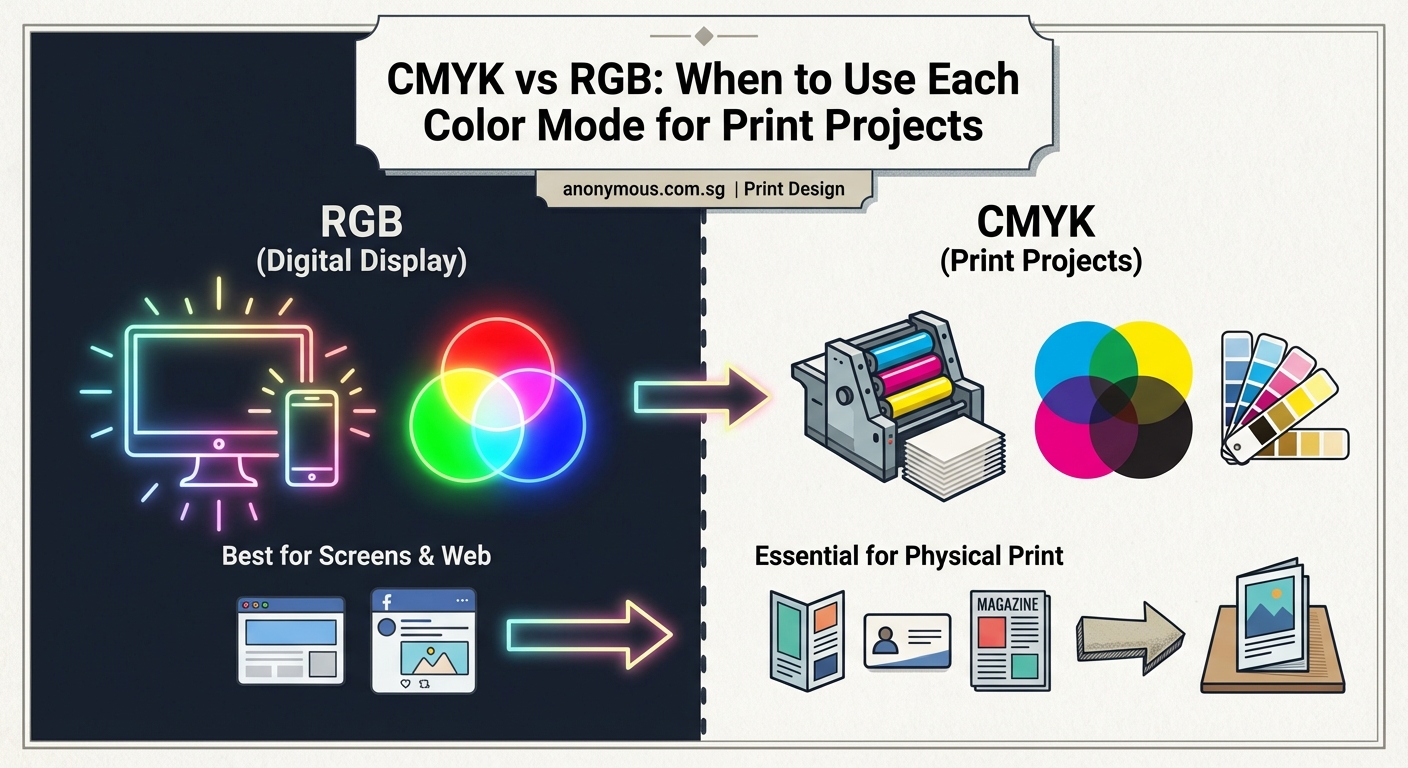
When to use RGB
Use RGB for any project that will only be viewed on screens.
- Website graphics and layouts
- Social media images and advertisements
- Email newsletters and digital campaigns
- Mobile app interfaces
- Digital presentations and slideshows
- Video content and motion graphics
- Photography portfolios displayed online
RGB gives you access to the full range of colors your screen can display. Your images look brighter and more vibrant. You work in the same color space where your audience will see the final result.
Photographers should shoot and edit in RGB. Camera sensors capture light, not ink, so they naturally produce RGB files. Keep your photos in RGB unless you have a specific print project.
When to use CMYK
Use CMYK for anything that will be printed with ink.
- Business cards and letterhead
- Brochures and flyers
- Posters and banners
- Magazine advertisements
- Product packaging
- Trade show displays
- Direct mail postcards
- Annual reports and booklets
Starting your design in CMYK prevents color disappointment. You see the limitations of print inks from the beginning. You choose colors that will reproduce accurately.
Some designers worry that CMYK looks dull on screen. Your monitor is still displaying RGB, so CMYK files appear less vibrant than they would if your screen could show true ink colors. This is normal and expected.
Trust the CMYK values, not what you see on screen. If you need to proof colors accurately, request a physical proof from your printer.
How to convert between color modes properly
Converting from RGB to CMYK requires attention to detail. Here is the proper process:
- Save a copy of your original RGB file before converting. Keep this master file for future screen use.
- Open your design software’s color settings and choose a CMYK profile that matches your printer’s specifications. Common profiles include SWOP, GRACoL, or Fogra39.
- Convert the color mode through your software’s proper conversion tool, not by simply changing the document mode. In Adobe applications, use Edit > Convert to Profile.
- Review every element in your design. Check photos, graphics, and colored text for unwanted color shifts.
- Adjust colors that shifted too much during conversion. Replace them with CMYK values that better match your original intent.
- Add rich black for large dark areas. Pure black (100% K) can look flat. A rich black like C60 M40 Y40 K100 gives deeper, more luxurious darkness.
Converting from CMYK to RGB is simpler because RGB has a wider gamut. All CMYK colors fit within RGB. You still need to convert properly using color profiles, but you will not face the same color shifting issues.
Design in the color mode of your final output. If you know something will be printed, start in CMYK. If it will be shown on screens, start in RGB. Converting later always introduces compromises.
Common mistakes that ruin print projects
| Mistake | Why it happens | How to fix it |
|---|---|---|
| Sending RGB files to print | Designer forgets to convert | Always convert to CMYK and check the proof |
| Using pure black for text | Default black is 100% K only | Use rich black for large areas, pure black for small text |
| Trusting screen colors | Monitors show RGB, not ink | Request printed proofs for color-critical work |
| Ignoring color profiles | Not all CMYK is the same | Ask your printer which profile they prefer |
| Converting multiple times | Each conversion degrades quality | Convert once, from RGB master to CMYK output |
| Using web graphics for print | Low resolution RGB images | Create print versions at 300 DPI in CMYK |
The pure black issue trips up many designers. Small text at 100% K prints fine. Large areas of 100% K can look washed out or show printer imperfections. Rich black solves this by layering multiple inks for depth.
Be careful not to make rich black too rich. Total ink coverage above 300% can cause drying problems and paper warping. A combination like C60 M40 Y40 K100 totals 240%, which is safe for most papers.
Working with brand colors across both modes
Many brands have specific colors that must appear consistent everywhere. A logo needs to look the same on a website and a business card.
This creates a challenge because RGB and CMYK cannot always match perfectly. The solution is to define separate values for each mode.
Professional brand guidelines include:
- Pantone spot color for exact matching
- CMYK values for offset printing
- RGB values for screen display
- Hex codes for web design
A bright blue might be Pantone 2925 C, which converts to C100 M56 Y0 K0 in CMYK and R0 G102 B204 in RGB. These values will not look identical, but they are the closest matches possible in each color space.
If your brand color falls outside the CMYK gamut, you have two choices. Adjust the brand color to something achievable in print, or use spot color printing for perfect matches.
Spot color printing uses premixed inks instead of CMYK combinations. A spot color can reproduce colors outside the CMYK gamut, but it costs more because it requires additional press runs.
Checking your files before sending them to print
Before you send files to your printer, verify the color mode. This simple check saves money and prevents reprints.
Most design software shows the current color mode in the document information. In Adobe Illustrator, check the top of your document window. In InDesign, look at the color swatches panel.
Open your placed images and check their color modes too. You can have a CMYK document with RGB images inside it. Each image needs individual conversion.
Export a PDF and examine it in Adobe Acrobat. Go to Tools > Print Production > Output Preview. This shows you exactly what inks will be used. If you see RGB listed anywhere and you intended CMYK only, you have unconverted elements.
Some printers prefer to receive native files (InDesign, Illustrator). Others want print-ready PDFs. Ask your printer which format they prefer and what color profile to use.
Include a color proof with your order when color accuracy matters. A proof is a test print that shows exactly how your colors will reproduce. Approve this before the full print run.
Setting up your design software correctly
Configure your software before starting a new print project. This prevents mistakes later.
In Adobe Creative Cloud applications, go to Edit > Color Settings. Choose a preset like North America Prepress 2 or Europe Prepress 3, depending on your location. These presets configure all color management settings appropriately for print work.
Enable color management warnings. Your software will alert you when you place an RGB image into a CMYK document or when color profiles do not match. These warnings catch problems early.
Set your default CMYK working space to match your printer’s specifications. If you work with multiple printers, use a standard profile like SWOP (US) or Fogra39 (Europe) and convert to printer-specific profiles only at the final output stage.
Create document templates with the correct settings. A business card template, a brochure template, and a poster template should all be preset to CMYK with appropriate dimensions and bleed settings.
Your monitor should be calibrated if color accuracy matters for your work. An uncalibrated monitor shows colors incorrectly, making it impossible to judge your designs accurately. Hardware calibration tools cost between $100 and $300 and are worth the investment for professional work.
Handling photos for print projects
Photographs present special challenges because cameras capture in RGB. Most photo editing happens in RGB because it offers more flexibility and better tool performance.
Edit your photos fully in RGB first. Make all your exposure, color, and retouching adjustments in the wider RGB color space. This gives you the best quality and the most editing headroom.
Only convert to CMYK as the final step before placing the photo in your print layout. This preserves maximum quality throughout your editing process.
When you convert a photo to CMYK, watch for shifts in skin tones, skies, and greens. These areas often change noticeably. Adjust them after conversion using curves or selective color tools.
Save your edited RGB master file. If you need the same photo for web use later, you can export from the RGB master instead of converting back from CMYK.
Some photographers keep both an RGB master and a CMYK print version of important images. This workflow ensures you always have the right file for each purpose.
Making colors work for you instead of against you
Understanding CMYK and RGB gives you control over your color reproduction. You make intentional choices instead of hoping for the best.
Start every project by asking where it will be seen. Screens or paper? This single question determines your color mode.
Build relationships with your print vendors. Ask them about their preferred color profiles and file formats. Good printers will help you get better results.
Keep learning about color management. It seems technical at first, but it becomes intuitive with practice. Your designs will reproduce more accurately, your clients will be happier, and you will waste less money on reprints.
The color mode you choose affects every project you create. Choose correctly from the start, and your prints will match your vision.