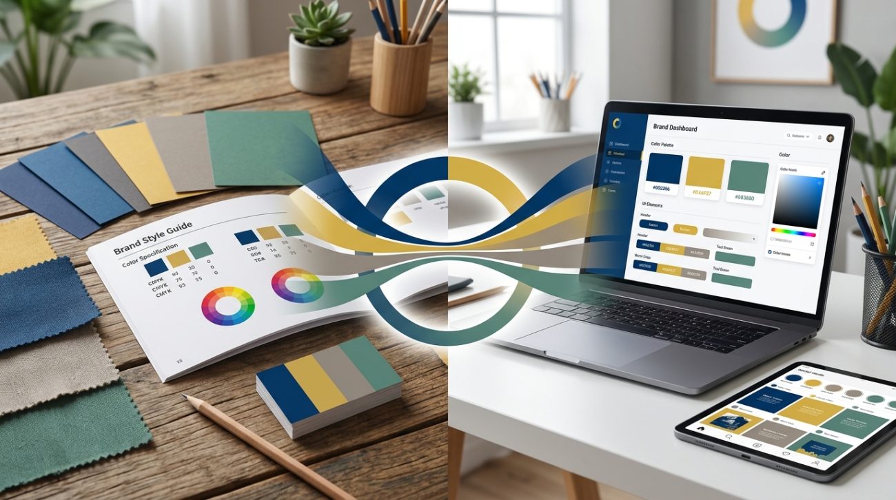
Your logo looks perfect on screen. Then you see it printed on a business card, and the blue has turned purple. The green went muddy. Your carefully chosen brand palette suddenly feels like a different company.
This happens more often than you’d think. Print uses CMYK ink. Screens use RGB light. Pantone is its own universe. Without a system, your brand will look different everywhere it appears.
A cohesive brand color palette across print and digital requires defining colors in multiple modes (RGB, CMYK, Pantone, HEX), testing on actual materials, documenting everything in a style guide, and training your team to use the right values. Color shift is inevitable between mediums, so choose adaptable hues and establish acceptable ranges rather than expecting pixel-perfect matches everywhere.
Why colors change between screens and paper
Screens emit light. Paper reflects it. That fundamental difference means colors will never match perfectly.
RGB (Red, Green, Blue) creates colors by mixing light. Your monitor, phone, and tablet all use RGB. It can produce bright, saturated colors that seem to glow.
CMYK (Cyan, Magenta, Yellow, Black) uses ink on paper. Printers mix these four colors to create everything else. The color range is smaller. Bright oranges and electric blues often fall outside what CMYK can reproduce.
Pantone offers a third system with premixed inks. Each Pantone color is a specific formula. This gives you consistency across print jobs, but Pantone colors still look different on screen.
Understanding these three systems is the foundation of maintaining a brand color palette for print and digital work.
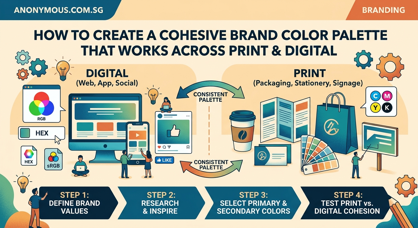
How to define your palette in all three color modes
Start by choosing your colors in RGB if you work primarily on screens. Or start with Pantone if print is your main medium. Either way, you need to convert and document all three.
Here’s the process:
- Pick your primary brand colors in your preferred color mode
- Convert each color to the other two modes using professional tools
- Print test sheets and view them under different lighting
- Adjust the CMYK values if the printed version looks too different
- Lock in your final values and document everything
Most design software can convert between color modes automatically. But automatic conversions often produce disappointing results. A vibrant RGB blue might convert to a dull CMYK version that doesn’t feel like your brand anymore.
Professional designers adjust the CMYK values manually after conversion. They boost the cyan or reduce the black to get closer to the original feeling, even if the technical color match isn’t exact.
“Perfect color matching across print and digital is impossible. Your goal is to maintain the same emotional impact and brand recognition, not identical color measurements.”
Setting up your color values correctly
Each color in your palette needs specific values for different uses. Here’s what to document:
- HEX code for websites and digital design tools
- RGB values for screens, presentations, and digital ads
- CMYK percentages for offset printing and most print vendors
- Pantone number for spot color printing and brand merchandise
- RAL or other standards if you work with industrial applications
Your how to build a brand style guide that actually gets used should include all these values in an easy reference table.
Here’s an example of how to structure this information:
| Color Name | HEX | RGB | CMYK | Pantone |
|---|---|---|---|---|
| Primary Blue | #0066CC | 0, 102, 204 | 100, 50, 0, 20 | 2935 C |
| Accent Orange | #FF6600 | 255, 102, 0 | 0, 60, 100, 0 | 1655 C |
| Neutral Gray | #666666 | 102, 102, 102 | 0, 0, 0, 60 | Cool Gray 9 C |
Notice how each color has a descriptive name. “Primary Blue” is better than “Blue 1” because it tells people when to use it.
Testing colors on real materials
Digital proofs lie. You need to see your colors on actual paper, fabric, and other materials you’ll use.
Order printed samples from your actual printer. Not your office inkjet. The commercial printer who will produce your business cards, brochures, and packaging.
Different paper types affect color dramatically. Glossy coated paper makes colors brighter. Uncoated paper absorbs more ink and looks duller. Recycled paper adds a warm tone to everything.
Test your palette on:
- Coated and uncoated paper stocks
- The actual materials for merchandise (fabric, metal, plastic)
- Different screen types if possible (phone, laptop, external monitor)
- Both light and dark backgrounds
Take photos of your printed samples next to your digital versions. This creates a visual reference for future projects and helps you set realistic expectations.
When you find colors that shift too much, you have two choices. Adjust the color to work better across mediums, or choose a different color entirely. Some hues just don’t translate well.
Common color shift problems and how to fix them
Certain colors cause predictable problems. Knowing these patterns helps you avoid them or plan workarounds.
Bright blues often turn purple in CMYK. The solution is to reduce magenta in your CMYK mix, even if it looks too green on screen. The printed result will be closer to your intended blue.
Vibrant oranges and warm reds lose intensity. CMYK can’t match the brightness of RGB in these ranges. Choose slightly deeper, less fluorescent versions of these colors from the start.
Light colors disappear on uncoated paper. Pale pastels that look perfect on screen often vanish when printed on textured or uncoated stock. Increase saturation by 10 to 15 percent for these applications.
Dark colors look muddy with too much ink. When your CMYK values add up to more than 280 percent total ink coverage, you risk oversaturation. The paper gets too wet and colors look murky. Reduce the black component and rebalance.
Creating acceptable color ranges
Perfect consistency is impossible. Instead, define acceptable ranges for each color.
Your primary blue might be #0066CC on screen. In print, it could range from Pantone 2935 C to 2945 C depending on paper and lighting. Both feel like “your blue” even though they’re technically different.
Document these acceptable ranges in your brand guidelines. Give examples of what’s too light, too dark, too purple, or too green. Visual examples work better than written descriptions.
This flexibility prevents endless revisions and helps vendors understand what matters. You care about brand recognition, not matching a specific color value to three decimal places.
Building a practical color workflow
Set up systems that make it easy for everyone to use the right color values.
Create color swatches in your design software with the correct values already entered. Name them clearly. Save them where your whole team can access them.
For Adobe Creative Suite, save an ASE (Adobe Swatch Exchange) file with your brand colors. For Figma or Sketch, create a shared library. For Microsoft Office, create a custom theme.
When you send files to printers, include a PDF with your color specifications. List the Pantone numbers and CMYK values you expect. This prevents the printer from making their own conversions.
Keep printed color samples at your desk. When someone asks “is this the right blue?” you can hold up the physical sample instead of trying to judge on different monitors.
Managing colors across your team
The biggest color consistency problems come from people, not technology.
Someone grabs the logo from the website and uses that RGB version in a print file. The designer creates a “close enough” color instead of using the official palette. The vendor substitutes a similar Pantone because they don’t have the right one in stock.
Training prevents these mistakes. Make sure everyone knows:
- Where to find the official color values
- Which color mode to use for each project type
- Why they can’t just eyeball it or use similar colors
- How to check their work before sending to production
Your what makes a brand memorable depends partly on consistent color use. When your blue varies wildly between touchpoints, people don’t connect them to the same brand.
Choosing colors that work everywhere
Some colors are naturally easier to reproduce across mediums. When building a new palette, consider technical limitations alongside aesthetics.
Mid-tone colors translate better than extreme lights or darks. A medium blue works in both RGB and CMYK. Electric cyan or navy might not.
Avoid colors that sit at the edge of the CMYK gamut. These will always disappoint in print. Most design tools can show you which colors fall outside the CMYK range before you commit.
Neutral colors (grays, tans, off-whites) stay consistent more easily. Build your palette with these as supporting colors to reduce overall color shift.
If your industry or how to choose brand colors that actually convert customers requires a specific hue that’s hard to reproduce, consider using it as an accent rather than your primary color. This limits the damage when it shifts between mediums.
Tools that help maintain consistency
Professional color management requires the right tools. Free solutions exist, but they have limits.
Pantone Color Bridge shows you how Pantone colors look in CMYK and RGB. This printed book is expensive but invaluable if you work with both spot and process colors regularly.
Adobe Color (formerly Kuler) lets you create palettes and see them in different color modes. It’s free with Creative Cloud.
Calibrated monitors display colors more accurately. A $200 colorimeter like the X-Rite i1Display Pro helps you calibrate your screen so what you see matches reality better.
Printer profiles tell your software how a specific printer reproduces colors. Good print vendors provide ICC profiles for their equipment and paper stocks.
Physical swatch books for your chosen color systems give you real-world references. Pantone, RAL, and other systems all sell official swatch books.
When to use spot colors versus process colors
Spot colors use premixed Pantone inks. Process colors mix CMYK during printing. Each has advantages.
Use spot colors when:
- You need exact color matching (like a trademarked brand color)
- You’re printing on unusual materials where CMYK behaves unpredictably
- Your design only uses one or two colors (spot can be cheaper)
- You need metallic, fluorescent, or other special ink effects
Use process colors (CMYK) when:
- Your design includes photos or complex gradients
- You need four or more colors (adding spot colors gets expensive)
- You’re printing on demand or digitally (most systems only do CMYK)
- Budget is tight and perfect color matching isn’t critical
Many projects use both. You might print photos in CMYK but add your logo as a spot color to ensure it matches perfectly.
Handling color in different lighting conditions
Your colors will look different under office fluorescents, natural daylight, and warm restaurant lighting. You can’t control this, but you can plan for it.
Test your printed materials under different light sources. Take them outside. View them under warm and cool bulbs. If a color looks drastically different, it might cause problems.
Metamerism is when two colors match under one light but look different under another. This happens more with certain color combinations. If you notice this with your palette, document it so people understand the colors aren’t “wrong.”
For packaging or retail applications, test under the actual lighting conditions where customers will see your brand. Store lighting is often quite different from office lighting.
Updating your palette over time
Brand colors can evolve. Technology improves. New printing methods become available. What was impossible five years ago might work now.
Review your color specifications every few years. Are your CMYK values still optimal for current printing technology? Do your colors work on new screen types like OLED?
When you refresh your brand, resist the temptation to choose colors based only on how they look on your retina display. Consider the full lifecycle of where these colors will appear.
Document why you made specific color choices. Future designers will thank you when they understand the reasoning behind seemingly odd CMYK values or Pantone selections.
Avoiding common color palette mistakes
Here are mistakes that cause the most problems:
| Mistake | Why It Happens | How to Fix It |
|---|---|---|
| Using RGB files for print | Designer works only on screen | Set up proper file templates for print |
| Too many brand colors | Wanting flexibility and options | Limit palette to 3-5 colors plus neutrals |
| No documented color values | Colors chosen casually over time | Audit all materials and standardize |
| Expecting perfect matches | Not understanding color science | Set acceptable ranges instead |
| Skipping physical proofs | Trusting digital proofs only | Always request printed samples |
The 7 logo design mistakes that make your brand look unprofessional often include color problems that could have been prevented with proper planning.
Working with vendors and printers
Good communication with your print vendors prevents color disasters.
Always provide color specifications in writing. Don’t assume they’ll match what they see on screen. Include Pantone numbers, CMYK percentages, and notes about acceptable variation.
Ask for a printed proof before the full run. This costs extra but saves you from 5,000 business cards in the wrong color.
Build relationships with reliable vendors who understand color management. A printer who takes color seriously will catch problems before they happen and suggest solutions.
When something prints wrong, don’t just complain. Work with the vendor to understand why. Was it the file setup? The paper choice? The lighting where you viewed it? Learning from mistakes improves your process.
The how to set up print files that won’t get rejected by printers covers technical file setup, but color specifications are equally important.
Digital-specific color considerations
Digital has its own challenges beyond just using RGB.
Different devices display colors differently. Your iPhone, Android phone, laptop, and desktop monitor all show slightly different versions of the same color. You can’t fix this completely, but you can test on multiple devices.
Web browsers handle color differently. Some respect color profiles, others ignore them. Design for the lowest common denominator.
Dark mode changes everything. If your brand colors look great on white but terrible on black, you need dark mode alternatives. Test your palette on both light and dark backgrounds.
Accessibility matters. Your color palette must provide enough contrast for people with vision impairments. Use contrast checking tools to verify your combinations meet WCAG standards.
Print-specific considerations
Print has physical limitations that digital doesn’t face.
Paper color affects everything. Your colors will look warmer on cream paper and cooler on bright white. Get samples of your chosen paper stock and test your colors on it.
Ink saturation has limits. Too much ink causes smearing, show-through, and drying problems. Keep total ink coverage under 280 percent for most papers.
Binding and finishing can affect color appearance. Colors near the spine of a bound book might look darker. Lamination makes colors more saturated. UV coating adds a cool tone.
Minimum feature size matters for color. Tiny text or thin lines in color might not print clearly. Use black for small elements instead.
Making your color system actually work
All this technical knowledge means nothing if people don’t use it correctly.
Make your color specifications easy to find. Put them in your style guide, but also create a one-page reference sheet. Designers want answers fast.
Provide ready-to-use files. Create templates with colors already set up correctly. Make it easier to do it right than to do it wrong.
Review work before it goes to production. Catch color mistakes early when they’re cheap to fix.
Celebrate good examples. When someone nails the color consistency across a campaign, point it out. Positive reinforcement works.
Your brand deserves consistent colors everywhere
Color consistency across print and digital isn’t about perfection. It’s about creating a recognizable brand that feels the same whether someone sees it on Instagram or picks up your business card.
Start by documenting your colors in all the necessary formats. Test them on real materials. Set up systems that make it easy for your team to use the right values. And remember that acceptable ranges work better than rigid exactness.
Your customers won’t notice if your blue is three percent different between your website and your brochure. They will notice if it looks like two completely different brands. Focus on maintaining that consistent brand feeling, and you’ll build the recognition that makes your business memorable.