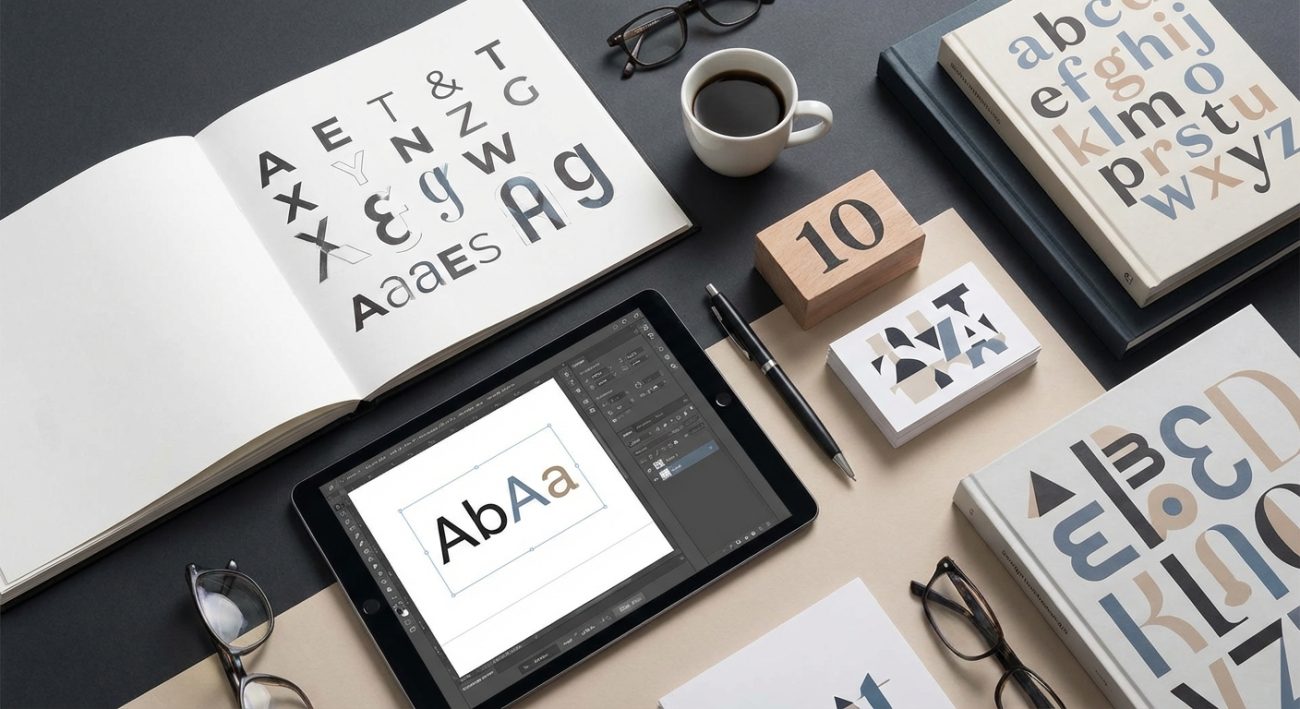
Typography is changing faster than ever. What worked last year already looks dated, and staying relevant means keeping up with what’s actually being used in the wild right now.
Typography trends 2024 blend technical innovation with nostalgic aesthetics. Variable fonts, high-contrast sans serifs, and custom typefaces dominate professional work. Designers are balancing personality with performance, choosing fonts that work across devices while making bold visual statements. Understanding these trends helps you create modern designs that feel fresh without chasing fads that fade fast.
Variable fonts are finally mainstream
Variable fonts let you adjust weight, width, and other attributes along a continuous axis instead of jumping between separate font files. This technology has been around for years, but 2024 is the year it became standard practice.
Browser support is solid now. Performance benefits are real. One variable font file can replace dozens of static ones, cutting load times significantly.
Designers are using variable fonts to create responsive typography that adapts to screen size, not just layout. Headlines can get bolder on larger screens without loading extra files. Body text can adjust its weight for better readability on different backgrounds.
The best part is the creative control. You can fine-tune weight to exactly 456 instead of choosing between 400 and 500. This precision matters when you’re trying to match a specific brand feel or balance visual hierarchy.
High-contrast sans serifs are everywhere
Walk into any design studio and you’ll see high-contrast sans serifs on screens everywhere. These typefaces combine the clean geometry of sans serifs with dramatic thick-thin stroke variations traditionally found in serifs.
The contrast creates visual interest without adding decorative elements. It works beautifully for headlines and display text where you want impact without ornament.
Brands are adopting these fonts because they feel both modern and established. The high contrast adds sophistication while the sans serif structure keeps things contemporary.
Here’s what makes them work:
- Strong vertical stress creates elegant proportions
- Thin strokes add refinement without feeling delicate
- Thick strokes provide weight and presence
- The combination reads well at large sizes
- They pair naturally with simpler body fonts
Chunky, rounded fonts bring personality back
After years of geometric minimalism, designers are reaching for fonts with actual character. Chunky rounded fonts feel friendly and approachable without being childish.
These typefaces work especially well for brands targeting younger audiences or anyone wanting to feel more human. The rounded terminals soften the overall impression while the heavy weight keeps things grounded.
You’ll see these fonts in app interfaces, packaging design, and social media graphics. They photograph well and hold up when compressed for digital platforms.
The trend reflects a broader shift away from corporate sterility. People want brands that feel like people, and typography is following that direction.
Retro serifs are making a calculated comeback
Serifs never really left, but the specific styles getting attention have shifted. Designers are pulling inspiration from 1970s editorial design, bringing back the warm, slightly quirky serifs from that era.
These aren’t your grandfather’s Times New Roman serifs. They have personality. Slightly unconventional proportions. Details that make you look twice.
The appeal is partly nostalgic, but it’s also practical. These serifs feel established and trustworthy while still being distinctive enough to stand out. That combination is hard to find in more modern typeface designs.
When working with retro serifs, pair them with contemporary sans serifs to avoid looking like a period piece. The contrast between old and new creates tension that feels intentional rather than dated.
Custom fonts separate brands from competitors
More brands are commissioning custom typefaces instead of licensing existing ones. The investment makes sense when you consider how much visual real estate typography occupies.
Custom fonts solve several problems at once:
- Complete uniqueness in a crowded market
- Perfect alignment with brand personality
- Control over technical specifications
- Ownership instead of licensing fees
- Exact matching to other brand elements
The process takes months and costs significantly more than licensing, but the result is typography that nobody else can use. That exclusivity has real value when building brand recognition and consistency.
Even small brands are exploring semi-custom options where foundries modify existing typefaces to create something unique without starting from scratch.
Implementing typography trends without losing your identity
Following trends blindly is how you end up with designs that look generic. The goal is using current typography to enhance your message, not replace it.
Here’s a practical process for evaluating trends:
- Identify which trends align with your brand personality and audience expectations.
- Test trend-forward typography in small applications before committing to major redesigns.
- Combine trendy display fonts with stable, proven body fonts for balance.
- Check technical performance across devices and browsers before finalizing choices.
- Document your typography decisions to maintain consistency as your team grows.
The brands doing typography well in 2024 are the ones using trends as tools, not templates. They understand that a well-chosen typeface supports the message instead of becoming the message.
Multilingual support is no longer optional
Global audiences mean global typography needs. Fonts that only support Latin characters leave huge portions of your audience with fallback fonts that don’t match your design.
Modern typeface families include extensive character sets covering Cyrillic, Greek, Arabic, Chinese, Japanese, Korean, and more. Designers are prioritizing these comprehensive families over more limited options.
This matters even if you’re not actively translating content yet. Users have multilingual names. They might share your content in other languages. Browser extensions translate pages automatically.
Choosing fonts with broad language support future-proofs your design system and shows respect for diverse audiences.
3D and kinetic typography add depth
Static typography still dominates, but 3D and animated treatments are becoming more accessible. Tools have improved to the point where adding dimension doesn’t require specialized 3D software.
3D typography works best for:
- Hero sections and landing pages
- Social media content that needs to stop scrolling
- Brand campaigns with specific creative directions
- Product launches and announcements
- Event promotion and seasonal campaigns
The key is restraint. 3D effects lose impact when overused. Save them for moments that deserve extra attention.
Kinetic typography, where letters move or transform, follows similar rules. Animation should enhance readability or meaning, not just add motion for its own sake.
Comparing typography approaches for different contexts
Different projects need different typography strategies. Here’s how current trends map to common design contexts:
| Context | Recommended Approach | Why It Works |
|---|---|---|
| Corporate websites | High-contrast sans with classic serif body | Balances modern feel with readability |
| E-commerce | Variable fonts for responsive sizing | Performance matters for conversion |
| Mobile apps | Rounded sans with generous spacing | Finger-friendly and approachable |
| Editorial design | Retro serifs with contemporary accents | Creates visual interest for long reads |
| Social media | Chunky display fonts with high contrast | Reads well at small sizes and compressed |
| Luxury brands | Custom serif with refined proportions | Exclusivity matches brand positioning |
Common typography mistakes to avoid in 2024
Trends create new opportunities but also new ways to mess up. Here are the mistakes seeing the most often right now:
Using too many variable font axes at once creates chaotic, unreadable text. Stick to one or two adjustments maximum per application.
Choosing high-contrast fonts for body text makes long-form reading difficult. Those thin strokes disappear at small sizes or on certain screens.
Applying 3D effects to entire paragraphs instead of selective words or headlines. The eye needs places to rest.
Ignoring font licensing when using custom modifications. Just because you can edit a font file doesn’t mean you legally should.
Following every trend simultaneously instead of choosing what fits your project. Your design should have a point of view, not a checklist.
The most critical mistake is choosing fonts without considering your overall brand identity. Typography should support your brand, not fight it.
Expert perspective on typography evolution
“The typography trends we’re seeing in 2024 aren’t random. They reflect deeper shifts in how people consume content and what they expect from brands. Variable fonts address real performance needs. Chunky, friendly typefaces respond to audience fatigue with corporate minimalism. The designers succeeding right now are the ones who understand the why behind the what.” – Independent type designer with 15 years of experience working with Fortune 500 brands
This perspective matters because it reframes trends as solutions rather than aesthetics. When you understand what problem a trend solves, you can evaluate whether that problem exists in your work.
Technical considerations for modern typography
Beautiful typography means nothing if it doesn’t load or render correctly. Technical execution matters as much as aesthetic choices.
File size impacts everything. Variable fonts are efficient, but poorly optimized custom fonts can slow your site significantly. Use font subsetting to include only the characters you actually need.
Font loading strategies prevent the flash of unstyled text that makes pages look broken during load. Consider using font-display: swap or preloading critical typefaces.
Fallback fonts should match your primary fonts in metrics and feel. When your custom font fails to load, users shouldn’t see a completely different design.
Test across devices and browsers religiously. That gorgeous high-contrast sans might render beautifully on your Retina display but turn into an illegible mess on older Android devices.
Pairing typography trends with other design elements
Typography doesn’t exist in isolation. It interacts with color, layout, imagery, and every other design decision you make.
High-contrast typography pairs naturally with bold color choices that create visual hierarchy. The dramatic letterforms can handle dramatic color combinations.
Rounded, chunky fonts work well with organic shapes and softer color palettes. The consistency in visual language creates cohesion.
Retro serifs need breathing room. Give them generous whitespace and let them be the star. Competing visual elements dilute their impact.
3D typography requires careful consideration of lighting and shadows in your overall design. Inconsistent light sources between 3D type and other elements look amateurish.
Building a typography system that scales
Individual font choices matter less than having a coherent system. Your typography should work as a complete toolkit, not a collection of isolated decisions.
Start with hierarchy. Define exactly how headlines, subheads, body text, captions, and labels should look. Document the relationships between these levels.
Establish clear rules for when to use display fonts versus body fonts. Having guidelines prevents inconsistent applications across different team members or projects.
Create a limited palette. Most projects need three fonts maximum: one display, one body, one accent. More than that and you’re probably overthinking it.
Test your system across different content types before committing. Run it through a blog post, a landing page, a social media graphic, and any other formats you regularly produce.
Typography trends meet accessibility requirements
Trendy typography still needs to be readable for everyone. Accessibility isn’t optional, and it doesn’t have to conflict with contemporary design.
Contrast ratios matter more than ever with high-contrast fonts. Those thin strokes might not meet WCAG standards against certain backgrounds. Test everything.
Font size minimums apply regardless of how cool your typeface looks. Body text below 16px causes real problems for real people.
Line height and letter spacing affect readability as much as the font itself. Trendy tight spacing might look sleek but creates barriers for people with dyslexia or vision impairments.
Avoid common typography mistakes that reduce legibility even when chasing aesthetic goals. Good design is inclusive design.
Where typography trends are heading next
Looking past 2024, several signals suggest where typography might go:
AI-assisted type design is getting more sophisticated. We’ll likely see more semi-custom fonts created through AI tools that let designers specify parameters without traditional type design skills.
Adaptive typography that responds to user preferences will become more common. Imagine fonts that automatically adjust weight or spacing based on ambient light sensors or user accessibility settings.
Experimental typefaces that break traditional rules will push boundaries in editorial and brand work, though probably won’t replace workhorses for everyday applications.
The gap between display and body fonts might narrow as variable font technology improves. Why maintain separate fonts when one can smoothly transition between both roles?
Making typography trends work for your projects
You don’t need to use every trend. You don’t even need to use most of them. The goal is understanding what’s current so you can make informed decisions about what serves your specific needs.
Start small. Test one new typeface in a side project before committing to a full rebrand. See how it feels. Get feedback. Iterate.
Build a collection of typefaces that align with your style and the work you do. Having a curated toolkit makes decisions faster and results more consistent.
Stay curious but skeptical. Not every trend deserves your attention. Filter based on your audience, your brand, and your actual design problems.
Typography trends 2024 give you options. What you do with those options is what separates good design from great design.
Typography is a tool, not a destination
The fonts you choose matter less than how you use them. A trendy typeface poorly applied looks worse than a basic font used with intention and skill.
Focus on fundamentals first. Master hierarchy, spacing, and pairing before worrying about whether your fonts are on-trend. Those basics never go out of style.
Treat trends as inspiration rather than instruction. They show you what’s possible, not what’s required. Your job is translating those possibilities into solutions that work for your specific context.
The best typography work happening right now combines current aesthetics with timeless principles. It feels fresh without feeling forced. It serves the content instead of overshadowing it. That balance is what you should aim for in every project.