You designed a beautiful flyer on your laptop. The colors looked vibrant, balanced, and exactly what you wanted. Then the printed copies arrived, and everything looked duller, darker, or just wrong. This frustrating experience happens to designers and business owners every day, and it’s not your fault or your printer’s fault.
Screens create colors using light (RGB mode) while printers use ink or toner (CMYK mode). These two systems produce different color ranges. Paper quality, coating, lighting conditions, and device calibration also affect how colors appear. Understanding these technical differences helps you set realistic expectations and adjust your designs for consistent results across digital and printed materials.
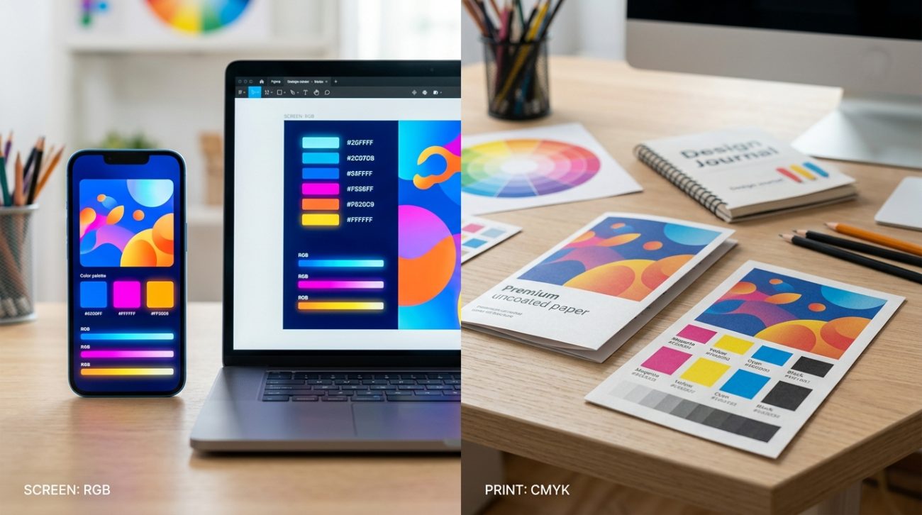
How screens and printers create color differently
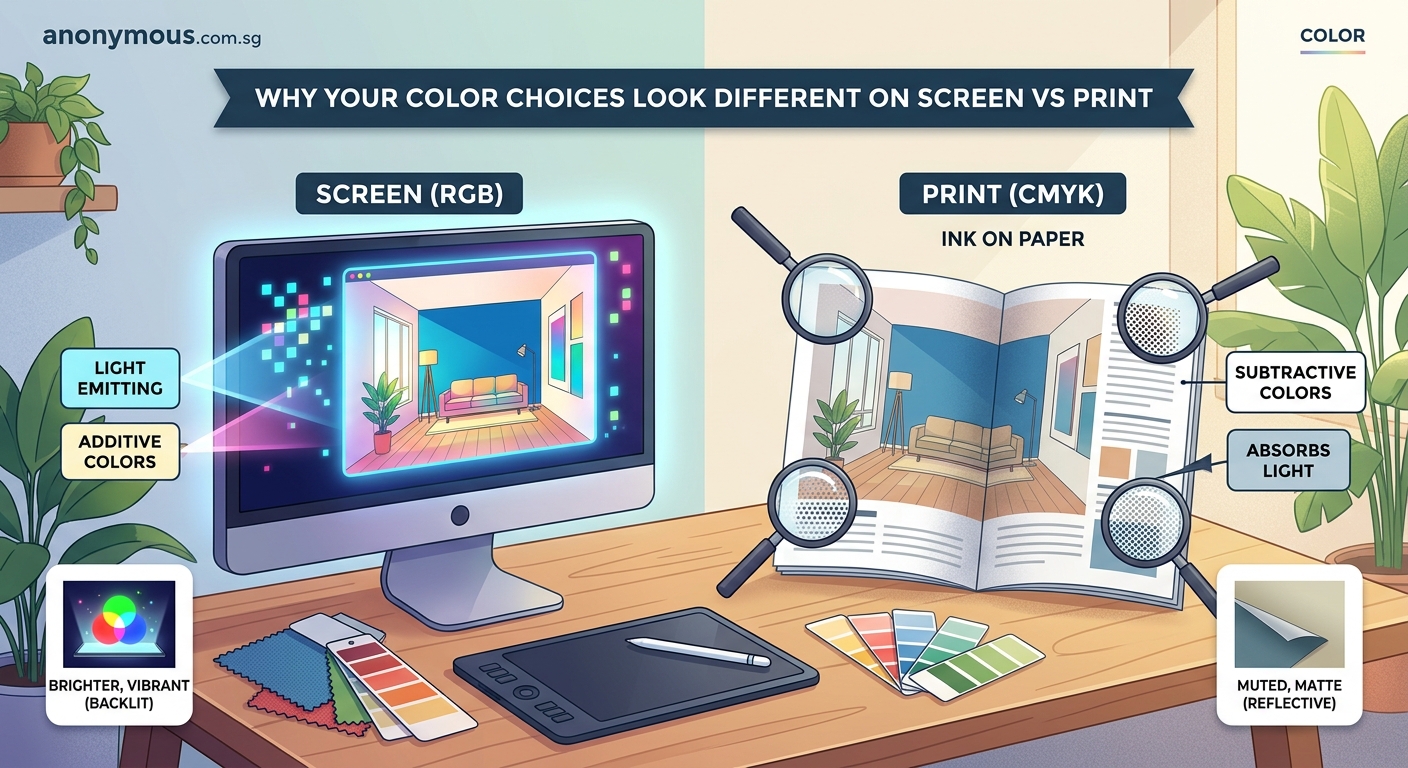
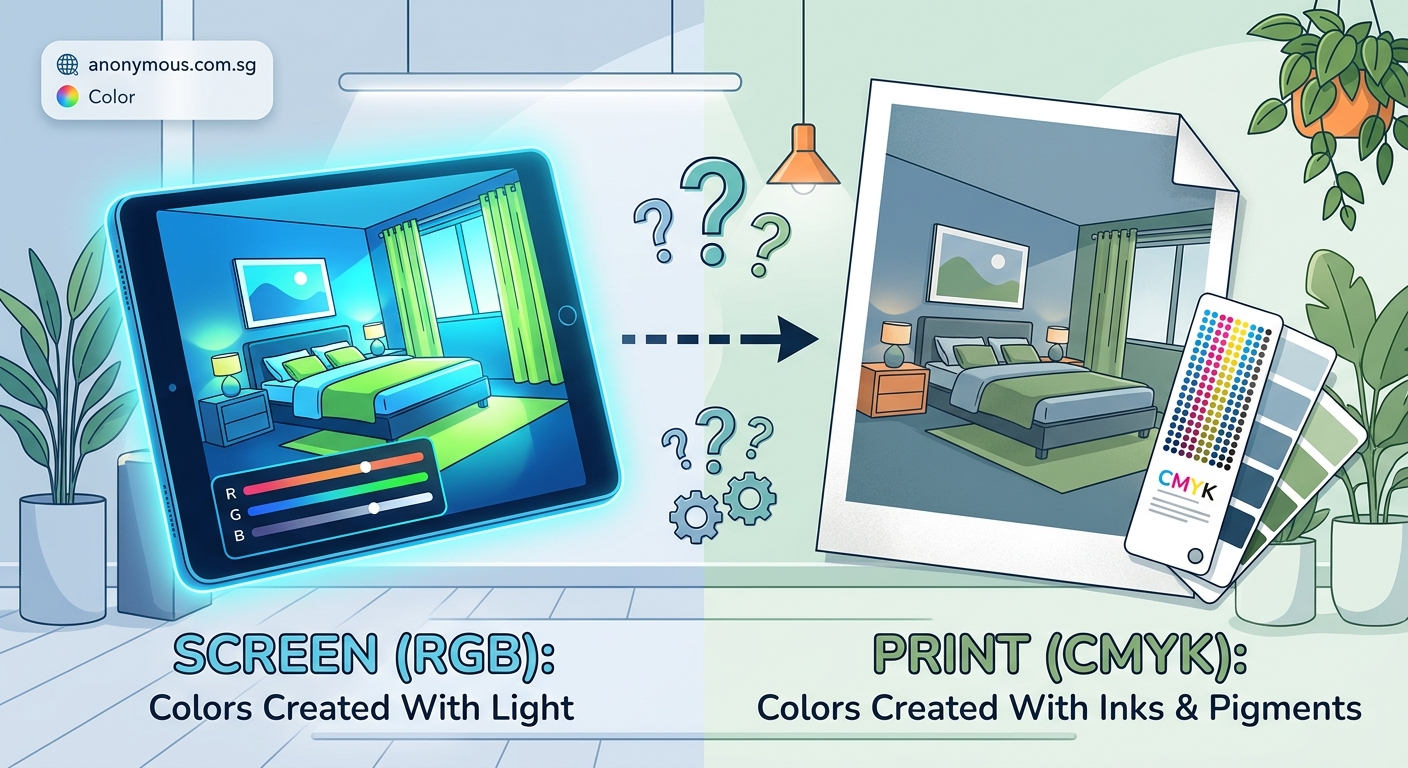
Your screen emits light to create colors. It combines red, green, and blue light at varying intensities. When all three colors shine at full brightness, you see white. When none shine, you see black.
Printers work the opposite way. They apply cyan, magenta, yellow, and black inks onto paper. The paper reflects light back to your eyes. Where all inks overlap heavily, you see dark colors or black. Where no ink exists, you see the white of the paper.
This fundamental difference means certain colors simply cannot translate perfectly between mediums. Bright electric blues and vivid neons look stunning on screens because they’re made of pure light. But ink on paper can never match that luminosity.
Think of it like comparing a lightbulb to a painted wall. The lightbulb creates its own light. The wall only reflects whatever light hits it.
The color gamut problem
Each color system has a gamut, which means the range of colors it can produce. RGB has a wider gamut than CMYK for most bright, saturated colors.
Some RGB colors exist outside the CMYK gamut entirely. When you convert a design from RGB to CMYK, those out-of-gamut colors get shifted to the closest printable alternative. This shift often makes colors look duller or slightly different in hue.
Here’s what typically happens to popular colors:
| Color Type | On Screen (RGB) | In Print (CMYK) |
|---|---|---|
| Bright orange | Vibrant, almost glowing | Slightly muted, more red-leaning |
| Electric blue | Intense, saturated | Darker, less vivid |
| Lime green | Sharp, eye-catching | Duller, may shift toward yellow |
| Hot pink | Brilliant, neon-like | Softer, less intense |
| Pure white | Glowing white light | Paper white (cream or blue-tinted) |
Your design software usually warns you about out-of-gamut colors. Look for warning triangles or exclamation marks in your color picker.
Paper and material choices matter
Even with perfect color conversion, your paper affects the final appearance dramatically. Coated glossy paper reflects more light and makes colors appear more saturated. Uncoated matte paper absorbs more ink and produces softer, warmer tones.
Textured papers like linen or kraft paper change colors even more. A bright red on smooth white paper becomes a rustic, earthy red on kraft paper.
Paper brightness varies too. Some papers have optical brighteners that make whites look whiter. Others have a natural cream or gray tone that affects every color printed on them.
The ink sits on top of glossy paper, keeping colors crisp. On uncoated paper, ink soaks in slightly, causing colors to spread and darken. This is called dot gain.
When choosing paper stock, always request printed samples of your actual design on your actual paper choice. Digital proofs on screen cannot show you how paper texture and coating will affect your final colors.
How to prepare files for accurate color printing
Getting colors right requires planning from the start. Here’s a step-by-step process:
- Design in CMYK mode from the beginning if you know the project will be printed. This prevents surprises later.
- Use Pantone or spot colors for brand-critical colors that must match exactly across all materials.
- Request a physical proof from your printer before approving a large print run. Screen proofs and inkjet proofs are not accurate enough.
- Calibrate your monitor regularly using a colorimeter device. Uncalibrated monitors show colors incorrectly.
- View your printed proofs under proper lighting. Natural daylight or daylight-balanced bulbs give the most accurate view.
- Save your print files as PDF/X-1a or PDF/X-4 format with embedded color profiles to ensure consistent color handling.
Many designers keep a swatch book of printed Pantone colors at their desk. When choosing colors for printed materials, they select from the physical swatches instead of trusting their screen.
Lighting conditions change everything
Colors look different under various light sources. The same printed piece appears warmer under incandescent bulbs and cooler under fluorescent lights.
Your screen’s brightness setting also affects perception. A design that looks perfect on your dimmed laptop screen at night may look completely different on a bright office monitor at noon.
This phenomenon is called metamerism. Two colors that match under one light source may look different under another.
Professional printers evaluate color under standardized D50 or D65 lighting, which simulates natural daylight. If you judge your prints under warm yellow home lighting, they’ll look different than they will in an office or store.
When designing materials for specific environments, consider where people will actually see them:
- Restaurant menus under warm ambient lighting
- Retail packaging under bright store lights
- Outdoor signage in natural sunlight
- Office documents under fluorescent lights
Screen technology creates more variation
Not all screens display colors the same way. An OLED phone screen shows deeper blacks and more saturated colors than an older LCD laptop screen. Cheap monitors often have poor color accuracy and limited color ranges.
Your client’s screen probably shows colors differently than yours. What looks like a soft coral on your calibrated monitor might look like hot pink on their budget laptop.
Brightness settings change perceived colors too. Higher brightness makes colors look lighter and more washed out. Lower brightness makes everything appear darker and more saturated.
Even the angle you view a screen from affects color. IPS displays maintain color accuracy at wide angles. TN panels shift colors dramatically when viewed from the side.
This variation makes it impossible to guarantee that everyone sees your digital designs exactly the same way. But you can control your printed output much more precisely.
Converting between color modes correctly
When you must convert RGB designs to CMYK for printing, your software’s conversion settings matter. Different rendering intents produce different results:
Perceptual preserves the visual relationship between colors by compressing the entire color range. Use this for photographs and complex graphics.
Relative colorimetric maintains colors that fit within CMYK gamut but shifts out-of-gamut colors to the nearest printable equivalent. Use this for logos and graphics with specific brand colors.
Saturation prioritizes vivid colors over accuracy. Use this rarely, mainly for charts or graphics where impact matters more than precision.
Absolute colorimetric simulates how colors would look on a specific paper stock. Use this for proofing purposes.
Most designers use relative colorimetric for general printing. It provides the best balance of accuracy and color preservation.
Your design software also needs proper color profiles. Install your printer’s ICC profile to see a more accurate simulation of how colors will print. Without the correct profile, your software can only guess at the conversion.
Why brand colors need special handling
Brand colors must remain consistent across every application. A logo that’s vibrant blue online but navy blue in print creates confusion and weakens brand recognition.
This is where Pantone Matching System (PMS) or other spot color systems become essential. Spot colors use premixed inks formulated to exact specifications. A Pantone 285 blue will look the same whether printed in Singapore, London, or New York, on any compatible paper stock.
For digital use, you’ll still need RGB values. For print, you’ll need both CMYK approximations for process printing and PMS numbers for spot color printing. Document all these values in your brand style guide to maintain consistency.
Many brands specify different color values for different applications:
- Primary RGB for digital
- Primary CMYK for full-color printing
- Primary PMS for spot color printing
- Secondary RGB/CMYK versions for when exact matching isn’t possible
This approach acknowledges that perfect matching across all mediums is impossible. Instead, it defines acceptable variations for each use case.
Testing and proofing strategies
Never approve a print job based solely on your screen. The only reliable way to verify color accuracy is with physical proofs.
A contract proof or hard proof uses the same printing process, paper, and inks as your final job. This gives you the most accurate preview possible. Request one for any important or expensive print run.
Digital proofs from high-end proofers are less expensive and faster. They’re reasonably accurate but still not perfect. Use them for general approval, but request a press proof for critical color matching.
Inkjet proofs from your office printer are useful for checking layout and text but worthless for color evaluation. Office printers use completely different inks and papers than commercial presses.
Here’s a realistic proofing workflow:
- Internal review using calibrated monitors
- PDF review with proper file setup for technical accuracy
- Digital proof for layout, text, and general color approval
- Press proof or contract proof for final color sign-off
- Press check for critical jobs where you attend the print run
Each step catches different issues. Skipping steps saves money in the short term but often leads to expensive reprints.
Common mistakes that make color shifts worse
Beyond the inherent differences between RGB and CMYK, several mistakes make color problems worse:
Using RGB images in CMYK documents. Your software will convert them automatically, but you have no control over the conversion. Convert images yourself in Photoshop where you can preview and adjust the results.
Ignoring black generation settings. CMYK black can be made by combining cyan, magenta, and yellow, or by using black ink, or both. Different black generation methods produce different results, especially in shadows.
Setting rich blacks incorrectly. Pure black ink (0/0/0/100) looks flat in print. Rich blacks add cyan, magenta, and yellow to make deeper, richer blacks. But too much color ink causes drying problems and offsetting.
Forgetting about ink coverage limits. Most printing processes limit total ink coverage to 300% or 320%. Exceeding this causes drying issues, smearing, and color shifts. Your design software should warn you, but check manually.
Using transparency effects without flattening. Transparent overlays can shift colors unpredictably when converted to CMYK. Flatten transparency carefully and check the results.
Designing in RGB “because it’s for web too.” If you need both web and print versions, design in CMYK and convert to RGB for web. Going from CMYK to RGB is lossless. Going from RGB to CMYK loses information.
Setting realistic client expectations
When clients complain that printed colors don’t match their screen, they’re not wrong. The colors genuinely look different. Your job is to educate them about why this happens and what’s achievable.
Show them physical samples early in the process. Print test sheets of their brand colors on the actual paper stock. Let them see and approve the printed colors before committing to thousands of brochures or business cards.
Explain that their laptop screen, your desktop monitor, and the printed piece will all look slightly different. This is normal and unavoidable. What matters is that the printed piece looks good and meets their goals.
For clients with existing printed materials they want to match, get physical samples. Don’t try to match colors from a photo of a business card they emailed you. Photograph colors differently than your eyes see them, and screens display photos differently than reality.
When selecting brand colors, consider printability from the start. Colors that look amazing on screen but terrible in print create ongoing problems. Choose colors that work well in both mediums.
Tools that help bridge the gap
Several tools and techniques make color matching easier:
Calibrated monitors with built-in or external colorimeters ensure your screen displays colors accurately. This won’t make screen and print match, but it ensures you’re starting from an accurate baseline.
Pantone color books show printed samples of every Pantone color on coated and uncoated paper. When you need a specific blue, flip through the book and choose based on the actual printed sample, not your screen.
Spectrophotometers measure the exact color of printed samples and generate ICC profiles. Professional printers use these to calibrate their equipment and verify color accuracy.
Soft proofing in Photoshop or other professional software simulates how RGB colors will look when converted to CMYK. It’s not perfect, but it’s much better than guessing.
Color management systems in your operating system and design software ensure consistent color handling across applications. Set them up correctly once, and they work automatically.
Most small businesses and independent designers don’t need expensive spectrophotometers. But a calibrated monitor and physical Pantone book are worthwhile investments if you work with print regularly.
Your colors will always look different
Screens and printers create color through fundamentally different processes. This means some color variation between digital and printed versions is unavoidable and normal.
Understanding the technical reasons behind these differences helps you design better files, set realistic expectations, and make informed decisions about color choices. Start projects in the right color mode, use proper conversion techniques, request physical proofs, and maintain calibrated equipment.
The goal isn’t perfect matching between screen and print. That’s impossible. The goal is producing excellent results in each medium that serve your design objectives and satisfy your clients. With proper preparation and realistic expectations, you can achieve consistent, professional color across all your materials.