Your Instagram post gets 12 likes. Your competitor’s gets 1,200. Same industry, similar followers, but their feed looks polished while yours looks… patchy. The difference isn’t budget or fancy software. It’s avoiding a handful of preventable design errors that scream “amateur hour” to everyone scrolling past.
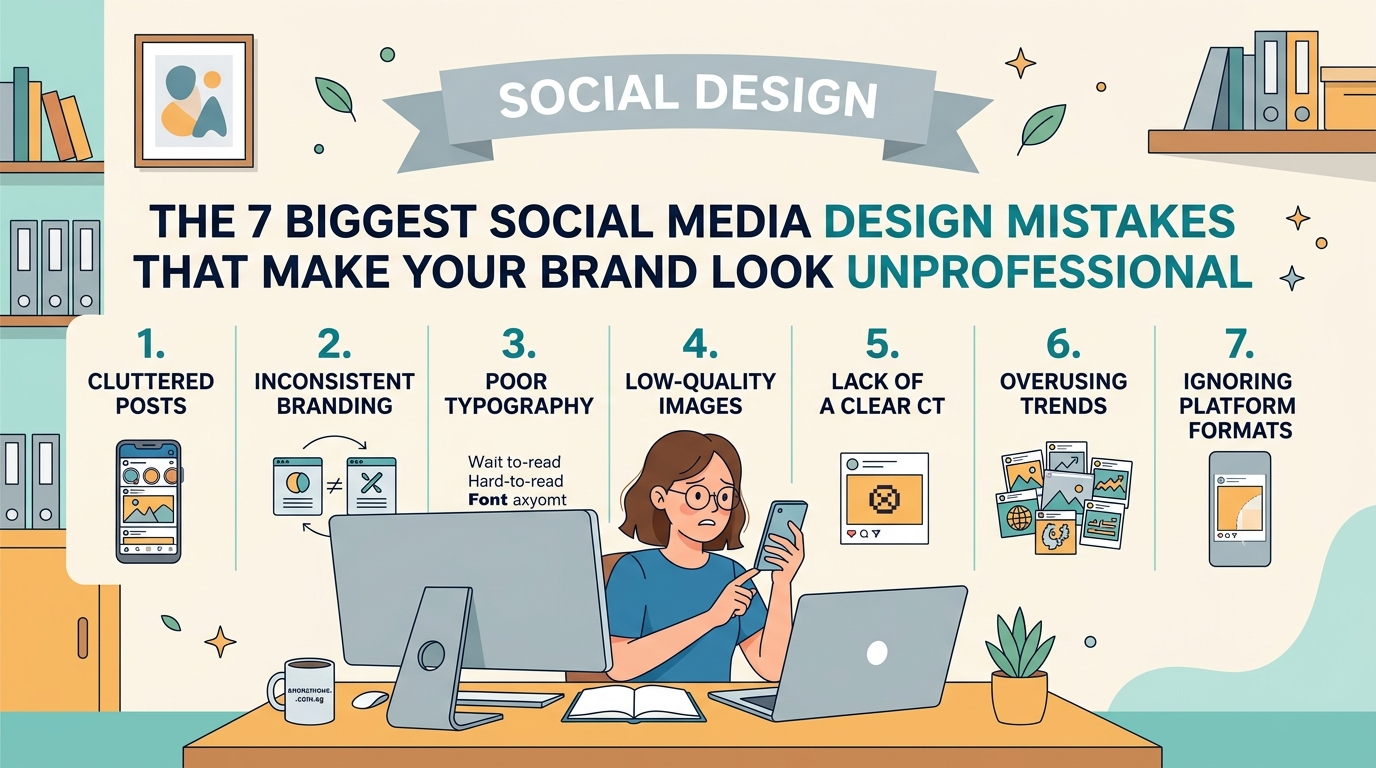
Social media design mistakes like inconsistent branding, cluttered layouts, poor font choices, and low-quality images destroy credibility fast. Small business owners can fix these errors by establishing brand guidelines, using proper sizing, choosing readable fonts, maintaining visual hierarchy, and ensuring every post aligns with their professional identity. These changes build trust immediately.
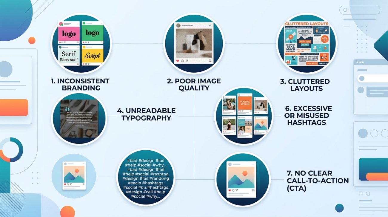
Inconsistent branding across platforms
You use one logo on Facebook, a different color palette on Instagram, and completely new fonts on LinkedIn. Visitors land on your profile and can’t tell if they’re looking at the same company.
Consistency builds recognition. When people see the same colors, fonts, and logo treatment everywhere, they remember you. When everything looks different, you seem disorganized or fake.
Create a simple brand kit with three core colors, two fonts (one for headlines, one for body text), and one logo file. Use these everywhere. No exceptions.
Your how to build a brand style guide that actually gets used should live in a shared folder where everyone on your team can access it. Update it once per year, not every month.
Using the wrong image sizes
You upload a beautiful photo, but Instagram crops out the product. Or your Facebook cover photo cuts off half your tagline. Platform dimensions matter more than you think.
Each social network has specific size requirements. Ignoring them makes your content look sloppy.
Here’s what you need:
| Platform | Profile Image | Cover/Header | Post Size |
|---|---|---|---|
| 320 x 320 px | N/A | 1080 x 1080 px (square) | |
| 170 x 170 px | 820 x 312 px | 1200 x 630 px (link) | |
| 300 x 300 px | 1584 x 396 px | 1200 x 627 px | |
| Twitter/X | 400 x 400 px | 1500 x 500 px | 1200 x 675 px |
Save these dimensions in a note on your phone. Check them before you upload anything. Most design tools have preset templates for each platform, so use them.
Cramming too much text into graphics
Your post has six different messages, four call-to-action buttons, and a paragraph of fine print. Nobody reads it because it looks like a chore.
People scroll fast. You have about 1.3 seconds to communicate one clear idea. If your graphic needs a manual, it’s too complicated.
Limit each post to one core message. Use five to seven words maximum for headlines. If you need more explanation, put it in the caption, not on the image itself.
“The best social media graphics communicate one idea so clearly that a distracted viewer gets it while waiting for their coffee to brew.” — Anonymous Design Team
Strip away everything that doesn’t support your main point. White space isn’t wasted space. It’s breathing room that makes your message readable.
Choosing unreadable fonts
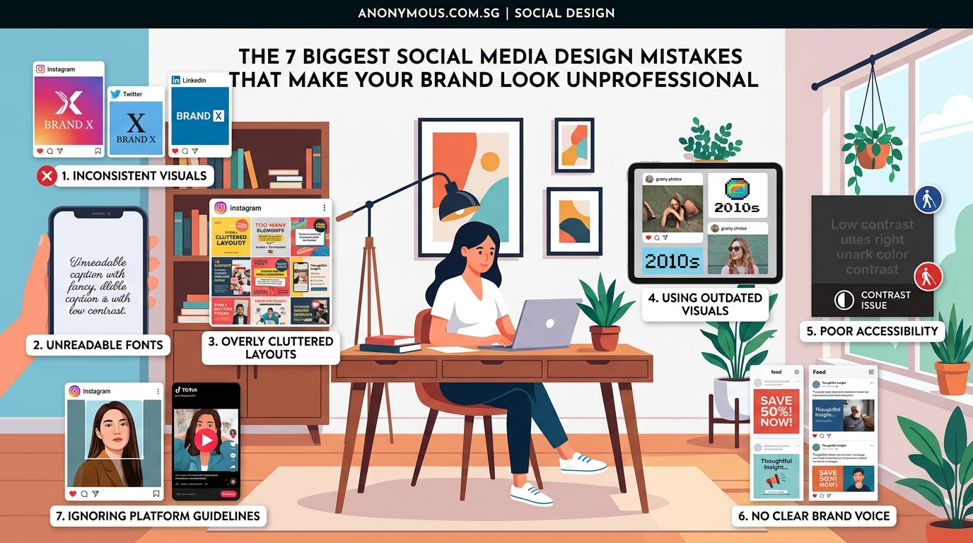
You picked a trendy script font because it looks elegant. Too bad nobody can read it on a phone screen.
Fancy fonts work for wedding invitations. They fail on social media where 80% of users view content on mobile devices with small screens and bright sunlight.
Stick to sans-serif fonts like Helvetica, Montserrat, or Open Sans for body text. If you want personality, use a distinctive font for headlines only, and make sure it’s still legible at thumbnail size.
Test every font choice by viewing it on your phone from arm’s length. If you squint to read it, choose something clearer. The how to choose the perfect font for your brand identity process takes 20 minutes and saves months of wasted posts.
Avoid these font mistakes:
- All caps for more than three words
- Script fonts smaller than 24pt
- Light gray text on white backgrounds
- More than two font families in one post
- Fonts that look identical to your competitors
Ignoring visual hierarchy
Everything on your post is the same size, same color, same weight. Your eye doesn’t know where to look first, so it looks nowhere and keeps scrolling.
Visual hierarchy guides the viewer’s attention in order of importance. Your headline should be biggest and boldest. Supporting text should be smaller. Your logo should be visible but not competing with the main message.
Follow this size ratio: if your headline is 48pt, make your subheading 24pt and your body text 16pt. This creates natural flow.
Use color strategically. Your primary brand color should highlight the most important element. Secondary colors support it. Everything else stays neutral.
The 7 typography mistakes that make your designs look unprofessional guide covers hierarchy in detail, but the basic rule is simple: make one thing obviously more important than everything else.
Using low-quality or stretched images
You found a perfect image online, but it’s 400 pixels wide. You stretch it to 1080 pixels for Instagram. Now it’s blurry and pixelated.
Blurry images signal low effort. They make people question whether you care about quality in other areas of your business too.
Always start with high-resolution images. Minimum 1500 pixels on the shortest side. You can always make images smaller without losing quality, but you can’t make small images bigger without them looking terrible.
Free stock photo sites like Unsplash and Pexels offer high-quality images. If you’re taking photos yourself, use your phone’s highest resolution setting and good natural lighting.
Never stretch an image beyond its original dimensions. If it doesn’t fit, find a different photo or crop strategically.
Mismatching colors that clash
You love bright orange. You also love electric blue. Together on the same post, they vibrate and hurt to look at.
Color theory isn’t complicated, but ignoring it makes your brand look chaotic. Some color combinations work. Others fight each other.
Choose a primary color that represents your brand. Pick two or three complementary colors that work well together. Use neutral colors (white, black, gray, beige) to balance them out.
The how to choose brand colors that actually convert customers approach helps you select colors that look professional together. Test your palette by creating a few sample posts. If anything feels jarring, adjust before you commit.
Avoid neon colors unless your brand specifically targets that aesthetic. Pastels work well for wellness and beauty brands. Bold, saturated colors suit tech and sports brands. Match your palette to your industry expectations.
Forgetting about mobile viewers
Your design looks perfect on your 27-inch monitor. On a phone, the text is unreadable and the important details are cut off.
Over 90% of social media users access platforms on mobile devices. If your design doesn’t work on a phone, it doesn’t work.
Check every post on your phone before publishing. Look at it in your feed, not just in the preview. See how it appears at thumbnail size. Make sure text is readable without zooming.
Design mobile-first. Start with the phone version, then scale up for desktop if needed. This ensures your most important elements are visible where most people will see them.
How to fix these mistakes starting today
You don’t need to redesign everything overnight. Start with a simple action plan that builds better habits.
- Create a brand kit with your colors, fonts, and logo files in one folder
- Save platform dimension templates in your design tool
- Review your last 10 posts and identify which mistakes appear most often
- Fix your profile images and cover photos first since they’re always visible
- Design your next three posts following the guidelines above
- Check each post on your phone before publishing
- Schedule a monthly review to ensure consistency holds
Small improvements compound. Fixing one mistake per week means 52 improvements by this time next year.
Set up a simple approval process. Before any post goes live, ask yourself three questions: Is the branding consistent? Is the text readable on mobile? Does it communicate one clear message?
If you answer no to any question, revise before posting.
Building a professional presence that lasts
Your social media presence is often the first impression potential customers get. Making it look professional isn’t about expensive tools or design degrees. It’s about avoiding common mistakes that undermine credibility.
Start with consistency. Use the same brand elements everywhere. Size your images correctly for each platform. Keep your designs simple and readable. Choose colors and fonts that work together. Always check how things look on mobile.
These aren’t artistic preferences. They’re practical standards that separate amateur accounts from professional ones. Apply them to your next post and watch the difference in how people respond to your brand.