
Your brand looks great today. But what happens when you launch a new product line, hire your first marketing manager, or expand into a second location?
Most businesses hit a wall. The logo that worked perfectly on your website suddenly feels wrong on packaging. Your color palette doesn’t include enough options for new campaigns. Your team creates social posts that look nothing like your emails.
You don’t need a rebrand. You need a system.
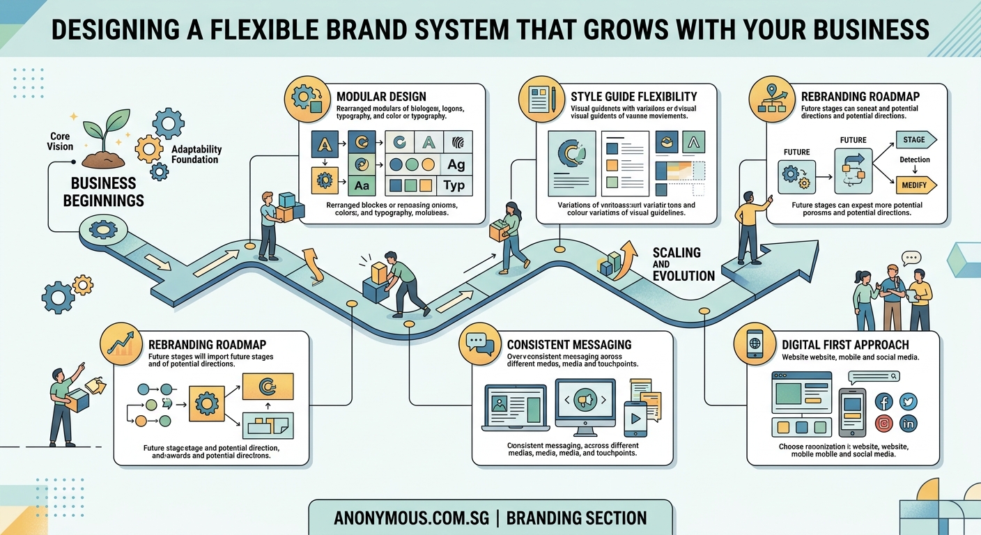
A scalable brand system gives you clear rules for logos, colors, fonts, and layouts that work across every channel and team member. Instead of redesigning everything when you grow, you build flexibility into your foundation. This guide shows you exactly how to create a system that adapts without breaking, using practical steps you can implement this week.
Why most brands break when businesses grow
You started with a logo and a couple of colors. That worked fine when it was just you posting on Instagram and sending emails.
Then you hired someone. They needed to make a flyer. They picked the wrong shade of blue because you never documented the exact hex code. The flyer looked off-brand, but you couldn’t explain why.
Then you launched on a new platform. Your square logo didn’t fit the horizontal banner space. You stretched it. It looked terrible.
Then you added a product line. Your original color palette only had two colors. You needed more variety but didn’t know which colors would still feel like your brand.
This is the scaling problem. Your brand wasn’t built to flex.
What makes a brand system different from brand guidelines
Brand guidelines tell you what your logo looks like. A brand system tells you how to use it everywhere.
Guidelines are a PDF. A system is a toolkit.
Here’s the difference:
| Brand Guidelines | Brand System |
|---|---|
| Shows final logo | Includes logo variations for different contexts |
| Lists three brand colors | Defines primary, secondary, and accent color roles |
| Names two fonts | Specifies font pairings and hierarchy rules |
| Shows example layouts | Provides templates and spacing formulas |
A system anticipates problems before they happen. It gives your team tools to make on-brand decisions without asking you every time.
Step 1: Audit what you already have
Before you build new rules, look at everything you’ve already created.
Collect every piece of branded material you can find. Website screenshots. Social posts. Email headers. Business cards. Presentation decks. Packaging photos.
Lay them out together. Look for patterns and problems.
Ask yourself:
- Which pieces feel most like your brand?
- Where does the design fall apart?
- What questions does your team ask most often?
- Which formats cause the most headaches?
This audit reveals your gaps. Maybe your logo works great on light backgrounds but disappears on dark ones. Maybe your color palette feels limiting. Maybe your font choices look inconsistent.
Write down every problem you find. These become your system requirements.
Step 2: Create logo variations for real-world scenarios

Your main logo is beautiful. But it won’t work everywhere.
You need versions for different contexts:
- Full logo with tagline
- Logo without tagline
- Horizontal lockup
- Stacked lockup
- Icon-only version
- Reversed version for dark backgrounds
- Single-color version for print
Each variation should feel cohesive but serve a specific purpose.
Document when to use each one. For example: use the icon-only version when the logo appears smaller than one inch. Use the reversed version on any background darker than 40% gray.
This prevents the logo stretching problem. Your team has options that actually work instead of forcing the wrong version into the wrong space.
Common mistakes with logo systems often include not planning for small sizes or forgetting about how professional logos should adapt across contexts.
Step 3: Build a color system with clear roles
Three brand colors aren’t enough when you scale.
You need a color system with defined roles:
Primary colors (1 to 2 colors): Your main brand identity. Use these most often.
Secondary colors (2 to 4 colors): Supporting colors that add variety without overwhelming your primary palette.
Accent colors (2 to 3 colors): Used sparingly for calls to action, highlights, or special emphasis.
Neutral colors (3 to 5 shades): Grays, off-whites, or muted tones for backgrounds and text.
For each color, document:
- Exact values (hex, RGB, CMYK, Pantone)
- When to use it
- What not to pair it with
- Accessibility contrast ratios
This structure gives you flexibility. Need a new campaign color? Pull from your secondary palette. Need a button color that pops? Use an accent. Your choices stay on-brand because the roles are clear.
Understanding which brand colors work for your audience helps you make strategic color decisions that support business goals.
Step 4: Define typography rules that scale
Picking two fonts isn’t enough. You need rules for how to use them.
Start with font pairings. Choose one font for headings and one for body text. Make sure they contrast enough to create visual hierarchy but complement each other stylistically.
Then define your type scale. This is the mathematical relationship between different text sizes.
A simple scale might look like this:
- H1: 48px
- H2: 36px
- H3: 24px
- Body: 16px
- Small: 14px
Each size serves a purpose. H1 for page titles. H2 for section headers. Body for paragraphs.
Document spacing rules too. How much space goes above and below headings? What’s the ideal line height for readability?
These rules prevent the random sizing problem. Every piece of content follows the same hierarchy, so everything feels connected even when different people create it.
Many businesses struggle with choosing fonts that match their brand personality while remaining functional across all materials.
Step 5: Create layout templates for repeated formats
Every time someone creates a social post, they shouldn’t start from scratch.
Build templates for your most common formats:
- Instagram posts and stories
- LinkedIn graphics
- Email headers
- Presentation slides
- One-pagers
- Case study layouts
- Blog featured images
Each template should include:
- Correct dimensions
- Logo placement
- Color zones
- Typography hierarchy
- Image placement guidelines
- Safe margins
Templates don’t limit creativity. They provide a starting point that’s already on-brand.
Your team can focus on the message instead of wondering where the logo goes or which font to use.
If you’re creating content for platforms like Instagram, understanding how to design engaging carousel posts within your brand system keeps your feed cohesive.
Step 6: Write voice and tone guidelines
Your visual brand is only half the system. Your words matter just as much.
Define how your brand sounds:
- Formal or casual?
- Technical or simple?
- Playful or serious?
- Long sentences or short?
Give examples of phrases you would and wouldn’t use.
Create a word bank of terms that feel on-brand and terms to avoid.
This keeps your messaging consistent even when different people write your content.
Step 7: Document everything in a central place
All these rules only work if people can find them.
Create a single source of truth. This could be:
- A Notion page
- A Google Doc
- A Figma file
- A simple PDF
Whatever format you choose, make it:
- Easy to access
- Easy to search
- Easy to update
Include visual examples for every rule. Show the right way and the wrong way.
Add download links for logo files, font files, and templates.
Update it whenever you add new elements or refine existing ones.
A well-organized resource becomes the kind of brand style guide people actually use instead of ignoring.
Step 8: Test your system with real projects
Your system isn’t done until you’ve tested it in real scenarios.
Pick three different projects that represent common use cases. Maybe a social campaign, a sales presentation, and a new landing page.
Try to complete each project using only the rules and assets in your system.
Where do you get stuck? What’s missing? What rules feel too rigid?
Refine based on what you learn.
A good system should make work faster, not harder. If something feels clunky, adjust it.
Common mistakes that break brand systems
Even well-intentioned systems fail. Here are the traps to avoid:
Making rules too strict. If your system says “never use this color combination” but that combination would work perfectly for a specific campaign, your team will ignore the system entirely.
Forgetting about edge cases. What happens when your logo needs to go on a photo background? What if you need to create a square graphic but all your templates are horizontal?
Not planning for growth. Your system should include room for new products, new channels, and new team members.
Skipping the documentation. Rules in your head don’t help anyone else.
Never updating it. Brands evolve. Your system should too.
“A brand system isn’t a cage. It’s a framework that gives you freedom to create without starting from zero every time. The best systems feel invisible because they make good design decisions feel obvious.”
How to roll out your system to your team
Building the system is half the work. Getting people to use it is the other half.
Start with a training session. Walk through the system together. Show examples. Answer questions.
Make it easy to access. Put the link in your team Slack. Add it to your onboarding docs. Reference it in project briefs.
Celebrate wins. When someone creates something that perfectly follows the system, share it. Show how the system made their work better.
Be patient with mistakes. If someone uses the wrong logo version, don’t just correct them. Show them where to find the right one in the system.
Collect feedback. Ask your team what’s working and what’s confusing. Update the system based on their input.
When to revisit and update your system
Your brand system isn’t set in stone.
Plan to review it every six months. Look at what you’ve created during that time. What worked? What didn’t?
Update your system when:
- You launch a major new product or service
- You expand into new markets or channels
- Your visual identity feels dated
- Your team consistently asks the same questions
- You hire new people and onboarding feels chaotic
Small updates keep your system relevant. Major overhauls should be rare if you built flexibility in from the start.
Tools that make managing a brand system easier
You don’t need expensive software to build a brand system, but the right tools help.
For documentation:
- Notion for searchable, updateable guides
- Figma for interactive design systems
- Google Drive for simple PDF access
For asset management:
- Dropbox or Google Drive for file storage
- Brandfolder or Frontify for larger teams
- A simple shared folder for small teams
For templates:
- Canva for easy-to-use templates your whole team can access
- Figma for more advanced design templates
- PowerPoint or Google Slides for presentation templates
Pick tools your team will actually use. A simple system they follow beats a complex system they ignore.
Your brand system is a living document
The businesses that scale successfully don’t rebuild their brands every year. They build systems that flex.
Your system should make decisions easier, not harder. It should speed up your work, not slow it down.
Start small. Pick one area to systematize this week. Maybe it’s just creating three logo variations and documenting when to use each.
Next week, tackle your color roles. The week after, build one template.
Small, consistent improvements build a system that actually works. And when your business doubles in size or launches in a new market, your brand won’t break. It’ll flex exactly how you designed it to.