
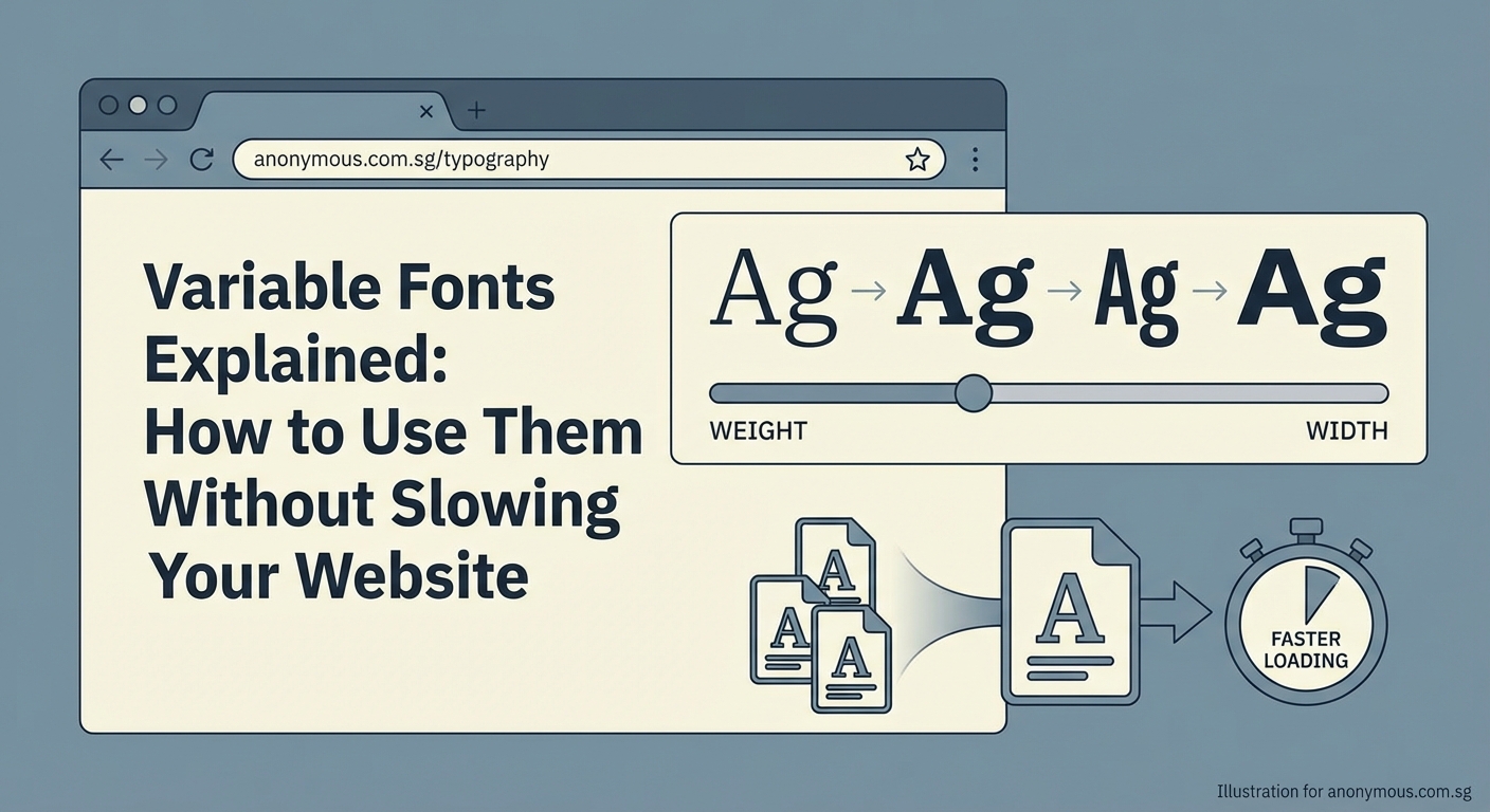
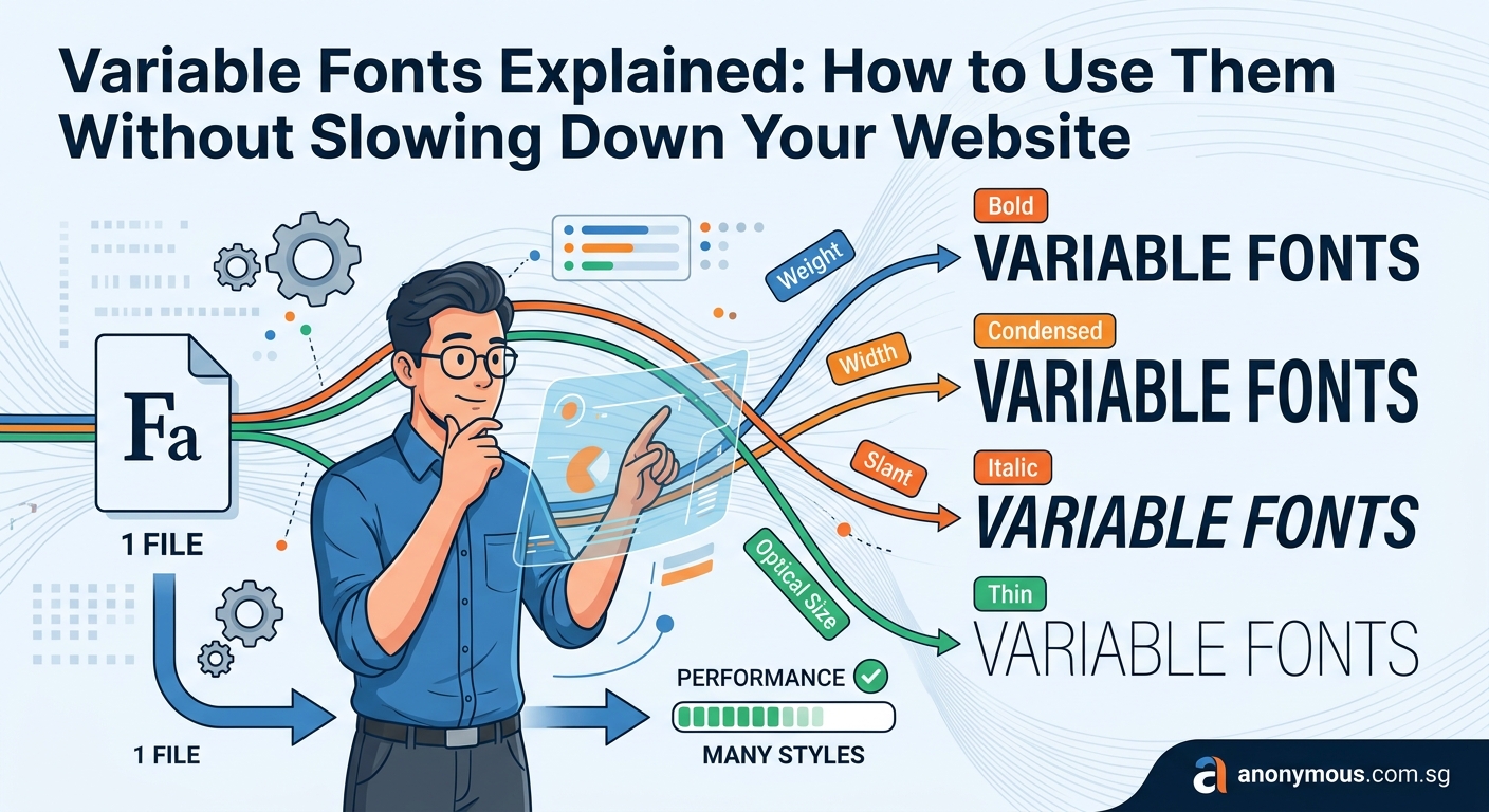
Variable fonts promise to simplify your workflow and speed up your site. One file replaces dozens of static font files. You get infinite design flexibility without the bloat. But if you implement them wrong, you’ll end up with slower load times, broken fallbacks, and frustrated users.
Variable fonts pack multiple weights, widths, and styles into a single file, reducing HTTP requests and improving performance. To use them effectively, you need to load the file correctly, control axes with CSS properties, provide fallbacks for older browsers, and subset the font to remove unused glyphs. Proper implementation can cut font file sizes by 50% or more.
What makes variable fonts different
Traditional fonts require a separate file for every weight and style. Regular, bold, italic, bold italic. That’s four files minimum. Add medium, semibold, and light, and you’re up to seven or more.
Variable fonts store all those variations in a single file. They use interpolation to generate any weight or width value between the minimum and maximum. Instead of downloading 400, 500, 600, and 700 weights, you download one file and access the entire range from 400 to 700.
This works through axes. Weight is an axis. Width is an axis. Italic, slant, and optical size are axes too. Some fonts include custom axes for unique effects.
Each axis has a range. The weight axis might go from 100 to 900. The width axis might span 75 to 125. You control these axes with CSS properties or the lower level font-variation-settings.
Loading variable fonts in your CSS
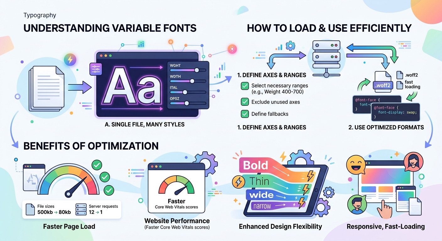
Start by adding the font file to your project. Variable fonts usually have a .woff2 extension. Place the file in your fonts directory.
Use @font-face to declare the font. The syntax looks similar to static fonts, but you need to specify the weight and style ranges.
@font-face {
  font-family: 'Inter Variable';
  src: url('/fonts/Inter-Variable.woff2') format('woff2');
  font-weight: 100 900;
  font-style: normal;
  font-display: swap;
}
The font-weight: 100 900; line tells the browser this font supports any weight from 100 to 900. The browser can interpolate any value in that range.
If your variable font includes an italic axis, add a second @font-face block with font-style: italic; and the appropriate range.
Set font-display: swap; to prevent invisible text during loading. The browser will show a fallback font immediately, then swap in the variable font once it loads.
Controlling weight and width with standard CSS
Once the font is loaded, you can use standard CSS properties to control the axes. For weight, use font-weight with any numeric value the font supports.
h1 {
  font-family: 'Inter Variable', sans-serif;
  font-weight: 750;
}

p {
  font-family: 'Inter Variable', sans-serif;
  font-weight: 420;
}
You’re not limited to 400, 700, or other standard values. You can use 420, 750, 863, or any number within the range.
For width, use font-stretch with a percentage value.
.narrow {
  font-stretch: 75%;
}

.wide {
  font-stretch: 125%;
}
For optical size, use font-optical-sizing: auto; to let the browser adjust automatically based on font size, or set it manually with font-variation-settings.
Using font-variation-settings for custom axes
Standard properties like font-weight and font-stretch work for registered axes. Custom axes require font-variation-settings.
Each axis has a four character tag. Weight is wght. Width is wdth. Italic is ital. Custom axes might be GRAD for grade or CASL for casual.
.custom {
  font-variation-settings: 'wght' 600, 'wdth' 90, 'GRAD' 50;
}
List multiple axes in one declaration, separated by commas. Each axis needs its tag in quotes, followed by the numeric value.
Be careful with font-variation-settings. It overrides standard properties. If you set font-weight: 700; and then use font-variation-settings: 'wdth' 90;, the weight resets to the default because you didn’t include wght in the settings.
Use standard properties whenever possible. Reserve font-variation-settings for custom axes or when you need to animate multiple axes simultaneously.
Step by step implementation process
Here’s how to add variable fonts to your site from start to finish.
-
Choose a variable font that includes the axes you need. Check the font’s documentation to see which axes it supports and their ranges.
-
Download the
.woff2file and add it to your project’s font directory. -
Write the
@font-facedeclaration with the correct weight and style ranges. Includefont-display: swap;for better loading performance. -
Apply the font family to your elements using standard CSS selectors.
-
Use
font-weight,font-stretch, and other standard properties to control the axes. Only usefont-variation-settingsfor custom axes. -
Test in multiple browsers to confirm the font loads correctly and the axes respond as expected.
-
Check your site’s performance with tools like Lighthouse or WebPageTest to verify the font file isn’t causing slowdowns.
Performance optimization techniques
Variable fonts can improve performance, but only if you optimize them properly. Here are the techniques that matter.
Subset the font file. Most variable fonts include glyphs for hundreds of languages. If your site only uses English, you don’t need Cyrillic or Arabic characters. Use a tool like glyphhanger or fonttools to create a subset with only the characters you need.
Preload critical fonts. Add a preload link in your HTML <head> for fonts used above the fold.
Use WOFF2 format. It offers the best compression. Skip older formats like TTF or OTF for web use.
Self host when possible. Hosting fonts on your own server gives you more control over caching and reduces DNS lookups. If you use Google Fonts, consider downloading the variable font files and hosting them yourself.
Limit the number of fonts. Even with variable fonts, loading multiple font families adds overhead. Stick to one or two families maximum.
Common mistakes and how to avoid them
| Mistake | Why it’s a problem | Solution |
|---|---|---|
Not specifying weight ranges in @font-face |
Browser treats it as a static font | Add font-weight: 100 900; to declare the full range |
Using font-variation-settings for standard axes |
Overrides other font properties and breaks inheritance | Use font-weight and font-stretch instead |
| Loading the full font without subsetting | Wastes bandwidth on unused glyphs | Subset to include only needed characters |
| Missing fallback fonts | Users see broken text if variable fonts fail to load | Always declare fallback fonts in your font stack |
| Not testing in older browsers | Variable fonts fail silently in browsers without support | Provide static font fallbacks for IE11 and older Safari |
Setting up fallbacks for older browsers
Variable fonts work in all modern browsers, but older versions of Safari, IE11, and some mobile browsers don’t support them. You need fallbacks.
The simplest approach is to load a static font first, then override it with the variable font.
@font-face {
  font-family: 'Inter';
  src: url('/fonts/Inter-Regular.woff2') format('woff2');
  font-weight: 400;
  font-style: normal;
}

@font-face {
  font-family: 'Inter Variable';
  src: url('/fonts/Inter-Variable.woff2') format('woff2');
  font-weight: 100 900;
  font-style: normal;
}

body {
  font-family: 'Inter Variable', 'Inter', sans-serif;
}
Browsers that support variable fonts will use Inter Variable. Older browsers will fall back to the static Inter font.
For more control, use @supports to conditionally apply variable font styles.
body {
  font-family: 'Inter', sans-serif;
  font-weight: 400;
}

@supports (font-variation-settings: normal) {
  body {
    font-family: 'Inter Variable', sans-serif;
    font-weight: 420;
  }
}
This approach keeps your code organized and makes it clear which styles apply to which browsers.
Animating variable font axes
Variable fonts shine when you animate them. You can smoothly transition between weights, widths, or custom axes.
Use CSS transitions for simple hover effects.
.button {
  font-variation-settings: 'wght' 400;
  transition: font-variation-settings 0.3s ease;
}

.button:hover {
  font-variation-settings: 'wght' 700;
}
For more complex animations, use CSS keyframes.
@keyframes breathe {
  0%, 100% {
    font-variation-settings: 'wght' 300;
  }
  50% {
    font-variation-settings: 'wght' 900;
  }
}

.animated-text {
  animation: breathe 3s infinite;
}
You can animate multiple axes at once by including them in the same font-variation-settings declaration.
Keep animations subtle. Excessive movement distracts users and can cause accessibility issues for people with vestibular disorders.
Responsive typography with variable fonts
Variable fonts make responsive typography easier. You can adjust weight or width based on screen size without loading additional files.
Use media queries to fine tune typography for different viewports.
body {
  font-variation-settings: 'wght' 400, 'wdth' 100;
}

@media (max-width: 768px) {
  body {
    font-variation-settings: 'wght' 450, 'wdth' 95;
  }
}

@media (min-width: 1200px) {
  body {
    font-variation-settings: 'wght' 380, 'wdth' 105;
  }
}
Slightly heavier weights improve readability on small screens. Wider spacing works better on large displays.
You can also tie font properties to viewport units for fluid scaling.
h1 {
  font-weight: calc(300 + 400 * ((100vw - 320px) / (1200 - 320)));
}
This formula scales the weight from 300 to 700 as the viewport width increases from 320px to 1200px. It’s a bit complex, but it creates smooth, responsive typography without breakpoints.
Integrating variable fonts into your design system
Variable fonts fit naturally into design systems. They reduce the number of font files you need to manage and make it easier to maintain consistency.
When choosing the perfect font for your brand identity, consider variable fonts for their flexibility. Document the axis ranges in your brand style guide so designers and developers know which values to use.
Define semantic weight and width values that match your design tokens.
:root {
  --font-weight-normal: 400;
  --font-weight-medium: 500;
  --font-weight-semibold: 600;
  --font-weight-bold: 700;

  --font-width-condensed: 85;
  --font-width-normal: 100;
  --font-width-expanded: 115;
}

body {
  font-weight: var(--font-weight-normal);
  font-stretch: var(--font-width-normal);
}

strong {
  font-weight: var(--font-weight-semibold);
}
This approach keeps your CSS maintainable and makes it easy to adjust typography across your entire site.
Testing and debugging variable fonts
Variable fonts can fail in subtle ways. An axis might not respond, or the font might render incorrectly in certain browsers.
Use browser DevTools to inspect font properties. In Chrome, open DevTools, select an element, and look at the Computed tab. You’ll see the actual font-variation-settings values being applied.
Wakamai Fondue is a web tool that analyzes variable font files. Upload your font and it shows you all available axes, their ranges, and example CSS code.
Test in multiple browsers. Safari, Chrome, and Firefox all support variable fonts, but they handle edge cases differently. Check your site in each one.
Use Axis Praxis to experiment with variable fonts interactively. You can adjust axes in real time and see how the font responds.
If a font isn’t working, check these common issues:
- Did you declare the weight or style range in
@font-face? - Are you using the correct axis tags in
font-variation-settings? - Is the font file corrupted or incomplete?
- Does the browser support variable fonts?
Where to find variable fonts
Google Fonts offers a growing collection of variable fonts. Filter by “Variable” in the font list to see available options. You can use them via the Google Fonts API or download the files for self hosting.
V-Fonts is a directory of variable fonts from multiple foundries. It includes free and paid options, with previews and axis information.
Axis Praxis showcases experimental and production variable fonts. It’s a good place to see what’s possible with custom axes.
Many commercial type foundries now offer variable fonts. Check the websites of foundries like Dinamo, Grilli Type, or TypeNetwork for high quality options.
When evaluating fonts, check the license. Some free fonts restrict commercial use. Make sure the license covers your use case before implementing the font on your site.
Making variable fonts work for you
Variable fonts simplify your workflow and improve performance when you implement them correctly. Load the file properly, use standard CSS properties for registered axes, subset the font to remove unused glyphs, and provide fallbacks for older browsers.
Start with one variable font family and test it thoroughly before rolling it out across your site. Measure the performance impact and adjust your implementation based on real data.
The flexibility of variable fonts opens up new design possibilities. You can fine tune typography for different contexts, create smooth animations, and maintain consistency with fewer files. Take the time to learn how they work, and you’ll have a powerful tool for better web typography.