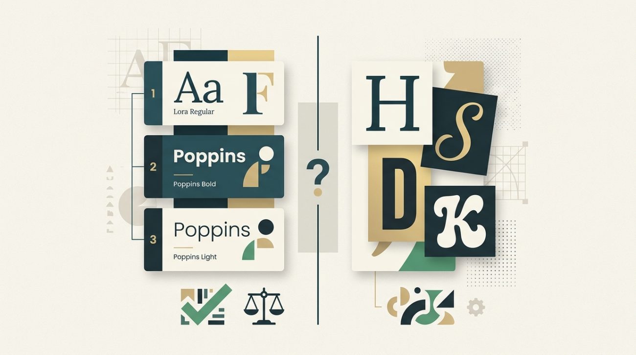
Most designers learn the two-font rule early on, but then they see beautiful designs using three, four, or even five typefaces. The confusion is real.
The truth is, there’s no magic number that works for every project. A business card needs fewer fonts than a 50-page magazine. A minimalist tech brand follows different rules than a playful children’s book publisher.
What matters more than the exact count is understanding why you’re adding each typeface and what job it needs to do.
Most designs work best with two to three fonts: one for headings and one for body text, with an optional accent font for special elements. Beginners should start with two and only add more when they can clearly explain why each typeface is necessary. The goal is visual hierarchy and readability, not variety for its own sake.
Why the two-font rule exists in the first place
The classic advice to stick with two fonts comes from decades of print design wisdom. One typeface handles headings, another handles body copy. Simple. Clean. Hard to mess up.
This approach works because it creates natural contrast. A bold sans-serif for headlines paired with a readable serif for paragraphs gives you instant visual hierarchy. Your eye knows where to look first.
Two fonts also force you to use size, weight, and spacing to create variety. You learn to make one typeface work harder by adjusting these properties instead of reaching for another font family.
But this rule was born in an era of print design with limited typeface libraries and high printing costs. Digital design opened up new possibilities and new problems.
When two fonts are genuinely enough
For many projects, two fonts remain the sweet spot. They cover your needs without adding complexity.
Website designs often thrive with just two typefaces. One handles all your headings (H1 through H6), navigation, and buttons. The other covers body text, captions, and form labels. Done.
Business cards, letterheads, and simple marketing materials rarely need more. The limited space means you’re better off perfecting the relationship between two fonts than cramming in extras.
Landing pages benefit from this constraint too. You want visitors focused on your message and call to action, not distracted by font variety.
Here are situations where two fonts genuinely shine:
- Minimal brand identities that emphasize restraint
- Text-heavy publications like blogs or news sites
- Corporate materials where professionalism trumps creativity
- Projects with tight deadlines where simplicity speeds up decisions
- Designs where content hierarchy is straightforward
The process becomes much easier when you’re only selecting two typefaces that need to work together.
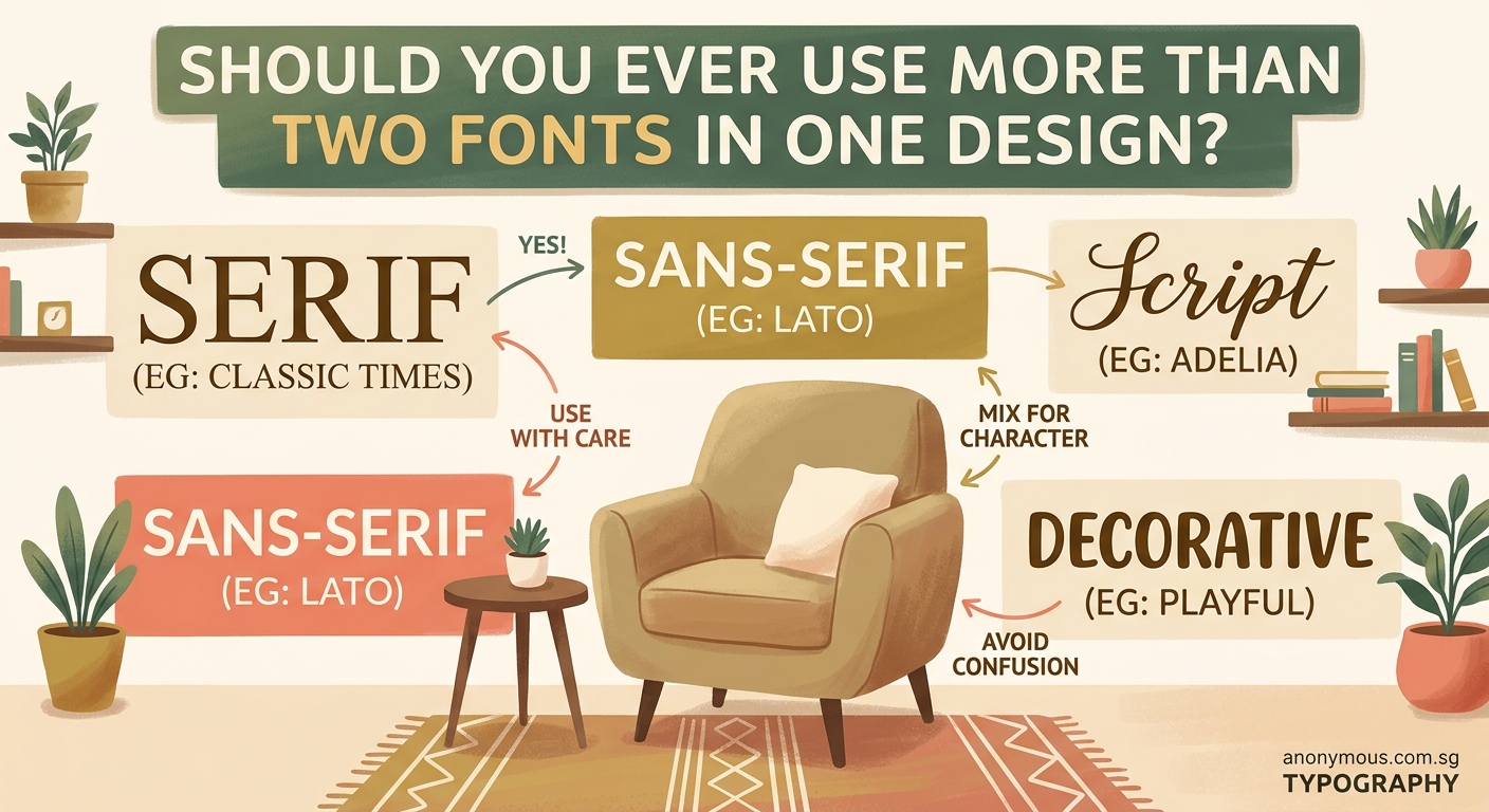
The case for three fonts
Three fonts open up new possibilities without tipping into chaos. This is where most intermediate designers land once they’ve mastered the basics.
The typical three-font system looks like this: a display font for major headings, a sans-serif for subheadings and UI elements, and a serif for body text. Each has a clear job.
Magazines and editorial designs often use this structure. The display font creates impact on cover stories and section openers. The sans-serif organizes information in sidebars and captions. The serif carries the main narrative.
Brand systems with multiple touchpoints benefit from three fonts too. Think about a company that needs a website, app, printed brochures, and packaging. Three fonts give you enough flexibility to handle different contexts while maintaining consistency.
Your third font should solve a specific problem. Maybe you need a monospace font for code examples. Or a handwritten style for testimonials. Or a condensed font for data tables where space is tight.
“Add a third font only when you can point to an element and say exactly why the first two can’t handle it. If you’re adding variety just because you’re bored, stop.”
This connects directly to building a cohesive where every choice serves a documented purpose.
How to know if you actually need four or more
Four or more fonts enter risky territory. You can pull it off, but you need a solid reason and strong execution skills.
Large-scale projects sometimes justify this complexity. Annual reports, conference branding with multiple tracks, or product launches with distinct sub-brands might need extra typefaces.
The key is creating clear rules about where each font appears. Font four might only show up in pull quotes. Font five might be reserved exclusively for data visualizations. Strict boundaries prevent chaos.
Editorial brands with strong personalities sometimes use four to six fonts successfully. But notice they’re usually handled by experienced art directors who understand the principles deeply.
Here’s a framework to test if you need more than three fonts:
- List every text element in your design (headings, body, captions, labels, etc.)
- Try assigning each element to one of your existing fonts using different weights and sizes
- Identify elements that genuinely don’t work with your current fonts
- Add a new font only for those specific elements
- Document exactly where and why the new font appears
Most of the time, you’ll realize you can solve the problem with your existing fonts. Adjusting weight, size, color, or spacing often creates the distinction you’re looking for.
Common mistakes that make font counts go wrong
The number matters less than how you use it. You can create a mess with two fonts or elegance with five. Here are the mistakes that typically cause problems:
| Mistake | Why It Fails | Better Approach |
|---|---|---|
| Choosing fonts that are too similar | Creates confusion instead of hierarchy | Pick fonts with clear contrast in style or weight |
| Using display fonts for body text | Kills readability in paragraphs | Reserve decorative fonts for short, large text only |
| Mixing too many font personalities | Looks like a ransom note | Stick to one personality (modern, classic, playful) across all choices |
| Ignoring font weights | Forces you to add fonts for variety | Use the weight range within each font family first |
| Forgetting about mobile screens | Text becomes unreadable at small sizes | Test every font at actual device sizes before committing |
| Adding fonts without defined roles | Creates visual clutter | Every font needs a specific job description |
The article covers these issues in more depth with visual examples.
Practical rules for choosing your font count
Start with these guidelines, then adjust based on your specific project needs.
For beginners: Stick with two fonts until you can confidently explain typographic hierarchy to someone else. This constraint teaches you fundamentals faster than experimenting with variety.
For websites and apps: Two to three fonts cover 90% of digital projects. More than that usually signals unclear information architecture.
For print materials: Match the font count to the content complexity. A simple flyer needs two. A 100-page catalog might justify four.
For brand identities: Choose two to three core fonts, then document exactly how they’re used across different applications. Consistency matters more than variety.
For experimental or artistic projects: Break the rules intentionally once you understand them. Just make sure the extra fonts serve your creative concept.
Consider your skill level honestly. Adding fonts is easy. Making multiple fonts work together harmoniously requires experience. There’s no shame in keeping it simple while you build that experience.
Testing your font choices before committing
Before finalizing your font count, run these practical tests.
Create a style sheet with real content. Don’t use Lorem Ipsum. Use actual headlines, paragraphs, captions, and labels from your project. This reveals problems that dummy text hides.
Print it out at actual size. Screens lie. A font that looks great on your monitor might fail on paper or at small sizes. Print tests catch these issues early.
Show it to someone unfamiliar with the project. Ask them to identify the most important information without any guidance. If they struggle, your font hierarchy isn’t working regardless of how many fonts you’re using.
Check accessibility. Run your text through contrast checkers. Make sure body text meets WCAG standards. Test with screen readers if your project is digital.
Sleep on it. Font choices that seem brilliant at midnight often look questionable the next morning. Give yourself time to see your decisions with fresh eyes.
These same principles apply when you’re working on where typography plays a central role.
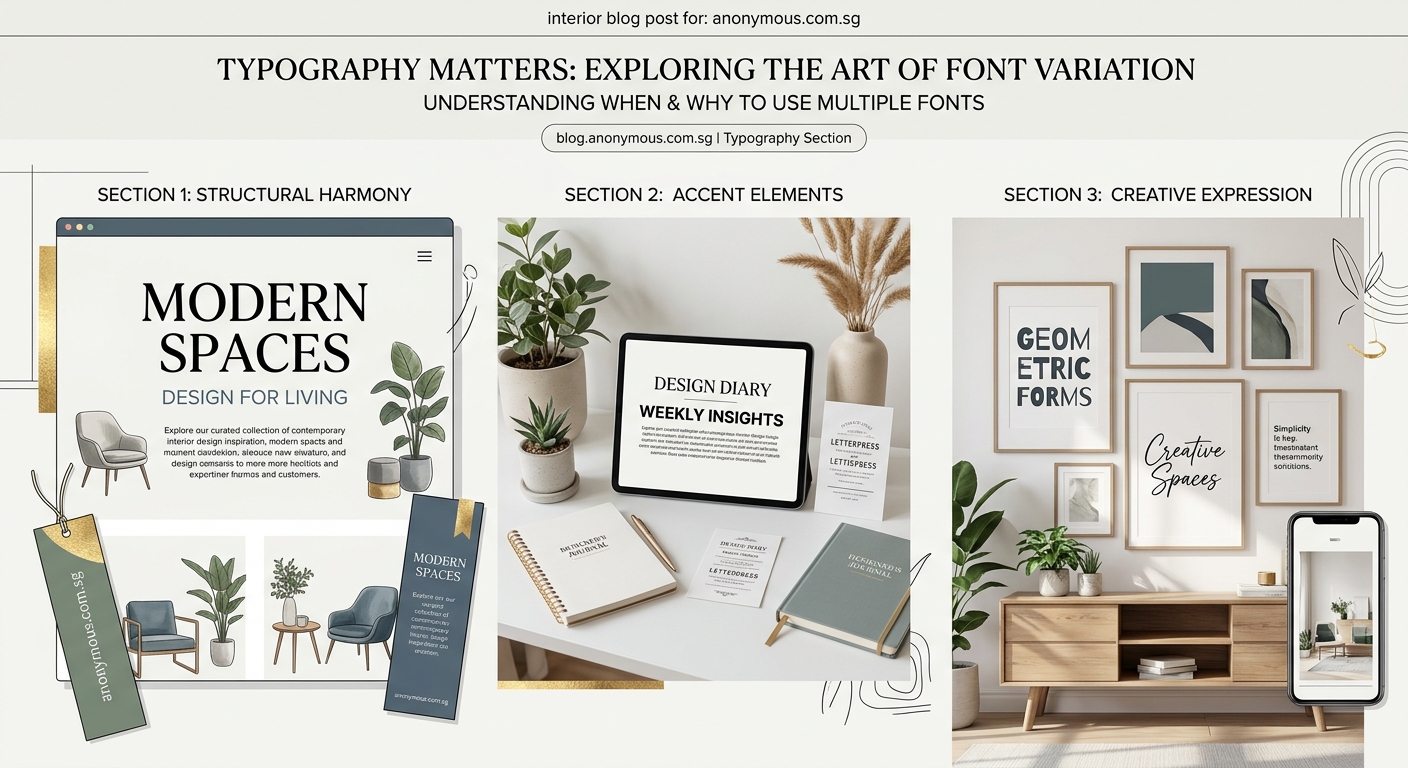
Real-world examples across different project types
Let’s look at how font counts play out in actual design scenarios.
Startup landing page: Two fonts work perfectly. A geometric sans-serif like Inter or DM Sans handles everything from the hero heading to button labels. A second font isn’t always necessary, but adding a serif like Lora for longer content sections creates nice contrast.
Restaurant menu: Three fonts make sense here. A decorative script or serif for the restaurant name and section headers. A clean sans-serif for dish names. A smaller serif or sans-serif for descriptions and prices. Each serves a distinct function.
Conference branding: Four fonts might be justified. A bold display font for the conference name. A sans-serif for speaker names and session titles. A serif for body text in the program. A monospace font for schedule times and room numbers. The complexity matches the information density.
Personal portfolio: Two fonts keep the focus on your work. Let your projects be the visual variety. A strong heading font and readable body font are all you need.
Magazine layout: Three to four fonts support different content types. Feature headlines get impact fonts. Body articles use readable serifs. Sidebars and infographics use sans-serifs. Pull quotes might get a fourth font for emphasis.
Notice how the font count grows with project complexity and content variety, not arbitrarily.
How font pairing affects your total count
The fonts you choose matter as much as how many you choose. Some typefaces play well together. Others clash no matter what you do.
Superfamilies make life easier. These are font families designed with multiple styles (sans, serif, slab, mono) that harmonize automatically. Using fonts from the same superfamily lets you add variety while maintaining visual coherence.
Contrasting styles create clear hierarchy. Pair a geometric sans-serif with a traditional serif. Or match a modern sans-serif with a humanist serif. The difference should be obvious, not subtle.
Avoid fonts from the same category unless they’re dramatically different. Two similar sans-serifs confuse readers. They’ll wonder if it’s intentional or a mistake.
Historical period matching helps too. A Renaissance serif pairs better with a classical serif than with a futuristic display font. Unless you’re deliberately creating tension, keep your fonts in the same aesthetic era.
The relationship between fonts impacts how through consistent visual language.
Tools and resources for managing multiple fonts
Managing multiple fonts gets tricky as your count increases. These tools help.
Font management software: Apps like FontBase or RightFont let you organize, preview, and activate fonts without cluttering your system. Essential if you’re testing multiple options.
Style guides: Document your font decisions immediately. Which font goes where? What sizes? What weights? Future you will thank present you. A solid prevents font chaos down the road.
Variable fonts: These let you adjust weight, width, and other properties along a continuous axis. One variable font file can replace multiple static weights, giving you variety without additional font files.
Font pairing tools: Websites like FontPair, Typ.io, or Google Fonts’ pairing suggestions help you find combinations that work. Useful when you’re stuck or learning.
Design systems: Tools like Figma or Adobe XD let you define text styles once and reuse them. This ensures consistency even when using multiple fonts across large projects.
Making your final decision with confidence
You’ve learned the guidelines. Now here’s how to actually decide for your specific project.
Count your distinct content types first. Headings, subheadings, body text, captions, labels, quotes, and special callouts. Each might need different treatment.
Try solving it with one font family first. Use weights, sizes, and spacing to create hierarchy. You might be surprised how far this takes you.
Add a second font only when the first can’t create enough contrast. Usually this means pairing a sans-serif with a serif, or adding a display font for major headings.
Consider a third font if you have a specific element that needs special treatment. Code blocks, pull quotes, or data tables are common reasons.
Stop there unless you’re working on something genuinely complex or you have the skills to manage more.
Trust your instinct about readability over everything else. If your body text is hard to read, it doesn’t matter how beautiful your font combination looks. Function beats aesthetics every time.
Your typography choices shape the entire design
The number of fonts you use sets the tone for your entire project. Two fonts signal restraint and professionalism. Three fonts suggest sophistication and careful planning. Four or more fonts communicate complexity or creativity, depending on execution.
Start conservative. You can always add fonts in future iterations if you genuinely need them. Removing fonts after you’ve built a design around them is much harder.
Pay attention to how experienced designers handle typography in work you admire. Count their fonts. Notice where each appears. Study how they create variety within constraints.
Your font choices will improve with every project. The key is making intentional decisions based on function, not adding variety because you can. Let your content guide the complexity, and you’ll land on the right number naturally.