
Navigation can make or break your digital product. Users abandon websites and apps when they can’t find what they need within seconds. The right navigation design patterns solve this problem by creating clear, intuitive pathways that guide people exactly where they want to go.
Navigation design patterns are proven interface solutions that help users move through your product efficiently. Choosing the right pattern depends on your content depth, user context, and device type. This guide covers the most effective patterns, when to use each one, and how to implement them without common mistakes that frustrate users and hurt conversion rates.
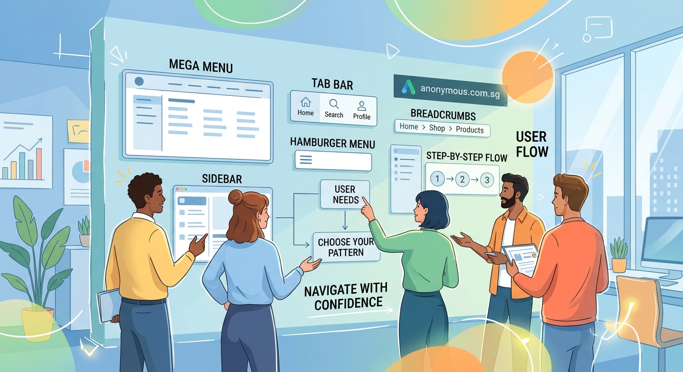
Understanding navigation design patterns
Navigation design patterns are reusable solutions to common interface problems. They work because users already recognize them from other products.
Think of them as design shortcuts. Instead of inventing a new way to organize menus, you pick a pattern that already works and adapt it to your needs.
These patterns exist because designers have tested them thousands of times across millions of users. They reduce cognitive load. They speed up decision making. They help people feel confident as they move through your product.
The pattern you choose affects everything from engagement to conversion rates. A confusing navigation structure sends users straight to your competitors.
Common navigation patterns and when to use them

Different products need different navigation approaches. Here are the patterns that solve most design challenges.
Top navigation bar
The horizontal menu across the top of your screen is the most familiar pattern on the web. Users expect it. They look for it automatically.
This pattern works best for websites with five to seven main sections. Any more than that and your menu feels crowded. Any fewer and you’re wasting prime real estate.
E-commerce sites love top navigation because it keeps product categories visible at all times. News websites use it to separate content types like politics, sports, and entertainment.
The main advantage is visibility. Users never have to hunt for the menu. The downside is limited space, especially on smaller screens.
Hamburger menu
Three horizontal lines that reveal a hidden menu when tapped. You see this pattern everywhere on mobile apps and responsive websites.
Hamburger menus save screen space. They let you include dozens of menu items without cluttering the interface. They work perfectly for content-heavy apps like news readers or documentation sites.
The trade-off is discoverability. Hidden navigation gets used less than visible navigation. Studies show that hamburger menus reduce engagement compared to visible alternatives.
Use this pattern when screen space matters more than immediate access. Skip it if your main navigation items drive most of your business value.
Tab bar
A row of icons or labels, usually at the bottom of mobile screens or top of desktop interfaces. Each tab switches between major sections of your app.
Tab bars excel at apps with three to five core functions. Instagram uses tabs for home, search, create, shop, and profile. Banking apps use them for accounts, transfers, payments, and settings.
This pattern keeps your most important features one tap away. Users can switch contexts without losing their place. The visual feedback shows exactly where they are.
Limit yourself to five tabs maximum. More than that and your icons shrink too small or your labels get truncated.
Sidebar navigation
A vertical menu along the left or right edge of the screen. Common in dashboards, admin panels, and productivity tools.
Sidebars handle complex information hierarchies better than horizontal menus. They can expand and collapse to show nested categories. They stay visible as users scroll through content.
This pattern shines in products where users spend extended sessions working on tasks. Email clients, project management tools, and content management systems rely heavily on sidebar navigation.
The main drawback is the space requirement. Sidebars take up valuable horizontal real estate that could display content instead.
Breadcrumbs
A horizontal trail showing the path from homepage to current location. You see these on e-commerce sites and documentation pages.
Breadcrumbs help users understand where they are in a deep hierarchy. They provide one-click access to parent pages. They reduce the number of actions needed to backtrack.
This pattern works best as secondary navigation, not primary. Use breadcrumbs alongside another main navigation pattern, never as a replacement.
They’re essential for websites with three or more hierarchy levels. Skip them on shallow sites with only one or two levels of depth.
Footer navigation
Links grouped at the bottom of the page. Usually contains secondary items like privacy policies, contact information, and site maps.
Footer navigation catches users who scrolled through your entire page without finding what they needed. It provides a second chance to guide them somewhere useful.
This pattern handles lower-priority links that don’t deserve space in your main navigation. Legal pages, company information, and help resources live here comfortably.
Don’t hide important conversion paths in your footer. Users scroll past footers more often than you think.
Choosing the right pattern for your project
Picking a navigation pattern isn’t about personal preference. It’s about matching user needs to interface constraints.
Start by answering these questions:
- How many main sections does your product have?
- How deep is your content hierarchy?
- What devices will users primarily use?
- How often do users need to switch between sections?
- What actions drive your business goals?
Your answers reveal which patterns fit your situation. A blog with ten categories needs different navigation than a mobile app with three core features.
Consider your user’s context too. Someone shopping for shoes browses differently than someone checking their bank balance. Shopping encourages exploration. Banking demands efficiency.
Test your assumptions with real users. What seems obvious to you might confuse someone seeing your product for the first time. Watch where they click. Notice where they hesitate.
“The best navigation is invisible. Users should accomplish their goals without thinking about how they got there. If people compliment your navigation, something went wrong.” – Luke Wroblewski, Product Director at Google
Combining patterns for better experiences
Most successful products use multiple navigation patterns together. Your main navigation handles primary tasks. Secondary patterns support different user needs.
A typical e-commerce site might combine:
- Top navigation for product categories
- Hamburger menu for account settings
- Breadcrumbs for category drilling
- Footer navigation for legal pages
This layered approach gives users multiple ways to find what they need. Some people prefer browsing categories. Others use search. Different patterns serve different preferences.
Just maintain consistency across patterns. If your hamburger menu slides in from the left, don’t make your shopping cart slide in from the right. Predictability builds confidence.
Keep your visual hierarchy clear too. Users should instantly recognize which navigation is primary and which is secondary. Size, position, and styling all communicate importance.
Mobile versus desktop navigation patterns
Mobile screens force different decisions than desktop monitors. What works beautifully on a 27-inch display falls apart on a 5-inch phone.
Desktop navigation can show more options simultaneously. You have room for mega menus with multiple columns. You can keep sidebars visible while displaying content.
Mobile navigation prioritizes content over chrome. Every pixel devoted to navigation is a pixel stolen from what users actually want to see.
Common mobile adaptations include:
- Converting top navigation to hamburger menus
- Moving tab bars to the bottom for thumb access
- Hiding secondary navigation until needed
- Simplifying mega menus to simple lists
Design for mobile first, then enhance for larger screens. This approach ensures your core navigation works everywhere, then adds convenience for users with more screen space.
Touch targets matter more on mobile. Fingers are less precise than mouse cursors. Make your navigation elements at least 44×44 pixels to prevent mis-taps.
Navigation pattern comparison
| Pattern | Best For | Screen Space | Discoverability | Complexity Limit |
|---|---|---|---|---|
| Top bar | 5-7 main sections | Medium | High | Low to medium |
| Hamburger | Space-constrained mobile | Low | Low | High |
| Tab bar | 3-5 core functions | Medium | High | Low |
| Sidebar | Deep hierarchies | High | Medium | High |
| Breadcrumbs | Multi-level content | Low | Medium | Any |
| Footer | Secondary links | Low | Low | Any |
Common mistakes that break navigation
Even experienced designers make navigation errors that frustrate users. Avoid these problems to keep your interface usable.
Hiding too much behind hamburger menus. If your most important features are hidden, users won’t find them. Reserve hamburgers for truly secondary functions.
Using vague labels. “Solutions” and “Resources” mean nothing specific. Users shouldn’t have to guess what’s behind a menu item. Be direct. Say “Pricing” instead of “Plans.” Say “Contact” instead of “Get in Touch.”
Creating too many hierarchy levels. Every additional level increases cognitive load. If users need four clicks to reach basic content, your information architecture needs work.
Forgetting mobile users. Navigation that works perfectly on desktop might be completely unusable on phones. Test every pattern on actual devices, not just in browser dev tools.
Inconsistent navigation between pages. Moving menu items around between sections confuses users. Keep your navigation stable and predictable across your entire product.
Overloading with options. Twenty items in your main menu paralyzes users with choice. Group related items. Hide less important options. Prioritize ruthlessly.
Accessibility in navigation design
Navigation patterns must work for everyone, including users with disabilities. Accessible navigation isn’t optional. It’s a baseline requirement.
Keyboard navigation is essential. Users should be able to tab through every menu item and activate links without touching a mouse. Test this yourself by unplugging your mouse and navigating your product.
Screen reader compatibility matters too. Use semantic HTML elements like <nav>, <ul>, and <a>. Add ARIA labels where needed. Announce state changes when menus open or close.
Color alone shouldn’t indicate navigation state. If your active page is marked only by color, colorblind users won’t notice. Add underlines, bold text, or icons to reinforce the visual difference.
Focus indicators help users track their position. Don’t remove the outline that appears when users tab to a link. Style it if you must, but never hide it completely.
Consider users with motor impairments too. Make click targets large enough for people with tremors or limited dexterity. Space items far enough apart to prevent accidental clicks.
Testing your navigation choices
Your navigation only works if real users can actually use it. Testing reveals problems you’ll never spot on your own.
Card sorting helps you understand how users mentally organize information. Give people cards with your content items and watch how they group them. Their categories might surprise you.
Tree testing validates your hierarchy before you build anything. Show users a text-only version of your navigation structure and ask them to find specific items. If they can’t find things in the simplified version, they definitely won’t find them in the finished product.
Usability testing with prototypes catches interaction problems early. Watch real users attempt real tasks. Notice where they pause. Ask them to think aloud as they navigate.
Analytics reveal how people actually use your navigation after launch. Track which menu items get clicked most. Identify dead ends where users abandon tasks. Look for patterns in navigation paths.
A/B testing compares different navigation approaches with real traffic. Try a tab bar against a hamburger menu. Test different label wording. Let data guide your decisions.
Making navigation patterns work with your brand
Navigation doesn’t have to look generic. You can adapt standard patterns to match your brand identity without sacrificing usability.
Typography plays a huge role in navigation personality. A carefully chosen font makes your menus feel sophisticated, playful, or authoritative. Just keep it readable above all else.
Color creates visual hierarchy and reinforces brand recognition. Use your brand colors strategically to highlight important navigation elements without overwhelming the interface.
Spacing and layout communicate brand values too. Generous whitespace feels premium. Tight spacing feels efficient. Your navigation density should match your overall brand positioning.
Consistency with your broader design system keeps everything cohesive. If your brand style guide specifies rounded corners and soft shadows, apply those same treatments to your navigation elements.
Just remember that usability trumps aesthetics every time. A beautiful navigation pattern that confuses users is worse than an ugly one that works perfectly.
Navigation patterns evolve with your product
Your navigation needs will change as your product grows. What works for ten pages breaks down at a hundred pages.
Start simple when you launch. Use the most straightforward pattern that handles your current content. Don’t over-engineer for hypothetical future needs.
Plan for growth but don’t implement it early. Know which pattern you’ll migrate to when you outgrow your current approach. Document that plan. Just don’t build it until you actually need it.
Monitor usage patterns as you add features. Your original navigation hierarchy might not fit new content. Be willing to reorganize when evidence shows users struggling.
Migration between patterns takes careful planning. Users hate it when familiar navigation suddenly changes. Introduce new patterns gradually. Provide clear guidance during transitions.
Test major navigation changes with a subset of users first. Roll out new patterns to 10% of your audience and measure the impact. Only proceed if metrics improve or stay stable.
Building navigation that actually helps users
Navigation design patterns give you a proven starting point. They solve common problems with tested solutions. They help users feel confident moving through your product.
But patterns are tools, not rules. Adapt them to your specific situation. Combine them thoughtfully. Test them with real users.
The best navigation disappears into the background. Users accomplish their goals without thinking about menus or hierarchies. They just get things done.
Start with your users’ needs, not your organizational chart. Pick patterns that match how people actually think about your content. Test early and often. Iterate based on evidence, not opinions.
Your navigation might never win design awards. That’s fine. If it helps people find what they need without frustration, you’ve succeeded.